This topic describes the meaning of each configuration items when the model viewer is fully selected.
Chart style
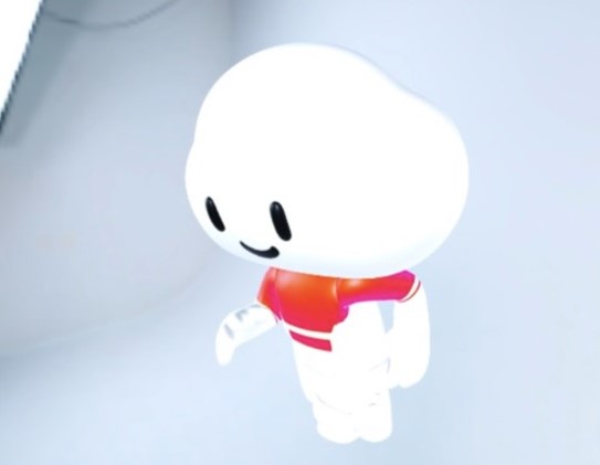
The model viewer is a 3D animation model loader based on the DataV team's self-developed webgl visual rendering engine datav.vangogh. The component supports loading gltf and glb format models, PBR maps, instantiated mesh parsing, immersive animation editor, selection of various light sources and post-effect configurations. 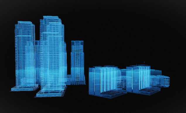
Style Panel 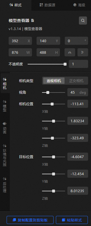
Search Configuration: Click the Search configuration items icon
 in the upper-right corner of the Style panel. In the Search Configuration panel, enter the name of the configuration items that you want to search for and locate the configuration items. Fuzzy match is supported. For more information, see Search configuration items.
 Size: the width and height of the widget. Unit: pixels.
Positioning: the x-axis and y-axis of the component. Unit: pixels. X-coordinate indicates the pixel distance between the upper-left corner of the widget and the left border of the canvas. Y-coordinate indicates the pixel distance between the upper-left corner of the widget and the upper border of the canvas.
Rotate: The widget is rotated around the center of the widget. Unit: degrees.
Directly enter the degrees in the Rotation Angle spin box or click the plus sign (+) or minus sign (-) to increase or decrease the value in the Rotation Angle spin box.
Click the
 icon to flip the widget style.
 Click the
 icon to flip the widget style.
Opacity: Valid values: 0 to 1. If this parameter is set to 0, the widget is hidden. If this parameter is set to 1, the widget is completely displayed. Default value: 1.
Camera
Metric
description
Camera Type
The type of the camera that is used to view the model. The camera types include Perspective Camera and Orthographic Camera.
Perspective
The fov value of the camera view refers to the angle value of the field of view of the model. Drag the slider to adjust the angle of the viewing angle. Valid values: 0.1 to 180. If you set Camera Type to Perspective Camera, the Current field is displayed.
Camera Position
The position of the camera in the X, Y, and Z axes within the model viewer. Drag the slider to adjust the position values of the camera on the three directions. The value range is -1000 to 1000.
Target location
The orientation position of the camera in the X, Y, and Z axis directions within the model viewer. Drag the slider to adjust the orientation values of the camera on the three direction axes. Valid values: -1000 to 1000.
Model
Metric
description
Model address
By default, a model URL is configured in the model address configuration items. If you are not satisfied with the default configuration model, you can customize and upload the required model. Two upload methods are available:
Method 1: Enter the URL of the required model in the link input box on the right of the model address.
Method 2: Click Change in the dotted line below the address field. In the Select Resource dialog box, select a model from Official Design Resources or a custom model that is uploaded to My Design Resources. You can also click the
 icon in My Design Resources to upload a local model. For more information about how to modify the design assets of a model, see Function description.
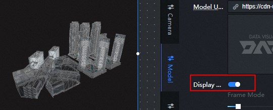
Display Mode
Turn on the switch to turn on the wireframe mode effect, which can overlay the specified solid color wireframe style on the original model texture.
Wireframe Width: Drag the slider to adjust the width and thickness of the wireframe.
Wireframe Color: Specify the color of the wireframe.
PBR Channel Display Mode: The model viewer supports the PBR map display of the model. In addition to the base color, only Metal-Roughness is supported. Click the PBR Channel Display Mode drop-down list to view the map styles in the PBR channel of the model. The available map styles include Final, Base Color, AO, Metalness, Roughness, Normal, and Illumination.
Rendering Effect
The rendering effect style of the model, including:
Shadow Settings: specifies the shadow style of the model. You can turn on or off Emit Shadow or Receive Shadow to control the shadow style of the model.
NoteCast shadow casts shadows on other meshings. Receive shadow casts shadows on other meshings. If the model itself needs to display the shadow effect generated before and after the mesh, the two shadow configuration items need to be turned on at the same time. If you only want to display the shadow of the model as a whole on the projection plane, you only need to turn on the configuration items of emitting shadow to reduce the loss of rendering performance.
Open only launch shadow renderings
 both launch and receive shadows open renderings
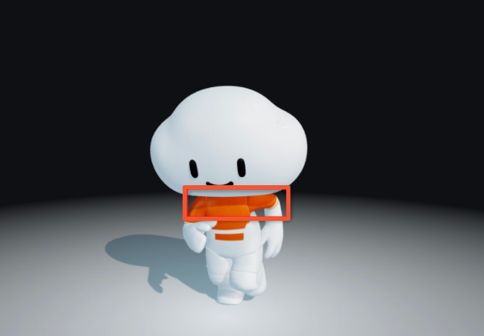
Opacity: Drag the slider to adjust the opacity of the model.
NoteThe function of setting opacity may affect the non-display of some effects in post-processing. If it is really necessary that some objects in the model are translucent, it is more recommend to adjust the materials in advance in the modeling software.
Change configuration
Position: Drag the slider to adjust the position of the model in the x-axis, Y, and Z directions. The value range is -1000 to 1000.
Rotate: You can drag the slider to adjust the selected angle of the model in the x-axis, Y, and Z directions. The value range is 0 to 100.
Scale: Drag the sliders to adjust the scale of the model along the x-axis, Y, and Z axes. Valid values: 0 to 100.
Animation
Metric
description
Model Animation
Turn on the switch to enable the effect of playing model animation. Component animation supports the animation of the loaded model itself (both morph animation and skeletal animation are supported).
For a single animation model, you can turn on the Animation Model switch to enable the animation.
Multi-animation model: If a model has multiple animation effects, the first animation in the model list is played by default after you turn on Animation Model. If you want to select other animation content, you can click Use Camera Position and Animation Settings to specify the required animation content.
NoteTo configure animation details, click Camera Position and Animation Settings to enter the Immersive Editor view animation mode.
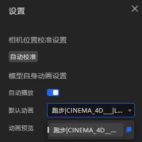
Specifically, the steps to configure animation details in the immersive editor mode are as follows:
Click Camera Position and Animation Settings in the upper-right corner of the model widget in Canvas Editor. The Settings dialog box appears.
Within the dialog box, you can click Auto Calibration to center the model.
Turn on the Auto Play switch to enable the auto play effect. You can also customize the preview or stop the animation playback effect of the multi-animation model.
In the Model Preview panel on the left side of the dialog box, you can drag the model to adjust the camera angle of the model and select an optimal angle to display the model.
Click the drop-down list next to Default Animation to view all animations in the model playlist. Select an animation that you want to play to specify the default animation for the model.
Click the
 icon and the
  icon to enable or disable the animation preview feature.
 When you have finished specifying animation selections, you can click the Exit and Save Settings icon at the bottom or the
 icon in the upper-right corner to exit the Animation Settings dialog box.
Sweep animation
Click the icon on the
 left and turn on the switch to configure the model to superimpose additional light-sweeping animation effects. Various light-sweeping configuration items can be customized to present cool effects.
 Front Type: You can select Plane or Surface.
Scan Axial: Select an axial direction for scanning the light-sweeping animation. Valid values: x-axis, Y, and Z.
Positive or Negative Direction: Select the direction of the light-sweeping animation. You can select Positive or Negative.
Color: the color of the sweep animation.
Sweep Length: Drag the slider to set the sweep length of the animation. Valid values: 0 to 100.
Sweep Speed: Drag the slider to set the sweep speed of the animation. Valid values: 0 to 100.
Rotation around an axis
Click the
 icon on the left and turn on the switch to configure the rotation of the model around the axis.
 Rotation Axis: Select a rotation axis. You can select x-axis, Y, Z, or Custom Axis.
Direction: Select the direction of rotation. You can select counterclockwise or clockwise.
Rotation Speed: Drag the slider to set the rotation speed around the axis.
Environment and Lighting
Metric
description
Background information
The model viewer has different background requirements for different scenarios. The component provides three types of background displays.
None: You can select None in the Background configuration items or turn off the Background switch to disable the background style. The layer widget below the model viewer widget is displayed on the canvas.
Color: If you select this option, you can set the background of the model viewer to a solid color. You can customize the background color and translucency.
Environment Map: If you select this option, the map content of the environment is displayed.
Environment Map
Click the
icon on the left and turn on the switch to configure the effect of the background environment map style of the model. The environment map is based on the lighting of the image. Currently, only the HDR format is supported. Environment Map: You can customize the URL of the input map or customize the design asset content of the map type in the image box below. DataV provides ten types of map styles.
Direction: Drag the slider to adjust the direction of the texture map. The value range is 0 to 360. Unit: degree.
Intensity: Drag the slider to adjust the intensity of the environment map. The value range is from 0 to 5.
Ambient light
The effect of ambient light is to uniformly illuminate all objects without creating shadows. Click the
 or
or  icon on the right to add or remove an ambient light series. Click the
  or
or  icon to configure the arrangement style of multiple ambient light series. Click the
  icon to copy the currently selected ambient light series configuration content and add an ambient light series style with the same configuration.
 Color: the color of the ambient light in the series.
Intensity: the intensity of the ambient light. Valid values: 0 to 10.
ImportantIf the model material metalness is 1, the model display is completely black when the light source of the entire component is only ambient light.
parallel light
The directional light is the only light source that you can set up to produce shadows, and the direction the directional light faces (the target point) is the origin of the model by default. Click the
or icon on the right to add or remove a directional light series. Click the or icon to configure the arrangement style of multiple directional light series. Click the icon to copy the current selected parallel light series configuration and add a parallel light series with the same configuration. Color: the color of the parallel light in the series.
Intensity: the intensity of the parallel beam. Valid values: 0 to 10.
Position: the position of the parallel beam in the X, Y, and Z directions.
Projection plane
Click the
icon on the left and turn on the switch to set the effect of the projection plane, which can be used to display the plane of the model shadow. Shadows display only when the Directional Light configuration items is turned on and configured, and the configuration items Model> Rendering Effects> Shadow Settings> Emit Shadows is turned on and the projection plane configuration items is in effect. Plane Color: Specify the plane color of the projection plane.
Shadow Color: The shadow color of the projection plane.
Edge Fade: Drag the slider to fade out the shadow. Valid values: 0 to 10.
Height: Drag the slider to set the height of the shadow. Valid values: -5 to 5.
Size: Drag the slider to set the size of the shadow. Valid values: 1 to 10.
Opacity: specifies the opacity of the projection plane.
Post- processing: Post-processing is a kind of full-screen effects, combined with digital image processing technology to render the screen output before reprocessing, similar to the effect of filter, to improve the visual effect.
Metric
description
Anti-aliasing Type
By default, the anti-aliasing type of the model viewer is the FXAA method. You can also select the SSAA method. However, the cost of the SSAA method is much higher than that of the FXAA method, and the computer performance is not particularly excellent. We recommend that you do not select the method.
Sharpen vignetting
Sharpening vignetting is a post-effect configuration items that combines sharpening of the picture with dizziness of the mirror. Appropriate dizziness of the mirror and sharpening particles will make the picture present a cinematic texture. Click the icon to the left of
Sharpen Vignette to turn on configuration items. 
Sharpness: Drag the slider to adjust the sharpness value. The larger the value, the sharper the image.
Vignette Radius: Drag the slider to adjust the value of the vignette radius. The larger the value, the larger the vignette radius and the smaller the vignette.
Vignette Softness: Drag the slider to adjust the value of the vignette softness. The larger the value, the more obvious the vignette transition effect.
Granularity: Drag the slider to adjust the granularity. A larger value indicates more graininess.
SSR
SSR, or screen space reflection, is a reflection formed by simulating the interaction between light and scene objects, which can produce subtle effects. The smoother the plane, the clearer the effect. Click the icon to the left of the
SSR to turn on the configuration items switch. 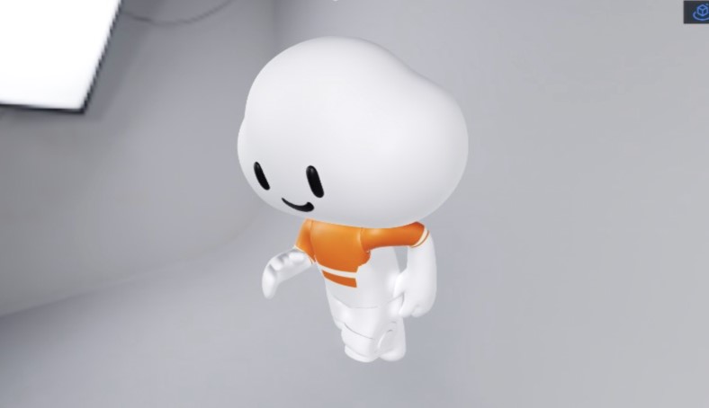
Reflection Range: Drag the slider to adjust the value of the reflection range. The larger the value, the larger the range and the lower the reflection quality.
Light Stepping Times: Drag the slider to adjust the number of reflected light stepping times. A larger value indicates higher reflection quality and higher computing overhead.
Light step size: Drag the slider to adjust the reflected light step size. The larger the value, the wider the scene the light can reach.
Reflective Surface Glossiness: Drag the slider to adjust the gloss of the reflective surface. A larger value indicates a smoother surface and a clearer reflection image.
Blur Degree: Drag the slider to adjust the blur degree of reflection. The larger the value, the more blurred the image.
AO Shadow
AO shadow is the screen ambient light shielding effect, through the information of each pixel and its adjacent pixels, the mutual shielding relationship is calculated, and the light and dark effect of the shadow at the edge contour and the gap is enhanced, so as to achieve the effect of enhancing the three-dimensional sense of the picture. Click the icon to the left of the
AO shadow to turn on the configuration items switch. 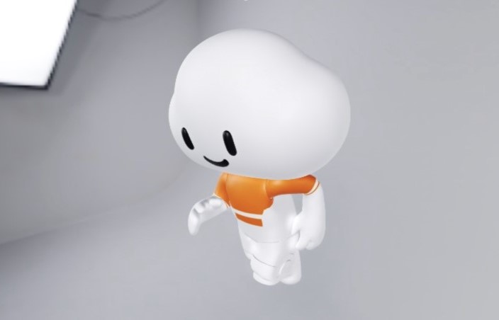
Offset: Drag the slider to adjust the AO shadow offset. The larger the value, the larger the shadow offset.
AO Intensity: Drag the slider to adjust the AO Intensity value to exponentially adjust the contrast.
Sharpness: Drag the slider to adjust the sharpness. The larger the value, the sharper the value.
AO Radius: Drag the slider to adjust the value of the AO Radius. The larger the value, the larger the range.
Blur Strength: Drag the slider to adjust the blur strength of AO shadows. A larger value indicates smoother shadows and higher overhead.
Lens blurring
Set the lens blurring to generate the blurring effect. Click the icon to the left of the
lens blurring to open the configuration items. 
Blur Degree: Drag the slider to adjust the blur degree of the shot. The larger the value, the more blurred the image.
Aperture Size: Drag the slider to adjust the value of the blurring aperture. The smaller the value, the clearer the image.
Focal Length: Drag the slider to adjust the focal length of the lens. The larger the value, the more blurred the image.
Focus Size: Drag the slider to adjust the focus size of the lens. The larger the value, the more blurred the image.
Glow
Setting the glow can enhance the light and dark contrast of the picture, and the higher the brightness of the picture, the outer light effect will be generated. Click the icon to the left of the
glow to open the configuration items. 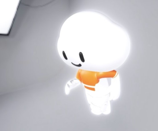
Mask: If you turn on the switch, you can set the outer glow effect when the mask exceeds the model range.
Intensity: Drag the slider to adjust the intensity of the glow. The larger the intensity, the more outward the glow.
Brightness: Drag the slider to adjust the brightness of the glow. The larger the value, the brighter the glow.
Brightness Threshold: Drag the slider to adjust the glow brightness threshold. The larger the value, the less obvious the glow effect.
Smoothing Width: Drag the slider to adjust the width of the glow smoothing. The larger the width, the smoother the glow.
Spot Radius: Drag the slider to adjust the spot radius. The larger the value, the more obvious the spot effect.
Motion Blur
Sets motion blur to an object blur drag effect that can be used to simulate fast motion. Click the icon to the left of the
motion blur to open the configuration items. 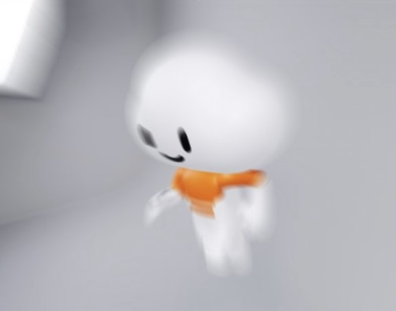
Blur Degree: Drag the slider to adjust the motion blur degree. The larger the value, the more blurred the motion blur degree.
Motion Rate: Drag the slider to adjust the motion rate. The larger the value, the more blurred the value.
Color correction
Set the color correction style to adjust the hue, saturation, brightness, and contrast of the final output image.
Tint: Drag the slider to adjust the tint value. The larger the value, the warmer the tint.
Saturation: Drag the slider to adjust the saturation value. A smaller value indicates a higher saturation.
Brightness: Drag the slider to adjust the brightness value. The larger the value, the brighter the screen.
Contrast: Drag the slider to adjust the value of Contrast. The larger the value, the higher the image contrast.
Data Sources panel 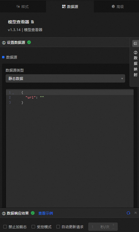
url: The URL link of the model.
Configure data items | Description |
Data sources | You can use the code editor or visual editor to view the data fields contained in the widget. You can also modify the data type to flexibly configure the component data. |
Data Mapping | If you need to customize chart field configurations, you can set different field mapping content in the Data Mapping module and field mapping these content to the corresponding fields of the widget. This allows you to match data without modifying the fields in the data source. You can also click the |
Configure a filter | Turn on Filter, select an existing data filter or create a data filter, and configure a data filter script to filter data. For more information, see Manage data filters. |
Data Response Result | The Data Response Result section displays widget data in real time. If the data source of the widget changes, this section displays the latest data. If the system response is delayed, you can click the |
Forbid Loading | If you select the check box, you will not see the loaded content during component initialization when you update the component and preview the data kanban. If you select the check box, the opposite is true. By default, the status is deselected. |
Controlled Mode | If you select the check box, the component does not request data in the initialized state, and only requests data by using global variables or the method configured in Blueprint Editor. If you clear the check box, you can use automatic update to request data. By default, the status is deselected. |
Auto Data Request | Select the check box to manually enter the time frequency of polling to set dynamic polling. If you clear the page, the page is not automatically updated. You need to manually refresh the page or use Blueprint Editor and global variable events to trigger a request to update data. |
 icon to configure the field style.
  icon on the right to view the data response result. You can also click the
  icon on the right to obtain the latest data of the widget. You can also click View Example to view an example of the response result of the current component.
 Advanced Panel
This widget does not support interaction events.
Blueprint Interaction
Click the
 icon in the upper-left corner to go to the Blueprint page.
 On the Layer Nodes tab, add the widget to the main canvas.
View blueprint configuration parameters.
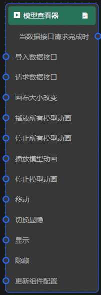
Event
Event
Description
When the data interface request is completed
The event is triggered with the processed JSON data after a data interface request is responded and processed by a filter. For more information about specific data examples, see the Data Response Result section of the Data Source tab in the right-side configuration panel of the canvas editor.
Action
Action
Description
Request Data Interface
This action is performed to request the server data again. The data sent by an upstream data processing node or layer node is used as a parameter. For example, if the API data source is
https://api.testand the data passed to the request data interface is{ id: '1'}, the final request interface ishttps://api.test?id=1.Import data
After data of a widget is processed in accordance with its drawing format, the widget is imported for redrawing. You do not need to request server data again. For more information about specific data examples, see the Data Response Result section of the Data Source tab in the right-side configuration panel of the canvas editor.
Canvas Size Change
The size of the canvas changes. The input data of the action is of the number type.
Animation playback
The animation is played. The input data of the motion is of the object and string types.
Animation Stop
The animation stops. The input data of the motion is of the object and string types.
Move
Move a widget to a specified location. For more information, see the data example.
    {
      // The positioning type. to indicates absolute positioning, whereas by indicates relative positioning. The default value is to.
        "positionType": "to",
      // The location, which is indicated by the x and y coordinates.
      "attr": {
        "x": 0,
        "y": 0
      },
      // The animation type.
      "animation": {
        "enable": false,
        // The duration in which animation is displayed.
        "animationDuration": 1000,
        // The animation curve, which can be set to linear|easeInOutQuad|easeInOutExpo.
        "animationEasing": "linear"
      }
    }
Toggle Show /Show
Specifies whether to show or hide a widget. No parameters are required.
Display
Display the widget. For more information, see Data example.
{
  "animationType": "",// The animation method. Valid value: fade. If you do not specify this parameter, no animation is generated.
  "animationDuration": 1000,// The animation delay. Unit: ms.
  "animationEasing": ""// animation curve
}
Hide
Hide the component. For more information, see Data example.
{
  "animationType": "",// The animation method. Valid value: fade. If you do not specify this parameter, no animation is generated.
  "animationDuration": 1000,// The animation delay. Unit: ms.
  "animationEasing": ""// animation curve
}
Update component configurations
Style configurations of widgets are dynamically updated. In the Style panel, click Copy Configuration to Clipboard to obtain the configuration data of the widget. After that, change the style field for the data processing node in Blueprint Editor.