a map container is a container used by the 3d flat map (v3.x) component to host the map itself and its sub-components. it allows you to add sub-components such as label layer, single-point bar layer, and animated bubbles layer layer. it also allows you to configure the general, natural, terrain, and decoration styles of the map. it can render the 3d effect of a flat map from multiple angles and in multiple forms. This topic describes the configuration items of a 3D flat map container.
Map mode
The 3D flat map includes two map modes: the China map and the world map. The component configurations and sub-component configurations are identical. The following chapters describe the meaning of each configuration items in the China map mode. 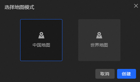
Quick Style
The 3D flat map widget provides the Quick Style feature. You can select a style based on your business requirements. Valid values: Extreme Night Black, Blue, Turquoise Blue, Purple Charm, and Black Gold. 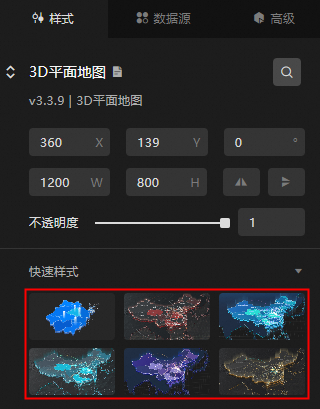
Lens Settings
Click the button in the upper-right corner of the
 3D Flat Map widget on the canvas or double-click the widget to go to the Lens Settings page.
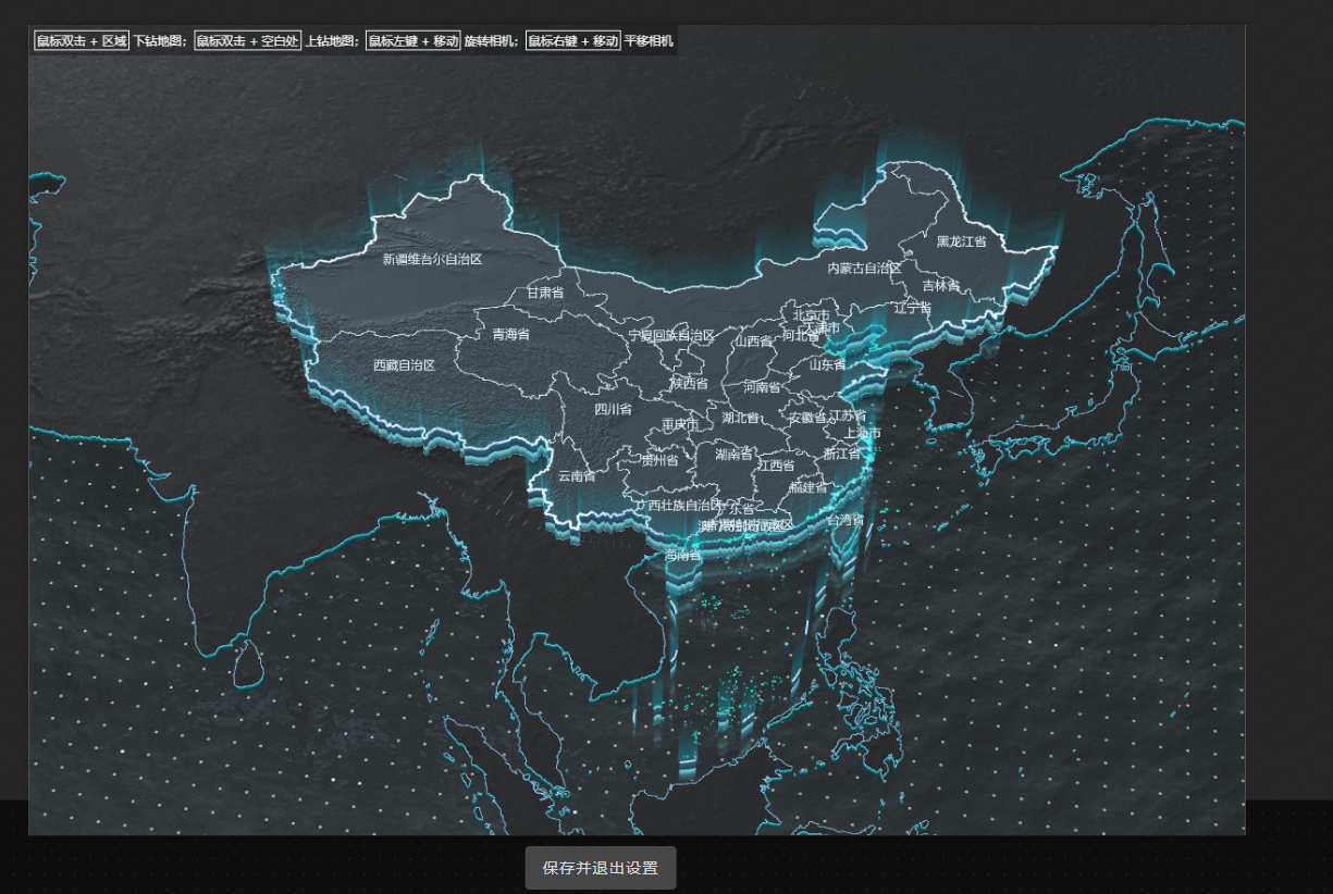
In the lens setting interface, you can freely change the lens angle of view of the map. After the change is completed, you need to save the set lens angle of view of the map.
There are several ways to change the angle of view of the map lens through the mouse:
Double-click a province or municipality area or a prefecture-level area in the map to drill down and zoom in on the area to the middle of the map.
Double-click the blank area of the map to drill up one level and locate and zoom in the viewing angle of the area after drilling up to the middle of the map.
Click and hold the right mouse button to pan the map by dragging.
Scroll the mouse wheel up and down to scale the size of the map.
Click and hold the left mouse button to rotate the map.
After you set the map lens, click Save and Exit Settings to save the map lens and close the lens settings page.
NoteAfter exiting the lens setting interface, you can still re-enter to modify the map lens style. Every time you enter the lens setting page, if there is any change in the lens angle, you need to save it again.
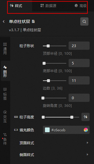
Manage sub-components
Add a component
On the canvas, click the 3D Flat Map widget to go to the Configuration tab on the right.
Click the
 icon on the left side of the panel to show Sub-component Panel and Sub-component Management Panel.
 Click Add. After the component is added, the component is displayed in the Component Management list.
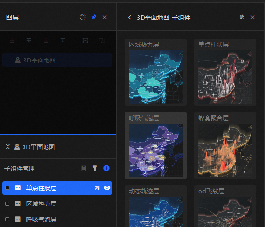
Click the added component and configure the component parameters.
After the configuration is complete, click the
 icon to return to the 3D flat map configuration panel and configure other components.
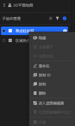
To copy, delete, or rename a component, right-click the component and select Copy or Delete. Double-click the subcomponent to rename it.
 Note
NoteFor more information about how to manage map components, see Manage map components.
Style Panel 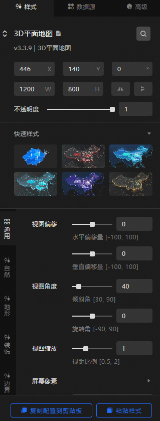
Search Configuration: Click the Search configuration items icon
 in the upper-right corner of the Style panel. In the Search Configuration panel, enter the name of the configuration items that you want to search for and locate the configuration items. Fuzzy match is supported. For more information, see Search configuration items.
 Size: the width and height of the widget. Unit: pixels.
Positioning: the x-axis and y-axis of the component. Unit: pixels. X-coordinate indicates the pixel distance between the upper-left corner of the widget and the left border of the canvas. Y-coordinate indicates the pixel distance between the upper-left corner of the widget and the upper border of the canvas.
Rotate: The widget is rotated around the center of the widget. Unit: degrees.
Directly enter the degrees in the Rotation Angle spin box or click the plus sign (+) or minus sign (-) to increase or decrease the value in the Rotation Angle spin box.
Click the
 icon to flip the widget style.
 Click the
 icon to flip the widget style.
Opacity: Valid values: 0 to 1. If this parameter is set to 0, the widget is hidden. If this parameter is set to 1, the widget is completely displayed. Default value: 1.
General: the general configuration of the map container.
Metric
description
View Offset
Map View Offset Style, which configures the offset values of the map in the visual horizontal and vertical directions. Valid values: -100 to 100.
View Angle
The tilt angle and rotation angle values of the map.
View Zoom
The ratio of the distance between the map and the line of sight of the map. Valid values: 0.5 to 2.
Screen pixels
Map screen pixel settings. Disable adaptive in high-performance scenarios and appropriately reduce the screen pixel ratio to reduce GPU usage.
Background Color
The background color of the map. For more information, see color picker instructions.
Scene interaction
The map scene interaction feature, including the optional interactive configurations of scene dragging, zooming, and rotating, can achieve interactive effects on the preview or publish page.
Nature: the nature effect configuration of the map.
Lighting: the lighting effect of the map.
Metric
description
Ambient light
The color and light intensity of the ambient light. Valid values: 0 to 100.
parallel light
Set the angle, illumination color, and illumination intensity of the parallel light along the x-axis, y-axis, and z-axis. Valid values: 0 to 100.
Water: the water effect style in the map. You can click the
 icon to display the water effect.
 Metric
Description
Water body color
The color of the water body on the map.
Normal Map
The normal map style of the water body. Only one style is available.
Light Color
The light color of the water body.
Light Direction
Drag the slider to set the light range of the water body in the x, y, and z directions.
flow velocity
Drag the slider to set the horizontal and vertical speed values of the water body. The value range is -100 to 100.
Wave size
Drag the slider to set the wave pattern size value of the water body. The value range is 1 to 100.
reflection distortion
Drag the slider to set the distortion degree of the water body reflection image. Valid values: 0 to 10.
Fogging Effect: the style of the fog effect on the map. You can click the
icon to display or hide the fog effect. Metric
description
Color
Sets the color of the map fog.
Distance
Drag the slider to set the atomization distance of the map. Valid values: 0 to 100.
Terrain: specifies the style of the terrain.
Subject Terrain: Set the style of the terrain in the area where all sub-component data is displayed. You can configure interactive operations in the subject terrain and click the
icon to control the display of the subject terrain. Terrain Height Ratio: Drag the slider to set the height range and height pull-down ratio of the terrain.
Metric
description
Valid value
The height scale of the terrain. Valid values: 0.01 to 1. Default value: 1.
Pull down ratio
The ratio of the small area to the height of the terrain. Valid values: 0.01 to 1.
Area Boundary
Metric
description
Stroke Style
The stroke style of the area border in the map, including setting the thickness and color of the stroke line. You can click the
icon to control the appearance or concealment of the stroke style. Flying Route Style
The flying line style within the area boundary in the map, including the type of the flying line, the blending mode of the flying line, the length of the flying line, the thickness of the flying line, the color of the flying line, and the speed of the flying line in the positive and negative control directions. You can click
the icon to control the display of the flying line style. Text Labeling
Text dimension style within the boundaries of the area in the map, including setting the font style of the text. The text weight style, font size, text color, text stroke weight, and stroke color. You can click
the icon to control the display of text labels. Top Surface Style: Set the top surface style parameters of the subject terrain, including the metal texture range value, roughness range value and material color of the top surface. You can also click the
icon to control the display and concealment of the top surface texture map, normal map, luminescence map style and mask mask style, and select the type, map intensity value and color of different maps. NoteWhen you configure the Texture Map, Normal Map, and Luminescent Map styles, you can use Single Texture Map or Raster Tile Address. The Raster Tile Address is an xyz Tile. The URL must contain the {x}{y}{z} placeholder. If you use a custom raster service, you must provide at least 12 layers of tiles.
Side Style: Set the side style parameters of the main terrain, including the ability to customize the effect of turning on or off the side reflection, the color of the side material, the style of the side texture map and the style of the glow map, the color of the glow map, the intensity value, and the value of the glow rate in the horizontal and vertical directions. Click the
icon to control the appearance and concealment of texture and glow maps. Glowing Fence: You can set the lighting fence style parameters of the subject terrain. You can enable or disable the lighting fence reflection effect, the height of the subject terrain, the height scale range, the color of the fence material, the style of the fence texture map, and the style of the lighting map. You can also set the lighting map color, intensity, and horizontal and vertical lighting rate. Click the
icon to control the display of the glow map.
Background Terrain: sets the style of the background terrain area except the main terrain. The background terrain setting does not respond to interaction events. You can click the
icon to control the display of the background terrain. Terrain Height Ratio: Drag the slider to set the height ratio of the background terrain to the host terrain.
Area Boundary: the stroke style of the area boundary in the background terrain, including the thickness and color of the stroke line. You can click the
icon to control the appearance or appearance of the stroke style. Top Surface Style: Set the top surface style parameters of the background terrain, including the metal texture range value, roughness range value, and material color of the top surface. You can also click the
icon to control the display and concealment of the top surface texture map, normal map, and luminescence map style, and select the type, intensity value, and color of different maps. NoteWhen you configure the Texture Map, Normal Map, and Luminescent Map styles, you can use Single Texture Map or Raster Tile Address. The Raster Tile Address is an xyz tile. The URL must contain the {x}{y}{z} placeholder. If you use a self-managed raster, you must provide at least 12 layers of tiles.
Side Style: Set the side style parameters of the background terrain, including the ability to customize the effect of turning on or off the side reflection, the color of the side material, the style of the side texture map and the style of the glow map, and the color and intensity of the glow map. Click the
icon to control the display of the glow map.
Decoration: Set the decoration style of the map.
Dynamic Decoration: Click the
icon to display or hide the dynamic decoration. Metric
description
Bottom height ratio
Drag the slider to adjust the scale value of the bottom height. The value range is 0.01 to 10.
Rotation speed
The rotation speed of the dynamic decoration. Valid values: -100 to 100. Unit: degree /frame.
respiratory rate
The respiration rate of the dynamic decoration. Valid values: 0 to 100.
Scaling
The scaling ratio of dynamic decorations. Valid values: 0 to 2.
Material Color
Sets the color of the dynamic decorative material.
Texture mapping
Sets the texture map style for the dynamic decorative material. Four types of maps are available.
Roughness
Drag the slider to adjust the roughness range of the dynamic decoration. Valid values: 0 to 100.
Metallic texture
Drag the slider to adjust the metallic texture range of the dynamic decoration. Valid values: 0 to 100.
Glow effect
Sets the color, optional four types of map styles, and map intensity values for the glow effect of the Dynamic Decoration material. Click the
icon to control the display of the glow map. Background Grid: Click the
icon to display the background grid. Metric
description
Bottom height ratio
Drag the slider to adjust the bottom height scale value. The default value is 0, and the value range is 0.01 to 10.
Material Color
Sets the color of the background mesh material.
Texture mapping
Sets the texture map style for the background mesh material, with four types of maps available, and sets the values for tiling in the horizontal and vertical directions. Click the
icon to control the appearance and concealment of the texture map. Roughness
Drag the slider to adjust the roughness range of the background mesh. Valid values: 0 to 100.
Metallic texture
Drag the slider to adjust the metallic texture range of the background mesh. Valid values: 0 to 100.
Glow effect
Sets the color of the background mesh material's glow effect, the four types of map styles to choose from, the map intensity value, the value of the horizontal and vertical tiling, and the value of the glow rate in the horizontal and vertical directions. Click the
icon to control the display of the glow map.
Border: the border style of the map.
Border: Specify the border color and border thickness.
Coast: sets the border color and border thickness of the coastline.
Border: Specify the border color and border thickness.
Data Sources panel 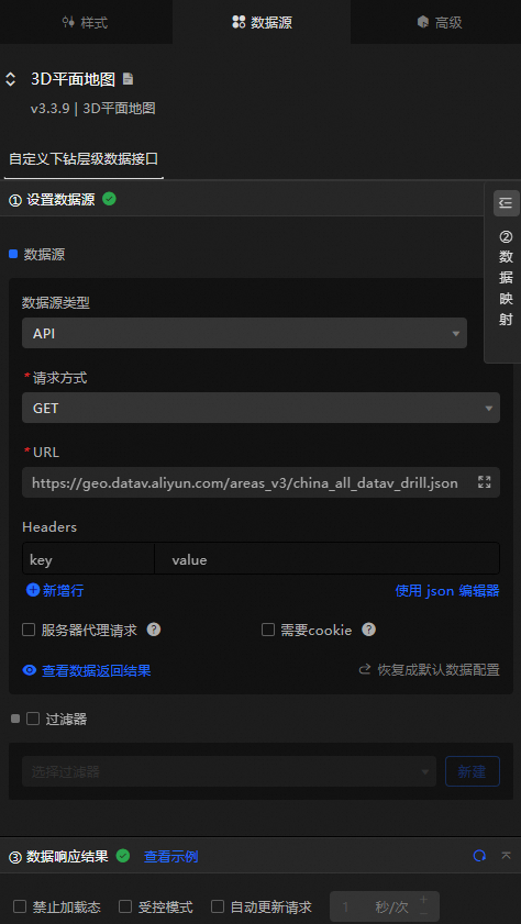
Configure data items | Description |
Data sources | You can use the code editor or visual editor to view the data fields contained in the widget. You can also modify the data type to flexibly configure the component data. |
Data Mapping | If you need to customize chart field configurations, you can set different field mapping content in the Data Mapping module and field mapping these content to the corresponding fields of the widget. This allows you to match data without modifying the fields in the data source. You can also click the |
Configure a filter | Turn on Filter, select an existing data filter or create a data filter, and configure a data filter script to filter data. For more information, see Manage data filters. |
Data Response Result | The Data Response Result section displays widget data in real time. If the data source of the widget changes, this section displays the latest data. If the system response is delayed, you can click the |
Forbid Loading | If you select the check box, you will not see the loaded content during component initialization when you update the component and preview the data kanban. If you select the check box, the opposite is true. By default, the status is deselected. |
Controlled Mode | If you select the check box, the component does not request data in the initialized state, and only requests data by using global variables or the method configured in Blueprint Editor. If you clear the check box, you can use automatic update to request data. By default, the status is deselected. |
Auto Data Request | Select the check box to manually enter the time frequency of polling to set dynamic polling. If you clear the page, the page is not automatically updated. You need to manually refresh the page or use Blueprint Editor and global variable events to trigger a request to update data. |
 icon to configure the field style.
  icon on the right to view the data response result. You can also click the
  icon on the right to obtain the latest data of the widget. You can also click View Example to view an example of the response result of the current component.
 Advanced Panel 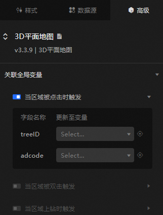
Event | Description |
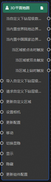
Triggered when an area is clicked | Turn on the switch to enable the widget interaction feature. When triggered when the area is clicked, it throws |
Triggers when a region is double-clicked | Turn on the switch to enable the widget interaction feature. When the area is double-clicked to trigger, the |
Triggered when area drill-up | Turn on the switch to enable the widget interaction feature. When a region drill fires, it throws |
Blueprint Interaction
Click the
 icon in the upper-left corner to go to the Blueprint page.
 On the Layer Nodes tab, add the widget to the main canvas.
View blueprint configuration parameters.
Event
Event
Description
When a custom drill-down data interface request is completed
The event is triggered with the processed JSON data after a data interface request is responded and processed by a filter. For more information about specific data examples, see the Data Response Result section of the Data Source tab in the right-side configuration panel of the canvas editor.
When the built-in world land boundary data interface request is completed
The event is triggered with the processed JSON data after a data interface request is responded and processed by a filter. For more information about specific data examples, see the Data Response Result section of the Data Source tab in the right-side configuration panel of the canvas editor.
When the built-in China State Border Data Interface request is completed
The event is triggered with the processed JSON data after a data interface request is responded and processed by a filter. For more information about specific data examples, see the Data Response Result section of the Data Source tab in the right-side configuration panel of the canvas editor.
Triggered when an area is clicked
The event that is raised when the area is clicked. For more information, see the data example.
{
  "treeID": 1,// The code of the hierarchical tree node.
  "adcode": ""// The region code.
}
Triggers when a region is double-clicked
The event that is raised when the area is double-clicked. For more information, see the data example.
{
  "treeID": 1,// The code of the hierarchical tree node.
  "adcode": ""// The region code.
}
Triggered when area drilling is triggered
The event that is raised when the region is drilled up. For more information, see the data example.
{
  "treeID": 1,// The code of the hierarchical tree node.
  "adcode": ""// The region code.
}
Action
Action
Description
Import custom drill-down level data
After data of a widget is processed in accordance with its drawing format, the widget is imported for redrawing. You do not need to request server data again. For more information about specific data examples, see the Data Response Result section of the Data Source tab in the right-side configuration panel of the canvas editor.
Request a custom drill-down data interface
This action is performed to request the server data again. The data sent by an upstream data processing node or layer node is used as a parameter. For example, if the API data source is
https://api.testand the data passed to the Request Custom Drill-down Interface action is{ id: '1'}, the final request interface ishttps://api.test?id=1.Update a custom region
Updates a custom area. The following three types of custom area fields are configured.
defaultArea: The region data is not changed, but only the current main terrain area is changed.
data: specifies the region data and displays the root node.
data and defaultArea : Set the area data and display the set body terrain area.
Reference data example.
{
  "data": {}, //TopoJSON object
  "defaultArea": "" // The code of the tree node in the default area. The treeID or adcode field in the data is used.
}
Set up the camera
Set the camera. For more information, see the data example.
{
  "target": { // The camera viewpoint position
    "x": 105,
    "y": 35,
    "z": -100307
  },
  "position": { // The camera viewpoint position
    "x": 105,
    "y": -70,
    "z": 17659888
  },
  "maxDistance": 100000000 // The maximum distance.
}
Update configurations
Updates the configuration. No parameters are required.
Move
Move a widget to a specified location. For more information, see the data example.
    {
      // The positioning type. to indicates absolute positioning, whereas by indicates relative positioning. The default value is to.
        "positionType": "to",
      // The location, which is indicated by the x and y coordinates.
      "attr": {
        "x": 0,
        "y": 0
      },
      // The animation type.
      "animation": {
        "enable": false,
        // The duration in which animation is displayed.
        "animationDuration": 1000,
        // The animation curve, which can be set to linear|easeInOutQuad|easeInOutExpo.
        "animationEasing": "linear"
      }
    }
Toggle Show /Show
Specifies whether to show or hide a widget. No parameters are required.
Display
Display the widget. For more information, see Data example.
{
  "animationType": "",// The animation method. Valid value: fade. If you do not specify this parameter, no animation is generated.
  "animationDuration": 1000,// The animation delay. Unit: ms.
  "animationEasing": ""// animation curve
}
Hide
Hide the component. For more information, see Data example.
{
  "animationType": "",// The animation method. Valid value: fade. If you do not specify this parameter, no animation is generated.
  "animationDuration": 1000,// The animation delay. Unit: ms.
  "animationEasing": ""// animation curve
}
Update component configurations
Style configurations of widgets are dynamically updated. In the Style panel, click Copy Configuration to Clipboard to obtain the configuration data of the widget. After that, change the style field for the data processing node in Blueprint Editor.