This topic describes the configuration items of drill-down layers in custom regions.
Chart style
A custom area drill-down layer is a subcomponent of the basic flat map 3.0. It can be directly used as a custom area drill-down layer at the provincial, municipal, or prefecture-level levels. Supports independent style, data, and interaction configurations, including annotations, edges, mouse interaction events, and location information for drill-down areas. 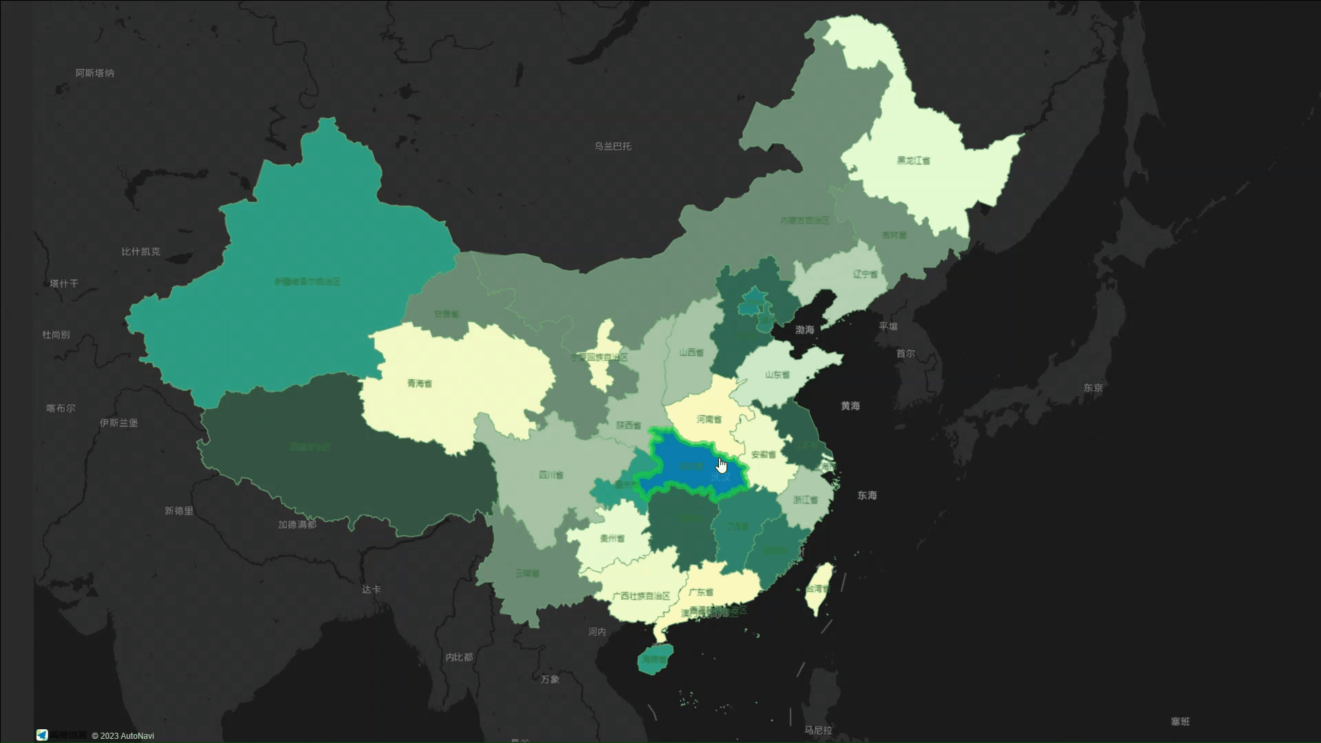
Style Panel 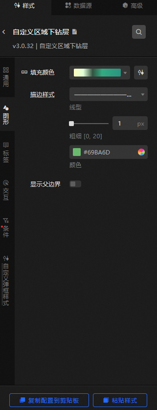
Search Configuration: Click the Search configuration items icon
 in the upper-right corner of the Style panel. In the Search Configuration panel, enter the name of the configuration items that you want to search for and locate the configuration items. Fuzzy match is supported. For more information, see Search configuration items.
 General: the common configuration parameters for drill-down layers in custom regions.
Metric
description
Visible Level
Set the visibility level of the drill-down layer in the custom area. The drill-down layer in the custom area is visible within the specified level range and invisible outside the level.
Opacity
The opacity of the drill-down layer in the custom area. Valid values: 0 to 100. Unit: %. The larger the value, the more opaque the custom area drill-down layer style.
Graphics: specifies the graphics style of the drill-down layer in the custom area. Area fill color and edge style parameters.
Metric
description
Fill Color
The color of the area corresponding to the maximum, minimum, and empty value values in the data. For more information about how to configure the color mapper for different regions, see Use the color mapper.
Stroke Style
You can customize the color, thickness, and line type of edges in each region of the drill-down layer.
NoteThe line type supports numeric input, such as 4,4. The first number indicates the length of the solid line, and the second number indicates the length of the interval.
Show Parent Boundary
Click the
 icon to display the parent boundary.
 Label: Set the label configuration items parameter for the drill-down area.
Display Label: the label style of the area. You can click the
icon to the left of Display Label to display or hide the label. Display Mode: the display mode of the area label. You can select Full Display, Click, or Hover.
Content Style: The content style parameter of the region tag is configuration items.
Metric
description
Style per line
Click the
 or
or  icon on the right side of Style per Line to add or delete a style for each line. Click the
  or
or  icon to configure the arrangement of multiple content styles per row. Click the
  icon to copy the currently selected content style configuration and add a new line of style content with the same configuration.
 Row Field: the name of the row field, which must match the field in the data panel.
Field Style: Specify the style of the line field, including the font style, font size, color, and weight of the field.
Field Prefix: specifies the content, interval, font, font size, color, and weight of the field. Click the
icon to the left of Field Prefix to control the display of Field Prefix. Field Suffix: specifies the content, interval, font, font size, color, and weight of the field suffix. Click the
icon to the left of Field Suffix to control the value of Field Suffix.
Field Width
The width of the field that is displayed in the area label. You can select Adaptive or Fixed Width to specify the width of the field. Unit: pixels.
Row height ratio
The row height ratio value of the area label. Valid values: 1 to 2.
Content Stroke
The content stroke style of the area label, including the color and weight of the stroke. You can click the
icon to the left of Content Stroke to control the appearance or concealment of the Content Stroke. Content Shadow
The content shadow style of the area label, including the shadow color, shadow blur value, and shadow offset value in the x and y directions. Click the
icon to the left of the content shadow to control the visibility of the content shadow. Background Style: Set the background style of an area tag. You can click the
icon to the left of the Background Style field to control the appearance or appearance of the Background Style field. Metric
description
Background Type
The type of the tag background. You can select Vector or Image.
Background Color
The background color of the tag. This parameter is available only when you set the Background Type parameter to Vector.
Border Style
Sets the style of the label border, including the line type, line width value, and color of the border. This parameter is available only when you set the Background Type parameter to Vector.
Border Fillet
Set the values of the rounded corners of the label border in four directions. Unit: px. This parameter is available only when you set the Background Type parameter to Vector.
Image Template
The template style of the background image. This parameter is available only when you set Image Template to Image.
Opacity
The opacity of the background image. Valid values: 0 to 100. This parameter is available only when you select Image for Image Template.
Content Margin
Set the distance between the content in the label and the top, bottom, left, and right.
Interaction: the interaction configuration items of the drill-down layer in the custom area.
graphical interaction
Metric
description
Double-click to focus
Click the icon on the left
to enable or disable the click-to-focus interaction function. If this feature is enabled, you can click the area to focus on a certain scale based on the area position. You can see the effect only when you preview or publish. Hover Style
Click the
icon on the left of Hover Style to enable or disable the hover interaction feature. If you turn on this switch, you can set the fill color, stroke color, and thickness of the area when you move the pointer over. You can see the effect only when you preview or publish.
Condition: the description of the condition style.
Conditional Style: Click the
or icon to add or remove a conditional style. Click the or icon to configure the arrangement style of multiple conditional styles. Click the icon to copy the selected conditional style configuration and add a conditional style. For more information about how to configure a conditional tree, see Usage notes. Fill Color: If you turn on the switch, you can configure the color of the block in the condition style. Click the
icon to the left of Fill Color to control the color of the area. Custom pop-up style: Set the custom pop-up style for the drill-down layer in the custom area.
Metric
description
Bomb switch
If you turn on the switch, you can click or hover to trigger the pop-up.
Display Mode
The display mode of the drill-down pop-up box in a custom area. Valid values: Click and Hover.
Relative Offset
The horizontal and vertical pixel offsets of the pop-up window. Valid values: -1000 to 1000. Unit: pixels.
Text Style
Set the text style in the dialog box, including the font style, font size, color, and weight of the text.
Display null values
If you turn on the switch, the pop-up box can be displayed as "No Data" on an object with no
infofield or an emptyinfofield.Box Style
Pin: the distance between the content of the pop-up text and the left and right sides.
Border Style: the rounded corners, line width, and color of the popup border.
Background Color: Set the background color of the dialog box.
Projection Style: specifies the blur color, blur radius, X offset, and Y offset of the pop-up projection.
Close Button: If you turn on the switch, the Close button and the color of the button are displayed in the dialog box of the drill-down layer.
Pointing Arrow: If you turn on the switch, a pointing arrow appears in the dialog box of the drill-down layer in the custom area.
Data Sources panel 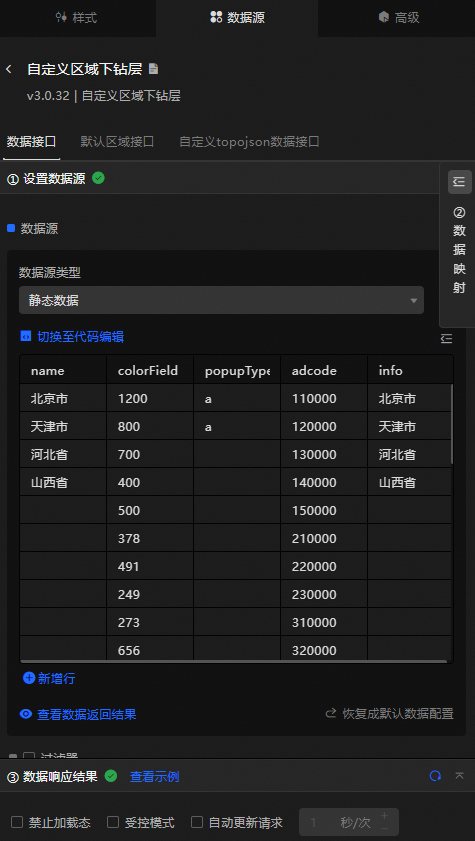
Data operations
You can configure the data interface to customize the style of the area drill-down layer. Custom area drill-down layers support data-first rendering.
On the Data tab of the Custom Layer component, click Data Interface.
Click Configure Data Source. In the Configure Data Source panel, set Data Source Type to Static Data. The following table describes the parameters.
Column
Description
adcodeThe adcode number of the region, which can be obtained by DataV.GeoAtlas.
treeIDThe number of the region.
name(Optional) The name of the region.
valueOptional. The value of the area. This parameter can be used together with the maximum, minimum, and no data configuration items values of the fill color in the configuration panel to control the color of the corresponding area.
NoteThe scale interval is obtained based on the value interval of the data to calculate the color gradient interval from the largest to the smallest.
colorField(Optional) The color mapping field for the region.
popupTypeOptional. The type of the pop-up window. The pop-up window must be used with the secondary development feature.
infoOptional. Customize the content of the pop-up window.
Default Region Port: You can configure the default region port to customize the default country port style of the drill-down layer.
adcode: the default country adcode number.
treeID: The default country number.
Custom topojson data interface: You can configure a custom topojson data interface to apply the extracted topojson data interface to DataV.
On the Data tab of the Custom Region Drill-down Layer component, click Custom topojson Data Interface.
Click Configure Data Source. In the Configure Data Source panel, set Data Source Type to API.
Paste the extracted JSON API into the data input area.
https://geo.datav.aliyun.com/areas_v3/china_all_datav_drill.jsonPublish the project. You can see the drill-down layer of the configured custom area.
Configure data items | Description |
Data sources | You can use the code editor or visual editor to view the data fields contained in the widget. You can also modify the data type to flexibly configure the component data. |
Data Mapping | If you need to customize chart field configurations, you can set different field mapping content in the Data Mapping module and field mapping these content to the corresponding fields of the widget. This allows you to match data without modifying the fields in the data source. You can also click the |
Configure a filter | Turn on Filter, select an existing data filter or create a data filter, and configure a data filter script to filter data. For more information, see Manage data filters. |
Data Response Result | The Data Response Result section displays widget data in real time. If the data source of the widget changes, this section displays the latest data. If the system response is delayed, you can click the |
Forbid Loading | If you select the check box, you will not see the loaded content during component initialization when you update the component and preview the data kanban. If you select the check box, the opposite is true. By default, the status is deselected. |
Controlled Mode | If you select the check box, the component does not request data in the initialized state, and only requests data by using global variables or the method configured in Blueprint Editor. If you clear the check box, you can use automatic update to request data. By default, the status is deselected. |
Auto Data Request | Select the check box to manually enter the time frequency of polling to set dynamic polling. If you clear the page, the page is not automatically updated. You need to manually refresh the page or use Blueprint Editor and global variable events to trigger a request to update data. |
 icon to configure the field style.
  icon on the right to view the data response result. You can also click the
  icon on the right to obtain the latest data of the widget. You can also click View Example to view an example of the response result of the current component.
 Advanced Panel 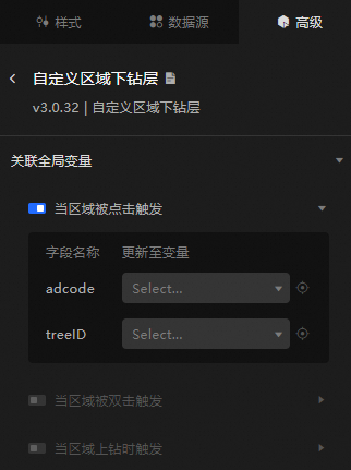
Turn on the switch to enable the widget interaction feature. You can trigger a data request and throw temporary variables when you click an area, double-click an area, or drill-up in an area. This implements dynamic loading of data in different areas when you click, double-click, or drill-up in an area. By default, the adcode and treeID values of the clicked area are displayed. For more information, see Component interaction configuration.
Blueprint Interaction
Click the
 icon in the upper-left corner to go to the Blueprint page.
 On the Layer Nodes tab, add the widget to the main canvas.
View blueprint configuration parameters.
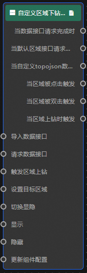
Event
Event
Description
When the data interface request is completed
The event is triggered with the processed JSON data after a data interface request is responded and processed by a filter. For more information about specific data examples, see the Data Response Result section of the Data Source tab in the right-side configuration panel of the canvas editor.
When the default zone interface request is completed
The event that is thrown after the default regional interface request is returned and processed by the filter. It also throws the processed JSON-formatted data. For more information about specific data examples, see the Data Response Result section of the Data Source tab in the right-side configuration panel of the canvas editor.
When a custom topojson API request is completed
The event that is thrown after the custom topojson data interface request is returned and processed by the filter, and the processed JSON data is also thrown. For more information about specific data examples, see the Data Response Result section of the Data Source tab in the right-side configuration panel of the canvas editor.
Triggered when a region is clicked
Thrown when you click a region of a drill-down layer in a custom region.
Triggers when a region is double-clicked
Thrown when a block of the drill-down layer in a custom area is triggered by double-clicking.
Triggers when an area is drilled up
Triggers an event and throws data when the region is drilled up.
Action
Action
Description
Import data
After data of a widget is processed in accordance with its drawing format, the widget is imported for redrawing. You do not need to request server data again. For more information about specific data examples, see the Data Response Result section of the Data Source tab in the right-side configuration panel of the canvas editor.
Request Data Interface
This action is performed to request the server data again. The data sent by an upstream data processing node or layer node is used as a parameter. For example, if the API data source is
https://api.testand the data passed to the request data interface is{ id: '1'}, the final request interface ishttps://api.test?id=1.Trigger Area Drill Up
The trigger area is drilled up. No parameters are required.
Set Target Region
The input data of the action is of the object type and contains
adcodeandtreeIDfields.Toggle Display
Specifies whether to show or hide a widget. No parameters are required.
Display
Display the widget. For more information, see Data example.
{
  "animationType": "",// The animation method. Valid value: fade. If you do not specify this parameter, no animation is generated.
  "animationDuration": 1000,// The animation delay. Unit: ms.
  "animationEasing": ""// animation curve
}
Hide
Hide the component. For more information, see Data example.
{
  "animationType": "",// The animation method. Valid value: fade. If you do not specify this parameter, no animation is generated.
  "animationDuration": 1000,// The animation delay. Unit: ms.
  "animationEasing": ""// animation curve
}
Update component configurations
Style configurations of widgets are dynamically updated. In the Style panel, click Copy Configuration to Clipboard to obtain the configuration data of the widget. After that, change the style field for the data processing node in Blueprint Editor.