By Amit Maity, Alibaba Cloud Tech Share Author. Tech Share is Alibaba Cloud's incentive program to encourage the sharing of technical knowledge and best practices within the cloud community.
Delivering analytic capabilities once reserved for professional analysts, Alibaba Cloud QuickBI allows you to perform data analytics, exploration, and reporting on mass data with drag-and-drop features and a rich variety of visuals. QuickBI enables users to perform data analytics, exploration, and reporting, and empowers enterprise users to view and explore data and make informed, data-driven decisions.
Some of the key features, which are very useful for quick data visualisation and data analysis,
In this guide, we will demonstrate some features of dashboards and OLAP modelling using US Census Bureau data set. Source data i.e. worldwide census data will be used to build a geo map chart in the dashboard.
This tutorial can easily be understood and followed if you are familiar with the below technologies and concepts,
Open international census database portal using below link,
https://www.census.gov/data-tools/demo/idb/informationGateway.php
Download "Mortality Indicators by Sex" report output after selecting the report parameters as shown below,
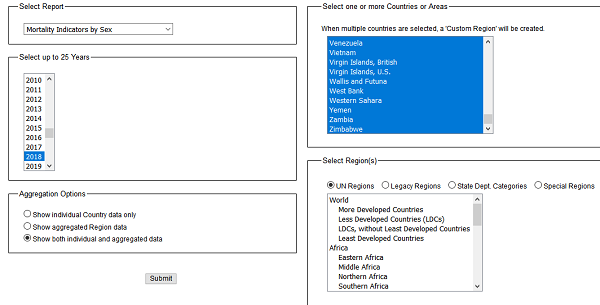
Submit the report to display the results. In results page, scroll down to the bottom and click on download all tables with CSV option to save the census data as source data in your local machine.

Log in and open QuickBI home page from cloud console product navigation menu. If you are opening first time, you will be asked to select appropriate QuickBI editions - Basic/Pro/Professional. Basic is free, Pro and Professional are chargeable versions. However, you will have option to subscribe Pro and Professional as trial version to explore the features of these premium editions.
Once the appropriate version is selected, you will have to select relevant zone before you start working in QuickBI workspace.
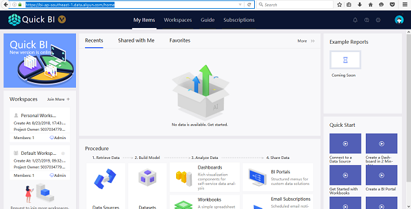
Before we proceed let's understand few BI components which are commonly used in QuickBI for developing the dashboard. Feel free to check QuickBI documentation if you want to have in depth understanding.
We'll create a data source with census data which is downloaded from https://www.census.gov
Navigate to Workspaces->Data Sources from home page. Create data source with Local CSV file option and upload the source data file which you have downloaded in previous step.


Once data source is created, create dataset with appropriate name in Workspaces->Datasets. By default datasets will be created in My Datasets folder. Create a separate folder of your own if you want to organize the dataset for better management.

After dataset creation, Use Edit link against the newly created dataset to preview the data uploaded from census data file. You may have to click 'Refresh Preview' option to display the data. Edit the dataset and apply various data transformation logic on data to prepare data for building chart. Preparing data at this stage, will make life easier in generating required dashboard chart. QuickBI automatically classify each fields in the dataset into dimensions and measurements. However, you can change the dimension or measurements of the fields while editing the dataset. Also, add additional field with the exiting data using calculated field option.
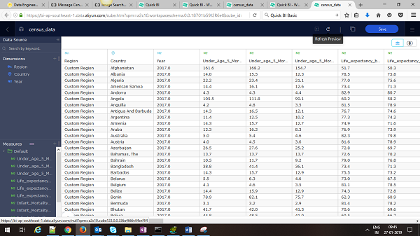
By default, value in Year column of the census data set may display as numeric value with decimal. To remove the decimal value, we can add new calculated field and calculate year value using expression.
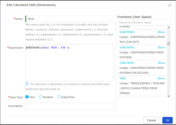
Use the + link in dimension section or settings icon in column headers section to open the add calculated field form.
Enter the name of the new column and complete the expression field using substr function to extract the first 4 characters from the Year value. Please use [] syntax to refer the relevant fields in the dataset.
For this tutorial, let's first build geo map. Geo map helps analysing geo spatial data though the use of interactive visualisation. To build geo map, we need to have a dimension field that contain geographical information. In our data set, country field is best suitable for this. However, country field is imported as string data type in dataset. So, switch country field type from String to Geographical Information.
In the dimension list, select Country and right-click on the dimension, and select Change Dimension > Location > Country. As shown in the following figure.
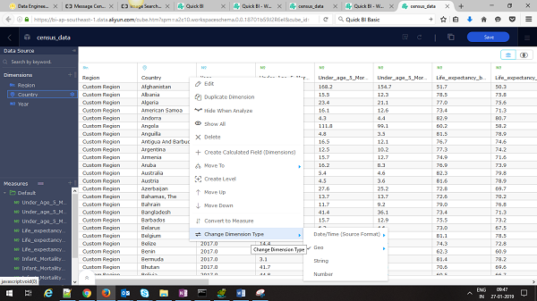
After this change, click Save and select Synchronize > Refresh Preview. Country field icon will change to the location icon from Str.
After dataset is edited, we can create BI reports in the dashboard. Click Dashboards in the left-side navigation pane. This will open dashboard management page. Select Create > Dashboards > Standard to open dashboard editing page.
There are 2 display modes – standard and full screen in QuickBI. However, full screen mode is only available for QuickBI professional edition users.
In dashboard management page, delete the default the Line Chart zone and add Geo chart by selecting Geo Map option from the top menu bar.
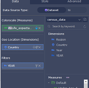
Data tab, ensure that following properties are selected,
Click update button to refresh the view and display the results in the dashboard
Style tab, no change required in basic settings. However, for better presentation, choose meaningful title and description for the chart.
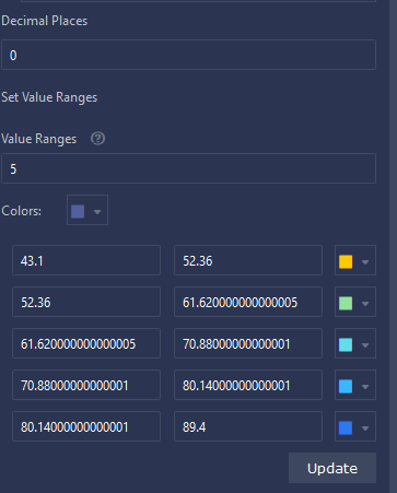
Few more settings should be updated in Series section,
Use Update button to apply the settings to the report.
Now, let's see how to add Text box widget and company log as image to the dashboard.
Text Box
Add text box by clicking Text box icon from top menu bar. After clicking the Text widget, text area will be inserted below the existing chart in dashboard. Add appropriate content in this text box and save the data.
Logo
You can use the Image function to insert a picture as required.
Click the Image icon in the top menu bar. Enter the picture url once image block is added to dashboard. Use Image Display option to select the appropriate image style.
Drag the image widget to top section of the dashboard and extend the border of the widget to make it same size as the Geo chart block.
Design Line Chart
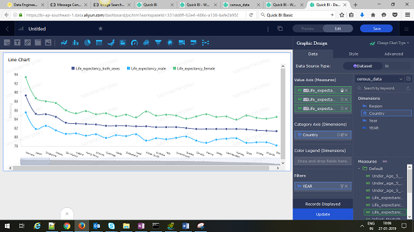
Now, let's add another chart type i.e. Line chart in the dashboard. Usually, line chart is used for visualising trends and presenting measures in a particular order. Here, we'll show few top countries with higher life expectancy. Also, we can display multiple measures in the same chart for comparison analysis.
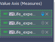
Here are the configurations to design the line chart,
Measures (Value Axis):
Dimensions (Category Axis):
By default, measures will not be sorted. So, click down arrow next to the measures for sorting in descending order. Do not forget to click update button to refresh the chart results after settings change.
Here is the final view of the line chart dashboard,
QuickBI offers few unique components, which are not available in other cloud based Business Intelligence tools. For example, Index Kanban, used for displaying the various metrics in Kanban chart format. Word Cloud option displays the frequency of words clearly. It is suitable for creating user preferences and user tags. Flow analysis chart demonstrates the conversion rate of a webpage by comparing its page views (PVs) and the number of its unique visitors (UVs).
Automated Web App Deployment from GitHub Push Using Alibaba Cloud EDAS

2,593 posts | 793 followers
FollowAlibaba Clouder - August 19, 2019
GarvinLi - December 14, 2018
Alibaba Clouder - June 17, 2020
Alibaba Clouder - July 17, 2020
Alibaba Cloud MaxCompute - September 18, 2018
Alibaba Clouder - July 15, 2020

2,593 posts | 793 followers
Follow Quick BI
A new generation of business Intelligence services on the cloud
Learn More DataV
DataV
A powerful and accessible data visualization tool
Learn MoreMore Posts by Alibaba Clouder