本文將介紹在 Quick BI 中開發一個基於 echarts 的圓角環形圖自訂群組件。
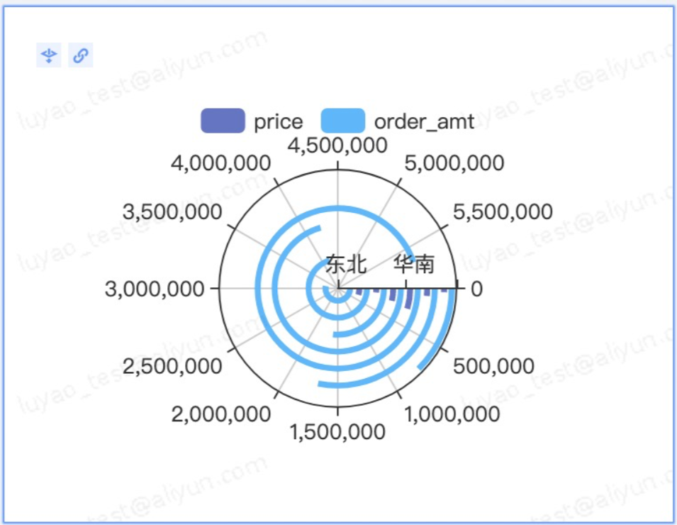
效果樣本圖
 詳細代碼請參見完整程式碼範例。
步驟一:建立專案
建立一個自訂群組件專案,建立完成後安裝依賴初始化。
請參見快速開始。
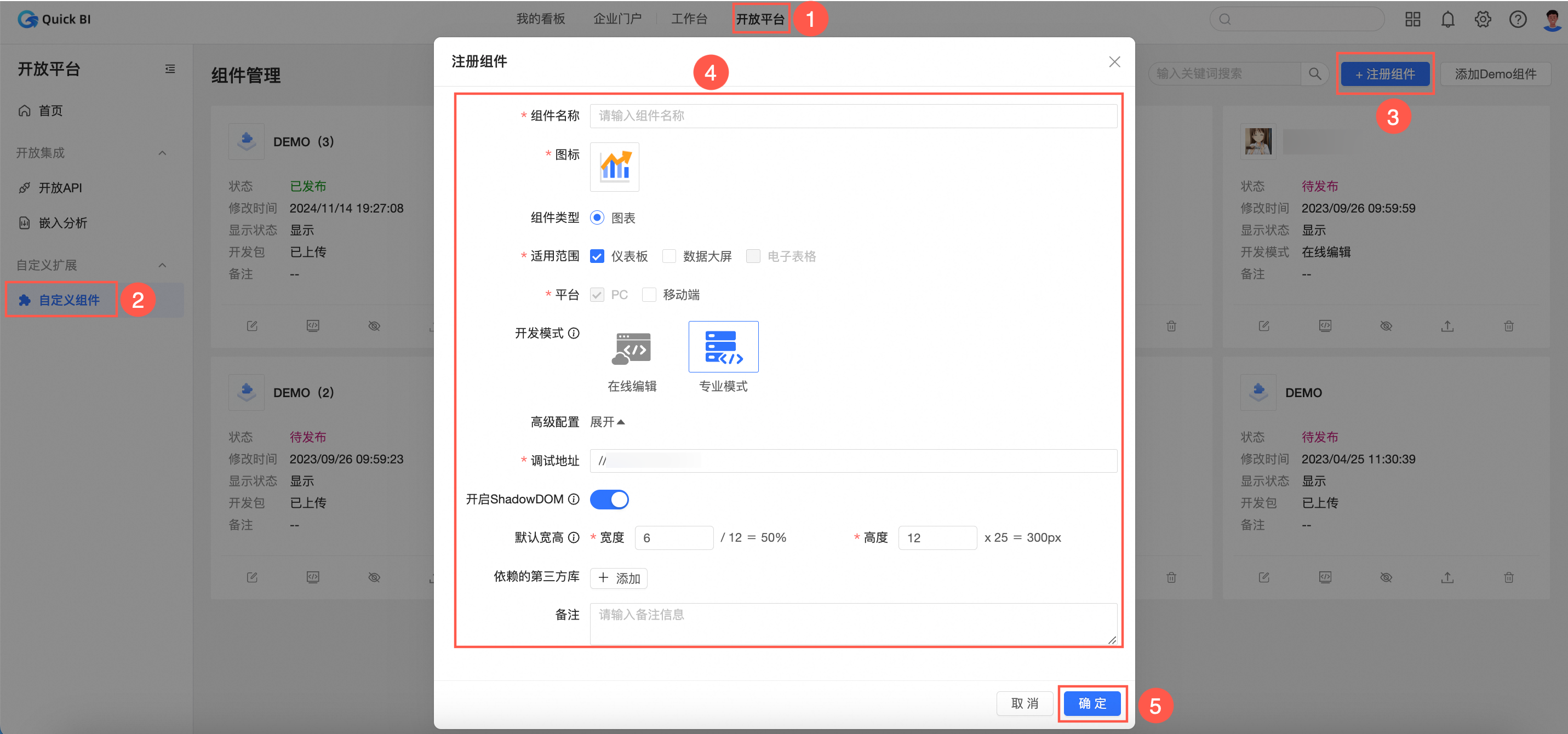
npm init qbi-app myEcharts cd myEcharts yarn在Quick BI控制台,按照下圖指引,註冊組件。
 說明
說明開發模式請選擇專業模式。
線上編輯的教程請參見教程:線上編輯模式下快速插入 echarts 代碼。
安裝echarts。
執行以下命令,安裝echarts類型定義。
yarn add -D @types/echarts選擇以下任意一種方式,安裝echarts。
第三方CDN引入:該方式可以提升載入效能。
操作方法:在編輯自訂群組件中的依賴的第三方庫中填入
echartsCDN地址。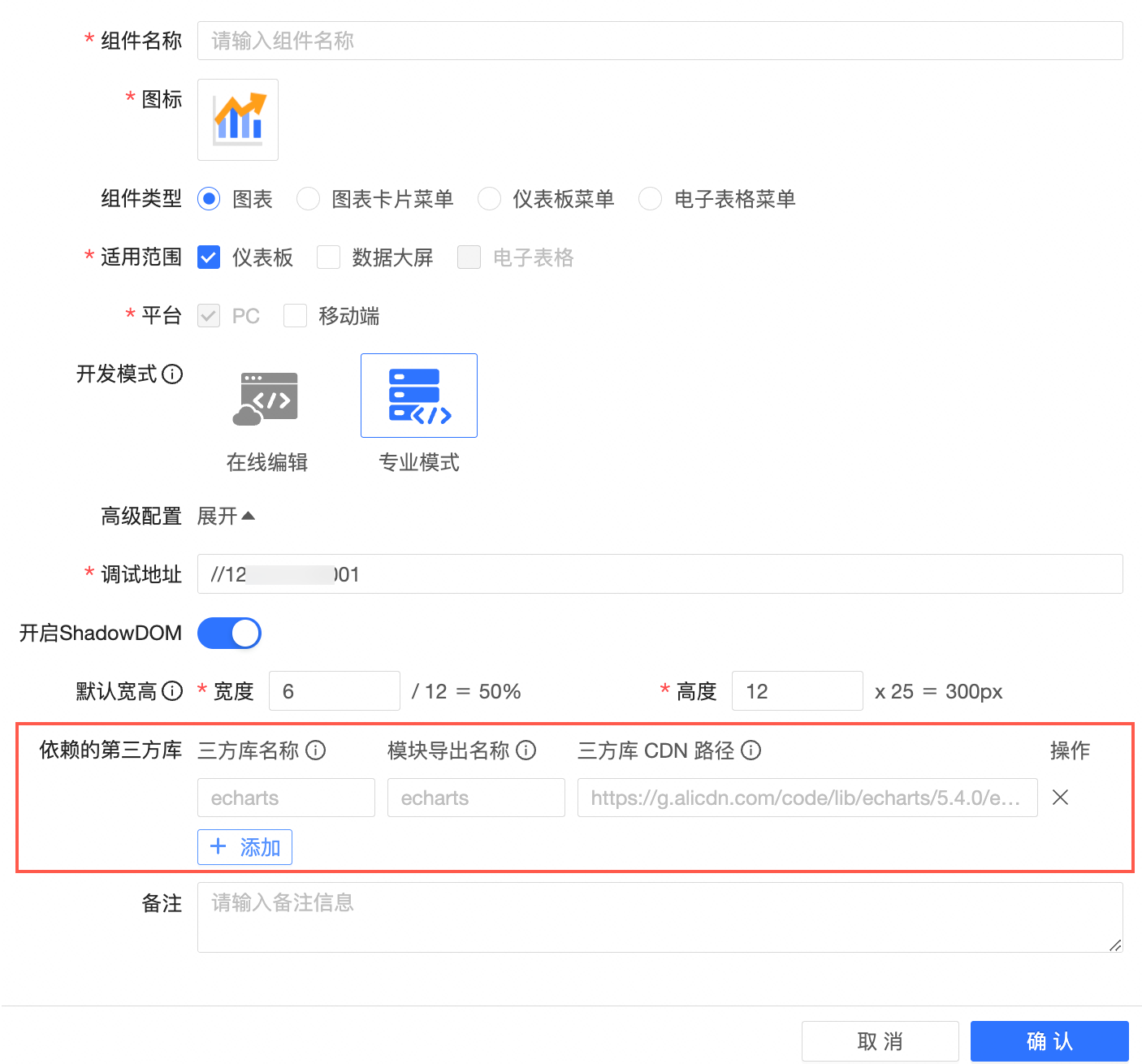
設定專案根目錄下的
webpack.config.js, 增加一項externals配置。// webpack.config.js externals: { lodash: '_', react: 'React', 'react-dom': 'ReactDOM', moment: 'moment', echarts: 'echarts', // 新增一項 },npm安裝:通過
npm或者yarn安裝。yarn add echarts
在組件管理列表中,找到目標組件並單擊調試表徵圖。
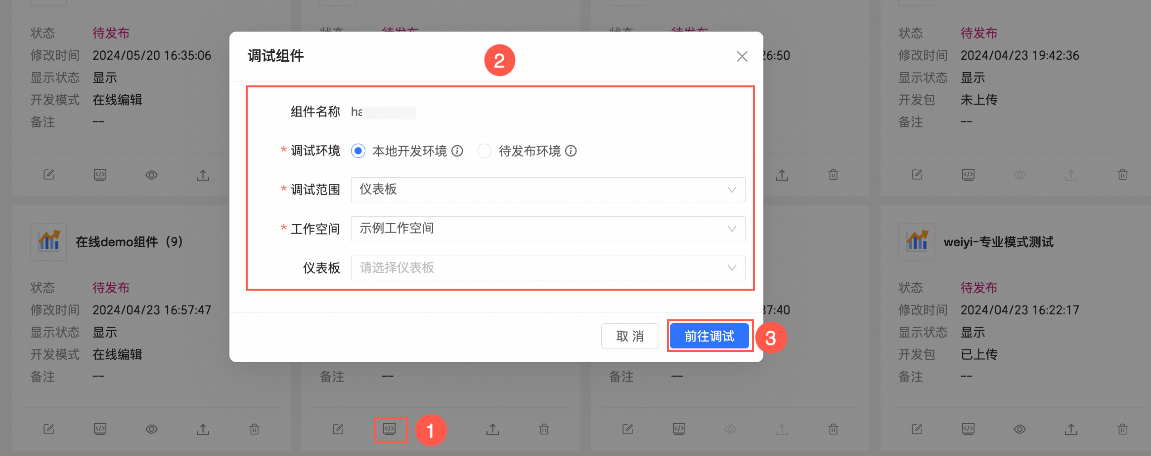
系統自動跳轉至對應的儀表板中,您可以根據需求進行調試。請參見調試組件。
步驟二:配置meta
meta配置包含資料面板和樣式面板的配置。
配置資料面板
在meta.ts中,dataSchema可以根據自身需求定製圖表取數的方式。在大部分情況下, 直接在模板工程裡建立好的 meta 的基礎上修改即可,常見修改的地方有:
areaName:欄位顯示的名稱
required:欄位是否必填
maxColumn:最多可拖入的欄位數量
假設您需要顯示1個維度,3個度量,則只需要改對應的maxColumn即可,配置樣本如下:
// meta.ts
const componentMeta: Interfaces.ComponentMeta = {
  propsSchema: {
    dataSchema: {
      areas: [
        {
          id: "drill",
          name: "切入/維度",
          queryAxis: "drill",
          rule: {
            fieldTypes: ["dimension"],
            required: false, // 是否是更新圖表必須欄位
            /** 限制數量 */
            maxColNum: 3,
          },
        },
        {
          id: "area_row",
          name: "維度",
          queryAxis: "row",
          rule: {
            fieldTypes: ["dimension"],
            maxColNum: 1, // 最多允許的欄位數
            required: true, // 是否是更新表徵圖必須欄位
          },
        },
        {
          id: "area_column",
          name: "度量",
          queryAxis: "column",
          rule: {
            fieldTypes: ["dimension", "measure"],
            maxColNum: 3, // 最多允許的欄位數
            required: true, // 是否是更新表徵圖必須欄位
          },
        },
        {
          id: "filters",
          name: "過濾器", //  名稱
          queryAxis: "filters",
          rule: {
            fieldTypes: ["dimension", "measure"],
            required: false,
          },
        },
      ],
      resultDisplay: {
        /** 限制條數 */
        upLimit: 1000,
      },
    },
  },
};
則可以產生資料面板,如下圖所示。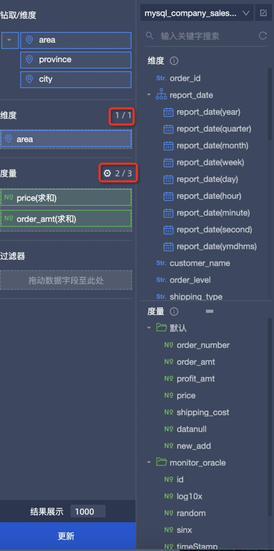
dataSchema具體配置請參考文檔。
配置樣式面板
styleSchema用於定義樣式面板的配置。您可以基於情境進行定製。在本例中樣式面板需求為:
可以勾選是否顯示圖例
可以定義起始角度(數字)
通過分析需求可知,需要定義一個checkbox 和 number 編輯器。因此在 styleSchema中定義,type: 'switch' 和 type: 'number'。(目前支援的編輯器請參見schema.type。)
const componentMeta: Interfaces.ComponentMeta = {
  propsSchema: {
    styleSchema: {
      schema: {
        type: 'object',
        className: 'tabs-uischema-container',
        props: { mode: 'collapse' },
        properties: {
          // 請在此處填寫你需要自訂的屬性
          display: {
            type: 'object',
            title: '顯示設定',
            properties: {
              showLegend: {
                type: 'switch',
                id: 'showLegend',
                defaultValue: true,
                props: {
                  mode: 'checkbox',
                  label: '顯示圖例',
                },
              },
              startAngle: {
                title: '起始角度',
                id: 'startAngle',
                type: 'number',
                defaultValue: 0,
                props: {
                  placeholder: '請輸出起始角度',
                  maxLength: 140,
                },
              },
            },
          },
        },
      },
    },
  },
};此時,在樣式面板中就會自動產生這兩個編輯器。編輯器輸入的值也可以在自訂群組件的customProps.viewConfig中擷取。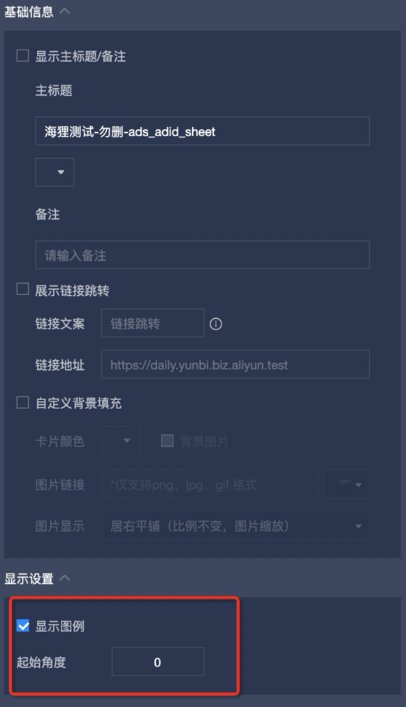
步驟三:開發echarts圖表
開發圖表需要調用setOption(option) 方法,下面為您介紹如何將Quick BI傳入的屬性轉換為echarts的接收的參數。
建立 echarts 執行個體。
在
mount方法中建立echarts執行個體。// src/component.ts mount(props: Interfaces.LifecycleProps<Interfaces.ComponentProps>) { // ... this.chart = echarts.init(props.container as HTMLDivElement); this.setOption(props); }轉換 data。
封裝一個
setOption方法,方便在mount和update階段調用。customProps.data是個二維數組,customProps.data[i]代表資料庫表中的一行資料,每行包括了所配置的維度和度量欄位所對應的值。customProps.data[i][j]代表資料庫表一個儲存格的值,資料結構請參見自訂群組件API,其中fieldId為維度和度量的欄位ID。由於資料每行的位置都是固定的,為了方便通過fieldId擷取到value值,可以建立一個fieldId與數組下標映射的map。
// src/component.ts
    setOption(props: Interfaces.LifecycleProps<Interfaces.ComponentProps>) {
    // 圖表資料
    const data = props.customProps.data;
    // 資料面板格式設定
    const fieldSettingMap = props.customProps.viewConfig.fieldSettingMap;
    // 第一行資料
    const [firstRow] = data;
    // 資料每行的位置都是固定的, 通過建立數組下標與 fieldId 的映射關係, 方便通過 fieldId 取值
    const fieldColumnIndexMap: {
      [key: string]: number;
    } = firstRow.reduce(
      (prev, curr, i: number) => ({
        ...prev,
        [curr.fieldId]: i,
      }),
      {},
    );
    }
設定 series。
series系列設定,在資料面板配置的維度和度量欄位,可以通過
customProps.dataConfig擷取。// src/component.ts setOption(props: Interfaces.LifecycleProps<Interfaces.ComponentProps>) { // ... data // 篩選出所有度量 const columnsFields = props.customProps.dataConfig.find(each => each.areaType === 'column')?.fields ?? []; // 資料面板資料格式設定 const fieldSettingMap = props.customProps.viewConfig.fieldSettingMap; // 轉換格式 const series = columnsFields.map((each, i) => { const filedSetting = fieldSettingMap[each.fieldId]; return { id: each.fieldId, type: 'bar', // 根據 fieldId 與數組下標的映射, 每一行的資料值 data: data.map(row => row[fieldColumnIndexMap[each.fieldId]]?.value), coordinateSystem: 'polar', // 設定別名 name: filedSetting?.aliasName ?? each.showName, }; }); // ... this.chart.setOption({ series, // ... }); }設定category。
設定類別,由於圓角環形圖只接收一個維度,故取第一個維度即可。
// src/component.ts
    setOption(props: Interfaces.LifecycleProps<Interfaces.ComponentProps>) {
    // 篩選出所有度量
    const rowFields = props.customProps.dataConfig.find(each => each.areaType === 'row')?.fields ?? [];
    // meta 中限制了只有一個維度
    const [onlyRow] = rowFields;
    const category = data.map(row => row[fieldColumnIndexMap[onlyRow?.fieldId]]?.value);
    // ...
    this.chart.setOption({
      radiusAxis: {
        type: 'category',
        data: category,
        z: 10,
      },
      // ...
    });
    }
讀取樣式面板。
在樣式面板中配置的表單的值,可以通過
customProps.viewConfig擷取。在本例中, checkbox編輯器的表單名為 showLegend,number輸入框的表單名為startAngle, 並且他們都定在了display下, 因此您可以通過customProps.viewConfig.display?.showLegend擷取。// src/component.ts setOption(props: Interfaces.LifecycleProps<Interfaces.ComponentProps>) { const showLegend = props.customProps.viewConfig.display?.showLegend; const startAngle = props.customProps.viewConfig.display?.startAngle; // 設定 echarts this.chart.setOption({ angleAxis: { startAngle, }, legend: { show: viewConfig.display?.showLegend, data: legend, top: 10, padding: 0, }, // ... }); }建立下鑽、聯動和跳轉效果。
Quick BI提供了
customProps.dispatch方法,通過調用該方法,即可實現下鑽、聯動和跳轉。其中dataIndex為需要現在的維度在customProps.data中的數組下標。// component.ts const dispatch = props.customProps.dispatch; if (typeof dispatch === 'function') { // 下鑽/聯動/跳轉事件 echarts.on('click', (serie: any) => { dispatch({ type: 'select', payload: { dataIndex: serie.dataIndex, // dataIndex 為所點擊的行在 data 中的數組下標 }, }); }); // 點擊空白處事件, 用於適配移動端下鑽 echarts.getZr().on('click', function (e) { if (!e.target) { dispatch({ type: 'cancelSelect', }); } }); }
完成上述步驟,圖表就可以顯示出來了。接下來就是對樣式做修改,以及資料格式的調整。詳情請參考完整程式碼範例中的注釋。
步驟四:打包
開發完成後,需要對自訂群組件進行打包。
npm run pack產出結果在build目錄下,您可以通過自訂群組件平台中上傳,發布組件即可。
 詳情請參見在Quick BI儀表板中調試組件。