本文為您詳細介紹自訂群組件API。
Lifecycle
自訂群組件本質上是一個對象, 其介面為:
interface Lifecycle {
  bootstrap?: LifecycleBootstrap;
  mount?: LifecycleMount;
  unmount?: LifecycleUnmount;
  update?: LifecycleUpdate;
}
bootstrap
開機生命週期,當進入 Quick BI 儀表板時,首先會註冊自訂群組件元資訊,此時會調用 bootstrap 函數,其介面為:
type LifecycleBootstrap<T = LifecycleProps, P = any> = (props?: LifecycleProps<T>) => void | Promise<P>;說明同一個自訂群組件無論在儀表板上建立了多少個圖表,
boostrap都只會觸發1次。mount
渲染生命週期,當需要渲染自訂群組件時,系統會建立一個 DOM 節點,並將自訂群組件渲染到其中。此時會調用mount函數,其介面為:
type LifecycleMount<T = LifecycleProps, P = any> = (props?: LifecycleProps<T>) => void | Promise<P>;unmount
卸載生命週期,當在儀表板中刪除自訂群組件時,會調用unmount函數,其介面為:
type LifecycleUnmount<T = LifecycleProps, P = any> = (props?: LifecycleProps<T>) => void | Promise<P>;update
更新生命週期,當自訂群組件的資料或者其他屬性有更新時,會調用update函數,其介面為:
type LifecycleUpdate<T = LifecycleProps, P = any> = (props?: LifecycleProps<T>) => void | Promise<P>;樣本如下:
// 這是一個自訂群組件
const CustomComponent = {
    bootstrap: (props) => {},
  mount: (props) => {},
  unmount: (props) => {},
  update: (props) => {},
}
LifecycleProps
LifecycleProps描述的是傳入自訂群組件各個生命週期的props參數類型。包含了container和customProps兩個屬性,其介面為:
interface LifecycleProps {
  container?: HTMLElement;
  customProps?: ComponentProps;
}
樣本如下:
class MyComponent {
    mount(props: LifecycleProps) {...}// props 是 LifecycleProps 類型
  update(props: LifecycleProps) {...}
  unmount(props: LifecycleProps) {...}
}

const MyReactComponent: React.FC<LifecycleProps> = (props) => <div>...<div/> // props 是 LifecycleProps 類型
container
props.container是Quick BI儀表板上的一個div DOM元素,作為自訂群組件的容器。如果開啟了Shadow DOM, 則props.container的父元素會變成ShadowRoot元素。customProps
props.customProps是自訂群組件運行時的一些資訊。其介面為:interface ComponentProps { viewConfig: ComponentPropsViewConfig; dataConfig: AreaModel[]; advancedConfig: object; globalConfig?: ComponentPropsGlobalConfig; data: DataCell[][]; dispatch?: ComponentPropsDispatch; cubeConfig?: ComponentPropsCubeConfig[]; sql?: string[]; }customProps.data
自訂圖表的資料,其資料結構是一個二維數組。
interface DataCell { fieldId: string; originValue: string; value: string; geoInfo?: object; }fieldId:資料欄位ID,與customProps.dataConfig中的ID一一對應。originValue:資料的原始值。value:資料的展示值。geoInfo:維度欄位的地理資訊。
customProps.dataConfig
自訂圖表資料面板的資料欄位配置,其介面為:
interface AreaModel { areaType: 'row' | 'column' | 'drill' | 'filter'; fields: FieldModel[]; }areaType:欄位類型,可能有以下幾種取值。row:維度類型欄位。column:度量類型欄位。drill:切入類型欄位。filter:過濾器類型欄位。
fields:欄位數組,同一種欄位類型下可能有多個欄位。其介面為:interface FieldModel { /** 唯一Id */ fieldId: string; /** 欄位名 */ fieldName: string; /** 最終展示別名 */ showName: string; /** 是否計算欄位 */ isCalc?: boolean; /** 如:calc */ skin?: string; /** 值的類型 */ valueType?: FieldValueType; /** 欄位類型: 維度或度量 */ fieldType: FieldCommonType; /** 彙總方式 */ aggregation?: FieldAggregation | string; /** [QBI特有] 資料渲染形式,目前有imageUrl用於交叉表、熱門排行榜圖片渲染 */ displayType?: 'imageUrl' | ''; /** [QBI特有] 資料集格式化配置,如#,##0.00% */ rawFormat?: string; /** [QBI特有] 資料集維度類型, TimeRegionInBackend, 需遷移,防止循環相依性 */ dimGranularity?: any; /** 最終格式化配置(註:qbi目前是放在styleConfig中,該欄位並未被使用) */ /** !!首先得產品層面統一 */ format?: QbiFormatModel | FbiFormatModel; /** 排序 */ order?: FieldOrder; /** 進階計算:同環比等 */ advancedCalculation?: 'year-to-year' | 'month-to-year'; /** 當前圖表的過濾條件集合 */ complexFilter: { limitNum: number; filter: any; }; // 真·欄位唯一標識 uuid: string; /** 不同圖表欄位特殊擴充資訊 */ extends?: FieldModelExtends; }
customProps.viewConfig
自訂圖表樣式面板的資料,其介面如下:
interface ComponentPropsViewConfig { caption?: string; chartColorSeries?: { key: string; name: string; colors: string[]; }; chartSkin?: { key: 'black' | 'default'; }; title?: { show: boolean; viceName?: string; color?: string; showLink?: boolean; link?: string; linkName?: string; }; fieldSettingMap?: { [fieldId: string]: ComponentPropsFieldSettingConfig }; width?: number; height?: number; [key: string]: any; }caption:組件主標題。title:組件標題配置。title.show:是否顯示主標題/備忘。title.viceName:主標題備忘。title.color:主標題顏色。title.showLink:是否展示連結跳轉。title.link:跳轉連結地址。title.linkName:跳轉連結文案。
chartColorSeries:儀表板主題色系。chartColorSeries.key:主題色系key。chartColorSeries.name:主題色系名稱。chartColorSeries.colors:主題色系顏色,共有10中顏色。
chartSkin:儀表板皮膚。chartSkin.key:儀表板皮膚key。default代表淺色版。black代表深色版。
fieldSettingMap欄位展示設定,例如欄位別名,資料展示格式等都配置都存放在其中。其介面為:interface ComponentPropsFieldSettingConfig { aliasName: string; numberFormat: NumberFormat; [key: string]: any; }fieldSettingMap.aliasName:欄位的展示別名。fieldSettingMap.numberFormat:欄位的資料展示格式。
height:自訂圖表高度。widith:自訂圖表寬度。自訂屬性除上述的屬性外,
viewConfig中還包含了在meta.js中定義的styleSchema配置所產生的表單值。
樣本如下:
// meta.js
const componentMeta = {
  // ...
  propsSchema: {
    styleSchema: {
      schema: {
        type: 'object',
        properties: {
          display: {
            type: 'object',
            title: t('顯示設定'),
            properties: {
                            // ...
              startAngle: {
                title: t('起始角度'),
                id: 'startAngle',
                type: 'number',
                defaultValue: 0,
              },
            },
          },
        },
      },
    },
  }
}

props.customProps.viewConfig.startAngle // 0
customProps.globalConfig
自訂圖表全域配置資料,建設中。
customProps.dispatch
自訂圖表修改屬性或觸發行為的函數。
(param: { type: 'select' | 'changeViewConfig' | 'cancelDrill' | 'cancelLinkage' paylpad: any }) => voidparam:行為型別參數。param.type共有以下類型:select:自訂圖表的下鑽、聯動、跳轉、聯動加下鑽等操作,調用後會觸發取數請求,並更新圖表。此時,
payload的類型為payload: { dataIndex: number },其中dataIndex是需要下鑽的維度在customProps.data數組中的數組下標。cancelDrill:自訂圖表的取消下鑽操作。調用後會觸發取數請求,並更新圖表。此時無需傳入
payload。cancelLinkage:自訂圖表的取消聯動操作。調用後會觸發取數請求,並更新圖表。此時無需傳入
payload。changeViewConfig:自訂圖表的變更操作。調用後可以修改樣式面板的資料,並更新圖表。此時
payload的類型為payload: { [key: string]: any },需要更新的屬性通過key value的方式傳入payload中。
樣本如下:
props.customProps.dispatch({ type: 'select', payload: { dataIndex: 1 } })
props.customProps.dispatch({ type: 'cancelDrill' })
props.customProps.dispatch({ type: 'cancelLinkage' })
props.customProps.dispatch({ type: 'changeViewConfig', payload: { caption: '新標題' } })
customProps.advanceConfig
自訂圖表進階面板配置,建設中。
customProps.cubeConfig
自訂圖表資料集配置,其資料結構是一個二維數組。
interface ComponentPropsCubeConfig {
  /** 資料集ID */
  cubeId: string;
  /** 資料集名稱 */
  cubeName: string;
}
customProps.sql
自訂圖表查詢SQL,其資料結構是一個字串二維數組。
ComponentMeta
自訂群組件的元資訊是一個描述組件樣式面板、資料面板、進階面板等配置的對象,其介面為:
interface ComponentMeta {
  propsSchema: {
    dataSchema?: DataSchema;
    styleSchema?: StyleSchema;
    advancedSchema?: StyleSchema;
  };
}
propsSchema.syleSchema
描述自訂群組件樣式面板表單的JSON規範,其介面為:
interface StyleSchema {
  schema: StyleSchemaBase;
  localEditors?: {
    [key: string]: React.ComponentType<any>;
  };
  validation?: StyleSchemaValidation;
}
樣本如下:
// meta.js 中配置了
"myData": {
  "title": "someTitle",
  "type": "number",
}
此時在樣式面板中,可以看到一個數字輸入框。
 此時在輸入框內輸入123,則產出結果:
{ "myData": 123 }schema:編輯器和表單配置,其介面為:interface StyleSchemaBase<P = any, T = string> { type: T; title?: string; titleAlign?: 'left' | 'center' | 'right'; properties?: StyleSchemaProperties; className?: string; description?: string; propertyOrder?: number; id?: StyleSchemaDependId; hide?: boolean; visibleDepends?: StyleSchemaDepend[]; disabled?: boolean; disableDepends?: StyleSchemaDepend[]; hideIfDisable?: boolean; validation?: StyleSchemaValidationRule[]; showRequiredMark?: boolean; hideValidateTips?: boolean; defaultValue?: any; props?: P; redirect?: string; relatedToData?: boolean; suffix?: string; grid?: { row: number; col: number }; }schema.type:編輯器類型,其中array,object是邏輯編輯器,其餘的是基礎編輯器(Editor)類型。目前支援的type如下表。編輯器類型
預覽
編輯器屬性
類型
預設值
說明
object

mode
'tabs' | 'collapse'
無
分組類型, 支援 tabs 和 collapse 兩種模式
array

-
-
無
數群組類型, 多個編輯器可以任意增加刪除
number

max
number
無
最大值
min
number
無
最小值
changeOnBlur
boolean
無
是否blur才觸發change
string

maxLength
number
無
最大長度
placeholder
string
""
預留位置
info
string
無
提示icon
debounceTime
number
0
延遲change(毫秒)
textArea
boolean
false
是否是textarea
select

suffix
string
無
尾碼。例如,數量:下拉框個
multiple
boolean
無
是否是多選
style
object
{ width: '100%' }
樣式
options
{ label: string; value: string | number;}[]
[]
下拉選項
switch

size
'default' | 'small''small'
大小
loading
boolean
false
是否載入中
info
string
無
氣泡提示
label
string
無
展示標籤
mode
'default' | 'checkbox''default'
模式:
default為switch控制項模式
checkbox為checkbox形式
checkbox

options
{ label: string; value: string | number; disabled?: boolean;}[][]
選項配置
maxCheckNum
number
無
最大可選數量,超過這個值,其他選項未選擇options置為disabled
label
string
無
展示標籤
tooltip
string
無
tooltip提示
radio

options
{ label: string; value: string | number; info?: string; iconClassName?: string; img?: string; disabled?: boolean;}[][]
選項配置
mode
'img' | 'icon' | 'default''default'
模式,支援img和icon,default(加了tooltip提示和省略符號)模式
useRadioButton
boolean
false
是否採用radio-button
slider

max
number
1
最大值
min
number
0
最小值
step
number
0.01
步長
isPercent
boolean
true
是否展示為百分比模式
color

mode
'default' | 'classic''default'
模式:
default預設模式classic傳統模式
classicSize
'large' | 'middle' | 'small''large'
大小。僅在
classic模式下生效placement
'top' | 'left' | 'right' | 'bottom' | 'topLeft' | 'topRight' | 'bottomLeft' | 'bottomRight' | 'leftTop' | 'leftBottom' | 'rightTop' | 'rightBottom''bottom'
色塊彈出的方向
isFontMode
boolean
false
是否為字型顏色模式
disableAlpha
boolean
false
是否禁用透明度
allowClear
boolean
false
是否允許清除顏色
toRgb
boolean
false
匯出rgb
tab

tab1
tab2
options
{ text: string; value: string | number; disable?: boolean;}[][]
tab選項
style
object
無
tab樣式
object:當type為object時,可以把一系列表單彙總在一起,包括配置項和值,類似於分組。樣本如下:// meta.js export default = { "propsSchema": { "styleSchema": { "schema": { "title": "基本設定", "type": "object", "properties": { "group1": { "type": 'object', "properties": { "address": { "title": "住址", "type": "string", "defaultValue": "aaaa", }, "phone": { "title": "電話", "type": "string" , "defaultValue": "1234567", } } } } } } } } // 最終會輸出這個 value 結構, 並可以從組件的 props.customProps.viewConfig 中擷取 props.customProps.viewConfig = { // ... group1: { "address": "aaaa", "phone": "1234567" } }array:當type為array時,可以將一個或多個編輯器組成數組表單。此時properties表示每一項使用的編輯器類型,可以是number、string或者object等任意支援的Editor類型。您還可以通過arrayItemDefaultValue添加數組每一項的預設值。樣本如下:// meta.js export default = { "propsSchema": { "styleSchema": { "schema": { "title": "Group1", "type": "object", "properties": { "simpleArray": { "title": "數組", "type": "array", "properties": "number", // 每一項使用什麼類型編輯器 "arrayItemDefaultValue": 5 // 數組每一項預設值 }, "multiArray": { title: "數組2", type: "array", properties: { name: { type: "string", props: { // ... } }, age: { type: "number", props: { // ... } } } } } } } } } // 最終會輸出這個 value 結構, 並可以從組件的 props.customProps.viewConfig 中擷取 props.customProps.viewConfig = { // ... "simpleArray": [1, 2, 3, 4, 5], "multiArray": [{ name: 'aa', age: 12 }, { name: 'bb', age: 13 }] }
schema.title:編輯器的標題。樣本如下:// ... phone: { title: '電話', type: 'string', },
schema.titleAlign:編輯器標題的對齊。schema.properties:當schema.type為object和array時,編輯器的實值型別就不是基本類型了,而是object和array結構。此時schema.properties可以定義編輯器的每一項值的結構。其介面為:type StyleSchemaProperties = | { [key: string]: StyleSchemaBase; } | string當
schema.properties為字串類型時, 其代表的含義與schema.type相同,schema.props中的屬性會傳入每一個自編輯器中。此時編輯器的值的類型取決於schema.properties的類型。樣本如下:{ a: { type: 'array', properties: 'string', // 數組的每一項都是 string 類型 // props 的屬性會傳入每個輸入框中 props: { placeholder: '請輸入' } } } // 最終輸出: 數組的每一項都是 string { a: ['xx', 'xx'] }當
schema.properties類型為對象時,此時編輯器的每一項值都是一個對象,結構取決於properties的配置。樣本如下:// meta.js { a: { type: 'object', properties: { c: { type: 'string' } } }, b: { type: 'array', properties: { c: { type: 'string' } } }, } // 最終輸出 { a: { c: 'xxxx' }, b: [{ c: 'xxx' }] }schema.className:編輯器標題的類名。schema.description:編輯器的描述,在編輯器下方展示。樣本如下:
// ...
phone: {
  title: '電話',
  type: 'string',
  description: 'this is description',
},
schema.propertyOrder:編輯器的展示順序,按照從上到下,從小到大的順序排列。schema.id:編輯器標題的標識,一般用於控制顯示、隱藏或禁用。schema.hide:編輯器是否隱藏。schema.visibleDepends:根據條件控制編輯器顯示或隱藏。通過給編輯器添加ID,可以設定
當某幾個編輯器的值分別為 X 的時候,才展現自身。說明當編輯器自身不展現時,不會觸發
onChange。當編輯器自身不展現時,其所有子編輯器都會隱藏。
StyleSchemaDepend介面為:type StyleSchemaDependId = number | string; interface ValueDepend { /** 用於標識編輯器的id */ id: StyleSchemaDependId; /** 編輯器的值 */ value: any | any[]; } interface PatternDepend { id: StyleSchemaDependId; /** Regex */ pattern: string; } type StyleSchemaBaseDepend = ValueDepend | PatternDepend; interface StyleSchemaAndDepend { $and?: StyleSchemaDepend[]; } interface StyleSchemaOrDepend { $or?: StyleSchemaDepend[]; } type StyleSchemaDepend = StyleSchemaBaseDepend | StyleSchemaAndDepend | StyleSchemaOrDepend;樣本如下:
// ...
{
  a: {
    title: 'a',
    type: 'string',
    id: 'a',
  },
  b: {
    title: 'b',
    type: 'string',
    id: 'b',
    visibleDepends: [{ id: 'a', value: 'china' }], // 當 id=a 的編輯器的值等於 china 時,此組件才展現
  },
  c: {
    title: 'c',
    type: 'string',
    id: 'c',
    visibleDepends: [{ id: 'a', pattern: '^china' }], // 當 id=a 的編輯器的值以 china 開頭時,此組件才展現
  },
}
當需要組合多個條件時,可以使用
$and或者$or對多個條件進行組合。樣本如下:// ... { d: { title: 'd', type: 'string', id: 'd', visibleDepends: [ { $or: [ { id: 'a', value: 'china' }, { id: 'a', value: 'usa' }, ], }, ], // 當 ID=a 的編輯器的值等於 china 或 usa 時,此組件才展現 }, }schema.disabled:編輯器是否禁用。schema.diableDepends:控制編輯器是否禁用的條件,其配置方式和visibleDepends一致。schema.hideIfDisable:編輯器禁用時是否隱藏。schema.validation:編輯器校正規則,用於校正表單值。聲明
validation為對象數組,可支援單規則或多規則情境。當有多條規則存在時,所有規則必須全部通過才可校正通過。// 校正規則介面 interface StyleSchemaValidationRule { message: string; [rule: string]: any; funcName?: string; }message:未通過校正時的錯誤資訊。[rule: string]:校正配置屬性。以下列舉常用的配置屬性。
校正屬性
取實值型別
說明
type
string(預設)
字串類型
number
數字類型
boolean
布爾值
integer
整型
float
浮點型
array
數群組類型
enum
類型枚舉
date
日期類型
url
url格式的字串
email
email格式的字串
required
boolean
是否必填
pattern
string
Regex
min
number
type為string時,校正字串最小長度type為number時,校正數字最小值
max
number
type為string時,校正字串最大長度。type為number時,校正數字最大值。
len
number
type為string時,校正字串長度。type為array時,校正數組長度。
funcName:自訂校正的函數名。當傳入了
funcName時, 其他的校正配置屬性會失效,詳情請參見validation。樣本如下:// ... { address: { title: '住址', type: 'string', validation: [ { required: true, message: '該項是必填項', }, { message: '長度必須等於7', len: 7, }, { message: '必須以 china 開頭', pattern: '^china', }, ], }, population: { title: '人口', type: 'number', validation: [ { type: 'integer', min: 1000, message: '最少1000人', }, { type: 'integer', max: 100000, message: '最多100000人', }, ], }, url: { title: 'url', type: 'string', validation: [ { type: 'url', message: '當前格式不滿足url格式', }, ], }, email: { title: 'email', type: 'string', validation: [ { type: 'email', message: '當前格式不滿足email格式', }, ], }, }
schema.showRequiredMark:是否顯示必填星號標記。schema.hideValidateTips:是否隱藏校正錯誤資訊。schema.defaultValue:編輯器的預設值。schema.props:props屬性是傳入各個編輯器內部的屬性。樣本如下:
// ...
"phone": {
  "title": "電話",
  "type": "string",

  // 這部分屬性是傳入 "string" 這個編輯器內的
  "props": {
    placeholder: "請輸入電話號碼"
  }
}
其中,
placeholder中string是這個編輯器的屬性,各編輯器屬性詳情請參見schema.type。schema.redirect:重新命名表單欄位名。通常表單輸出的key是以
styleSchema中配置的key為準。樣本如下:styleSchema: { schema: { type: 'object', properties: { a: { type: 'object', properties: { b: { type: 'string' } } } } } } // 最終輸出結構 { a.b: '...' }如果您覺得輸出層級太深,可以使用
redirect重新命名key。樣本如下:styleSchema: { schema: { type: 'object', properties: { a: { type: 'object', properties: { b: { type: 'string', redirect: 'b' } } } } } } // 最終輸出結構 { b: '...' }schema.suffix:編輯器尾碼。例如xx: [select] 天。schema.grid:編輯器布局屬性,目前支援縱向排列、分欄排列等布局。col:寬度,遵循24-col規則。例如,輸入12,則表示50%寬度。
row:行號。
樣本如下:
{ title: '', type: 'object', properties: { // 專案名稱和綁定工程名稱兩個欄位並排顯示 projectName: { title: '專案名稱:', type: 'string', props: { placeholder: '請輸入專案名稱描述' } grid: { row: 0, // 行號 col: 12 // 列寬(遵循 24-col 規則,12則是50%寬) } } } };validation:自訂校正函數可以通過validation對象傳入到編輯器中。其介面為:interface StyleSchemaValidation { [validateFuncName: string]: ( rule?: any, currentValue?: any, extras?: { data?: any; schema?: Schema; keyPaths?: string[] }, ) => string | Promise<any> | void; }rule:當前校正規則。currentValue:當前編輯器的值。extras:當前編輯器的附加資訊。
樣本如下:
// meta.js export default { propsSchema: { schema: { ... test: { type: 'string', validation: [ { funcName: 'isNum' } ] } }, validation: { isNum: function(rule, currentValue) { if (typeof currentValue !== 'number') { return `${currentValue} 不是數字` } } } } }localEditors:自訂編輯器,建設中。
propsSchema.dataSchema
描述的是自訂群組件取數的資料模型,通過定義該模型可以實現對組件資料面板的定製。
interface DataSchema {
  /** 欄位設定 */
  areas: DataSchemaArea;
  /** 結果展示配置 */
  resultDisplay: ResultDisplay;
}
在Quick BI資料面板中, 資料集有維度和度量兩種類型的欄位, 不同欄位可以拖入到不同的區塊中實現不同的取數方式。資料面板有以下幾種區塊:
切入區塊
維度區塊
度量區塊
過濾器區塊
propsSchema.dataSchema.areas
資料面板區塊設定,其介面為:
interface DataSchemaArea { /** 欄位id */ id?: 'area_column' | 'area_row' | 'drill' | 'filters'; /** 欄位類型 */ queryAxis?: 'dimension' | 'measure' | 'drill' | 'filters'; /** 欄位名 */ name: string; /** 欄位提示 */ nameTip?: string; /** 規則配置 */ rule: DataSchemaAreaRule; }propsSchema.dataSchema.areas[].id:區塊的ID標識。可能有以下幾種取值:
area_column:度量區塊ID。area_row:維度區塊ID。drill:切入區塊ID。filters:過濾器區塊ID。
propsSchema.dataSchema.areas[].rule:區塊配置規則,其介面為:interface DataSchemaAreaRule { /** 佔位顯示內容 */ placeholder?: string; /** 允許拖入的欄位類型 */ fieldTypes: ('dimension' | 'measure')[]; /** 是否必填 */ required?: boolean; /** 欄位配置個數限制 */ maxColNum?: number; }rule.fieldTypes:設定區塊能拖入的欄位類型。可能的取值:
dimension:只接收維度欄位。measure:只接收度量欄位。
其類型為數組,當所有的類型都可以拖入時,可以按以下方式配置。
fieldTypes: ['dimension', 'measure']rule.required:當前區塊能否為空白。rule.maxColNum:當前區塊最多能接收的欄位數量。
propsSchema.dataSchema.areas[].queryAxis:區塊功能類型。可能有以下幾種取值:
column:度量類型。row:維度類型。drill:切入類型。此時
rule.type必須是dimension。filters:過濾器類型。
propsSchema.dataSchema.areas[].name:區塊的展示名稱。樣本如下:
const componentMeta = {
  // ...
  dataSchema: {
    areas: [
      {
        id: 'drill',
        name: '切入/維度',
        queryAxis: 'drill',
        rule: {
          fieldTypes: ['dimension'],
          required: false,
          maxColNum: 6,
        },
      },
      {
        id: 'area_row',
        name: '維度',
        queryAxis: 'row',
        rule: {
          fieldTypes: ['dimension'], // 維度還是計量
          maxColNum: 1, // 最多允許的欄位數
          required: true, // 是否是更新表徵圖必須欄位
        },
      },
      {
        id: 'area_column',
        name: '度量',
        queryAxis: 'column',
        rule: {
          fieldTypes: ['measure', 'dimension'],
          maxColNum: 3,
          required: true,
        },
      },
      {
        id: 'filters',
        name: '過濾器', //  名稱
        queryAxis: 'filters',
        rule: {
          fieldTypes: ['dimension', 'measure'],
          required: false,
        },
      },
    ],
    resultDisplay: {
      upLimit: 1000,
    },
  }
}
propsSchema.dataSchema.resultDisplay
資料面板結果展示區的配置,其介面為:
interface ResultDisplay {
  /** 上限 */
  upLimit?: number;
    /** 下限 */
  downLimit?: number;
  /** 是否隱藏展示結果設定 */
  hide?: boolean;
}
propsSchema.dataSchema.resultDisplay.upLimit:圖表取數數量上限。propsSchema.dataSchema.resultDisplay.downLimit:圖表取數數量下限,預設值是1。propsSchema.dataSchema.resultDisplay.hide:是否隱藏結果展示區塊,預設值是false。
廢棄API
說明Quick BI v4.1.1.1版本升級了資料面板,以下
deprecated的老API 已棄用。若您當前的版本低於Quick BI v4.1.1.1版本,請參考以下API。(deprecated in v4.1.1.1) schema:資料面板配置,其介面為:interface DataSchema { schema: DataSchemaBase; } interface DataSchemaBase { area: DataSchemaArea[]; limitNum: number; }(deprecated in v4.1.1.1) schema.area:資料面板區塊設定,其介面為:interface DataSchemaArea { id?: 'area_column' | 'area_row' | 'drill' | 'filters'; queryAxis?: 'dimension' | 'measure' | 'all'; areaName: string; columnList?: any[]; rule: DataSchemaRule; }(deprecated in v4.1.1.1) schema.area[].id:區塊的ID標識。能有以下幾種取值:
area_column:度量區塊ID。area_row:維度區塊ID。drill:切入區塊ID。filters:過濾器區塊ID。
(deprecated in v4.1.1.1) schema.area[].rule:區塊配置規則,其介面為:interface DataSchemaRule { type: 'dimension' | 'measure' | 'all'; required?: boolean; maxColNum?: number; show?: boolean; }rule.type:設定區塊能接收的欄位類型。可能的取值:
dimension:只接收維度欄位。measure:只接收度量欄位。all:維度欄位和度量欄位都能接收。
rule.required:當前區塊能否為空白。rule.maxColNum:當前區塊最多能接收的欄位數量。
(deprecated in v4.1.1.1) schema.area[].queryAxis:區塊功能類型。有以下幾種取值:
column:度量類型。row:維度類型。drill:切入類型。此時
rule.type必須是dimension。filters:過濾器類型。
(deprecated in v4.1.1.1) schema.area[].areaName:區塊的名稱。樣本如下:
{
  "area": [
    {
      "id": "drill",
      "areaName": "切入/維度",
      "queryAxis": "drill",
      "rule": {
        "show": false,
        "type": "dimension",
        "required": false,
        "maxColNum": 6
      },
      "columnList": []
    },
    {
      "id": "area_onerow",
      "areaName": "維度",
      "queryAxis": "row",
      "rule": {
        "type": "dimension",
        "maxColNum": 1,
        "required": true
      },
      "columnList": []
    },
    {
      "id": "area_column",
      "areaName": "度量",
      "queryAxis": "column",
      "rule": {
        "type": "measure",
        "maxColNum": 3,
        "required": true
      },
      "columnList": []
    },
    {
      "id": "filters",
      "areaName": "過濾器",
      "queryAxis": "filters",
      "rule": {
        "type": "all",
        "required": false
      },
      "columnList": []
    }
  ],
  "limitNum": 1000
}
(deprecated in v4.1.1.1) schema.limitNum:最大的取數數量限制。
propsSchema.advancedSchema
描述自訂群組件進階面板表單的配置規範。建設中。
bi-open-sdk API
bi-open-sdk和bi-open-react-sdk是針對不同架構所提供的SDK,其API完全一致。
createBIComponent
建立Quick BI自訂群組件的函數。返回一個自訂群組件對象。
(option: IOption) => Lifecycleoption參數的配置。interface IBiComponent { mount?: Interfaces.LifecycleMount<Interfaces.ComponentProps>; umount?: Interfaces.LifecycleUnmount<Interfaces.ComponentProps>; update?: Interfaces.LifecycleUpdate<Interfaces.ComponentProps>; } interface IBiComponentConstructor { new (): IBiComponent; } interface IOption { element: IBiComponentConstructor | React.ComponentType }說明element自訂群組件createBIComponent。如果通過
bi-open-sdk引入,則類型為IBiComponent。如果通過
bi-open-react-sdk引入,則類型為React.ComponentType。
樣本如下:
import { createBIComponent } from 'bi-open-sdk'

class MyComponent {
    mount() {}
  update() {}
  umount() {}
}

const { bootstrap, mount, unmount, update } = createBIComponent({
  element: MyComponent,
})
基於react架構:
import { createBIComponent } from 'bi-open-react-sdk'

const MyComponent = (props) => <div>...</div>

const { bootstrap, mount, unmount, update } = createBIComponent({
  element: MyComponent,
})
Interfaces
Quick BI自訂群組件的類型定義。
Utils
Quick BI 自訂群組件的工具庫。
Utils.getStringRealLength:擷取字串的實際長度。(str: string) => numberstr:需要擷取實際長度的字串。樣本如下:getStringRealLength('abc') // 3 getStringRealLength('中文') // 4 中文佔2位Utils.formatNumber:格式數字。(num: number | string, partten?: 'CN' | 'CNT' | 'CN2' | 'EN' | 'KMG' | string, invalidString = 'N/A' ) => stringpartten:需要轉換的格式,不指定時返回原始值。invalidString:數字不合法時的傳回值,預設是N/A。
樣本如下:
formatNumber(1234, '#,##0') // 1,234 formatNumber(1.234, '0.##') //1.234 formatNumber(12, '0.##') // 12 formatNumber(12.34, '0') // 12 formatNumber(12.34, '0.#') // 12.3 formatNumber(0.1, '%') // 10% formatNumber(0.001, '0.#%') // 0.1% formatNumber(0.01, '‰') // 10‰ // 當數字大於10000時 formatNumber(12345, 'CN') // 1.234萬 formatNumber(12345, 'EN') // 12.34K formatNumber(12345, 'CNT') // 1.234萬 formatNumber(12345, 'CN2') // 1.23萬 formatNumber(12345, 'KMG') // 12.3KUtils.formatNumberWithConfig:根據儀表板資料面板中配置的數值展示格式格式化數字。(num: number | string, config: object) => string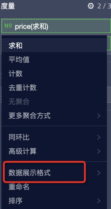
num:需要轉換格式的數字。config:數值展示格式,不指定時返回原始值。該配置一般從
props.customProps.viewConfig.fieldSettingMap中擷取。
樣本如下:
// 可以通過 props 擷取數值展示格式的配置
update(props) {
  // ...
  const fieldSettingMap = props.customProps.viewConfig.fieldSettingMap
  const config = fieldSettingMap[fieldId].numberFormat;
  const value = formatNumberWithConfig(12345, config)
}
I18n
Quick BI自訂群組件的國際化類,
I18nInstance是通過I18n.init或new I18n()建立的執行個體。I18n.init:建立國際化執行個體的靜態方法,返回I18nInstance執行個體。static (options: IOption, appendTarget?: object) => I18nInstanceoptions:配置項參數。type Lng = "zh-CN" | "en-US" | "zh-TW" | "zh-MO" | "ja-JP" interface IOption { lng?: Lng, resources: Partial<{ [key in Lng]: { [key: string]: string } }> }lng:設定當前語言,如果沒有傳入,則當前語言預設為Quick BI當前語言。resources:語言套件配置。與詞條的key與t函數的第一個參數一一對應。
appendTarget:綁定的對象,如果傳入,則i18n執行個體會綁定到該對象上。 一般用於效能最佳化中。
樣本如下:
import { I18n } form 'bi-open-sdk' I18n.init({ resources: { // 英文 key 'en-US': { 我的: 'my', 蘋果: 'apple', '{{who}}{{count}}個蘋果': '{{who}} {{count}} apple', '{{who}}{{count}}個蘋果_plural': '{{who}} {{count}} apples', // 當有 {{count}} 時, 可以添加 _plural 處理複數情況 }, // 日文 key 'ja-JP': { 蘋果: '蘋果', ... } }, }) I18n.init(option, window.biI18n) window.biI18n // { t, i18n } 綁定在 window.biI18n 上I18nInstance.t:翻譯函數。(text: string, param?: object) => string;text:需要翻譯的文字。param:需要替換的參數。可以替換
text中通過{{}}包裹的運算式。如果傳入count,則還可以區分單複數。
樣本如下:
const t = i18n.t.bind(i18n) t('蘋果') // apple t('{{who}}{{count}}個蘋果', { who: t('我的'), count: 2 }) // my 2 applesI18nInstance.addResources:追加翻譯詞條。(lng: "zh-CN" | "en-US" | "zh-TW" | "zh-MO" | "ja-JP", resource: IResource) => I18nInstancelng:需要添加的語言。resource:追加的語言套件。
樣本如下:
i18n.addResources('en-US', { '蘋果': 'apple', })I18nInstance.changeLanguage:切換當前語言。(lng: "zh-CN" | "en-US" | "zh-TW" | "zh-MO" | "ja-JP") => I18nInstancelng:需要切換的語言。樣本如下:
i18n.t('蘋果') // 蘋果
i18n.changeLanguage('en-US')
i18n.t('蘋果') // apple