Limit the number of data categories displayed in a Log Service dashboard flow chart to reduce query and rendering load, improving dashboard performance and response speed.
Prerequisites
-
You have collected log data. For more information, see Collect text logs from a host.
-
You have created indexes. For more information, see Create an index.
Overview
-
Query and analysis: Query and analyze logs in the console, including log search, aggregation, and statistics.
-
Add a chart: A dashboard consists of one or more charts, each representing one or more query and analysis statements.
-
Configure maximum categories: The flow chart groups data by the
request_methodfield. Set the maximum number of categories to control how many values are displayed.
Step 1: Query and analyze data
Log on to the Simple Log Service console. In the Projects section, click the project you want.

On the tab, click the logstore you want.
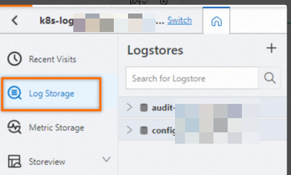
-
Enter a query and analysis statement and click Last 15 Minutes to specify a time range.
Example:
-
* | select __time__,count(0) as pv group by request_method,__time__
-
Step 2: Add a chart
In the left-side navigation pane, choose . In the Dashboard list, click the dashboard you want. In the upper-right corner of the dashboard page, click Edit. In edit mode, choose .
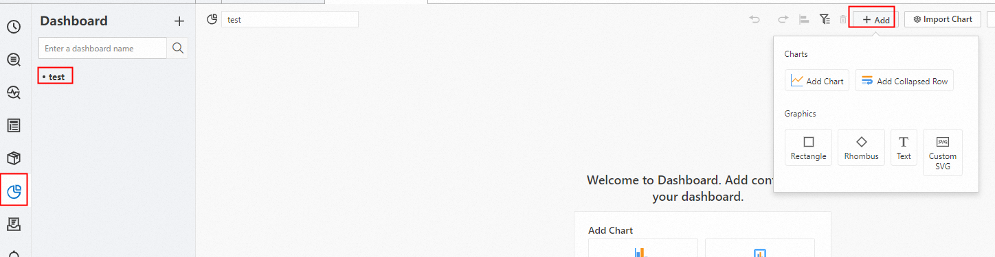
-
Under General Configurations > Chart Types >
 . On the Search & Analysis tab, select LogStore (SQL), select the target Logstore, and enter a query statement.
From the drop-down list in the upper-right corner, select a time range, such as Last 15 Minutes. Click .
-
In the section, set Axis X Field to
__time__and Axis Y Field topv.
By default, the x-axis field __time__ is in the UNIX time format. To format the time for readability, enable Time Series Mode and set the Format option for the x-axis to
YYYY-MM-DD hh:mm:ss. Time Series Mode. -
Step 3: Configure maximum categories
Under to 20. This limits how many categories are displayed for the request_method field. The resulting chart shows data for the GET and POST categories.