Set custom thresholds for statistical charts to change a chart's appearance based on its value, helping you quickly identify whether a metric is within the expected range.
Prerequisites
-
You have collected log data. For more information, see Collect text logs from a host.
-
You have created an index. For more information, see Create an index.
-
You have created a dashboard. For more information, see Create a dashboard.
Overview
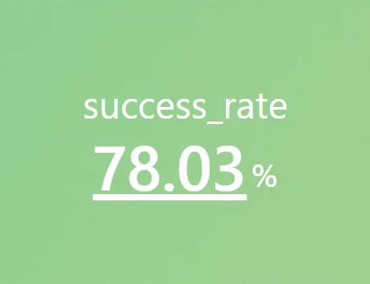
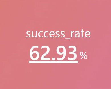
-
Search & Analyze: Calculate the success rate of web requests from your log data.
-
Set thresholds for a statistical chart: Add a chart named
Request Success Rateto the target dashboard. Configure a threshold and background color for thesuccess_ratefield. If the rate is lower than 70%, the background turns red; otherwise, it turns green.
Step 1: Search and analyze
Log on to the Simple Log Service console. In the Projects section, click the project you want.

-
In the navigation pane on the left, click Log Storage. In the Logstores list, click the target Logstore.
-
Enter the following query statement to calculate the success rate of web page requests, and then click Search & Analyze to view the logs.
(*)|select round(sum(if(status < 300, 1, 0)) * 100.0 / count(1), 2) as success_rate
Step 2: Set a threshold
1. Add a statistical chart
Log on to the Log Service console and select the target Project. In the navigation pane on the left, choose . On the Dashboard list page, click the target dashboard. In the upper-right corner of the dashboard, click Edit. In edit mode, click .
2. Configure the statistical chart
-
Configure general settings for the chart: On the right side of the page, configure the Chart Type and Title. On the left side of the page, configure the time range, Logstore, and query statement. Then, click Apply at the top of the page to preview the chart.
Select Single Value Chart Pro as the chart type, set the title to Request Success Rate, set the time range to The day before yesterday (1d), select the nginx Logstore, and set the query statement to
(*)|select round(sum(if(status < 300, 1, 0)) * 100.0 / count(1), 2) as success_rate. After you click Apply, the chart shows a success rate of 78.03. -
Configure field settings for the chart: Set the threshold for the success_rate field to 70 and configure the background color. If the success rate is lower than 70%, the background turns red; otherwise, it turns green.
-
On the right side of the page, click Field Configuration and select A > success_rate.
-
Configure the following settings for the
success_ratefield:-
Standard Configurations > Unit: Set the unit for the
success_ratefield to %. -
Chart Style > Value Font Size: Set the value font size to 70.
-
Threshold > Threshold: Set the threshold for the success_rate field in Query Analysis A to 70.
-
Standard Configurations > Color Scheme: Configure the color scheme based on the threshold. If the value is less than 70, the background turns red; otherwise, it turns green.
-
Chart Style > Color Mode: Select Background to set the background color of the chart.
-
Chart Style > Font Color: Set the font color to white.
-
For more information about the configurations, see Chart properties.
-
-
3. Save the chart and dashboard
-
In the upper-right corner of the chart editing page, click OK.
-
In the upper-right corner of the dashboard editing page, click Save.