Add sparklines to dashboard table cells to visualize data trends as inline line, area, or column charts.
Prerequisites
-
You have collected NGINX access logs. For more information, see Collect text logs from servers.
-
You have created indexes. For more information, see Create indexes.
Overview
-
Query and analysis: Search, aggregate, and generate statistics from logs in the console.
-
Add a chart: Each dashboard chart is generated from a query and analysis statement.
-
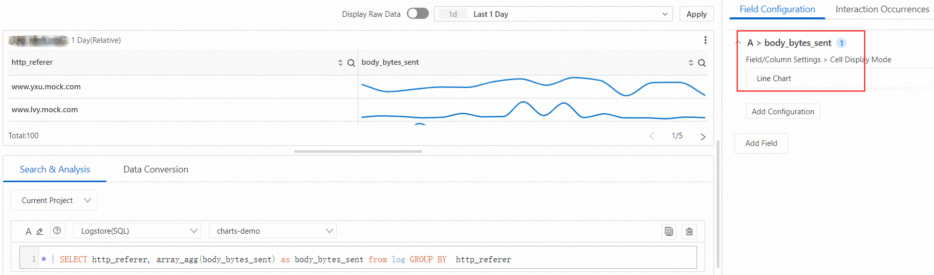
Add a sparkline: Configure a table cell to display data as a line, area, or column chart.
Step 1: Query and analyze data
Log on to the Simple Log Service console. In the Projects section, click the project you want.

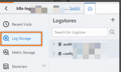
On the tab, click the logstore you want.
-
Enter a query and analysis statement, and click Last 15 Minutes to set the time range.
For example, this statement returns traffic by request path:
* | SELECT http_referer, array_agg(body_bytes_sent) as body_bytes_sent from log GROUP BY http_refererThe array_agg function aggregates field values into an array.
Step 2: Add a chart
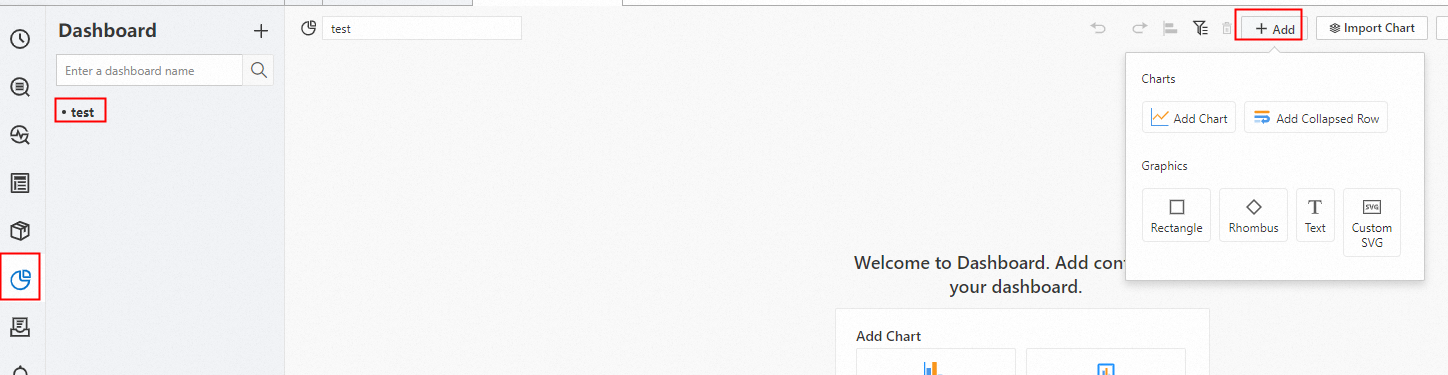
In the left-side navigation pane, choose . In the Dashboard list, click the dashboard you want. In the upper-right corner of the dashboard page, click Edit. In edit mode, choose .
-
In the section, select the
 icon for Chart Type. On the Query and Analysis tab, select your data source (in this case, LogStore (SQL)), select the target Logstore, and enter a query statement.
In the upper-right corner, select a time range such as Last 15 Minutes and click Apply.
Set Chart Type to Table. An example query:
* | select *.
Step 3: Add a sparkline
Line sparkline
Click , select the field, and then click Add Configuration. Select and choose Line Chart.
Area sparkline
Click , select the field, and then click Add Configuration. Select and choose Area Chart.
Column sparkline
Click , select the field, and then click Add Configuration. Select and choose Column Chart.