A Sankey diagram visualizes the flow and distribution of data from one set of states (nodes) to another. The width of each branch is proportional to the data flow volume, letting you track and compare data across paths. Sankey diagrams are well suited for showing transfers of energy, materials, funds, or user behavior across stages or categories.
Example
Configure Data
-
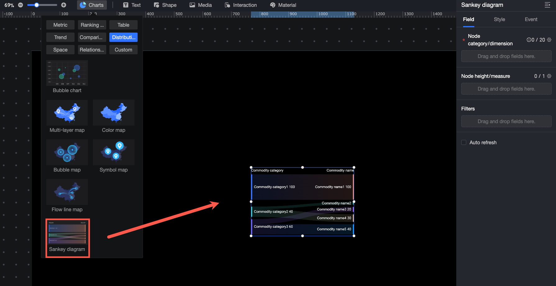
In the widget library, from the Charts section, drag Sankey Diagram onto the canvas.
-
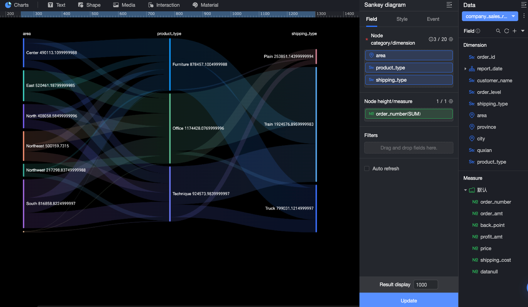
In the Data pane, select a dataset and configure the Fields for the chart as follows.
-
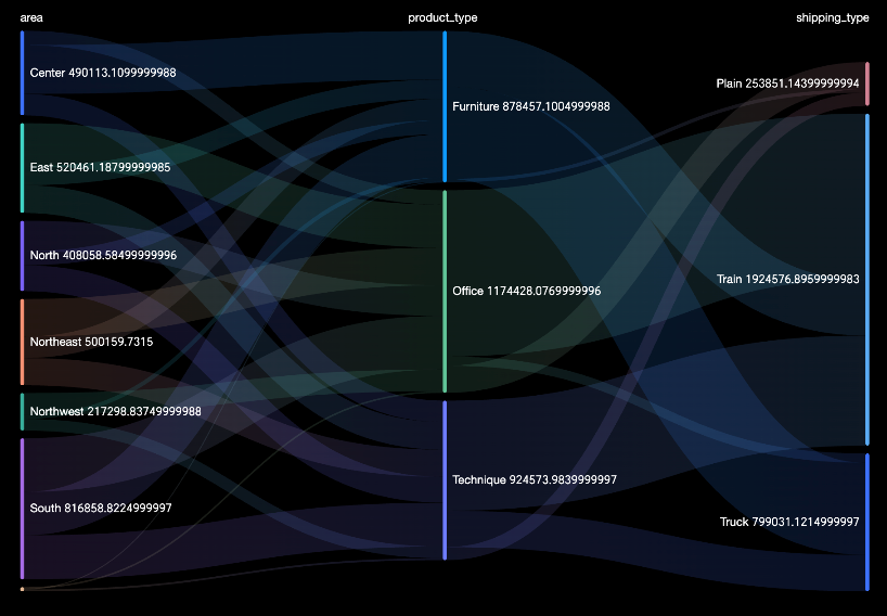
In the Node Type/Dimension field, add the dimensions that determine the node types. Each node represents a category or stage, such as product type or marketing campaign stage. In this example, drag the Region, Product Type, and Product Package fields to view the data flow and distribution among the three nodes.
-
In the Node Height/Measure field, add the measure that determines the node height. This helps visualize the distribution of data flow for each node. In this example, drag the Order Amount field to view the order amount distribution for different product types in each region and for different packages under each product type.
-
You can also perform the following operations on the data: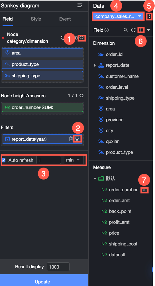
-
Configure field formats in batches (①). For more information, see Configure field styles in batches.
-
Filter fields (②). For more information, see Filter data.
-
Set up automatic data refresh (③). For more information, see Refresh data on a schedule.
-
Switch datasets (④). For more information, see Switch datasets.
-
Edit the dataset (⑤). For more information, see Edit a dataset.
-
Process data (⑥). For more information, see Create a Calculated Field, Create a Grouped Dimension, and Placeholders.
-
Copy a field (⑦). For more information, see Copy a field and convert it to a dimension.
Configure Styles
Position and Size
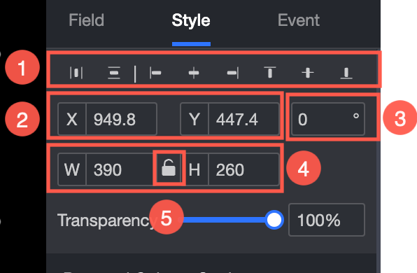
In the configuration pane, set the following properties for the widget:
-
Adjust the widget alignment (①): Options include align left, center, and align right.
-
Adjust the widget position (②): Set the X and Y values to adjust the position relative to the top-left corner.
-
Adjust the widget angle (③): Set the rotation angle.
-
Adjust the widget size (④): Set the W and H values to adjust the width and height of the widget.
-
Lock the widget (⑤): Locks the widget so that its size cannot be adjusted.
-
Adjust the opacity (⑥): Set the opacity of the widget.
Chart
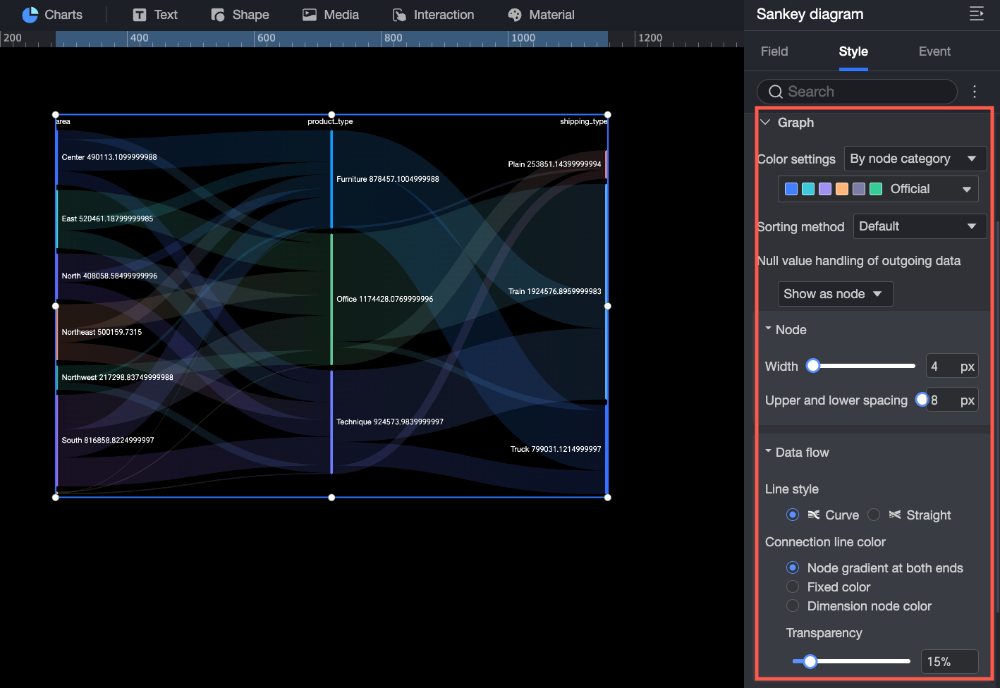
In the Chart section, configure the following settings.
-
Color Scheme: Set the overall color scheme for the chart. You can select By Node Category or Monochrome.
-
By Node Category: Assigns a different color to each node category. Choose from preset color schemes or customize colors per category.
-
Monochrome: Applies a single color to the entire chart.
-
-
Sort Order: The default is no sorting. You can set it to Ascending by Node Height or Descending by Node Height.
-
Handle Null Values in Outflow Data: The default is Show as Node. You can set it to Show as Loss Bar or Hide Flow. If you select Show as Loss Bar, you can configure the color of the loss bar.
-
Node: Set the Width and Vertical Spacing of the nodes.
-
Data Stream: Set the Line Type, Line Color, and Opacity of the data stream.
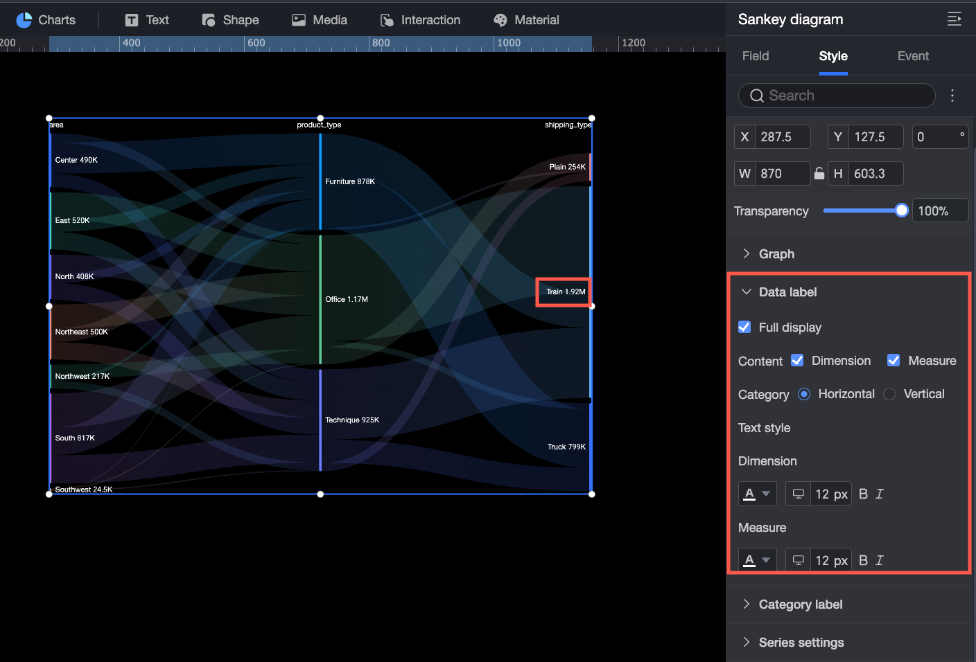
Data Labels
In the Data Labels section, configure the following settings.
-
Show All: Specifies whether to show all data labels. Clear this option to display only some labels and reduce clutter.
-
Content: Sets the content to display in the data labels. You can select Dimension and Measure information as needed.
-
Arrangement: Sets the arrangement of the dimension and measure text. Options are Side by Side or Top and Bottom.
-
Text Style: Sets the style of the text in the data labels, including font color and size. You can set different text styles for the dimension and the measure.
Category Labels
In the Category Labels section, configure the following settings.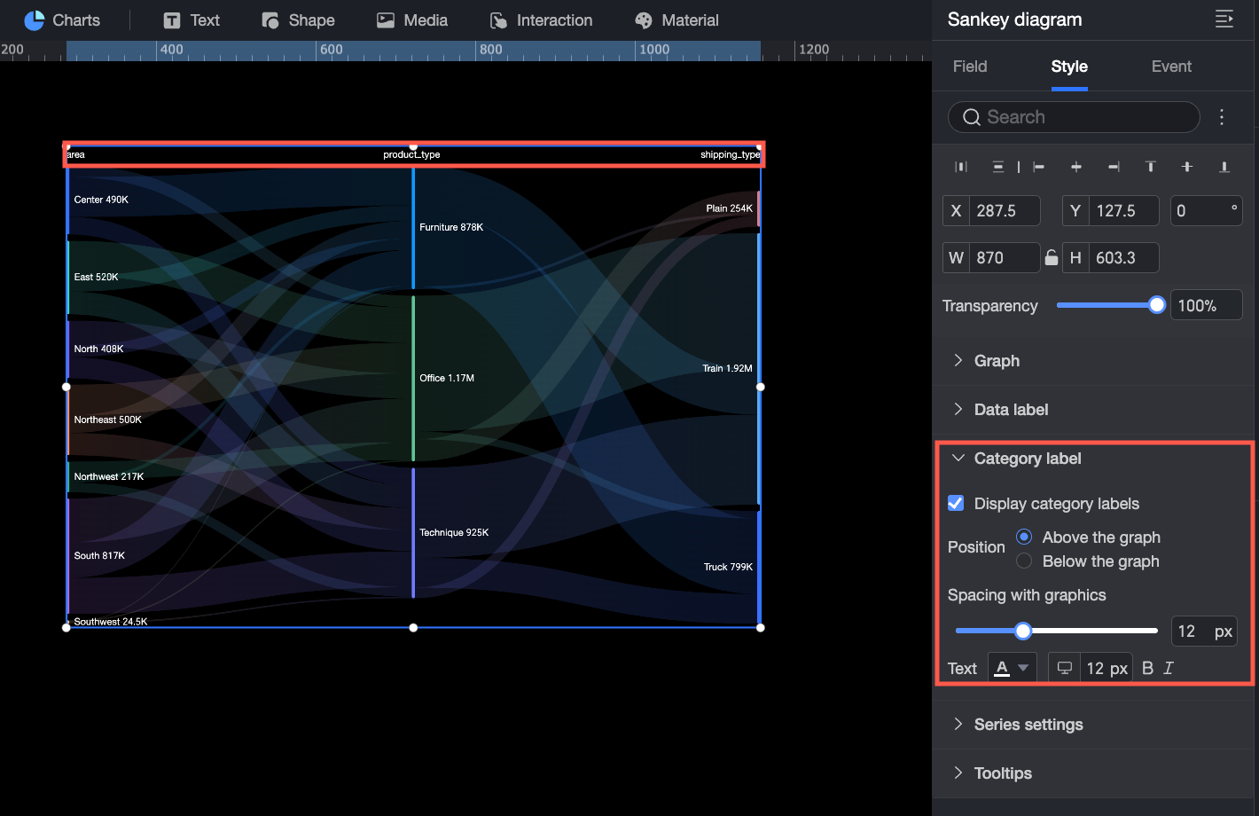
-
Position: Sets the display position of the category labels in the chart. Options are Above Chart or Below Chart.
-
Spacing from Chart: Sets the vertical distance between the category labels and the chart.
-
Text: Sets the text style for the category labels.
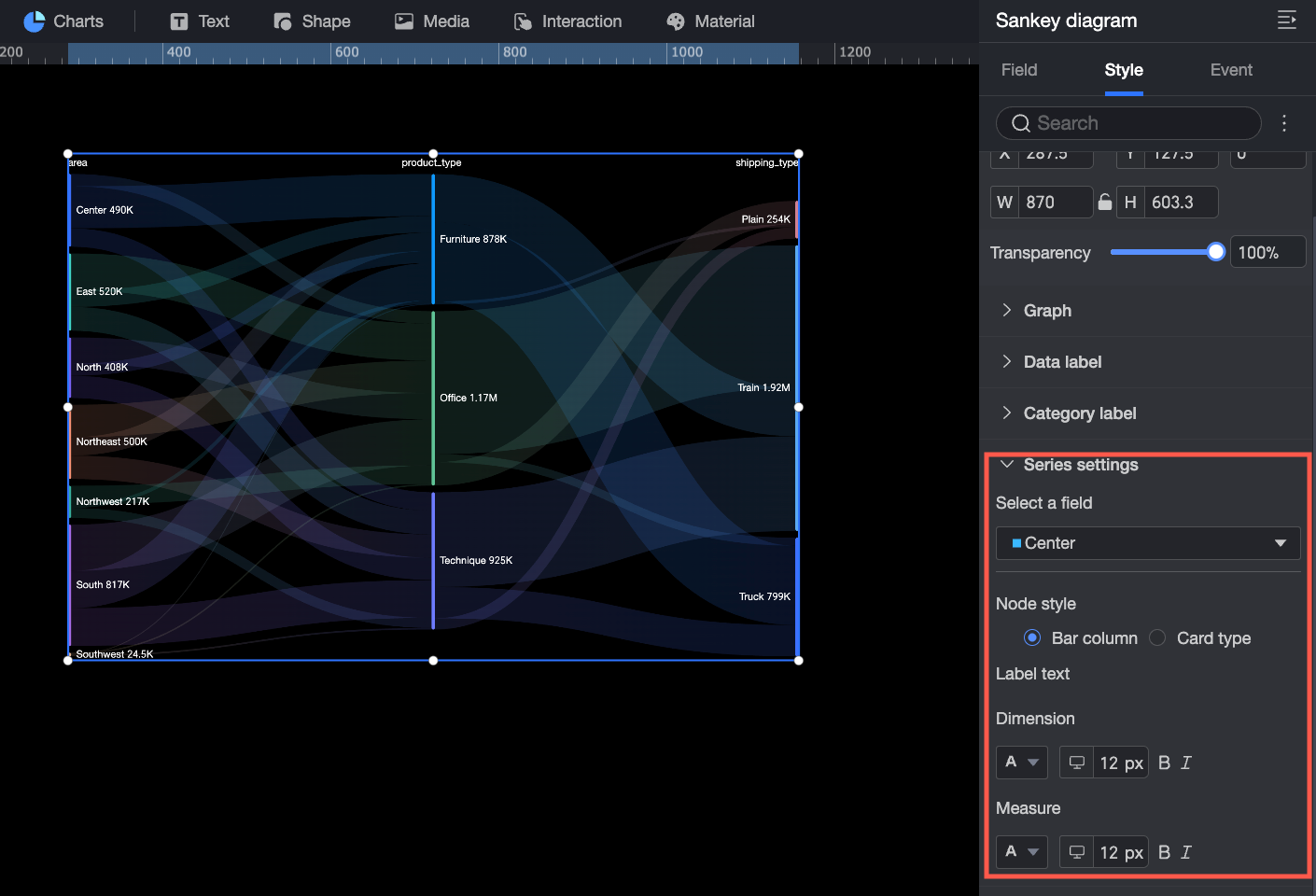
Series Settings
In the Series Settings section, configure the display style for the data of a specific dimension value.
-
Select Field: Select the dimension value whose style you want to set.
-
Node Style: Sets the display style of the node. Options are Bar or Card. You can also set the background color and border style of the node.
-
Label Text: Sets the style for the dimension text and measure text.
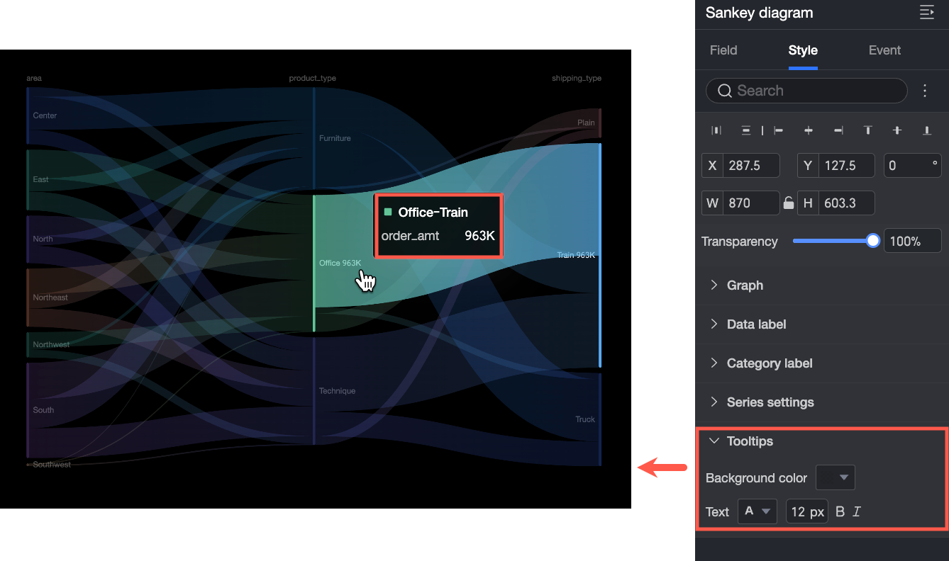
Tooltip
A tooltip appears when you hover over a data point. You can set the background color and text style for the tooltip.