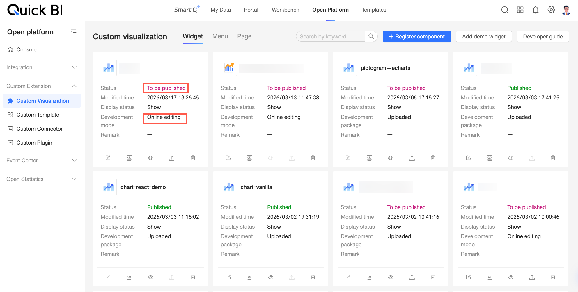
The Custom Visualization page in the Quick BI Open Platform displays all visualization components created in your organization. You can switch between views by clicking the Component, Menu, or Page tabs. You can also manage components by registering, editing, or deleting them. This topic describes these operations in detail.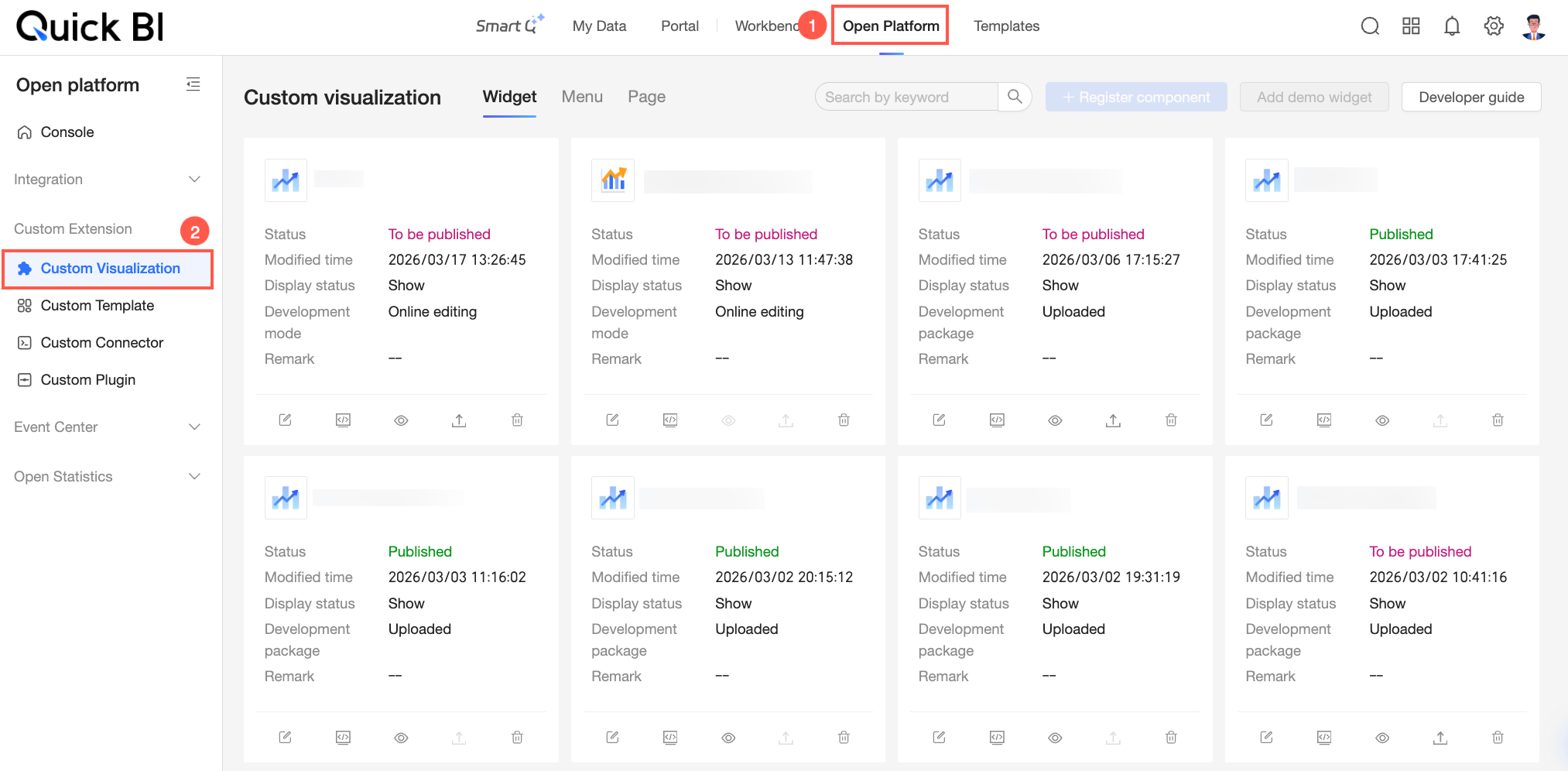
Register
To add a new visualization component, you must register it on the appropriate tab:
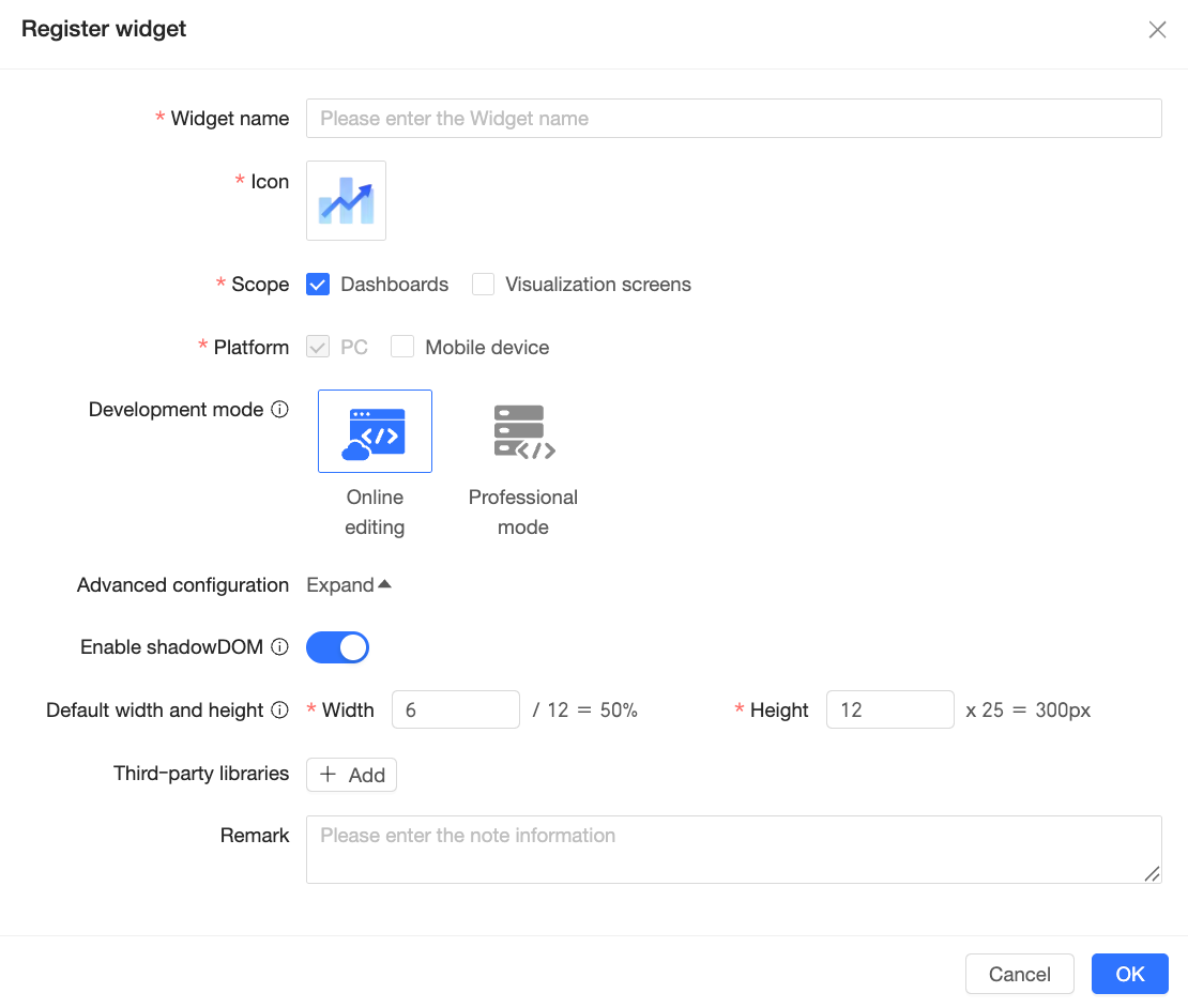
Register Component: On the Components tab, click Register Component and configure the settings in the Register Component dialog box.
Configuration item
Description
Component name
Enter a custom name for the component. This name appears in the asset panel to help identify the component. Use a meaningful name based on its business purpose.
Icon
Select an icon for the component. This icon appears in the asset panel to visually distinguish custom components. You can use built-in icons or upload a custom image.
NoteYou can upload only JPG, JPEG, PNG, or GIF images. Each file must be under 100 KB.
Scope
Select where the component can be used: dashboards or data dashboards.
Platform
Select the device type where the component can run. PC is selected by default and cannot be cleared. You can optionally enable it for mobile devices.
Development mode
Select the development mode for the component: Online editing or Professional mode.
Online editing: Develop and debug the component in the Quick BI console. No local development environment is required. Debugging is simpler and faster.
Professional mode: Develop and debug the component locally. You must first install and configure a local development environment. This mode suits complex components.
NoteThis setting affects your development workflow and cannot be changed after registration.
Advanced configuration
Enable Shadow DOM
When enabled, your custom code is isolated from other page code. This helps with CSS styling isolation.
Default width and height
Set the default width and height for the component.
Third-party libraries
Add third-party dependencies used during development.
Click Add and enter the following information:
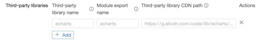
Library name: The name used in the import statement. For example, in
import * as echarts from "echarts", the library name is"echarts".Exported name: The name bound to the global object. For example, in
window.echarts, the exported name isecharts.CDN path: The request path used to load the library. The library must follow the UMD module specification.
For more details about third-party libraries, see Third-party Library CDN.
Notes
Add notes for the component.
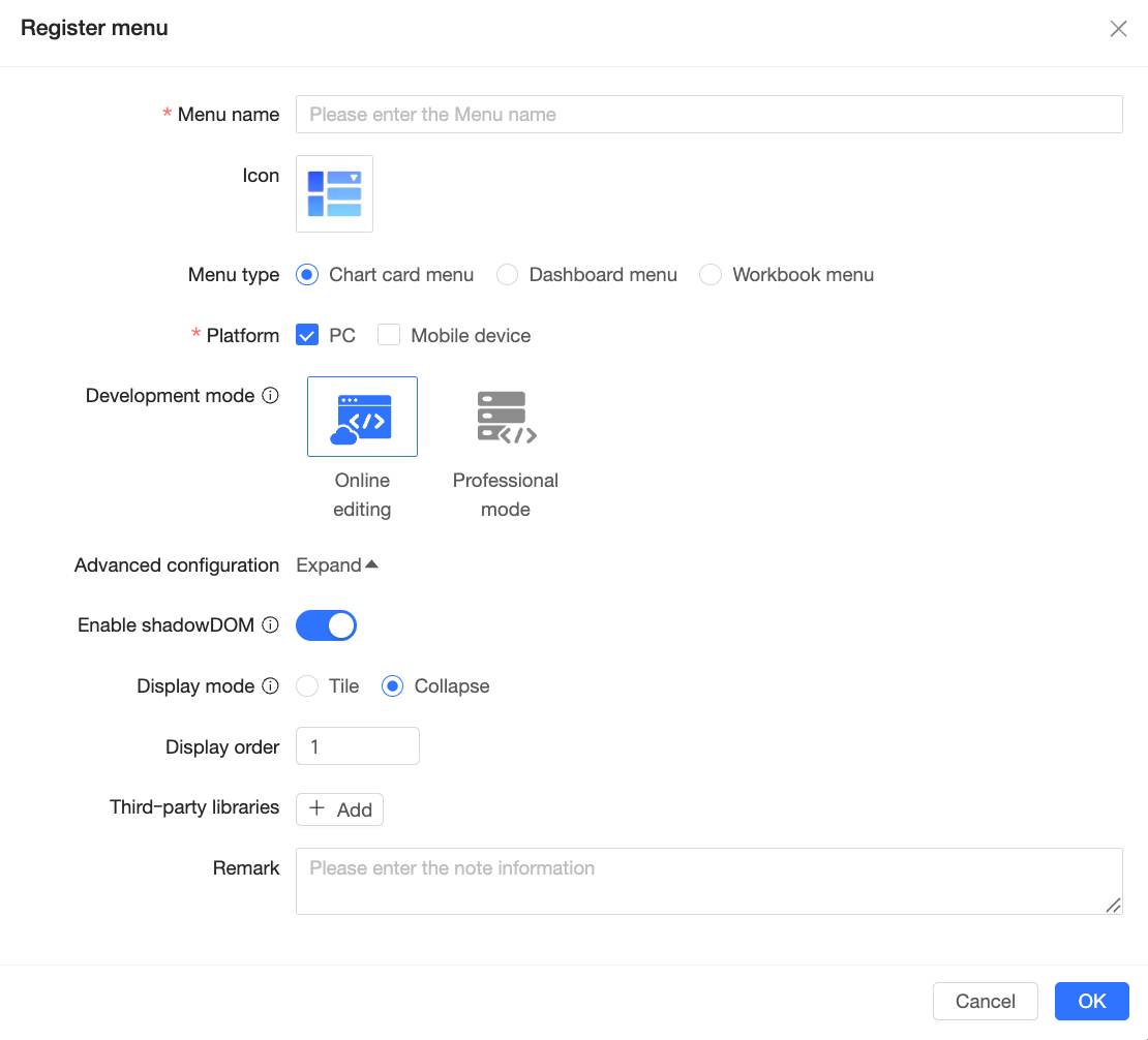
Register Menu: On the Menu tab, click Register Menu and configure the settings in the Register Menu dialog box.
Configuration item
Description
Menu name
Enter a custom name for the menu. This name appears in the menu bar to help identify the menu item. Use a name that reflects its function.
Icon
Select an icon for the menu. This icon appears in the menu bar to visually distinguish custom menu items. You can use built-in icons or upload a custom image.
NoteYou can upload only JPG, JPEG, PNG, or GIF images. Each file must be under 100 KB.
Menu type
Select the menu type: Chart card menu, Dashboard menu, or Workbook menu.
Platform
Select the device types where the menu can run.
If the menu type is Chart card menu, choose PC or mobile. If the menu type is Dashboard menu or Workbook menu, only PC is supported.
Development mode
Select the development mode for the menu: online editing or professional mode.
Online editing: Develop and debug the menu in the Quick BI console. No local development environment is required. Debugging is simpler and faster.
Professional mode: Develop and debug the menu locally. You must first install and configure a local development environment. This mode suits complex development scenarios.
NoteThis setting affects your development workflow and cannot be changed after registration.
Advanced configuration
Enable Shadow DOM
When enabled, your custom code is isolated from other page code. This helps with CSS styling isolation.
Display mode
Select how the menu displays: Tile or Collapse.
NoteOn PC, up to two custom menus can tile. On mobile, up to ten custom menus can collapse.
Display order
Set the display order of this menu item in the system menu list. A smaller number means it appears earlier.
Third-party libraries
Add third-party dependencies used during development.
Click Add and enter the following information:
Library name: The name used in the import statement. For example, in
import * as echarts from "echarts", the library name is"echarts".Exported name: The name bound to the global object. For example, in
window.echarts, the exported name isecharts.CDN path: The request path used to load the library. The library must follow the UMD module specification.
For more details about third-party libraries, see Third-party Library CDN.
Notes
Add notes for the menu.
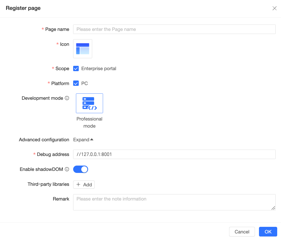
Register Page: On the Pages tab, click Register Page and configure the settings in the Register Page dialog box.
Configuration item
Description
Page name
Enter a custom name for the page. This name appears in the PC enterprise portal customization page selection list to help identify the page. Use a name that reflects its business purpose.
Icon
Select an icon for the page. This icon appears in the PC enterprise portal customization page selection list to visually distinguish custom pages. You can use built-in icons or upload a custom image.
NoteYou can upload only JPG, JPEG, PNG, or GIF images. Each file must be under 100 KB.
Scope
Select where the page can be used. Currently, only enterprise portals support custom pages.
Platform
Select the device type where the page can run. Currently, only PC is supported.
Development mode
Select the development mode for the page. Only professional mode is supported. This means you develop and debug locally using the SDK.
Advanced configuration
Debug URL
The URL used to debug the custom page.
The default is
//127.0.0.1:8001. This points to the enterprise portal page in Quick BI. Change it to your own debug URL if needed.Enable Shadow DOM
When enabled, your custom code is isolated from other page code. This helps with CSS styling isolation.
Third-party libraries
Add third-party dependencies used during development.
Click Add and enter the following information:
Library name: The name used in the import statement. For example, in
import * as echarts from "echarts", the library name is"echarts".Exported name: The name bound to the global object. For example, in
window.echarts, the exported name isecharts.CDN path: The request path used to load the library. The library must follow the UMD module specification.
For more details about third-party libraries, see Third-party Library CDN.
Notes
Add notes for the page.
Edit
To modify the information of a visualization component, click the  icon on its card and update the information in the dialog box that appears. For more information about the configuration items, see Register.
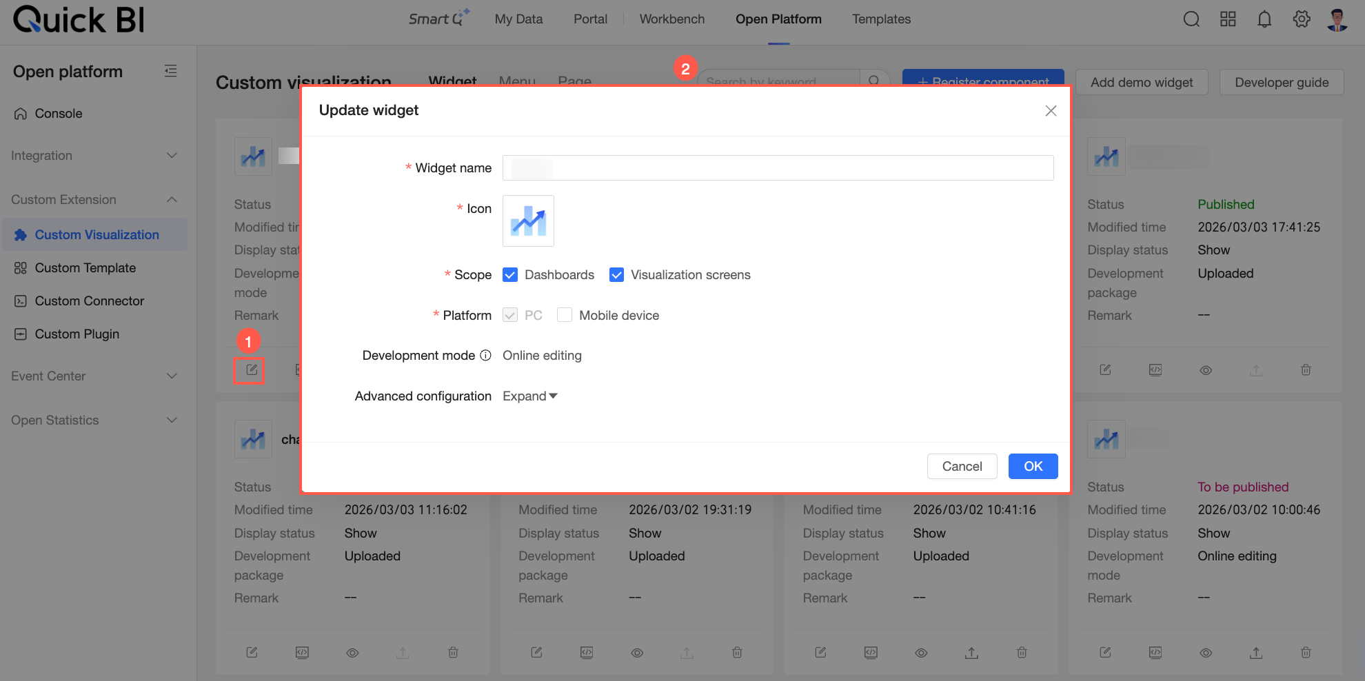
Debug
During development, you can debug your custom visualization. Click the  icon on the card of the component that you want to debug. In the dialog box that appears, configure the debug environment, scope, and other settings. After you configure these options, click Go to Debug to open the host page and view the visualization.
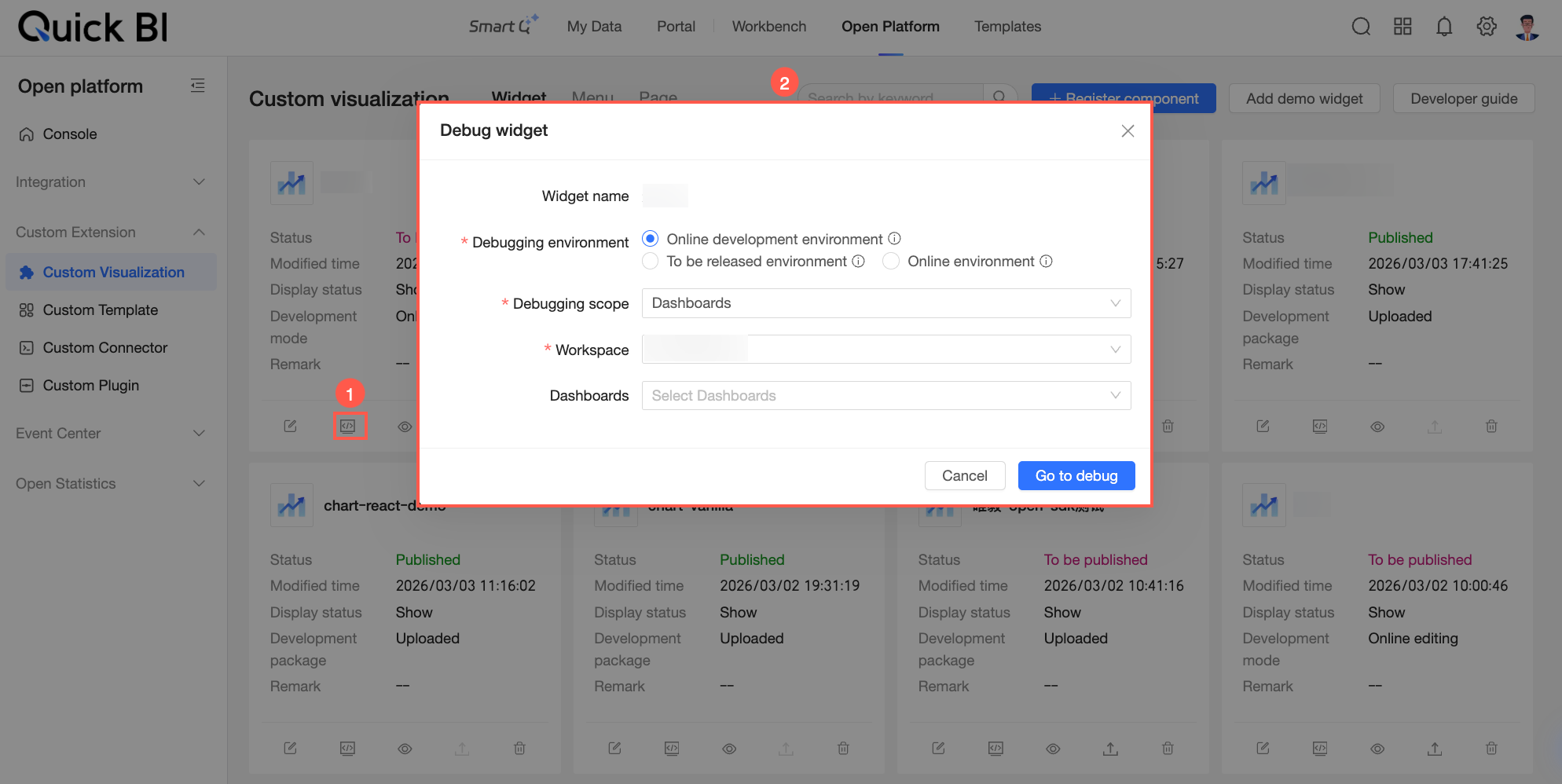
The available debug environments depend on the component’s runtime state. For more information, see Runtime State.
Hide
To hide a visualization component from the asset panel, click the  icon on its card and confirm the action in the dialog box that appears.
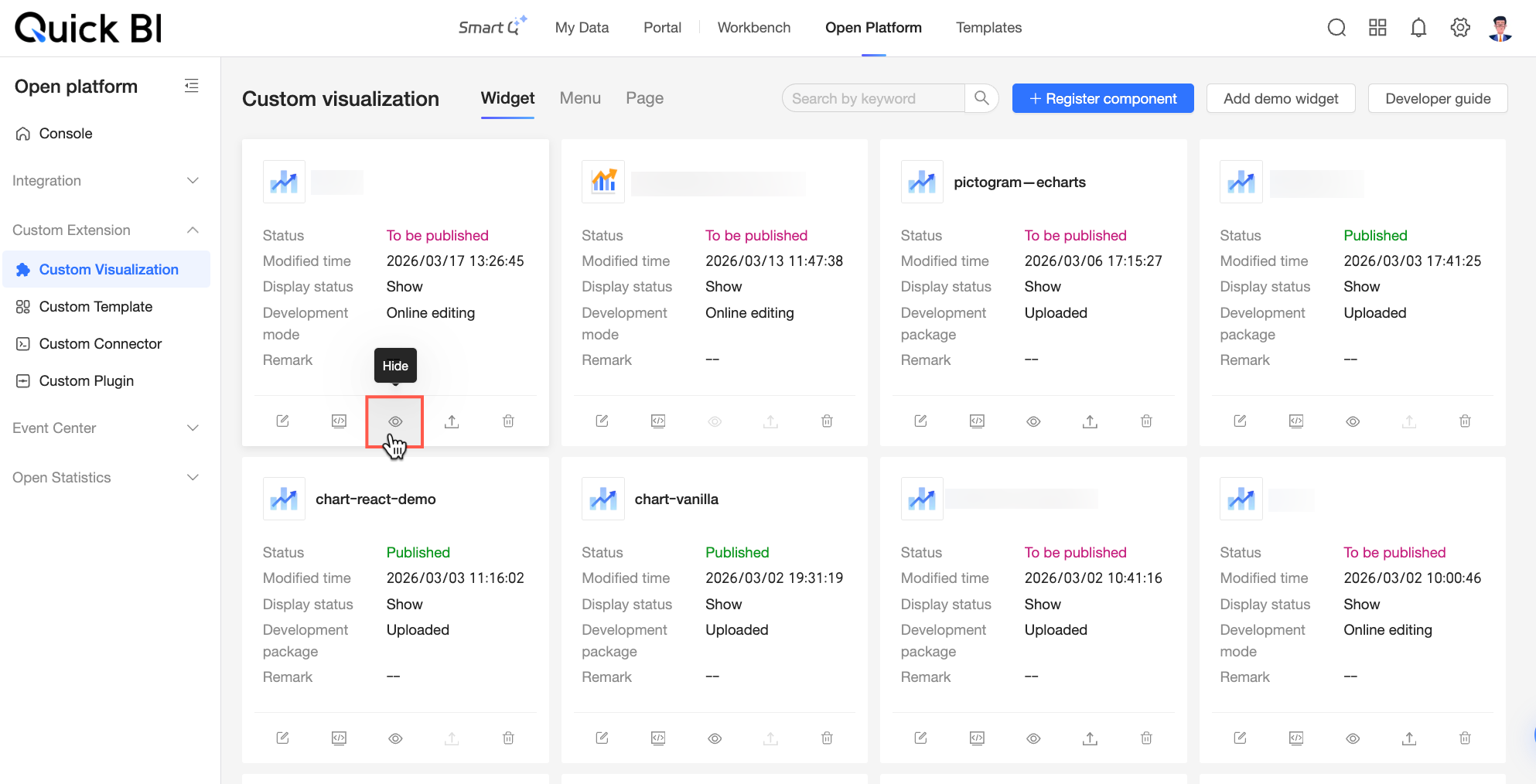
You can hide only components that are in the Pending Publish or Published state.
Hiding a component affects its visibility. For more information, see Visibility State.
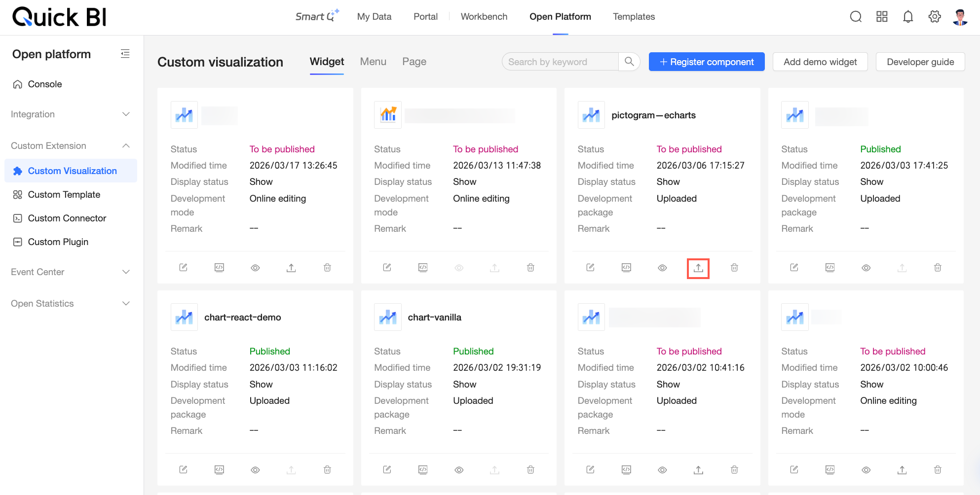
Publish
After you develop and debug a visualization component, you can publish it to the production environment. To publish the component, click the  icon on its card. The publishing steps vary based on the development mode:
Online mode: After you register a visualization component, its status changes to Pending Publish.
 Click the Publish icon (
 ). In the source code dialog box that appears, you can view the component details. Click View Code Diff to view the code changes in the Code Diff dialog box.
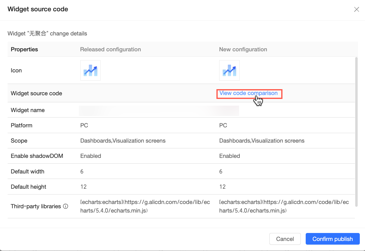 After you confirm the information, click Confirm Publication to publish the component.
Professional mode: A visualization component enters the Pending Publish state after you upload its development package. It also enters this state if you modify information for a published package before the changes are synced to the production environment. In this state, the Publish button on the component card is active.
 Click the Publish icon (). In the source code dialog box that appears, you can view file information. If you re-upload a revised development package for a component that is already published, the change details are displayed.
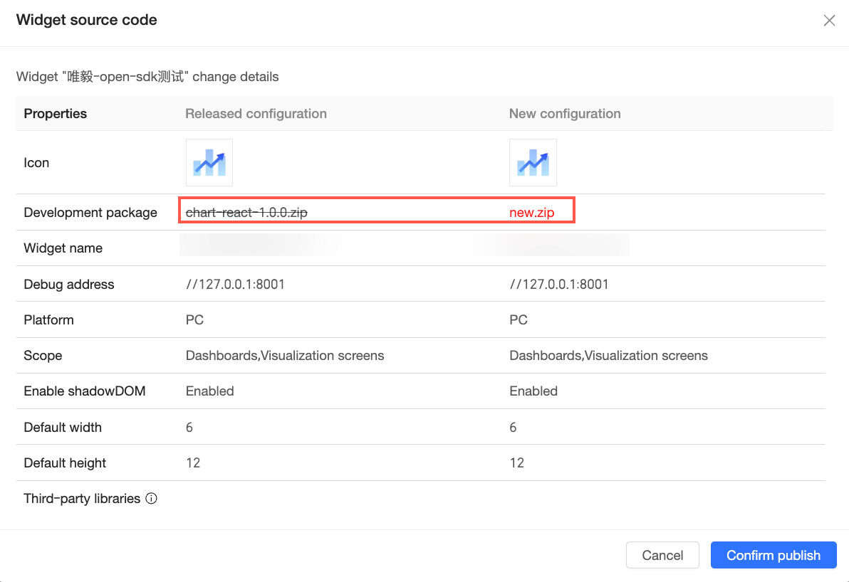 After you confirm the information, click Confirm Publish to publish the component.
Delete
If you no longer need a visualization component, you can delete it. Click the  icon on the component card and confirm the action in the dialog box that appears.
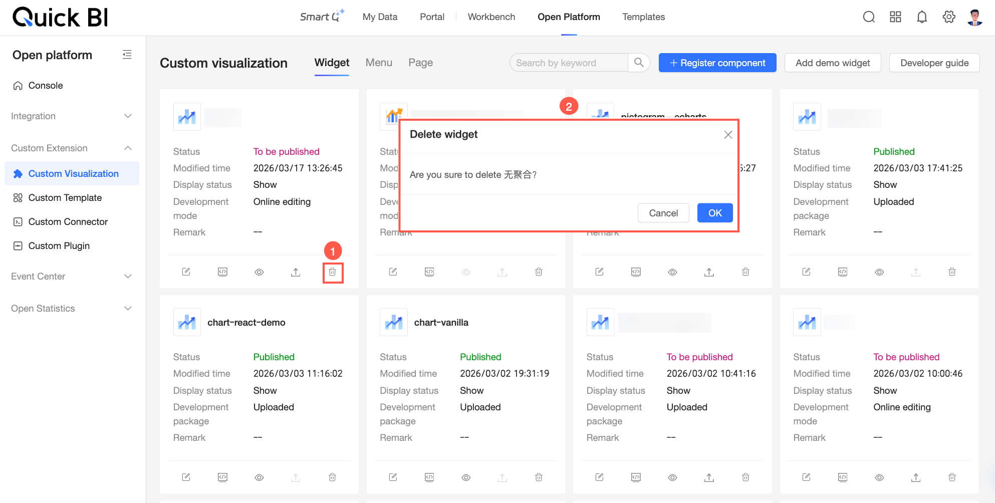
After a component is deleted:
The component no longer appears in the asset panel.
The component is no longer displayed on pages where it was previously used. A message appears in its place, indicating that the component metadata is abnormal or has been deleted.
Component States
Managing custom visualization components changes their runtime state and visibility state.
Runtime State
The runtime state tracks the component lifecycle from registration to deletion. The state depends on the development mode that you selected during registration.
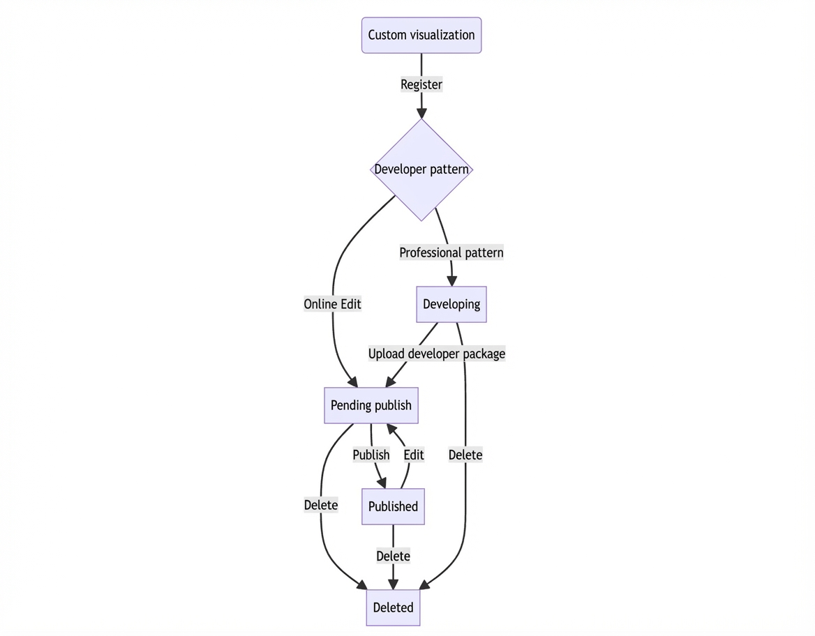
State | Description | Available debug environments |
In development | The component is registered but has no development package uploaded. Only professional mode enters this state. | Local development environment |
Pending publish | The draft state of the component.
| Available debug environments vary by case.
|
Published | The component enters this state after publishing. Only components in this state appear in the host page’s asset panel. Integrated components use the latest published version. | Local development environment, pending-publish environment, production environment |
Deleted | The component enters this state after deletion. It disappears from the host page’s asset panel and becomes unavailable in integrated pages. | / |
Visibility State
The visibility state controls whether a published custom visualization component appears in the asset panel of the host page. The visibility state can be one of the following:
Visible: The component appears in the asset panel.
Hidden: The component does not appear in the asset panel. You cannot add new instances of the component, but existing instances remain active. If you are debugging the component on the host page, it always appears in the asset panel, even if its state is Hidden.
The following table describes how the runtime state and visibility state interact:
Runtime state | Display | Hidden | ||
Asset panel visible | Component Availability | Asset panel visible | Component Availability | |
In development | Visible | Usable | Visible | Usable |
Published | Visible | Not usable | Not visible | Usable |
Deleted | Not visible | Not usable | Not visible | Not usable |