This topic describes how to manage dashboard topics.
Prerequisites
A dashboard is created. For more information, see Create a dashboard.
Background information
Quick BI Pro supports custom dashboard themes:
If you are an administrator of an organization, you can select an official recommend theme or add a custom theme.
If you are a non-administrator of an organization, you can select an official recommend theme or an existing custom theme. You cannot add a custom theme.
Procedure
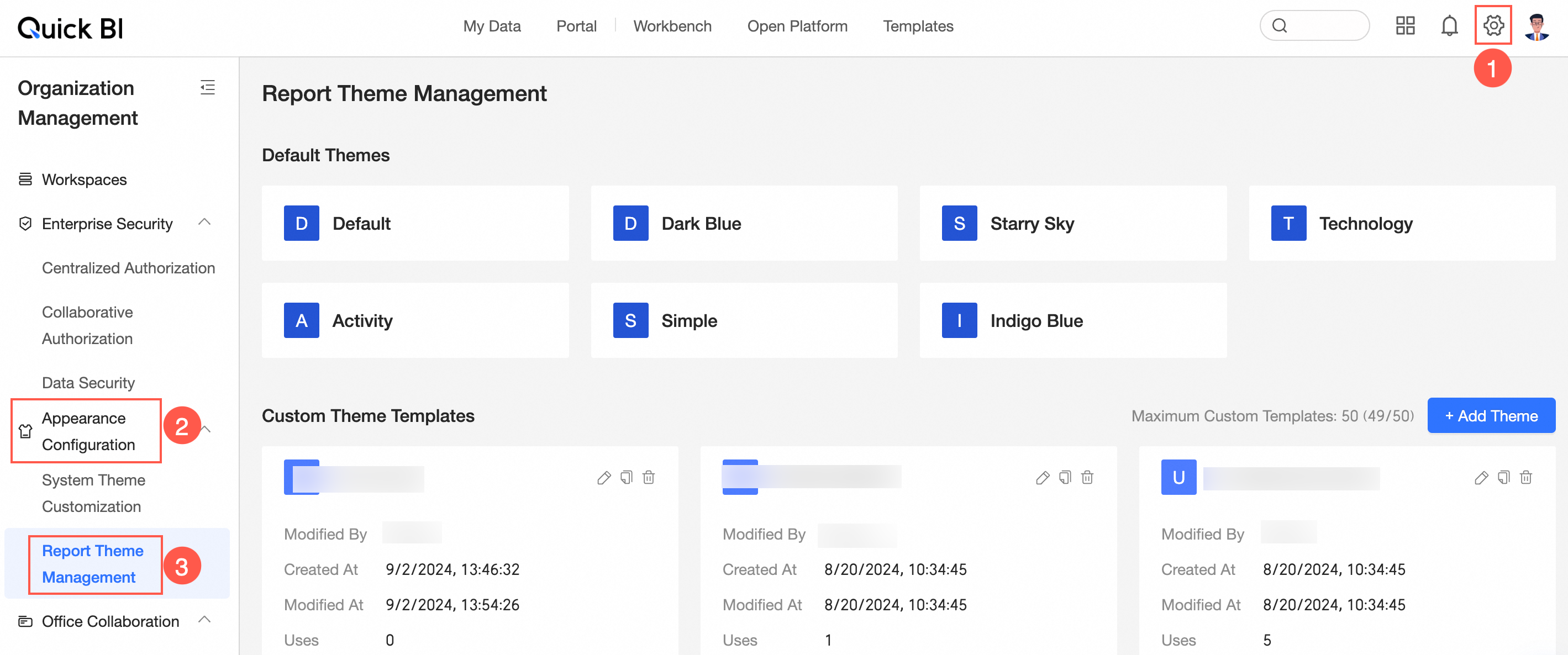
On the homepage, follow the instructions in the following figure to go to the Report Subject Management page.
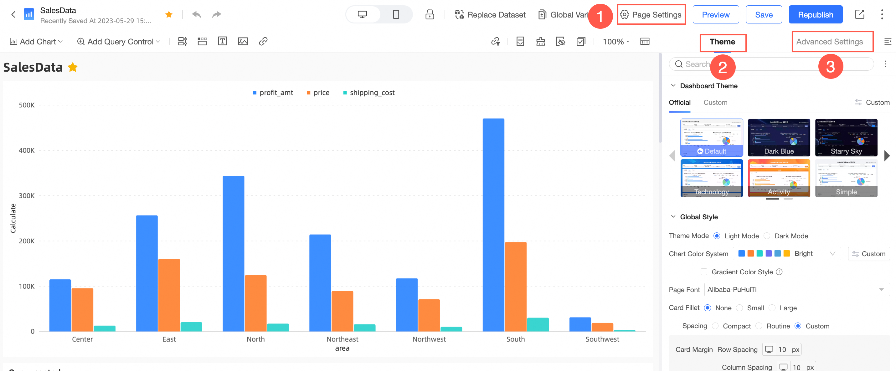
You can also choose Page Settings> Themes> Custom from the dashboard editing page to go to the Themes page.
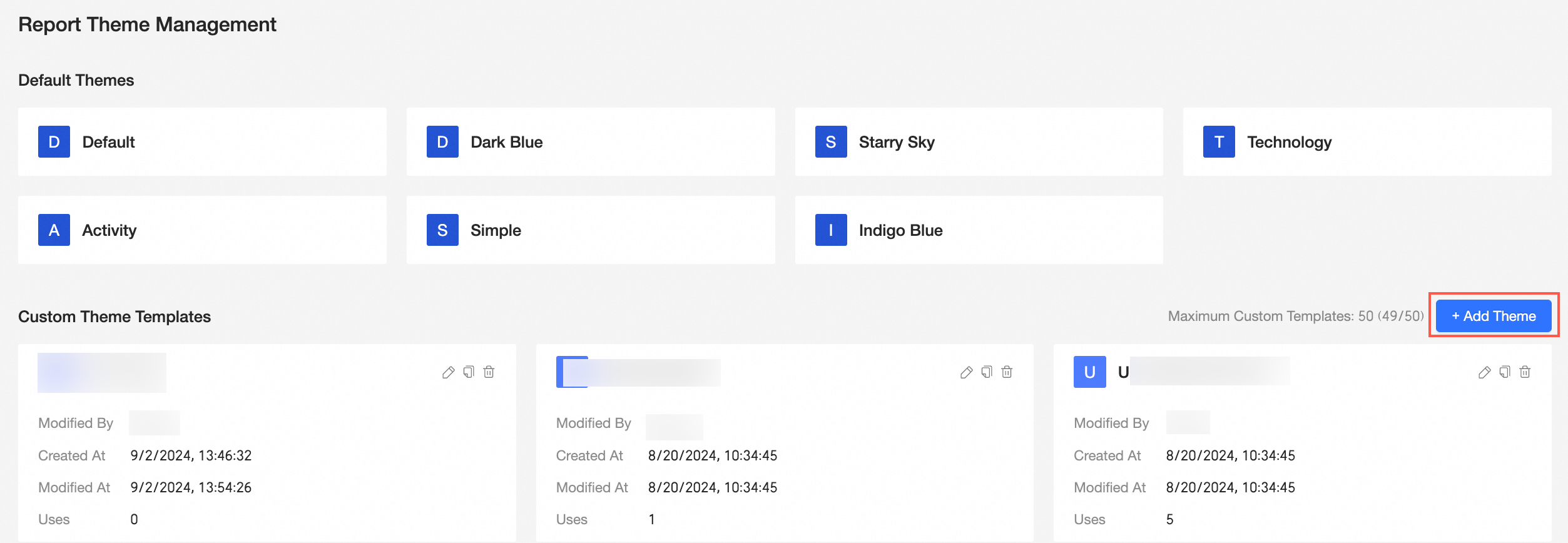
Add a theme
Click Add Topic.
Go to the Theme Design page.
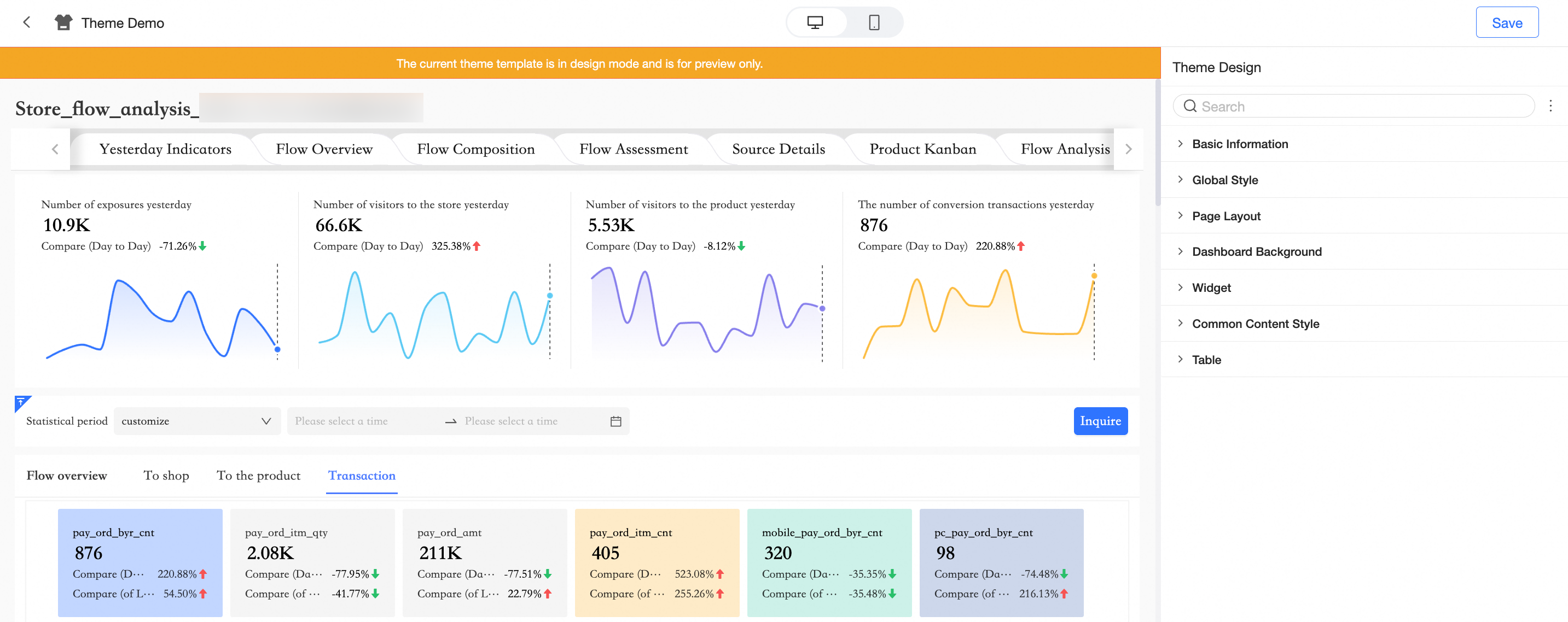
You can configure the following parameters in:
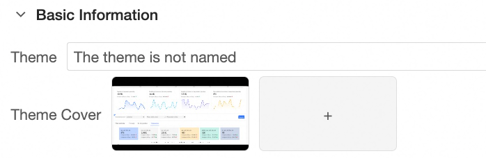
In the Basic Information section, configure the topic name and topic cover.
In the Global Style section, configure the global style of the theme.
Chart configuration items
Parameters
Theme Mode
Light and dark modes are supported.
Chart Color
You can configure template colors and customize colors.
Gradient Color Style
You can select a gradient color style to achieve the effect of a theme gradient.
Page Font
Configure the font type on the chart page.
Card Fillet
Configure the radian of the corners of the chart card. No rounded corners, small rounded corners, or large rounded corners are supported.
Spacing
Compact, regular, and custom are supported.
Inter-Card Spacing
You can set and adjust the card row spacing and column spacing only in the spacing selection custom mode.
Card Pane
You can adjust the distance between the top, bottom, left and right edges of the card only when you select Custom Spacing.
In the Page Layout section, configure the following parameters.
Chart configuration items
Parameters
Page Information
You can configure the content of the title area, story outline, and footer.
Page Background
Configure the background color. You can select whether to overlay the background image.
Page Width
The adaptive and fixed methods are supported.
NoteIf you select Fixed, you must set the pixel size of the page margin. After you set the Page Margins parameter, you cannot adjust the pixel size of the page margin.
Margins
Margins can be selected from regular, extra-wide pages, and custom three ways.
In the Background section, configure the following parameters.
Chart configuration items
Parameters
Top Image and Bottom Image
When you select an image, you can select an existing image or a custom image and configure the content area margin gap.
NoteWhen you select a custom image, you can choose to upload a local image or upload it by using the link of the target image.
In the Components section, configure the following parameters.
Chart configuration items
Parameters
title
Text
Set the font size and alignment of the chart title.
line separator
Set the color and width of the title line separator.
Custom Title Background
You can configure the background of the title and the position of the title area.
If you select Monochrome, you can set Background Color.
When you select a gradient, you can configure Gradient Color and Gradient Angle.
When you choose Custom, you can choose to use a material or a custom image.
NoteWhen you select a custom image, you can choose to upload a local image or upload it by using the link of the target image.
The position of the title area can be Inside, Edge, or Above.
Status icon
You can configure the Status icon or Always Show and set the color of the Status icon.
Hide more operations in the preview mode
After you select this configuration items, the More Actions selection entry is hidden on the Preview page.
Background Style
Scaling
Sets whether the background displays a fill color.
Overlay background image
Overlay image materials or custom images for the chart background.
Borders
Sets whether the border is displayed for the background and the border color.
Show Shadow
Sets whether the background displays shadows.
In the General Content Style section, set the following parameters.
Chart configuration items
Parameters
Figure Style
Axis Title
Set the font size and color of the axis title.
Axis Labels
Set the font size and color of the axis label.
Tag
Set the label font size and color.
Tooltips
Set the tooltip font size and color.
Legend
Set the font size and color of the legend.
Table Style
Style settings
You can set the style here, supporting zebra crossing, wireframe, simplified version, minimalist four styles.
main color system
You can set the main color system here. The theme color, gray color, and custom color system are supported.
Table header
Set the font size and color of the header.
The content of the document.
Set the content font size, color, and so on.
TAB component area
TAB Selected Style
You can set the TAB selection style here. Three styles are supported: underscores, line separator, and Selected Block.
Tab Label Style
You can set the font size, default state style, and selected state style of tab labels.
Tab bottom line separator
If the title is located inside the chart, the title line separator coincides with the bottom line separator of the tab, which must be configured separately in the title style.
Display TAB Internal Visualization Card Border
Set whether to display the border of the visualization card inside the TAB. You can select a color.
Query Control Area
Borders
Specifies whether to display the border of the query control. You can select a color.
Interactive Button
The color of the Interactive Button.
Button fillet
You can set the rounded corners of interactive buttons.
Conditional spacing
You can set the Conditional Spacing parameter.
Condition Name
You can set the text style of the Condition Name.
Universal Style
You can set the Marquee Style parameter.
Background Color
You can set the background color of the marquee.
Borders
Supports setting the thickness and color of the marquee.
Round Angle
The rounded corners of the marquee.
Text index
You can set the text color and font size of the marquee.
In the Tables&Cross Tables section, configure the following parameters.
Chart configuration items
Parameters
Style settings
Supports default, simplified, and simplified versions (without header)
main color system
If you set the Style parameter to Default, you can set Default Color and Custom Color.
Header Background
When Style is set to Default, you can set the background color of the header.
Style settings
You can set the header text color and content text color.
Click Save.
Manage custom theme templates
You can edit, copy, and delete an existing custom theme template.
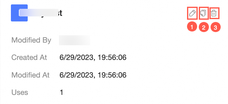
① Edit
Click the  icon to go to the Theme Design page, where you can modify existing configurations.
② Copy
Click the  icon Copy to copy the custom theme template.
③ Delete
Click the  icon to delete a custom theme template.