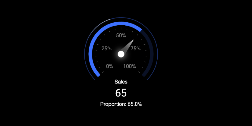
A gauge visually represents the status of a specific metric, typically to show its proportion. For example, you can use a gauge to display the inventory status of a product category to determine if the stock is sufficient or needs to be replenished. This topic describes how to add data to a gauge and configure its style.
Preview
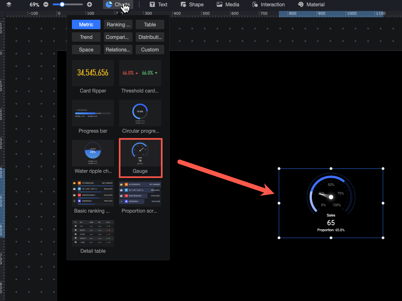
Configure Data
In the component library, under Charts, find the Gauge component and drag it to the canvas.
In the Data area, select a dataset and configure the fields for the chart as follows.
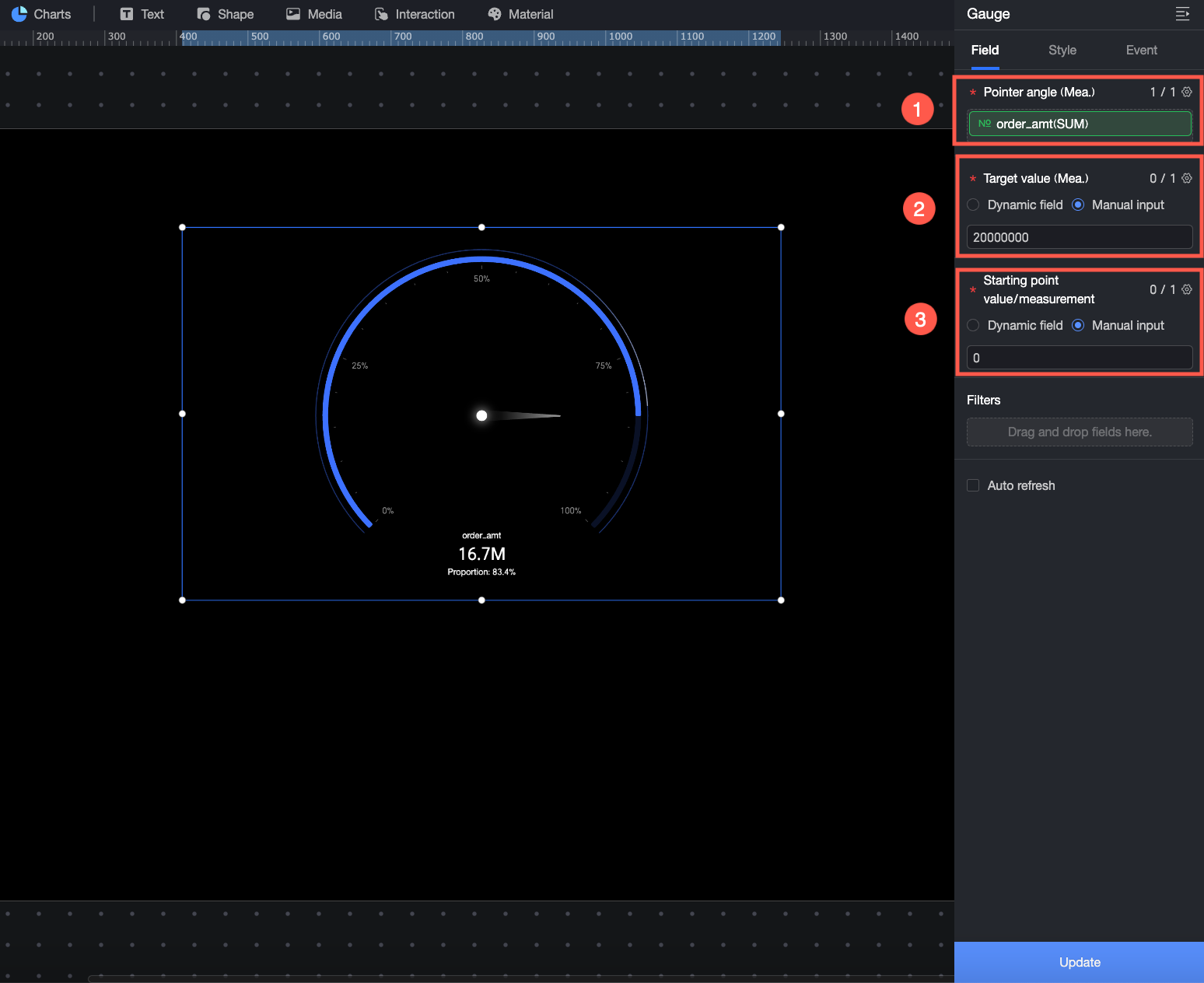
① In Pointer Angle/Measure, drag the core measure that you want to display. For example, to view order amount performance, drag the Order amount field.
② In Target Value/Measure, set a target value for the measure in Pointer Angle/Measure to view its completion status and proportion. For example, you can enter a target value for the order amount to see the completion status of the current order amount measure. You can drag a dynamic field or manually enter a target value.
Dynamic field: The target value is dynamically updated based on business data. This is suitable for scenarios where the target value needs to be automatically adjusted based on time and business conditions, such as for frequently changing measures like inventory levels.
Manual input: Set a fixed target value. This is suitable for scenarios with fixed targets, such as annual sales goals or project budgets.
③ In Start Value/Measure, set the start value for the pointer, which is the starting point of the gauge scale. You can drag a dynamic field or manually enter a value.
Dynamic field: Use a dynamic field when the start value needs to update automatically with data changes. For example, in a gauge that displays sales performance, if the start value for each month must automatically adjust to the sales on the first day, you can set a dynamic field that represents the start-of-month sales as the start value.
Manual input: Manually enter a start value when you have a clear and fixed starting point. For example, if annual sales need to accumulate from 0, you can set 0 as the start value.
You can also perform the following operations on the data fields: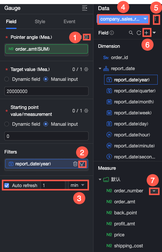
Configure field formats in batches (①). For more information, see Configure field styles in batches.
Set filters for fields (②). For more information, see Filter data.
Set up auto-refresh for the data (③). For more information, see Refresh data on a schedule.
Switch datasets (④). For more information, see Switch datasets.
Edit datasets (⑤). For more information, see Edit datasets.
Process data (⑥). For more information, see Create Calculated Field, Create a grouped dimension, and Placeholders.
Copy fields (⑦). For more information, see Copy and convert to a dimension.
Configure Styles
Position and Size
You can configure the following component settings in the configuration area.
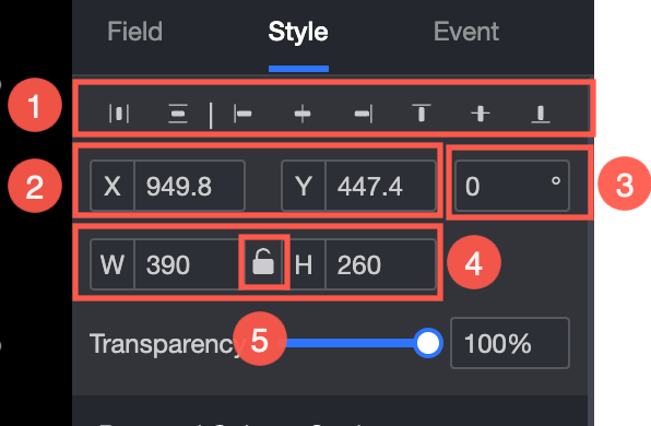
Adjust the component's alignment (①). The options are align left, center, and align right.
Adjust the component's position (②). You can set the X and Y axis values to adjust the position relative to the top-left corner.
Adjust the component's angle (③). You can set the rotation angle value.
Adjust the component's size (④). You can set the W and H values to adjust the width and height of the component.
Lock the component (⑤). After a component is locked, you cannot adjust its size.
Adjust the opacity (⑥). You can set the opacity of the component.
Gauge Style
In the Gauge Style area, you can configure the gauge style. The following operations are supported.
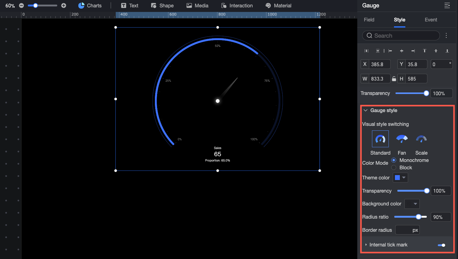
Visualization Style Switch: Set the overall style of the gauge. You can select Standard, Fan, or Scale.
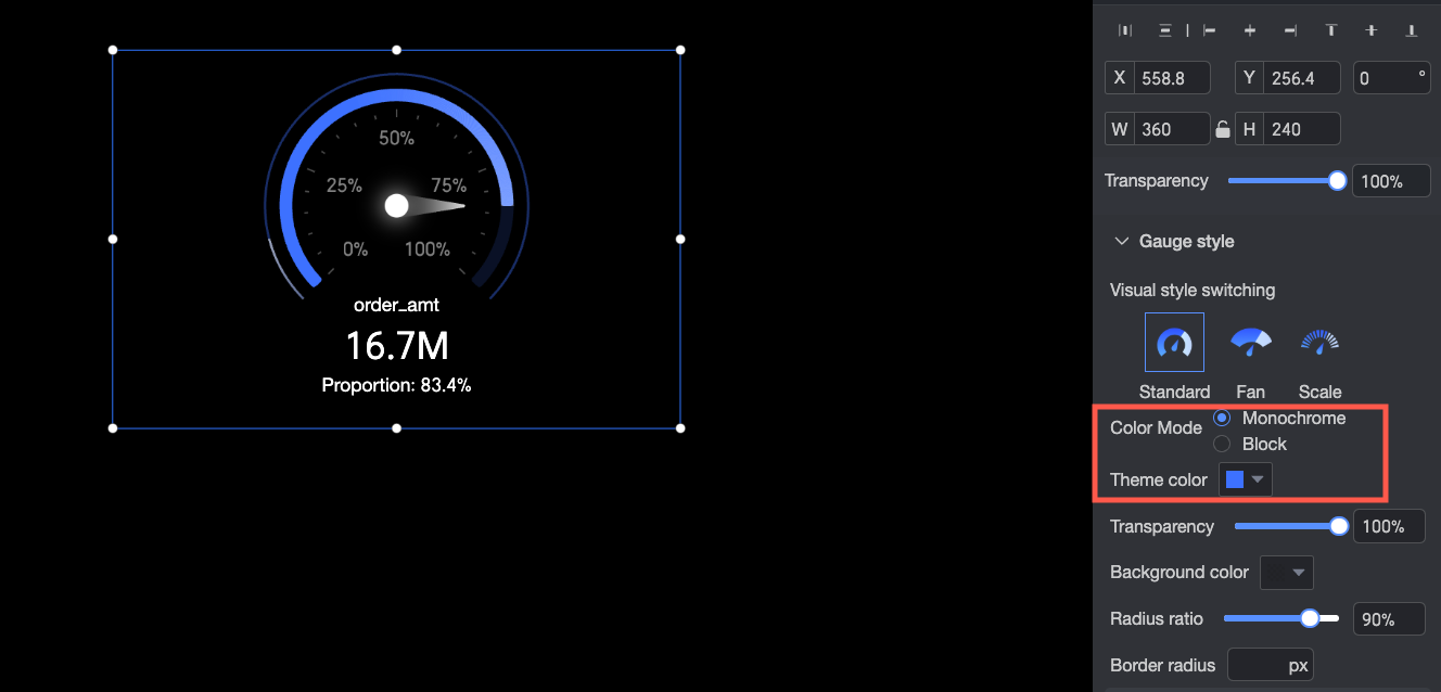
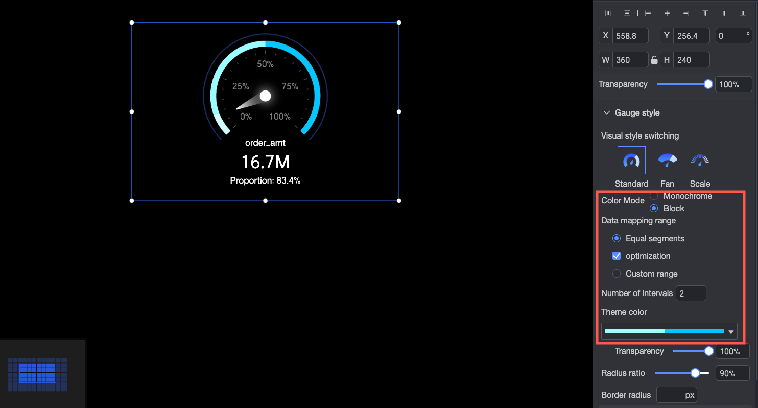
Color Mode: Set the color mode for the gauge. The options are monochrome or color by section.
When you select Monochrome mode, the entire gauge uses a single color. In the Theme Color section, you can customize the color of the data bar and set the Background Color.
When you select Color by Section mode, different data ranges can be represented by different colors. In the data mapping range, you can set the data partitioning method and customize the colors in the Theme Color section.
Opacity: Set the opacity of the data bar.
Radius Ratio: Set the radius size of the gauge.
Border Radius: Set the border radius value for the gauge.
Inner Ticks: Set whether to display inner ticks on the gauge. You can select whether to display them as a Percentage or the Original Data Value.
Data Labels
In the Data Labels area, you can perform the following operations.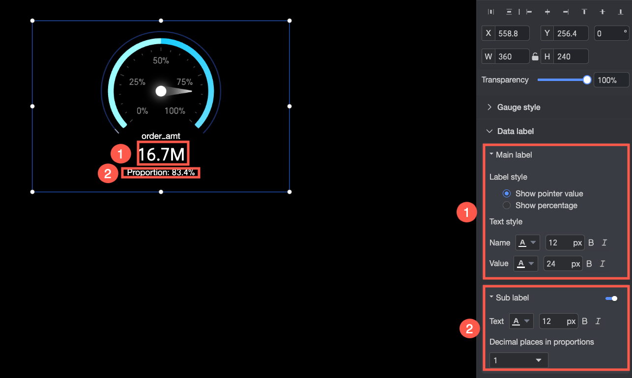
① Primary Label: Configure the primary label style.
Label Style: Set the display format for the primary label. You can choose to Show Pointer Value or Show Percentage.
Text Style: Set the text style for the primary label name and value. You can configure settings such as font color and size.
② Secondary Label: Choose whether to enable the secondary label and configure its style.
Text: Set the text style for the secondary label. You can configure settings such as font color and size.
Decimal Places for Percentage: Set the number of decimal places for the percentage value.
Animation Effects
In the Animation Effects area, you can configure the display animations for the gauge.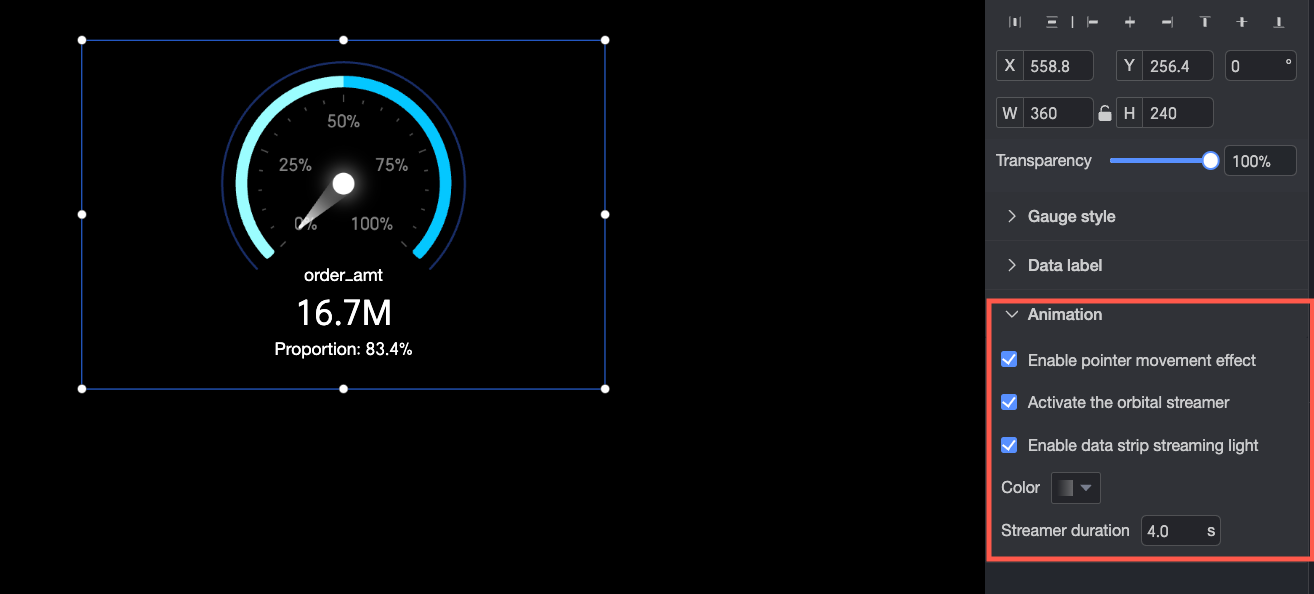
Enable Pointer Animation: Set whether to enable the animation effect for the pointer as it moves.
Enable Track Streamer Effect: Set whether to enable a flowing light effect on the track.
Enable Streamer Effect: Set whether to enable a flowing light effect on the data bar. If enabled, you can set its Color and Streamer Duration.