Getting started with visualization screen
Visualization Screen is a cool big screen for enterprise data consumers, which combines visualization and scene narrative technology and runs on smart devices with contactless connection. It meets CXO cockpit, business monitoring, external PR and other scenes, thus promoting enterprise data group consumption.
Common application scenarios of data big screen include CXO cockpit, activity data monitoring, project meeting demonstration, external reception or PR, etc. It is an important part of the four Quick BI data analysis scenarios and is committed to meeting the data display scenarios with high visualization requirements of enterprises.
You can follow these steps to complete the quick start:
Limits
Data visualization screen applies only to group spaces of the Advanced and Enterprise Standard versions.
Create a visualization screen
After you log on to the Quick BI console.
On the Quick BI product homepage, create a visualization screen by following the instructions shown in the following figure.
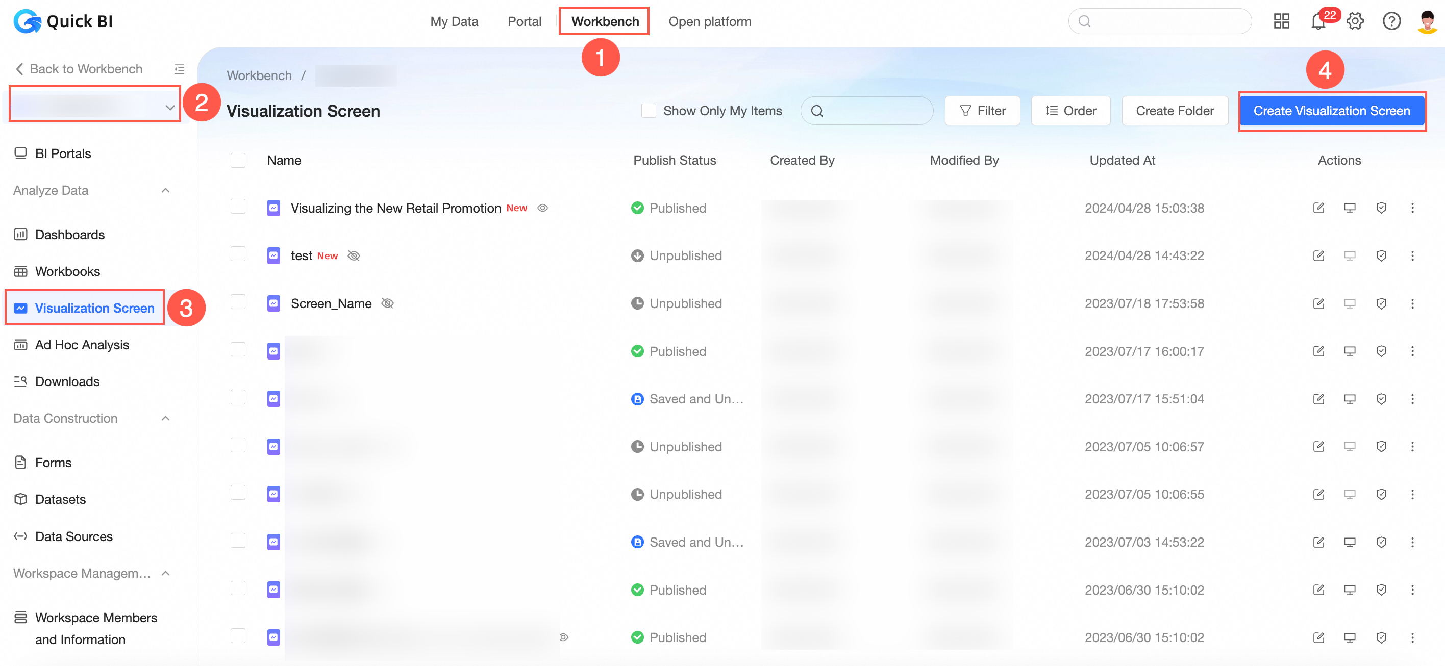
After the creation is complete, go to the data editing page.
For more information, see Overview.
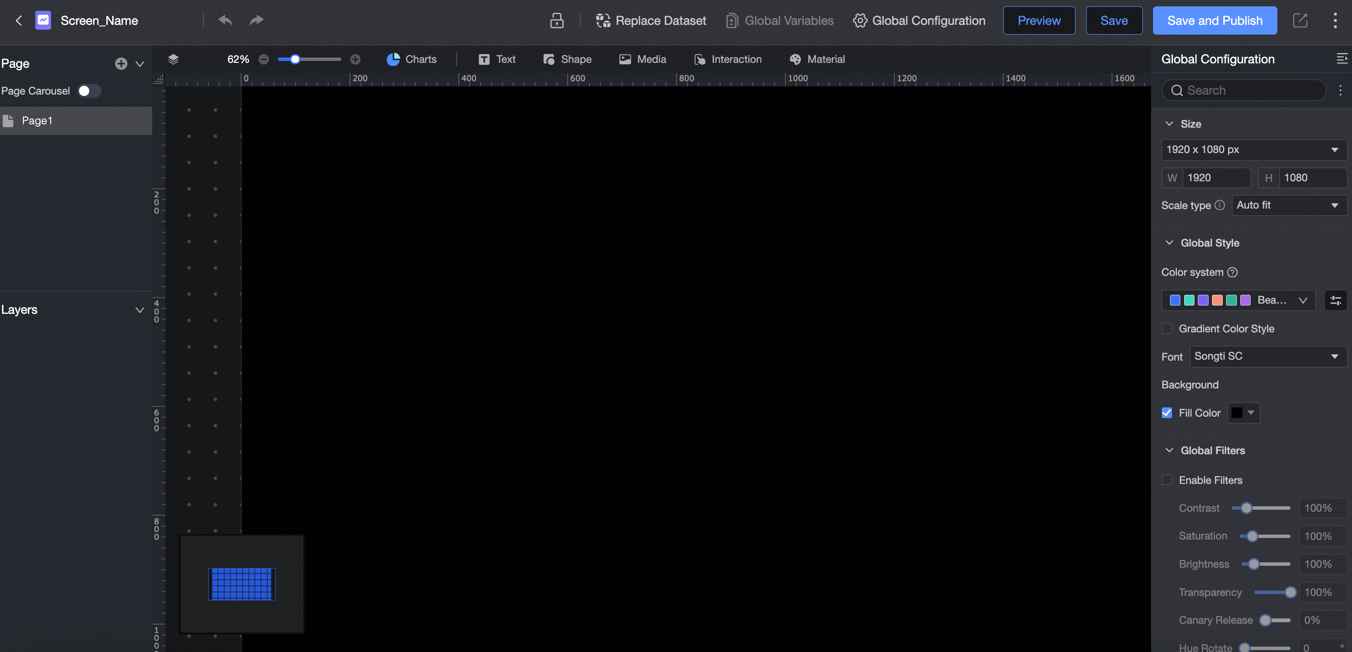
Set data visualization screen parameters
This section describes how to create multiple large-screen pages, make screen groups, scale the canvas, and adjust the global style.
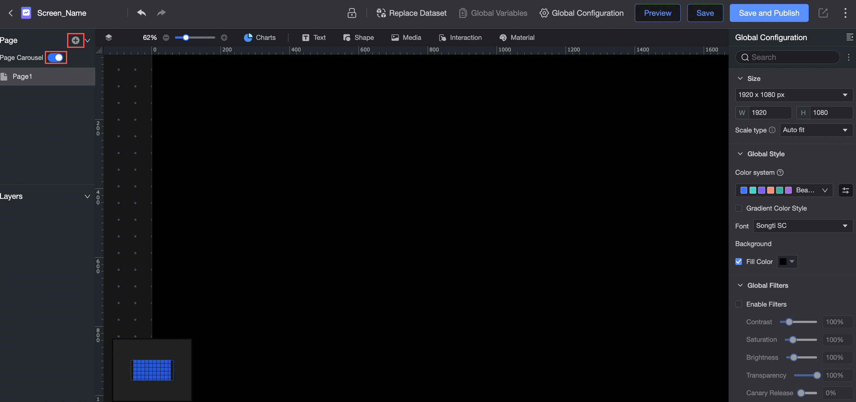
Click the
 icon to turn on Page Carousel.
 You can configure multiple pages. The order of the pages can be adjusted.
Automatic page carousel is supported. You can adjust relevant parameters in global configuration.
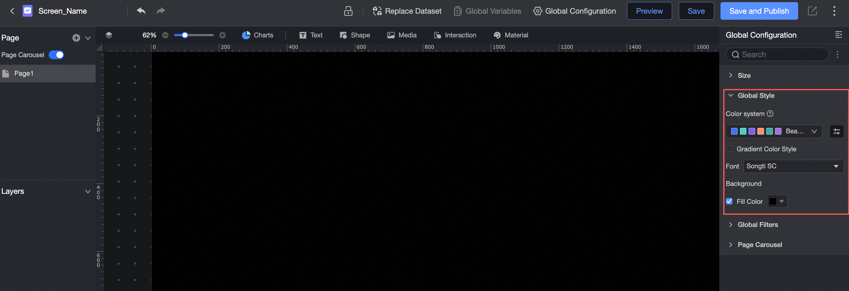
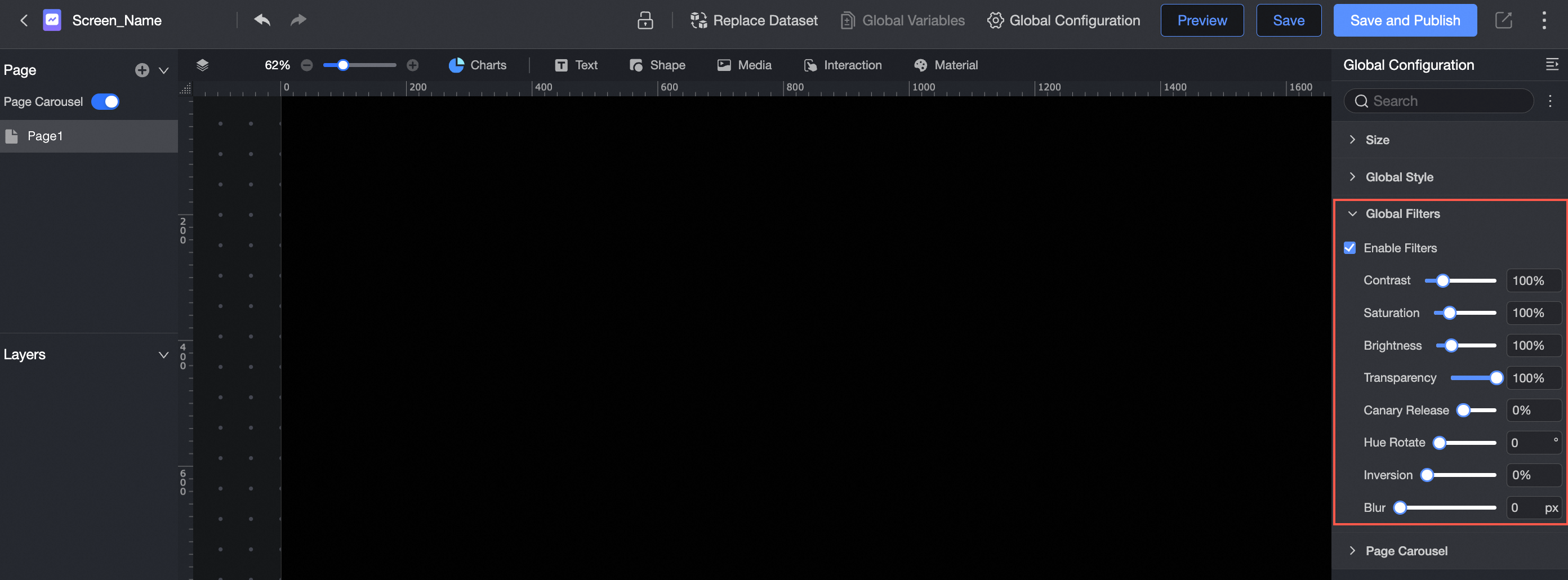
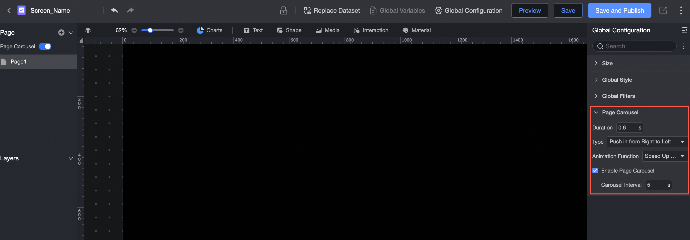
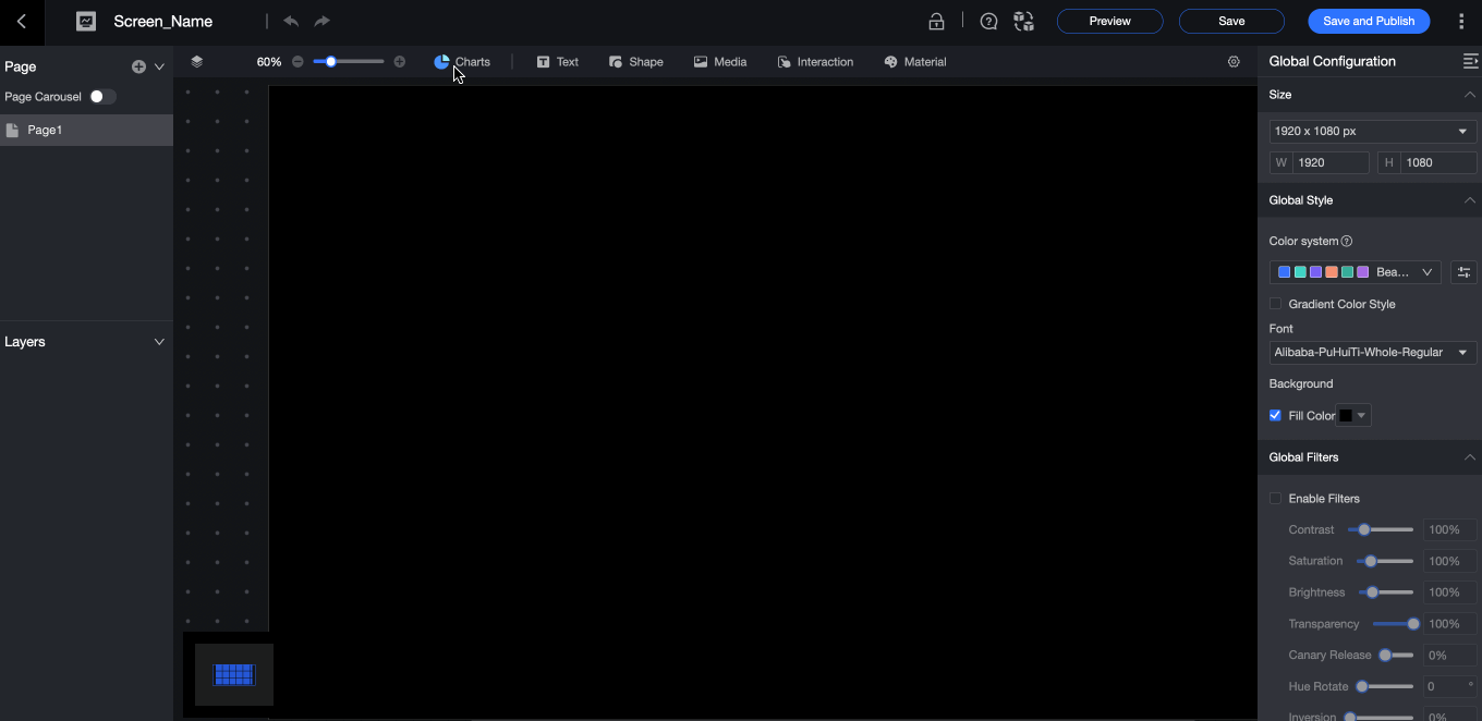
You can set Size, Global Style, Global filter, and Page carousel in the Global Settings section.
Size
You can adjust the zoom ratio of the canvas to the desired zoom ratio based on the screen size. This allows you to edit and view data on various screens.
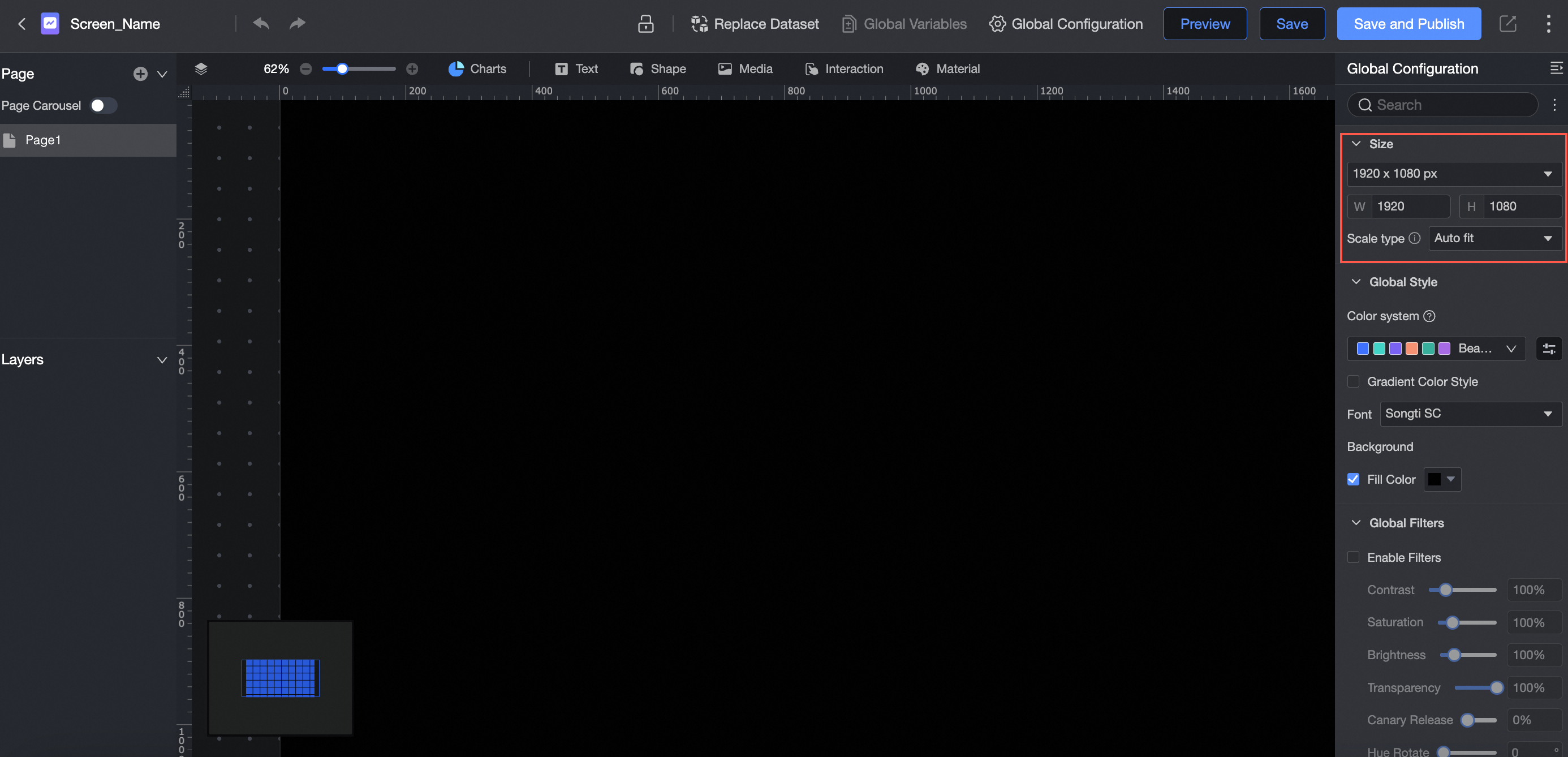
Global Style
You can configure colors, gradient color styles, fonts, and background fills.

Global filter
You can configure the contrast, saturation, brightness, and transparency.
Page carousel
Supports setting transition duration, transition type, animation function, and enabling page carousel and carousel interval.
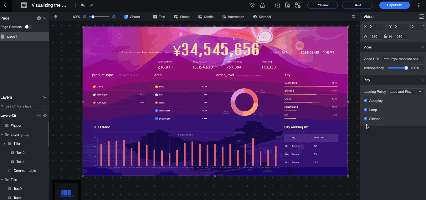
Create a data visualization screen widget
Data visualization provides seven types of charts, as well as a wide range of text, media, interactive controls, and materials to meet the needs of diverse visualization. This topic describes how to create and configure a project widget.
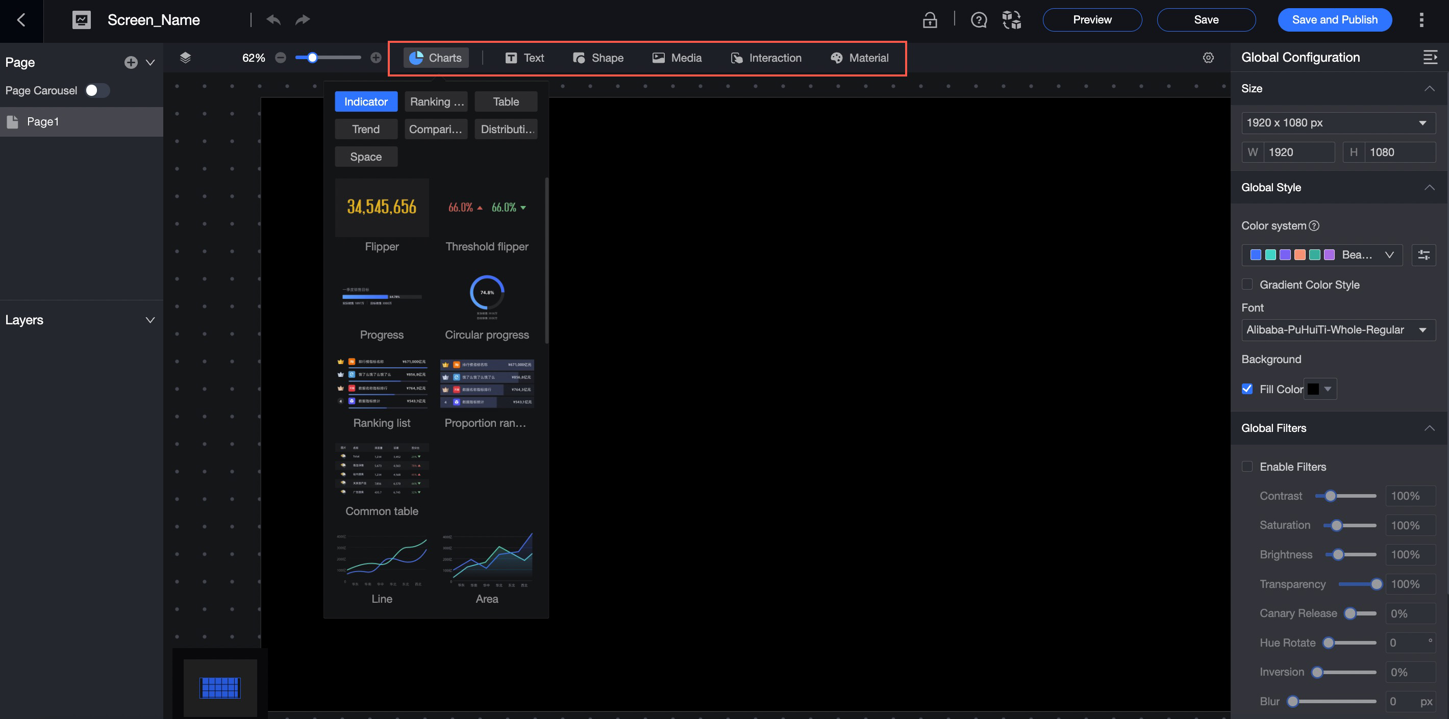
In the head navigation bar, drag a widget to the canvas.
Introduce dataset data and configure chart fields.
You can configure chart fields in the same way as in a dashboard. For more information, see Configure chart fields.
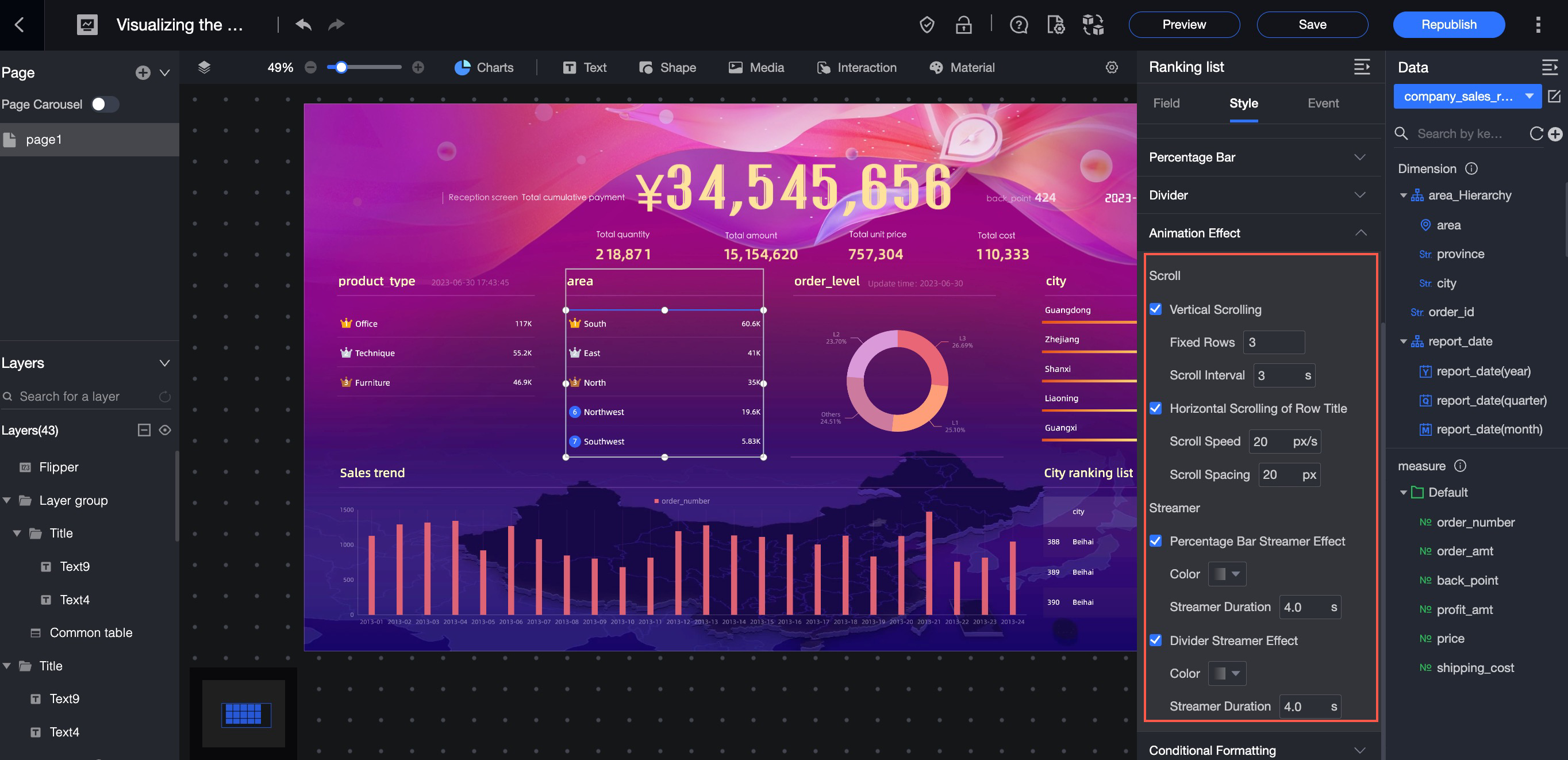
Configure the chart style.
Fine-grained style configuration properties: You can configure the style of a chart element. You can configure the color, font, position, arrangement, width, etc.
Rich animation effects: supports streamer, page turning, scroll, and other animation effects.

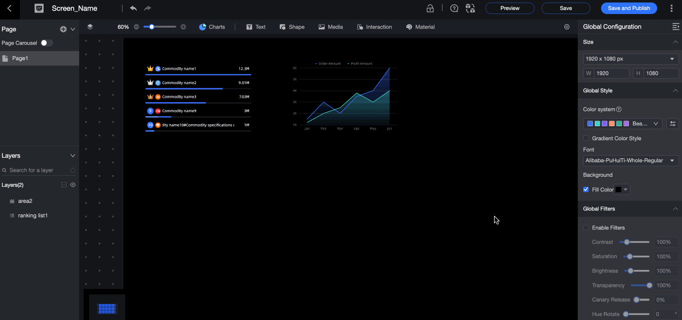
Configure layer groups
One element in the canvas is a layer. This section describes how to configure a layer group and enable layer carousel.
Select and right-click two layers to form a layer group.
In the layer group on the right, select Enable Layer Overlay and adjust the transition duration, transition type, and animation function.
Select Enable Auto-carousel and set the carousel interval.
Flexible canvas layout adjustment
This topic describes the layout of a data dashboard.
Compared with dashboards, the data dashboard uses a more flexible way to adjust the canvas. You can drag and drop components on the canvas, move them pixel-by-pixel, cut, copy, lock, hide, and combine components, and control the layout of the canvas. 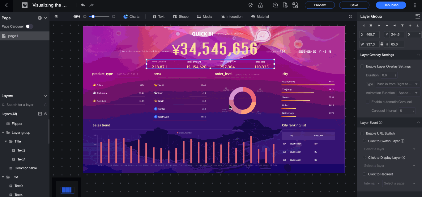
Preview the visualization screen effect
This section describes how to preview a visualization screen, which includes two modes: Preview Page and Preview Visualization Screen.
Procedure
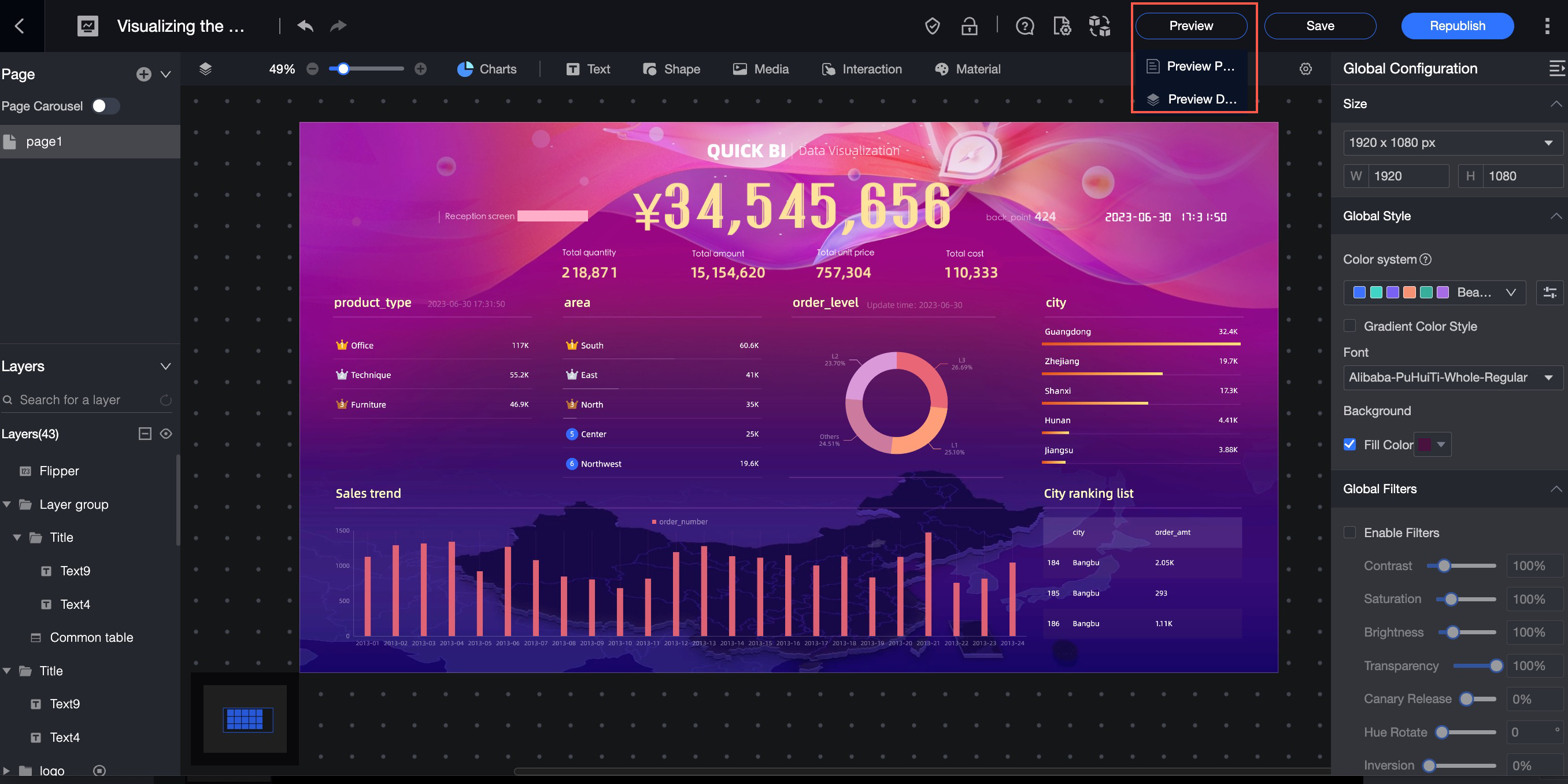
Preview page
Preview only the current page. In this mode, the navigation bar is retained. 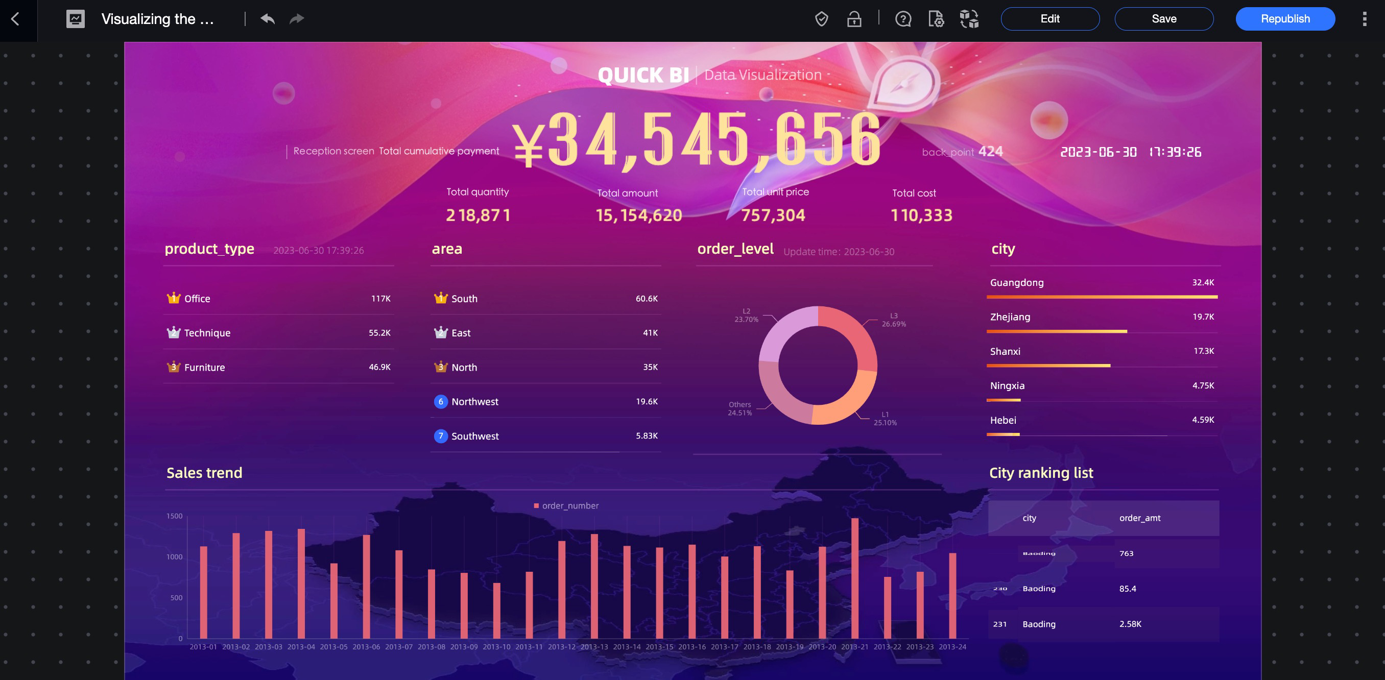
Preview the visualization screen
Preview the entire visualization screen, the same as the screen effect. If multiple pages are configured, you can view the multi-page effect here.