|
Advanced Control Type
|
Cluster parameter settings
|
|
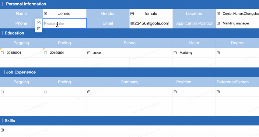
Tree drop
-
Effect display 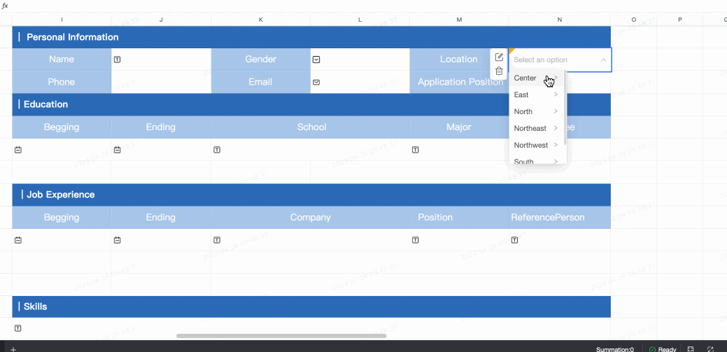
-
Control configuration 
|
-
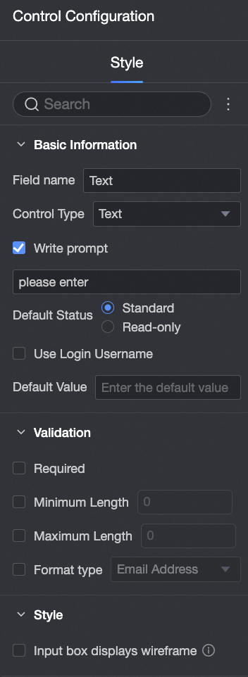
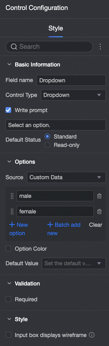
Basic information:
-
Field Name: You can customize the field name.
-
Control Type: You can switch to another control type.
-
Enter tips: You can customize the tips displayed in the Enter status.
-
Default: If you do not select Read-only, the control can be edited. If you select it, the control cannot be edited.
-
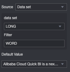
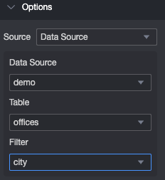
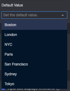
Option
-
Select Dataset Source and select the dataset and data fields on which you have permissions. You can specify up to five fields. 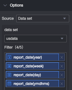
-
Select Source, and then select the data source, table, and linkage field on which you have permissions. 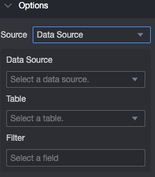
-
Validation
-
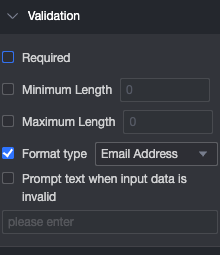
Required: This control is required by default.
-
Prompt text when input data is invalid: This configuration items only takes effect when a verification condition is valid. For example, if required is selected and no option value is filled in, a custom error copy is prompted.
-
Style
|
|
Upload images
-
Effect display 
-
Control configuration 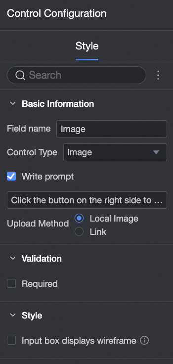
|
-
Basic information:
-
Field Name: You can customize the field name.
-
Control Type: You can switch to another control type.
-
Enter tips: You can customize the tips displayed in the Enter status.
-
Upload Method: You can select Local Image or Link.
-
Validation
-
Required: This control is required by default.
-
Prompt text when input data is invalid: This configuration items only takes effect when a verification condition is valid. For example, if required is selected and no option value is filled in, a custom error copy is prompted.
-
Style
|
|
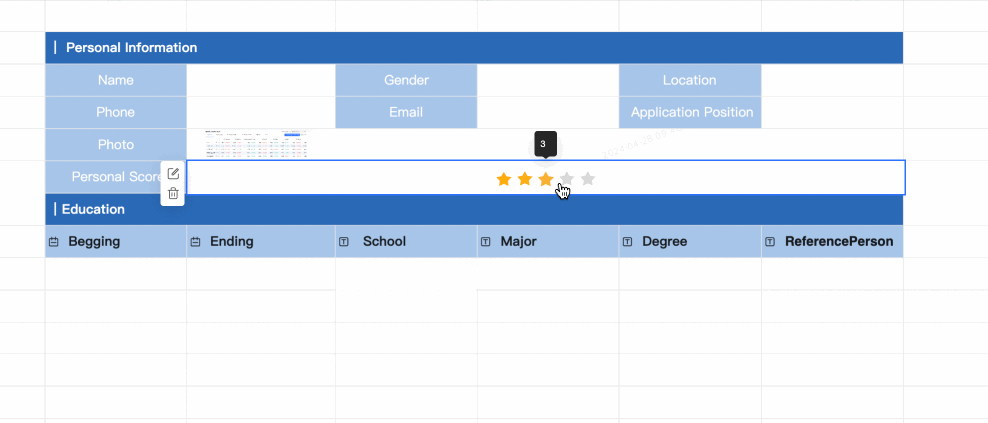
Score
-
Sample output
-
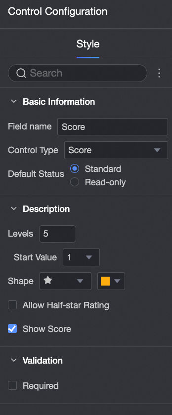
Control configuration
|
-
Basic information:
-
Field Name: You can customize the field name.
-
Control Type: You can switch to another control type.
-
Default: If you do not select Read-only, the control can be edited. If you select it, the control cannot be edited.
-
Description
-
Gear number: support manual setting gear number, the maximum value is 10.
-
Start Value: Set the start value. You can select 0 or 1.
-
Shape: Set the Shape and Color of the scoring block. 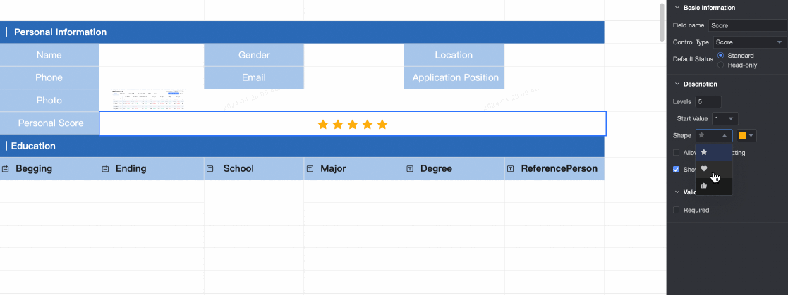
-
Allow Half-Star Scoring: Select whether to allow half-star scoring.
-
Show Score: Select whether to show the scoring score. 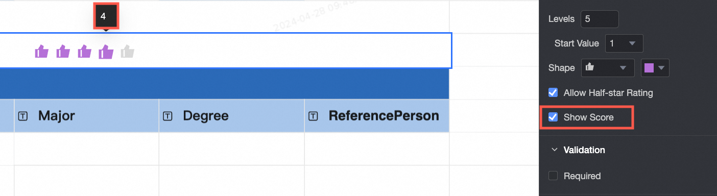
-
Validation
-
Required: This control is required by default.
-
Prompt text when input data is invalid: This configuration items only takes effect when a verification condition is valid. For example, if required is selected and no option value is filled in, a custom error copy is prompted.
|
|
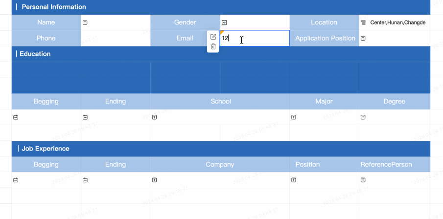
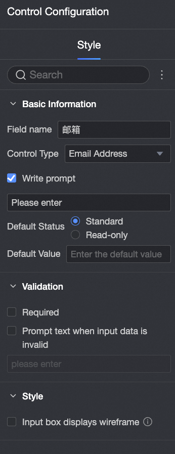
Mailbox
-
Sample output
-
Control configuration
|
-
Basic information:
-
The name of the field. The default value is Email. You can customize the field name.
-
Control type, you can switch to other control types.
-
Enter tips: You can customize the tips displayed in the Enter status.
-
Default: If you do not select Read-only, the control can be edited. If you select it, the control cannot be edited.
-
Default Value: the default value displayed in the Enter status.
-
Verification:
-
Required: This control is required by default.
-
Prompt text when input data is invalid: This configuration items only takes effect when a verification condition is valid. For example, if required is selected and no option value is filled in, a custom error copy is prompted.
-
Style:
|
|
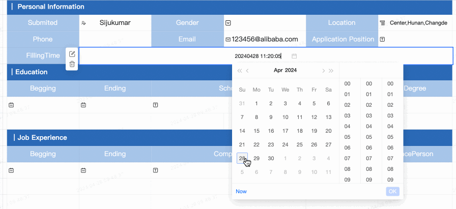
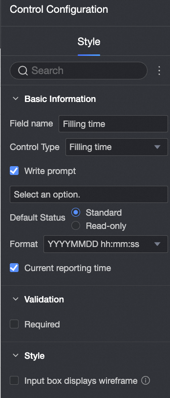
Filling Time
Use this control to automatically record the time when a form entry is submitted.
-
Sample output
-
Control configuration
|
-
Basic information:
-
The name of the field. The default value is the time when the field was filled. You can customize the field name.
-
Control type, you can switch to other control types.
-
Enter tips: You can customize the tips displayed in the Enter status.
-
Default: If you do not select Read-only, the control can be edited. If you select it, the control cannot be edited.
-
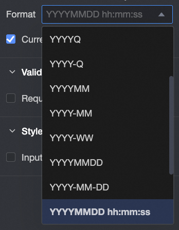
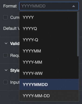
Format: Year, Year-Quarter, Year-Quarter, Year-Month, Year-Week, Year-Month-Day, Year-Month-Day, Year-Month-Day, Year-Month-Day-Hour-Minutes-Second.
-
Current Filling Time: selected by default. If you select this check box, the current filling time will be displayed.
-
Verification:
-
Required: This control is required by default.
-
Prompt text when input data is invalid: This configuration items only takes effect when a verification condition is valid. For example, if required is selected and no option value is filled in, a custom error copy is prompted.
-
Style:
|
|
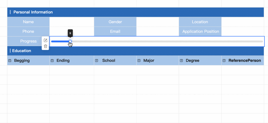
Progress
-
Sample output
-
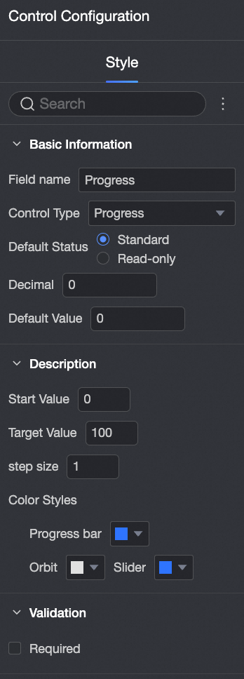
Control configuration
|
-
Basic information:
-
Field Name: You can customize the field name.
-
Control Type: You can switch to another control type.
-
Default: If you do not select Read-only, the control can be edited. If you select it, the control cannot be edited.
-
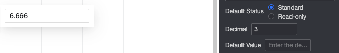
Decimal Places: Customize the setting of decimal places in the progress bar. 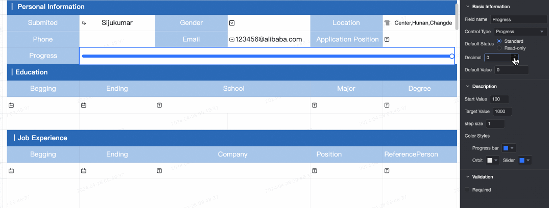
-
Default Value: Set the default value displayed in the progress bar. The default value is 0.
-
Description
-
Start Value: Set the initial value of the progress bar. The default value is 0. The value must be lower than the target value.
-
Target Value: Set the final value of the progress bar. The default target value is 100. The target value must be higher than the initial value. 
-
step size: specifies the jump range of the progress bar each time it is updated. The default value is 1. 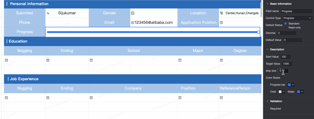
-
Color Style: You can customize colors in progress bar, tracks, and sliders. 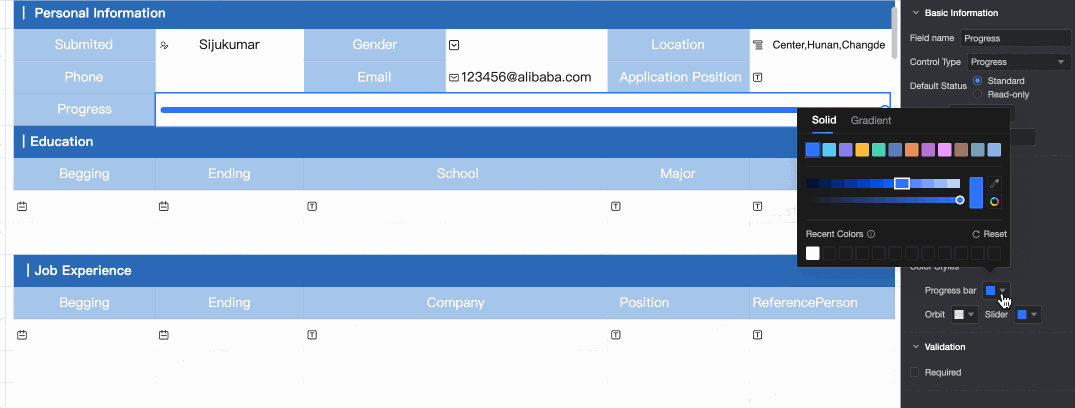
-
Validation
-
Required: This control is required by default.
-
Prompt text when input data is invalid: This configuration items only takes effect when a verification condition is valid. For example, if required is selected and no option value is filled in, a custom error copy is prompted.
|
|
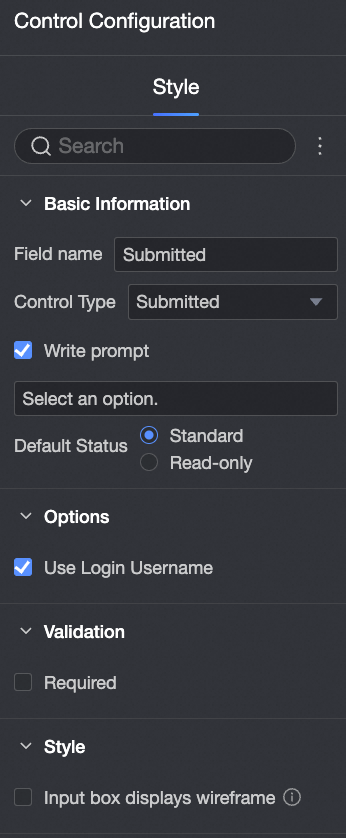
Submitted by
Use this control to automatically populate the name of the person who submits the form.
-
Sample output
-
Control configuration
|
-
Basic information:
-
The name of the field. The default value is the name of the field. You can customize the field name.
-
Control type, you can switch to other control types.
-
Enter tips: You can customize the tips displayed in the Enter status.
-
Default: If you do not select Read-only, the control can be edited. If you select it, the control cannot be edited.
-
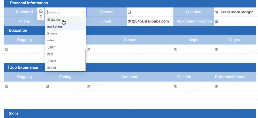
Options:
-
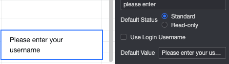
Use Login Username, which is selected by default. When selected, the login user name is displayed by default.
-
Default Value: If you do not select Use Logon Username, you can enter the default value.
-
Verification:
-
Required: This control is required by default.
-
Prompt text when input data is invalid: This configuration items only takes effect when a verification condition is valid. For example, if required is selected and no option value is filled in, a custom error copy is prompted.
-
Style:
|
|
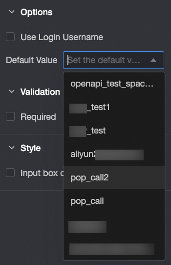
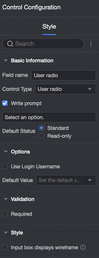
User radio
-
Sample output

-
Control configuration
|
-
Basic information:
-
The name of the field. The default value is User-Select. You can customize the field name.
-
Control type, you can switch to other control types.
-
Enter tips: You can customize the tips displayed in the Enter status.
-
Default: If you do not select Read-only, the control can be edited. If you select it, the control cannot be edited.
-
Options:
-
Use the login user name. If you select this check box, the login user name is displayed by default.
-
Default Value: the default value displayed in the Enter status.
-
Verification:
-
Required: This control is required by default.
-
Prompt text when input data is invalid: This configuration items only takes effect when a verification condition is valid. For example, if required is selected and no option value is filled in, a custom error copy is prompted.
-
Style:
|
|
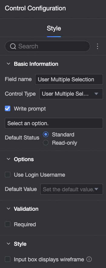
Multiple User Selection
-
Sample output
-
Control configuration
|
-
Basic information:
-
The name of the field. By default, this parameter is set to Multi-choice. You can customize the field name.
-
Control type, you can switch to other control types.
-
Enter tips: You can customize the tips displayed in the Enter status.
-
Default: If you do not select Read-only, the control can be edited. If you select it, the control cannot be edited.
-
Options:
-
Use the login user name. If you select this check box, the login user name is displayed by default.
-
Default Value: the default value displayed in the Enter status.
-
Verification:
-
Required: This control is required by default.
-
Prompt text when input data is invalid: This configuration items only takes effect when a verification condition is valid. For example, if required is selected and no option value is filled in, a custom error copy is prompted.
-
Style:
|
|
Function
-
Effect display 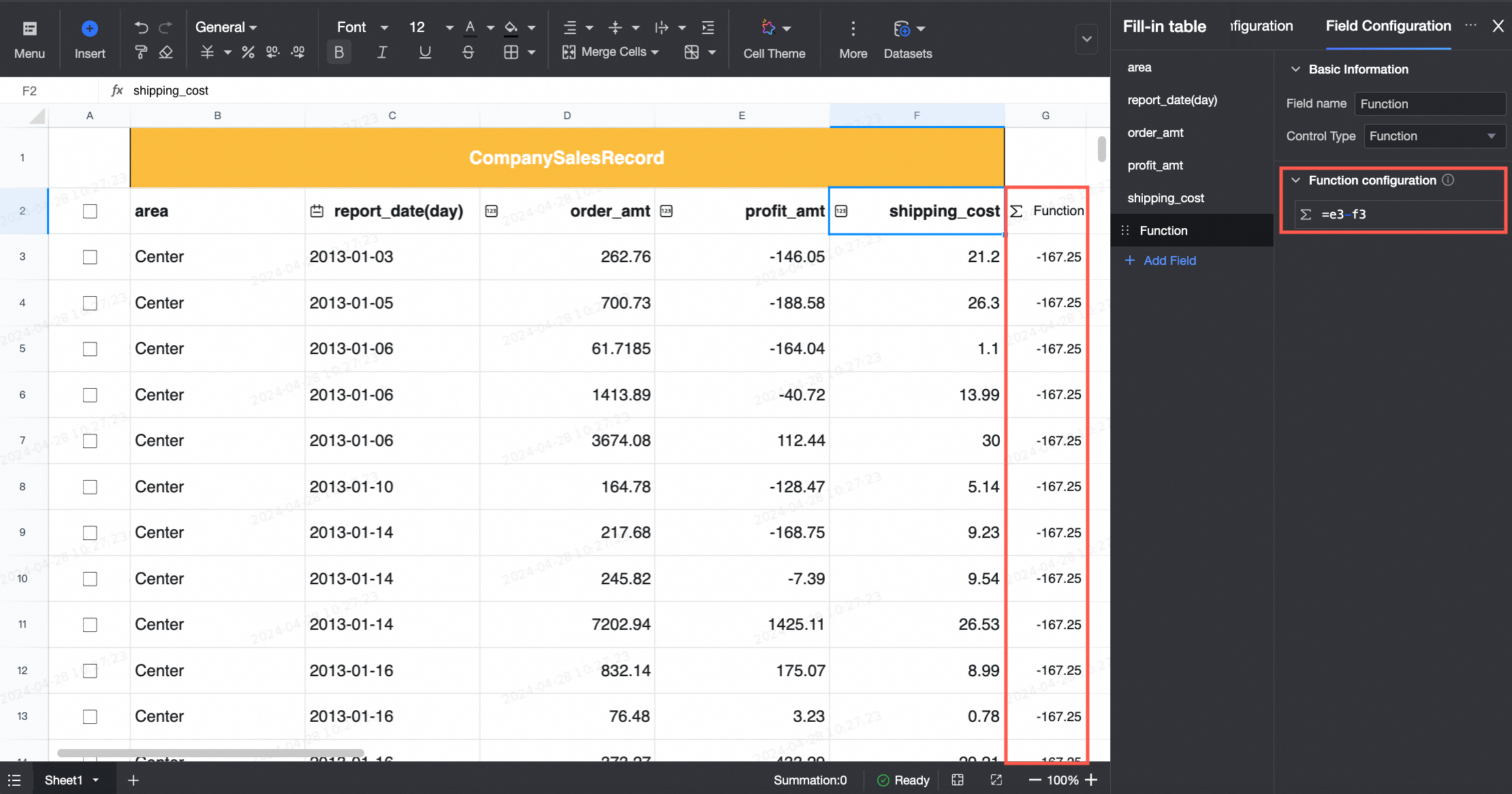
-
Control configuration 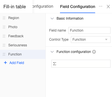
|
-
Basic Settings
-
Configure the function
-
Excel functions can be used to reference fields in table filling and dataset tables in [field name]. 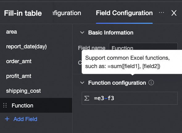
-
For more information, see Functions supported by workbook.
|


 to drag and drop the display order of an option. Click
  to delete an option.
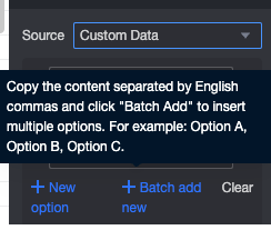

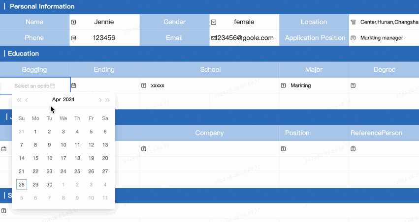

 option in the Date Field section. In the Date Display Format section, you can customize.