NL2Chart converts SQL query results into visual charts — column, line, or pie — without any charting code. Pass the SQL generated by NL2SQL directly to NL2Chart, and the model selects the right chart type based on your question and returns a PNG image URL.
How it works
NL2Chart runs as the second stage of a two-step pipeline:
NL2SQL translates a natural language question into an SQL statement.
NL2Chart takes that SQL statement, runs it to get the data, and renders the result as a chart.
By default, the model selects the chart type automatically based on keywords in your question. To force a specific type, append a drawing instruction to the usr_query parameter.
Currently, onlyresult_type = 'IMAGE'is supported. The returned URL points to a PNG image, has no permission restrictions, and expires after 90 minutes. Check theExpiresfield in the URL for the exact expiration time.
Syntax
/*polar4ai*/SELECT * FROM PREDICT (MODEL _polar4ai_nl2chart, <SQL_statement>)
WITH (usr_query = <usr_query>, result_type = <result_type>);
Parameters
| Parameter | Description | Example |
|---|---|---|
usr_query | Your question in natural language. The model uses this to select the chart type. To override the automatic selection, append a drawing instruction (e.g., draw a line chart). | 'Quarterly sales statistics for 2023' |
result_type | Return format. Currently, only 'IMAGE' is supported. | 'IMAGE' |
SQL_statement | The SQL query that retrieves the data to plot. Typically the output from NL2SQL. | SELECT quarter, sales FROM sales_data WHERE year = 2023 |
Example
The following example shows the full pipeline — from a natural language question to a rendered chart.
Step 1: Use NL2SQL to convert your question into SQL.
/*polar4ai*/SELECT * FROM PREDICT (MODEL _polar4ai_nl2sql, select 'merchant type statistics')
WITH (basic_index_name='schema_index', pattern_index_name='pattern_index');
NL2SQL returns an SQL statement:
SELECT merchtype AS merchant_type, COUNT(*) AS product_count
FROM hkrt_merchant_info
GROUP BY merchtype;
Step 2: Pass that SQL to NL2Chart.
/*polar4ai*/SELECT * FROM PREDICT (MODEL _polar4ai_nl2chart,
  SELECT merchtype AS merchant_type, COUNT(*) AS merchant_count
  FROM hkrt_merchant_info
  GROUP BY merchtype
) WITH (usr_query = 'merchant type statistics', result_type='IMAGE');
NL2Chart returns a URL to the generated PNG image:
http://db4ai-xxx-.aliyuncs.com/pc-xxx/OSSAccessKeyId=xxx&Expires=1716130199&Signature=KvPFzxxx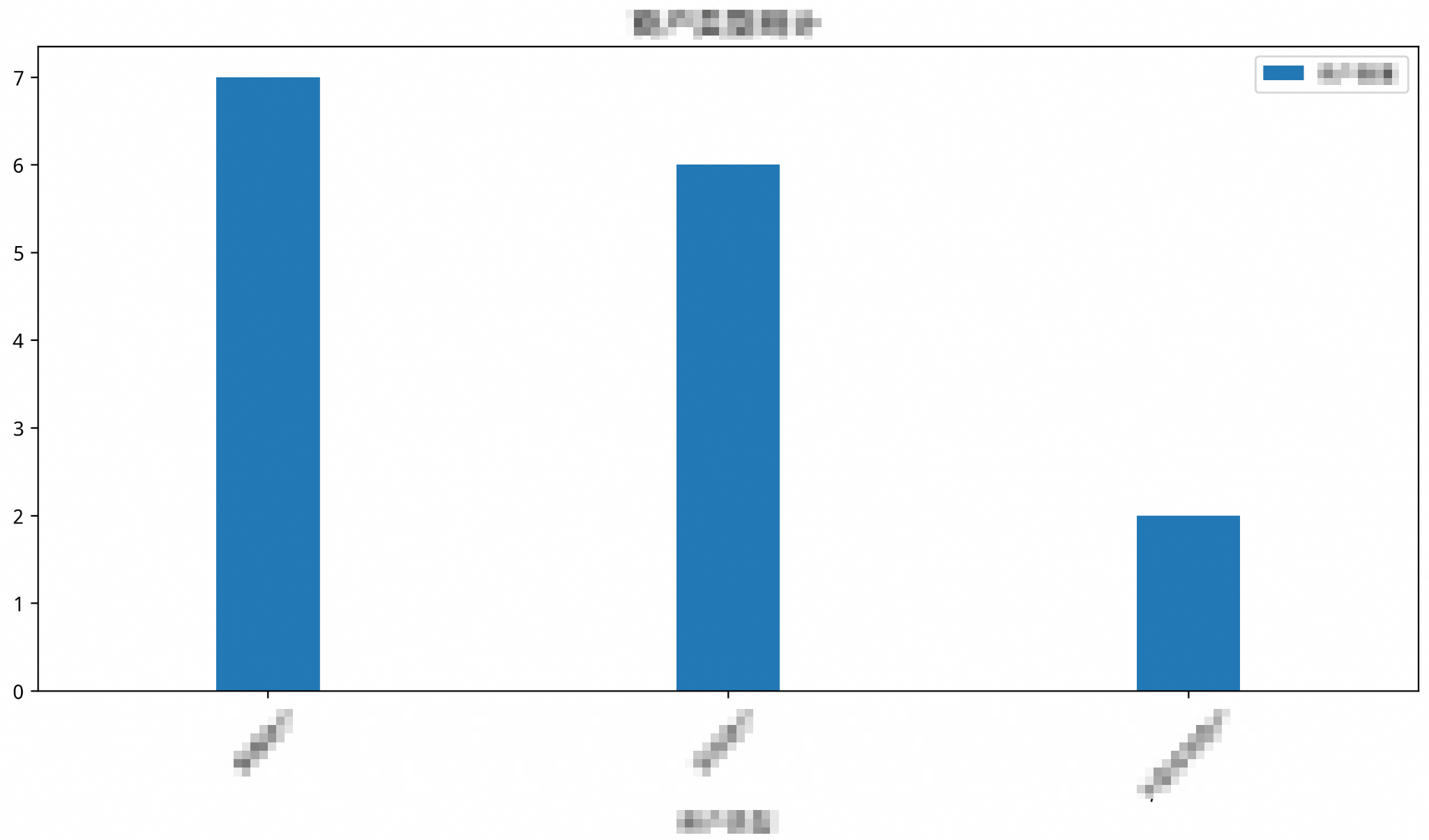
Chart type selection
The model picks a chart type based on two factors: what the data looks like, and what you're trying to communicate. The following table shows how question types map to chart types.
| Question type | Chart type | Example question | When to use |
|---|---|---|---|
| Count statistics | Column chart | "Count the sales in each city" | Comparing quantities across categories — such as totals, counts, or frequencies |
| Trend changes | Line chart | "Show the user growth trend over the past year" | Showing how values change over time or across ordered categories |
| Proportion distribution | Pie chart | "Show the sales proportion of each product line" | Showing each category's share of a total; requires a clear total across categorical data |
Override the chart type
To use a specific chart type regardless of the question, append a drawing instruction to the end of usr_query.
Example: force a line chart
-- Force NL2Chart to render a line chart
/*polar4ai*/SELECT * FROM PREDICT (MODEL _polar4ai_nl2chart,
  SELECT merchtype AS merchant_type, COUNT(*) AS merchant_count
  FROM hkrt_merchant_info
  GROUP BY merchtype
) WITH (usr_query = 'merchant type statistics, draw a line chart', result_type='IMAGE');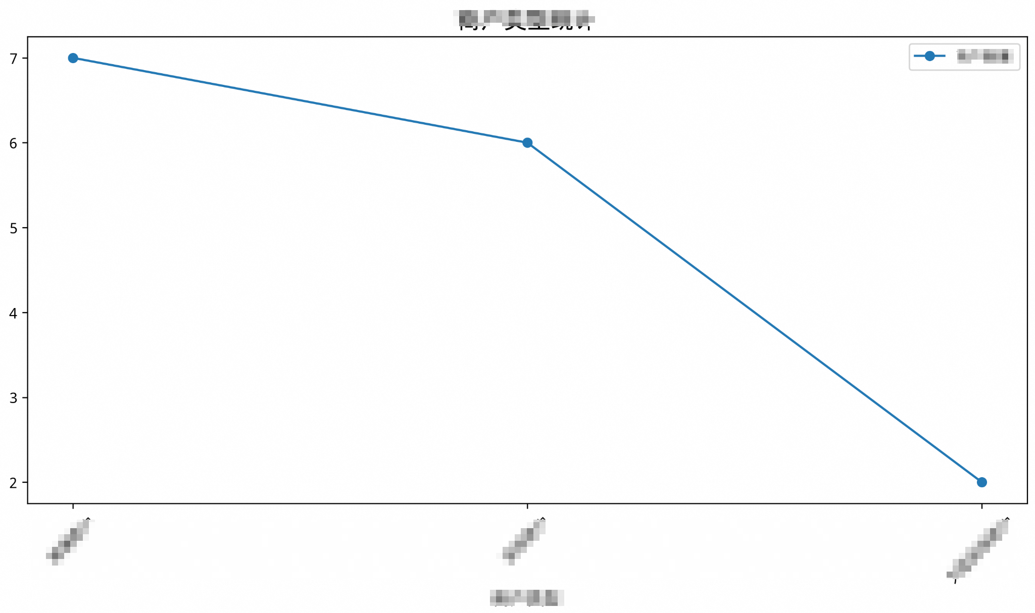
Example: force a pie chart
-- Force NL2Chart to render a pie chart
/*polar4ai*/SELECT * FROM PREDICT (MODEL _polar4ai_nl2chart,
  SELECT merchtype AS merchant_type, COUNT(*) AS merchant_count
  FROM hkrt_merchant_info
  GROUP BY merchtype
) WITH (usr_query = 'merchant type statistics, draw a pie chart', result_type='IMAGE');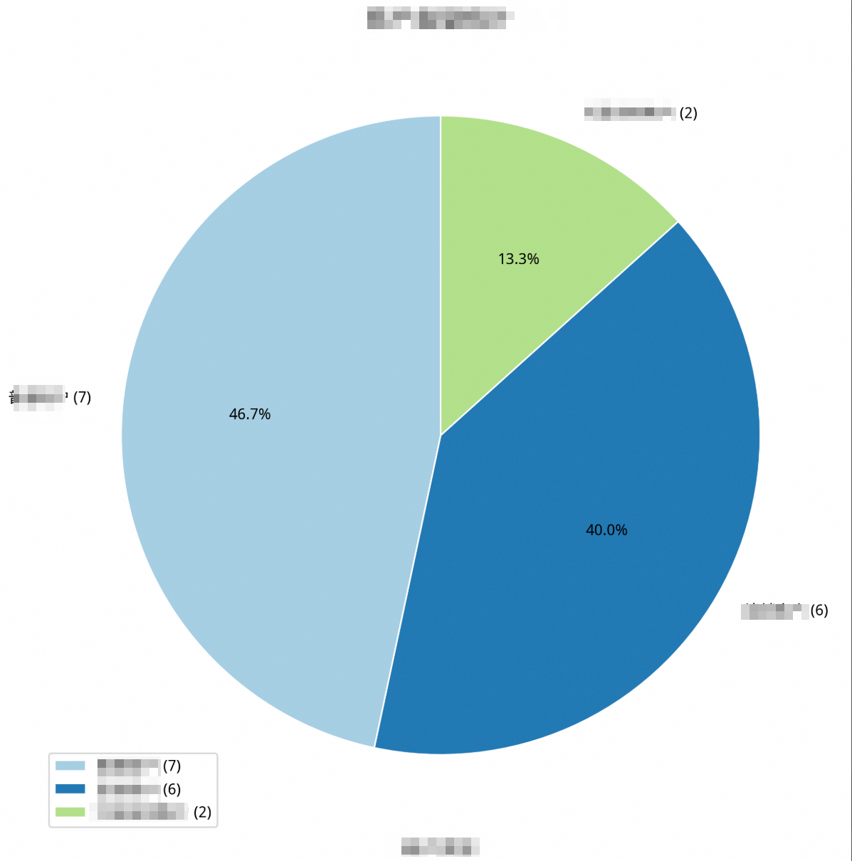
Best practices
Match the chart type to the data structure. Pie charts require proportion data with a clear total. Line charts require time series or ordered categorical data. If the data doesn't fit the chart type, the result may be misleading.
Let the model choose when possible. Keywords like "count", "trend", and "proportion" in
usr_queryhelp the model recommend a suitable chart type. Reserve manual overrides for cases where the default doesn't meet your needs.Use NL2SQL and NL2Chart together. Feed the SQL output from NL2SQL directly into NL2Chart to go from a natural language question to a visual report in two steps.
Related topics
NL2SQL — Generate SQL from natural language questions