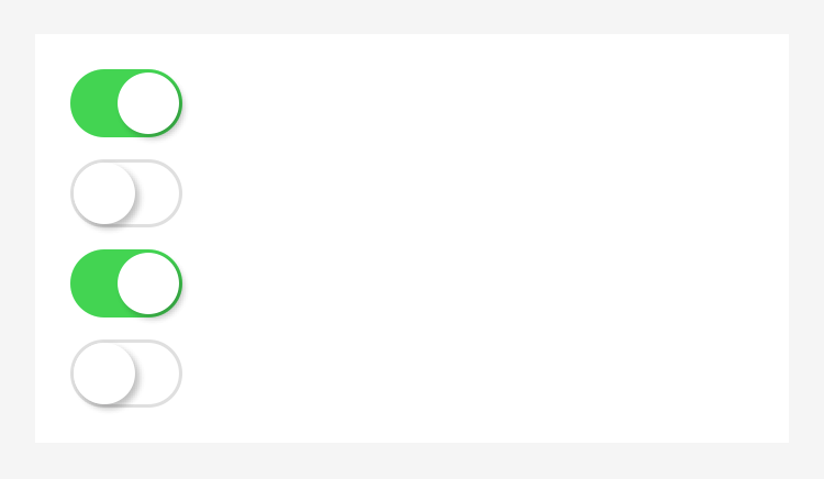
This topic describes switch, the single-choice item.
| Attribute | Type | Default value | Description | Minimum version |
|---|---|---|---|---|
| name | String | - | The component name, which is used to submit the form to obtain data. | - |
| checked | Boolean | - | Whether to select. | - |
| disabled | Boolean | - | Whether to disable the button. | - |
| color | String | - | The component color. | - |
| onChange | EventHandle | - | Trigger when checked is modified, where event.detail={value:checked}. |
- |
| controlled | Boolean | false | Whether the component is a controlled component. If the value is true, checked is fully controlled by setData. | 1.8.0 |
| color | Color | - | The switch color. | 1.10.0 |
Illustration
Code sample
<view class="page"><view class="switch-list"><view class="switch-item"><switch checked onChange="switchChange"/></view></view></view>
Page({switchChange (e){console.log('The switchChange event, and the value is: ', e.detail.value)},})