A pie chart is used to show the percentage of each category of data. The arc length of each slice in a pie chart is proportionate to the quantity that is represented by each category. This topic describes how to configure a pie chart.
Overview
A pie chart is divided into multiple slices based on the percentages of categories. Each slice shows the percentage of a category of data. The sum of all percentages is equal to 100%. Simple Log Service provides the following types of standard pie charts: pie chart, donut chart, and polar area chart. The following list describes the donut and polar area charts:
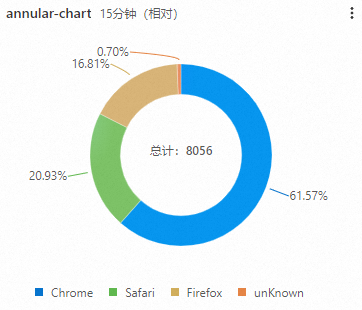
Donut chart: A donut chart is a variant of a pie chart and has a hollow center. Compared with a pie chart, a donut chart provides the following advantages:
A donut chart displays more information, such as total numbers.
A donut chart allows you to compare data between two donut charts based on ring lengths.
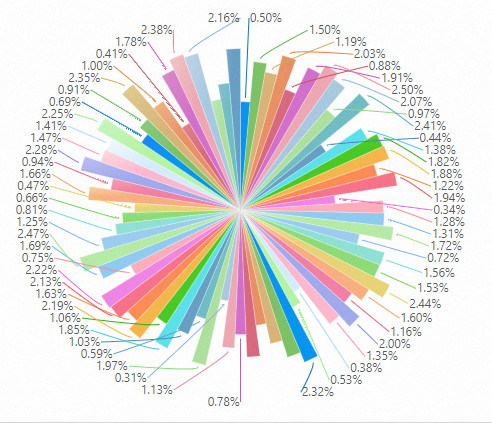
Polar area chart: A polar area chart is a column chart in the polar coordinate system. Each category of data is represented by a slice that has the same angle, and the radius of each slice varies based on the value. Compared with a pie chart, a polar area chart provides the following advantages:
If the results that a query statement returns can be classified into no more than 10 categories, you can use a pie chart to display the query results. If the results can be classified into 10 to 30 categories, you can use a polar area chart to display the query results.
A polar area chart enlarges the differences among the values of categories because the area of a slice correlates with the square of the radius. Polar area charts are suitable for comparing values that have small differences from one another.
You can use a circle to display periodic data. You can use a polar area chart to analyze value changes in different periods, such as weeks and months.
For more information about how to add a pie chart, see Add a chart to a dashboard.
Configuration effect
Pie chart type | Sample pie chart | References |
Basic pie chart |
| |
Donut chart |
| |
Polar area chart |
| |
Pie chart that supports multi-statement query |
|

Configure a pie chart
Log on to the Simple Log Service console. In the Projects section, click the project you want.
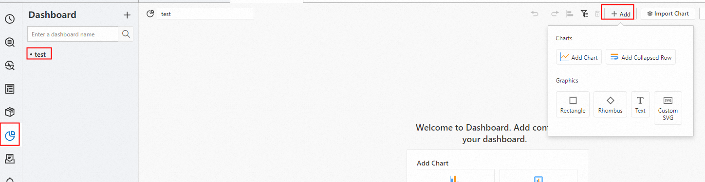
In the left-side navigation pane, choose Dashboard > Dashboards. In the dashboard list, click the dashboard you want. In the upper-right corner of the dashboard page, click Edit. In edit mode, click Add > Add Chart.
On the right side of the Edit Chart page, select Pie ChartPro in the Chart Types section and configure parameters in the Query and Analysis Configurations section based on the following figure. On the left side of the Edit Chart page, configure the query time range, Logstore, and query statement for the pie chart. After you complete the configuration, click Apply in the upper part of the Edit Chart page to view the configuration effects of the pie chart.
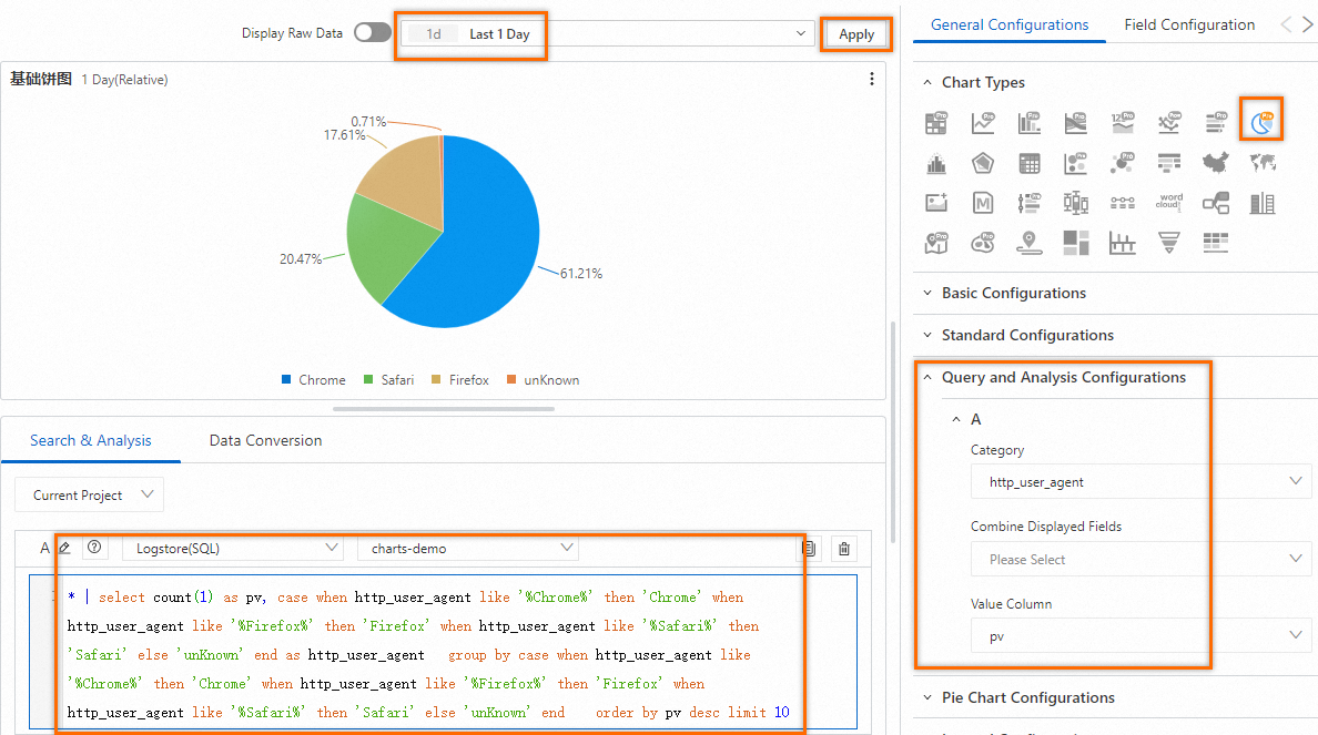
The following query statement is used to query the page views (PVs) by browser:
(*)| select count(1) as pv, case when http_user_agent like '%Chrome%' then 'Chrome' when http_user_agent like '%Firefox%' then 'Firefox' when http_user_agent like '%Safari%' then 'Safari' else 'unKnown' end as http_user_agent group by case when http_user_agent like '%Chrome%' then 'Chrome' when http_user_agent like '%Firefox%' then 'Firefox' when http_user_agent like '%Safari%' then 'Safari' else 'unKnown' end order by pv desc limit 10
Configuration on the General Configurations tab
You can configure global settings for a pie chart on the General Configurations tab.
Parameters in the Basic Configurations section
Parameter
Description
Title
The title of the pie chart.
Display Title
If you turn on Display Title, the title of the pie chart is displayed.
Display Border
If you turn on Display Border, the borders of the pie chart are displayed.
Display Background
If you turn on Display Background, the background color of the pie chart is displayed.
Display Time
If you turn on Display Time, the query time range of the pie chart is displayed.
Fixed Time
If you turn on Fixed Time, the query time range of the pie chart is independent of the global time range of the dashboard.
Parameters in the Standard Configurations section
Parameter
Description
Format
The display format of numeric values.
Unit
The unit of numeric values.
Number of Digits after Decimal Point
The decimal places of numeric values.
Display Name
The display name of the pie chart.
Color Scheme
The color scheme of the pie chart. Valid values:
Built-in: uses the built-in color scheme.
Solid: uses the color that you select.
Parameters in the Query and Analysis Configurations section
Parameter
Description
Category
The field that you want to use to categorize data.
Value Column
The field that specifies the numeric values to be displayed.
Parameters in the Pie Chart Configurations section
Parameter
Description
Pie Chart Type
The type of the pie chart. Valid values: Pie Chart, Donut Chart, and Polar Area Chart.
Scale Text Format
The format of the scale text that is displayed for the slices in the pie chart. Valid values:
Percentage: displays the scale text in the Percentage format. Example: 1.98%.
Category: Percentage: displays the scale text in the Category: Percentage format. Example: PUT: 1.98%.
Category:Numeric Value (Percentage): displays the scale text in the Category:Numeric Value (Percentage) format. Example: PUT:120 (1.98%).
Show Scale Text
If you set this parameter to Yes, the scale text of each slice in the pie chart is displayed.
Parameters in the Legend Configurations section
Parameter
Description
Display Legend
If you turn on Display Legend, the legend in the pie chart is displayed.
Legend Position
The position of the legend in the pie chart.
Actions
The data display effect when you click a legend item. Valid values:
Single: If you click a legend item, only the data for the legend item is displayed in the pie chart.
Switch: If you click a legend item, the data for the legend item is hidden or displayed in the pie chart.
Maximum Width (Height)%
The maximum width and height of the legend.
Parameters in the Variable Replacement section
Parameter
Description
Variable Replacement
The settings for variable replacement. You can click AddVariable Replacement to add a filter of the Variable Replacement type to the table. After you configure the settings for variable replacement on the General Configurations tab, Simple Log Service adds a filter in the upper-left corner of the table. You can select a value from the filter drop-down list. Then, Simple Log Service automatically replaces the variable in the query statement of the table with the variable value indicated by the value that you select, and performs a query and analysis operation. For more information, see Example 2: Configure variable replacement.
Parameters in the Documentation section
Parameter
Description
Add Documentation Link
The button that allows you to specify custom document links and descriptions. After you configure the settings, the specified information is displayed in the upper-right corner of the pie chart.
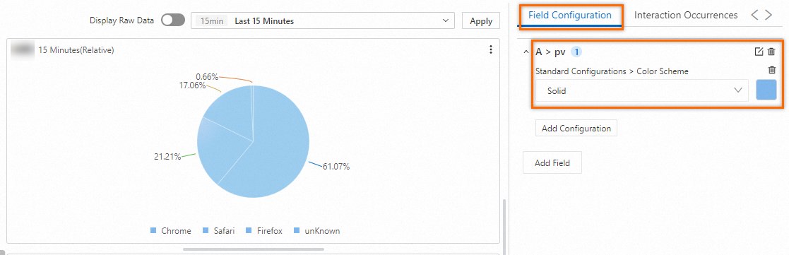
Configuration on the Field Configuration tab
You can configure personalized display settings for the results of a single query statement or for a single column of data in the results. For more information, see Configuration on the General Configurations tab.
For example, you can select A > pv to configure settings for the pv field in the results of Query Statement A. In the following figure, the Color Scheme parameter is set to Solid in the Standard Configurations section.
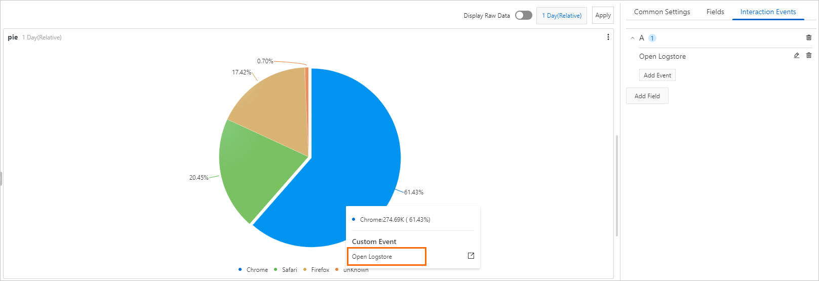
Configuration on the Interaction Occurrences tab
You can configure an interaction occurrence for a single field or the results of a single query statement to analyze data in a finer-grained manner. Supported types of interaction occurrences include Open Logstore, Open Saved Search, Open Dashboard, Open Trace Analysis, Open Trace Details, and Create Custom HTTP URL. For more information, see Interaction occurrences.
For example, in the A section, you can configure an Open Logstore interaction occurrence for the results of Query Statement A. After you configure the interaction occurrence, you can click a point in the pie chart and click Open Logstore. Then, you are navigated to the Logstore that you specify.