After running SQL queries in DataWorks DataAnalysis, you can convert query results into interactive charts without leaving the tool. This topic walks through four chart configurations built from user profile data in the ads_user_info_1d_emr table: a stacked bar chart, two pie charts, and a grouped column chart.
Prerequisites
Before you begin, ensure that you have:
Processed the required data into basic user profile data using DataWorks DataStudio
Data analysis scenarios
The four charts in this example are built from the ads_user_info_1d_emr table.
Scenario | Chart type |
Numbers of registered members in different provinces and cities | <img> |
Distribution of page views (PVs) of members in different age ranges | <img> |
Distribution of page views (PVs) of members by gender | <img> |
Numbers of page views (PVs) of members counted by gender and zodiac sign | <img> |
Open SQL query
In the DataWorks console, select a region from the top navigation bar. In the left-side navigation pane, choose Data Analysis and Service > DataAnalysis. Click Go to DataAnalysis, then click SQL Query in the left-side navigation pane.
Set up a data source
Grant data source permissions. Go to Security Center and choose Security policy > Data query and analysis control. On the Queryable data source tab, find your data source and click Authorization in the Actions column. For details, see Use the data query and analysis control feature.
Create a temporary file.
If the SQL Query page is empty or no file is open, click Create SQL Query in the right-side area.
If a file is already open, click the
 icon to the right of the open file's name.
Note: For more details on creating SQL query files, see SQL query.
Select a data source. On the configuration tab of the SQL query file, click the
 icon in the upper-right corner to select a workspace, a compute engine type, and a data source. This example uses a MaxCompute data source.
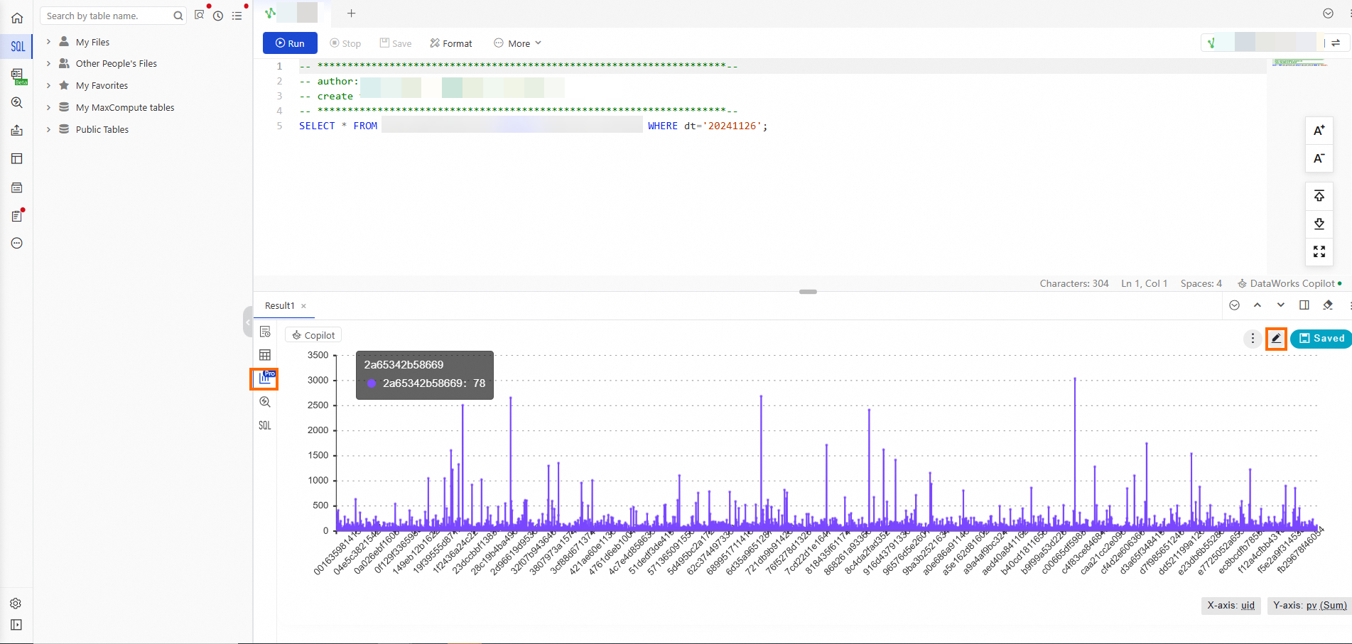
Query the data
On the configuration tab of the SQL query file, enter the following SQL statement and click the ![]() icon to run the query.
icon to run the query.
-- If the desired partition is not found, run the show partitions tablename command to confirm the table partition.
select * from ads_user_info_1d_emr where dt='Data timestamp';
This example queries the dt="20241126" partition of the ads_user_info_1d_emr table.
After the query completes, click the ![]() icon on the left side of the results section to open the chart view. To go to the chart configuration tab, click the
icon on the left side of the results section to open the chart view. To go to the chart configuration tab, click the ![]() icon in the upper-right corner of the chart.
icon in the upper-right corner of the chart.
Configure charts
All four charts follow the same general pattern: set a title, choose a chart type under Style Settings, configure fields under Data Settings, and optionally rename axis labels under Style Settings > Global Settings.
Numbers of registered members in different provinces and cities
A Stacked Bar Chart works well here because it compares quantities across many discrete categories (provinces), where the total count per category matters.
Configuration summary:
Setting | Value |
Chart type | Stacked Bar Chart |
X-axis field |
|
X-axis display title | Number of Registered Members |
Y-axis field |
|
Y-axis display title | Province |
Steps:
Set the title. Double-click the original chart title and enter a new title.
Select the chart type. Click Style Settings on the right side. On the Change Chart tab, select Stacked Bar Chart.
Configure data fields. Click Data Settings on the left side.
Drag the uid field to the X-axis area. From the X-axis drop-down list, choose Aggregate > Distinct Count.
Drag the region field to the Y-axis area.

Rename the axis labels. Click Style Settings on the right side. Go to the Global Settings tab, then Chart Information > Details > Chart Style.
In the X-axis section, click Axis Title and change Displayed Title from uid to Number of Registered Members.
In the Y-axis section, click Axis Title and change Displayed Title from region to Province.
Click Save.

Review the final chart.

Distribution of page views of members in different age ranges
A Pie Chart works well here because the data breaks out a single metric (page views) across a small number of categories (age ranges), making proportional comparison intuitive.
Configuration summary:
Setting | Value |
Chart type | Pie Chart |
Category field |
|
Value field |
|
Steps:
Set the title. Double-click the original chart title and enter a new title.
Select the chart type. Click Style Settings on the right side. On the Change Chart tab, select Pie Chart.
Configure data fields. Click Data Settings on the left side.
Drag the age_range field to the Category area.
Drag the pv field to the Value area. From the Value drop-down list, choose Aggregate > Sum.
Click Save.

Review the final chart.

Distribution of page views of members by gender
A Pie Chart works well here because the data has only two categories (gender), making proportional comparison straightforward.
Configuration summary:
Setting | Value |
Chart type | Pie Chart |
Category field |
|
Value field |
|
Steps:
Set the title. Double-click the original chart title and enter a new title.
Select the chart type. Click Style Settings on the right side. On the Change Chart tab, select Pie Chart.
Configure data fields. Click Data Settings on the left side.
Drag the gender field to the Category area.
Drag the pv field to the Value area. From the Value drop-down list, choose Aggregate > Sum.
Click Save.

Review the final chart.

Numbers of page views of members counted by gender and zodiac sign
A Grouped Column Chart works well here because it compares a metric (page views) across two dimensions simultaneously (gender and zodiac sign), showing both within-group and cross-group patterns.
Configuration summary:
Setting | Value |
Chart type | Grouped Column Chart |
X-axis field |
|
X-axis display title | gender |
Y-axis field |
|
Y-axis display title | pv |
Split field |
|
Steps:
Set the title. Double-click the original chart title and enter a new title.
Select the chart type. Click Style Settings on the right side. On the Change Chart tab, select Grouped Column Chart.
Configure data fields. Click Data Settings on the left side.
Drag the gender field to the X-axis area.
Drag the pv field to the Y-axis area. From the Y-axis drop-down list, choose Aggregate > Sum.
Drag the zodiac field to the Split area.

Rename the axis labels. Click Style Settings on the right side. Go to the Global Settings tab, then Chart Information > Details > Chart Style.
In the X-axis section, click Axis Title and set Displayed Title to gender.
In the Y-axis section, click Axis Title and set Displayed Title to pv.
Click Save.

Review the final chart.

What's next
After finishing your charts:
Click Save in the upper-right corner to permanently save your changes and share a chart.
Click Save As to save the current query result as a new chart with a different visualization type.

Click Cards in the left-side navigation pane of the DataAnalysis page to view all charts saved with Save As.
