With the increase in the number and richness of building materials for DataV products, the traditional component concept can no longer cover the concept of all building materials. Therefore, in the new version of DataV, the product upgrades the original component panel to the component library panel. This article details the meaning of the component library list and the main functions it can implement.
Component library source
In the Widgets drop-down list, all widget packages that are included in your account are displayed. The component packages presented can be divided into three main categories. 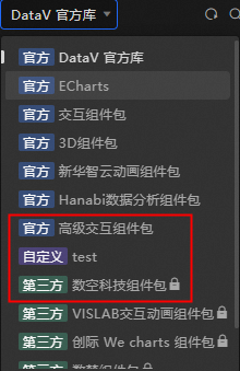
Official: the package provided by DataV.
Custom: The
 icon appears in the lower-left corner of a widget package that you customize or that is authorized to write to the widget.
Third-party: component packages provided or authorized by third-party companies and individuals. The
 icon appears in the lower-left corner of the component package.
Component package switchover
In the Widget Library section, you can select a widget from the drop-down list and select a widget from the drop-down list. 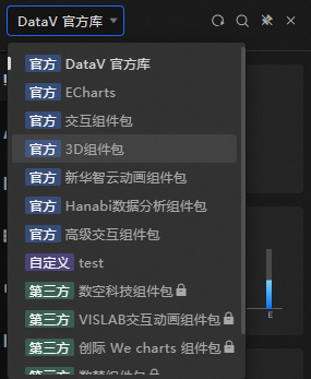
Search and classify widget display area
In the Component Library list, click the drop-down menu above the list to view all applicable component packages. To help you better locate and view the required components and reduce the component retrieval costs, the components page redefines the criteria for sorting out component categories. You can search for a widget by category or click the  icon above the widget list. For more information, see Component classification.
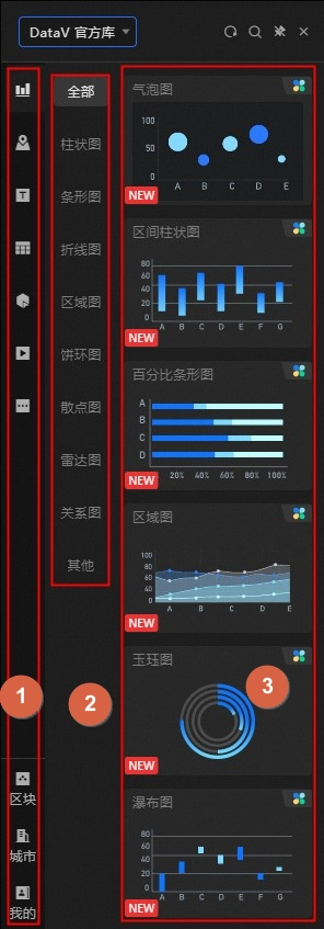
No. | Description |
1 | In the Component Library Classification panel, the system classifies components in a component package by category. This allows you to quickly locate components. You can use the following advanced features: Chart, Map, Info, Table, Control, Media, and Others. You can also use advanced features such as Block, City, and My. |
2 | In the component library partition panel, after the system partitions components by categories, some components need to be classified again. The categories that contain partitions include Charts and Controls. |
3 | The widget details panel. You can click or drag the widget to the canvas. For more information, see Canvas Editor. |
Panel function
In the upper part of the Component Library panel, you can perform the following operations:
Click the
 icon to refresh the Component Library page. All components are updated to the latest version.
 Click the
 icon to open the Shortcut Search panel and enter the widget that you want to query.
 Click the
 icon to fix the Component Library panel to Canvas Editor. If you open another panel, the panel is not closed.
 Click the
 icon to close the Component Library panel.