This topic describes the meaning of each configuration items when you select Full Radar Chart for Double 11.
Chart style
The Double 11 radar chart is a type of other basic charts. Compared with the basic radar chart, the Double 11 radar chart only supports data display in a single dimension. It is suitable for displaying the quantity of products sold in each region during the Double 11 period. For example, it displays the quantity of products sold in regions such as North China and East China. 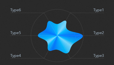
Style Panel 
Search Configuration: Click the Search configuration items icon
 in the upper-right corner of the Style panel. In the Search Configuration panel, enter the name of the configuration items that you want to search for and locate the configuration items. Fuzzy match is supported. For more information, see Search configuration items.
 Size: the width and height of the widget. Unit: pixels.
Positioning: the x-axis and y-axis of the component. Unit: pixels. X-coordinate indicates the pixel distance between the upper-left corner of the widget and the left border of the canvas. Y-coordinate indicates the pixel distance between the upper-left corner of the widget and the upper border of the canvas.
Rotate: Rotate the widget by degrees.
Directly enter the degrees in the Rotation Angle spin box or click the plus sign (+) or minus sign (-) to increase or decrease the value in the Rotation Angle spin box.
Click the
 icon to flip the widget style.
 Click the
 icon to flip the widget style.
Opacity: Valid values: 0 to 1. If this parameter is set to 0, the widget is hidden. If this parameter is set to 1, the widget is completely displayed. Default value: 1.
Global level
Top Offset: the distance between the radar chart and the top of the widget.
Outer Style
Parameter
Description
Edge Color
Please refer to the color picker description to modify the color of the outer edge.
Edge line width
The width of the outer edge.
Radar area
Parameter
Description
Preset Max Capacity
The maximum preset value for the radar area zone. When the preset maximum value is greater than the maximum value of the data, the larger the preset maximum value is, the smaller the radar area proportion is.
Color
The gradient color of the radar chart. Click the
 or
or  icon on the right to add or delete a color area. Click the
  or
or  icon to configure the arrangement style of multiple color series. Click the
  icon to copy the current color series configuration and add a new color series with the same configuration.
 Position: the position of each color in the gradient band.
Color: the color of each location.
Edge line width
The width of the region edge. Unit: pixels.
Edge Style
The style of the region edge. Valic values: Curve and Line.
Curve Radian
The radian when the edge is a curve, ranging from 0 to 1. When the value is 1, the edge becomes a straight line.
Text boxes and lines
Parameter
Description
Distance from Text Box to Line
The vertical distance between the text box and the line. Unit: pixels.
Font
The font of text in the timeline widget. Default value: Microsoft YaHei.
The color of the font. For more information, see Color setting parameters.
The font color of all text in the component.
Font size
The font size of all text in the component.
Font weight
The font weight of all text in the widget.
Line Color
The color of the line.
Connection Width
The width of the line. Unit: pixels.
Sweep: the style of the sweep effect. You can click the
 icon to enable or disable the sweep effect.
 Image: the image used for the sweep effect. Enter the URL of the image.
Animation Duration: the duration of the sweep animation. Unit: seconds.
Data Sources panel 
Parameter | Description |
| The category value, which corresponds to the specific text content. |
| A numeric value that corresponds to the specific data in the radar area in the chart. The larger the value, the closer the distance to the outer circle. |
Configure data items | Description |
DataSource | You can use the code editor or visual editor to view the data fields contained in the widget. You can also modify the Data Type parameter to flexibly configure the component data. |
Data Mapping | If you need to customize chart field configurations, you can set different field mapping content in the Data Mapping module and field mapping these content to the corresponding fields of the widget. This allows you to match data without modifying the fields in the data source. You can also click the |
Configure a filter | Turn on Filter, select an existing data filter or create a data filter, and configure a data filter script to filter data. For more information, see Manage data filters. |
Data Response Result | The Data Response Result section displays widget data in real time. If the data source of the widget changes, this section displays the latest data. If the system response is delayed, you can click the |
Forbid Loading | If you select the check box, you will not see the loaded content during component initialization when you update the component and preview the data kanban. If you select the check box, the opposite is true. By default, the status is deselected. |
Controlled Mode | If you select the check box, the component does not request data in the initialized state, and only requests data by using global variables or the method configured in Blueprint Editor. If you clear the check box, you can use automatic update to request data. By default, the status is deselected. |
Auto Data Request | Select the check box to manually enter the time frequency of polling to set dynamic polling. If you clear the page, the page is not automatically updated. You need to manually refresh the page or use Blueprint Editor and global variable events to trigger a request to update data. |
 icon to configure the field style.
  icon on the right to view the data response result. You can also click the
  icon on the right to obtain the latest data of the widget. You can also click View Example to view an example of the response result of the current component.
 Advanced Panel
This widget does not support interaction events.
Blueprint Interaction
Click the
 icon in the upper-left corner to go to the Blueprint page.
 On the Layer Nodes tab, add the widget to the main canvas.
View blueprint configuration parameters.

Event
Event
Description
When the data interface request is completed
The event is triggered with the processed JSON data after a data interface request is responded and processed by a filter. For more information about specific data examples, see the Data Response Result section of the Data Source tab in the right-side configuration panel of the canvas editor.
Action
Action
Description
Import data
After data of a widget is processed in accordance with its drawing format, the widget is imported for redrawing. You do not need to request server data again. For more information about specific data examples, see the Data Response Result section of the Data Source tab in the right-side configuration panel of the canvas editor.
Request Data Interface
This action is performed to request the server data again. The data sent by an upstream data processing node or layer node is used as a parameter. For example, if the API data source is
https://api.testand the data passed to the request data interface is{ id: '1'}, the final request interface ishttps://api.test?id=1.Move
Move a widget to a specified location. For more information, see the data example.
    {
      // The positioning type. to indicates absolute positioning, whereas by indicates relative positioning. The default value is to.
        "positionType": "to",
      // The location, which is indicated by the x and y coordinates.
      "attr": {
        "x": 0,
        "y": 0
      },
      // The animation type.
      "animation": {
        "enable": false,
        // The animation delay. Unit: milliseconds.
        "animationDuration": 1000,
        // The animation curve, which can be set to linear|easeInOutQuad|easeInOutExpo.
        "animationEasing": "linear"
      }
    }
Switch Display /Display
Toggles whether the widget is displayed or hidden. No parameters are required.
Display
Display the widget. For more information, see Data example.
{
  "animationType": "",// The animation method. Valid value: fade. If you do not set this parameter, no animation is available.
  "animationDuration": 1000,// The animation delay. Unit: ms.
  "animationEasing": ""// animation curve
}
Hide
Hide the component. For more information, see Data example.
{
  "animationType": "",// The animation method. Valid value: fade. If you do not set this parameter, no animation is available.
  "animationDuration": 1000,// The animation delay. Unit: ms.
  "animationEasing": ""// animation curve
}
Update component configurations
Style configurations of widgets are dynamically updated. In the Style panel, click Copy Configuration to Clipboard to obtain the configuration data of the widget. After that, change the style field for the data processing node in Blueprint Editor.