This article describes the meaning of each configuration items of the Gaud base layer.
Chart style
Gaud base layer is a sub-component of the basic plane map 4.0. It supports independent style and interactive configuration, including the template, display content and filter of the base map. It supports access to the latest Gaud online map as the base map, and can customize the map style according to needs. 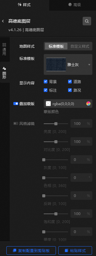
Style Panel
Search Configuration: Click the Search configuration items icon
 in the upper-right corner of the Style panel. In the Search Configuration panel, enter the name of the configuration items that you want to search for and locate the configuration items. Fuzzy match is supported. For more information, see Search configuration items.
 General: the common configuration parameters of the layer.
Metric
description
Visible Level
Set the visible level of the GLOBAL layer. Valid values: 3 to 20. Unit level. The GLOBAL layer is visible within the specified level range and invisible outside the level.
Opacity
The opacity of the layer. Valid values: 0 to 100. Unit: %. The larger the value, the more opaque the map style.
Graphics: Set the parameters for the graphics style of the underlying layer.
Metric
description
Map Style
The style of the map. Valid values: Standard Template and Custom Style.
Standard Template
Valid values: Standard, Phantom Black, Indigo Blue, Polar Blue, Yashi Grey, Moonlight Silver, Grass Green, Graffiti, Far Mountain Dai, Macaron, and Sauce Seed. This parameter is available only when you set the Map Style parameter to Standard Template.
Gaode Key /Gaode Key
The applied key of the map. This parameter is available only when you set the Map Style parameter to Custom Style.
Noteyou need to apply for a map key first. for more information about how to apply for a map key, see the following steps.
Register an Alibaba Cloud account: Go to the Alibaba Cloud Open Platform to register as an Alibaba Cloud developer.
Obtain the high-end key:
Log on to the DataWorks console. In the left-side navigation pane, choose Applications> My Applications> Create Application. In the Create Application dialog box, set the Application Name and Application Type parameters and click Create.
Click Add Key on the right of the application list. In the dialog box that appears, enter a key name in the Key Name field, select Service Platform, and select Read and agree to Terms of Service at the bottom of the page. Then, click Submit.
After you submit the application, Autodesk automatically generates a key. You can view the key on the My Applications page and copy the key to your computer.
Return to the Datav console and paste the obtained Gaud Key into the text box next to Gaud Key. After successful, the Gaud online map becomes the basemap of the basic flat map.
ImportantIf multiple Autodesk layers exist on the same dashboard, you must configure the same Autodesk Key and Autodesk Key.
Map Style ID
Enter a map style ID in the Map Style ID field. This parameter is available only when you set the Map Style parameter to Custom Style.
NoteTo create a custom map and obtain the map style ID, perform the following steps:
Log on to the DataWorks console. In the left-side navigation pane, choose GeoHUB Custom Map > Custom Map> Create Map from Template. On the page that appears, select a template and click Use Template.
After the template is created, you can customize the configurations based on the template.
After the configuration is complete, click the
 icon Save in the upper-right corner. After the configuration is saved, click the
  icon Publish.
 After the map is published, the Successfully published dialog box appears. Click Back to Console to return to the Custom Map page.
On the Custom Map page, click Use and Share below the map style that you published.
On the Use and Share page, click Copy next to Style ID to copy the style ID.
Paste the copied style ID into the DataV Style> Map Style field. Click the blank area in the configuration panel, and the bottom layer style will take effect.
Display Content
You can select Background, Road, Label, and Traffic.
Style filter
Click the icon on the left
 to enable the style filter configuration. After you turn on the switch, you can set the Brightness, Contrast, Grayscale, Hue, Invert, Saturation, and Ink Level of the filter to add filter effects.
 If you want to use the default style, replace Map Style ID in the figure with Style ID, as shown in the following table.
Style Name
Style ID
Standard
normal
Phantom Black
dark
INDIGO BLUE
blue
extreme night blue
darkblue
Yashi Grey
grey
Moonlight Silver
light
grass green
fresh
Doodle
graffiti
Far Mountain Dai
whitesmoke
Macaron
macaron
sauce seed
wine
Data Sources panel
No configuration data is required for this component.
Advanced Panel 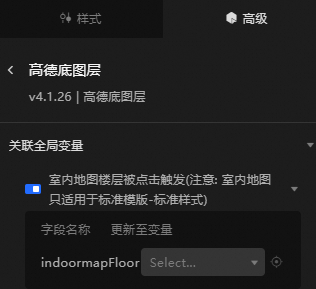
Turn on the switch to enable the associated global variable feature. You can click a specific floor on the indoor map to trigger a data request and obtain the callback value. This allows you to dynamically load data from different floors when you switch floors. By default, the indoormapFloor field is thrown. For more information, see Component interaction configuration.
The interactive display mode of map floors. This mode can be triggered only when you select Standard Template.
Blueprint Interaction
Click the
 icon in the upper-left corner to go to the Blueprint page.
 On the Layer Nodes tab, add the widget to the main canvas.
View blueprint configuration parameters.
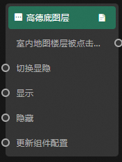
Event
Indoor Map Floor Clicked: indicates that the callback ID is invoked when you click an indoor map floor in the bottom layer.
Action
Action
Description
Switch Display /Hide
Specifies whether to show or hide a widget. No parameters are required.
Display
Display the widget. For more information, see Data example.
{
  "animationType": "",// The animation method. Valid value: fade. If you do not specify this parameter, no animation is generated.
  "animationDuration": 1000,// The animation delay. Unit: ms.
  "animationEasing": ""// animation curve
}
Hide
Hide the component. For more information, see Data example.
{
  "animationType": "",// The animation method. Valid value: fade. If you do not specify this parameter, no animation is generated.
  "animationDuration": 1000,// The animation delay. Unit: ms.
  "animationEasing": ""// animation curve
}
Update component configurations
Style configurations of widgets are dynamically updated. In the Style panel, click Copy Configuration to Clipboard to obtain the configuration data of the widget. After that, change the style field for the data processing node in Blueprint Editor.