drop-down-list-selectors
This topic describes the meaning of each configuration items when you select Full from the drop-down box selector.
Chart style
The drop-down box selector is a type of control component. It can be used as a drop-down box form in visual applications to submit the user-selected data to the backend for processing or through interactive configuration to display the user-selected content on other components. 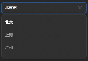
Style Panel 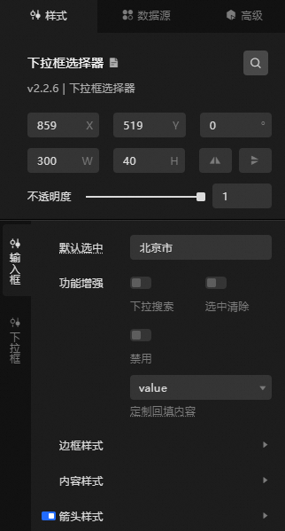
Search Configuration: Click the Search configuration items icon
 in the upper-right corner of the Style panel. In the Search Configuration panel, enter the name of the configuration items that you want to search for and locate the configuration items. Fuzzy match is supported. For more information, see Search configuration items.
 Size: the width and height of the widget. Unit: pixels.
Positioning: the x-axis and y-axis of the component. Unit: pixels. X-coordinate indicates the pixel distance between the upper-left corner of the widget and the left border of the canvas. Y-coordinate indicates the pixel distance between the upper-left corner of the widget and the upper border of the canvas.
Rotate: The widget is rotated around the center of the widget. Unit: degrees.
Directly enter the degrees in the Rotation Angle spin box or click the plus sign (+) or minus sign (-) to increase or decrease the value in the Rotation Angle spin box.
Click the
 icon to flip the widget style.
 Click the
 icon to flip the widget style.
Opacity: Valid values: 0 to 1. If this parameter is set to 0, the widget is hidden. If this parameter is set to 1, the widget is completely displayed. Default value: 1.
Input box
Selected by Default: If you select this option, the content in the input box must be the existing content in the
valuefield in the data panel. Otherwise, Prompt Text is displayed in the Input Box> Content Style> Prompt Text format.Feature Enhancement: the feature enhancement style of the input box.
Parameter
Description
Drop-down search
If you turn on the switch, you can enter custom search content in the input box and filter out the data content in the corresponding drop-down list. If you turn off the switch, you cannot use the custom input search content function.
Clear Selected
If you turn on the switch, an
 icon appears on the right after you select an entry in the input box. You can click the icon to clear the selected content in the input box. If you turn off the switch, you cannot use the function to clear the selected content.
 Disable
Turn on the switch to set the Disable Value option.
Custom Backfill Content
After you select a drop-down entry for the input box, enter the content type displayed in the box. Valid values: auto (All is displayed by default), value (value field value in data), and title (title field value in data).
Border Style: the border style of the input box.
Parameter
Description
Use the default authorization method
The default line thickness under the border, the optional type of line, the line color, and the angle value of the border fillet.
Suspension
When you move the pointer over the border of an input box, you can enter the line thickness, optional line type, line color, and the angle value of the border fillet.
Selected
Triggered when the mouse is clicked on the border of the input box. The line color value of the input box border. We recommend that you select the hover color whose color is the transparency 0.2.
Content Style: the style of the content in the input box.
Parameter
Description
Alignment Mode
The alignment of the prompt text in the input box. Valides: Left, Center, and Right.
Background Color
The background color of the input box. For more information, see color picker description.
Content Text
The style of the text in the input box, including the font style, weight, font size, and color of the text.
Text Style
The style of the text entered during search, the style of the prompt text, and the content style of the text displayed when the drop-down list is empty, including the font style, text weight, font size, and color of the text.
Prompt Text
The content of the prompt text when the input box is empty.
Arrow Style: the arrow style of the input box. You can click the
icon to specify the arrow style. Parameter
Description
Size
The size of the arrow in the input box.
Color
The color of the arrow in the input box.
Right Margin
The distance between the arrow of the input box and the right border of the widget.
Clear Style: the style to be cleared in the input box. You can configure this parameter when the Clear Selection feature is enabled.
Parameter
Description
Size
The size of the clear icon in the input box.
Color
The color of the field clear icon.
Right Margin
The distance between the field clear icon and the right border of the widget.
Background color
The background color of the input box to clear the icon.
drop-down box
drop-down list debugging: Click the
icon to enable the drop-down list debugging feature. You can view the style settings in real time. Height: the height of the drop-down box.
Parameter
Description
List height
The height value of the overall list of drop-down boxes.
Option Height
The height of each option in the drop-down box. Unit: px.
Background: the background color of the drop-down box.
Border: the border style of the drop-down box.
Parameter
Description
thickness
The thickness of the drop-down box border line.
Type
The style of the border line in the drop-down box. You can select Solid Line, Dashed Line, Dotted Line, Double Solid Line, Carve Effect, Emboss Effect, Pin Effect, or Emboss Effect.
Color
The color of the drop-down box border.
Fillet
The size of the rounded corners of the drop-down box. Valid values: 0 to 360. When the value is 0, the drop-down box is square. When the value is 360, the drop-down box is round.
Text: the style of the selected text in the drop-down list.
Parameter
Description
Font
The font style of the selected text in the drop-down box.
Text weight
The text weight value of the option text in the drop-down box.
Font size
The size of the text font in the drop-down box.
Color
The color of the option text in the drop-down box.
Margin: the distance between the content of the option in the drop-down box and the border of the option.
Icon Configuration: the configuration style of the icon on the left side of the text in the drop-down list. You can click the
icon to control the display of the icon. NoteThe Icon Configuration configuration items in the drop-down list must match the
imgSrcfield in the Data Source panel. By default, only the icon field of the first data item is configured in the sample data source panel. If you need to configure the icon of other options, you can customize theimgSrcfield of the corresponding data item.Parameter
Description
Width
The width of the icon.
Height
The height of the icon.
Distance Text Spacing
The distance between the icon and the text.
Option Hover Style
Parameter
Description
Background information
The background color when the mouse hovers to the options in the drop-down box.
Text
The text style when you move the pointer over the option in the drop-down box, including the font style, text weight, font size, and color of the text.
Option Selection Style: the styles of the options that are selected in the drop-down list. For more information, see Option suspension styles.
 icon appears on the right after you select an entry in the input box. You can click the icon to clear the selected content in the input box. If you turn off the switch, you cannot use the function to clear the selected content.
  icon to specify the arrow style.
 Data Sources panel
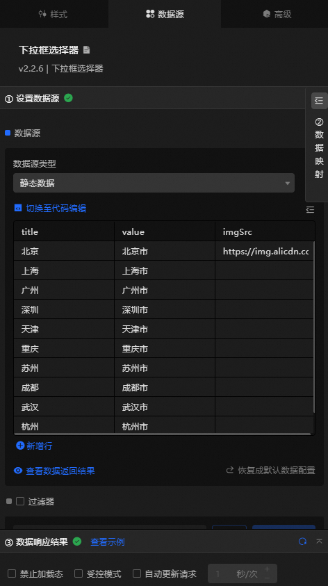
Field | Notes |
| The title content of the pop-up window for each option in the drop-down box selector. |
| The actual display value of each option in the drop-down box selector. The field value is of the string type and cannot be set to the int type. |
| (Optional) The default check value for the drop-down box selector. |
| Optional. The icon of each option in the drop-down selector. This option is displayed only when the Icon Configuration option in the Style panel is turned on. |
Configure data items | Notes |
DataSource | You can use the code editor or visual editor to view the data fields contained in the widget. You can also modify the Data Type parameter to flexibly configure the component data. |
Data Mapping | If you need to customize chart field configurations, you can set different field mapping content in the Data Mapping module and field mapping these content to the corresponding fields of the widget. This allows you to match data without modifying the fields in the data source. You can also click the |
Configure a filter | Turn on Filter, select an existing data filter or create a data filter, and configure a data filter script to filter data. For more information, see Manage data filters. |
Data Response Result | The Data Response Result section displays widget data in real time. If the data source of the widget changes, this section displays the latest data. If the system response is delayed, you can click the |
Forbid Loading | If you select the check box, you will not see the loaded content during component initialization when you update the component and preview the data kanban. If you select the check box, the opposite is true. By default, the status is deselected. |
Controlled Mode | If you select the check box, the component does not request data in the initialized state, and only requests data by using global variables or the method configured in Blueprint Editor. If you clear the check box, you can use automatic update to request data. By default, the status is deselected. |
Auto Data Request | Select the check box to manually enter the time frequency of polling to set dynamic polling. If you clear the page, the page is not automatically updated. You need to manually refresh the page or use Blueprint Editor and global variable events to trigger a request to update data. |
 icon to configure the field style.
  icon on the right to view the data response result. You can also click the
  icon on the right to obtain the latest data of the widget. You can also click View Example to view an example of the response result of the current component.
 Advanced Panel
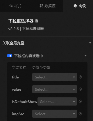
Turn on the switch to enable the associated global variable feature. You can change the content of the selection in the drop-down box, trigger a data request, throw a temporary variable, and then configure the use in other components. By default, the title, value, isDefaultShow, and imgSrc values configured in the Data Source panel are thrown. For more information, see Component interaction configuration.
Blueprint Interaction
Click the
icon in the upper-left corner to go to the Blueprint page. On the Layer Nodes tab, add the widget to the main canvas.
View blueprint configuration parameters.
Event
Event
Notes
When the drop-down box selector port request is completed
The event is triggered with the processed JSON data after a data interface request is responded and processed by a filter. For more information about specific data examples, see the Data Response Result section of the Data Source tab in the right-side configuration panel of the canvas editor.
The content of the drop-down list is selected.
The event that is raised when the content of the drop-down box is selected, and the data item corresponding to the value is also raised. For more information, see the data example.
{
  "title": "Beijing",
  "value": "Beijing",
  "isDefaultShow": true,
  "imgSrc": "https://img.alicdn.com/tfs/TB1jV1lcF67gK0jSZPfXXahhFXa-128-129.png"
}
Action
Action
Notes
Import drop-down box selector interface
After data of a widget is processed in accordance with its drawing format, the widget is imported for redrawing. You do not need to request server data again. For more information, see the data example.
[
  {
    "title": "Beijing",
    "value": "Beijing",
    "isDefaultShow": true,
    "imgSrc": "https://img.alicdn.com/tfs/TB1jV1lcF67gK0jSZPfXXahhFXa-128-129.png"
  }
]
Request drop-down box selector interface
This action is performed to request the server data again. The data sent by an upstream data processing node or layer node is used as a parameter. For example, if the drop-down box selector is configured with the API data source as
https://api.testand the data transferred to the request drop-down box selector interface is{ id: '1'}, the final request interface ishttps://api.test?id=1.Set Selected Entries
Indicates that the value in the current drop-down box is set. For more information, see the data example.
{
  "title": "Shanghai",
  "value": "Shanghai"
}
Clear selected entries
Clear the selected drop-down box entry. No parameters are required.
Obtain the current drop-down box value
Gets the value in the current drop-down box. No parameters are required.
Clear the default value of a component
Restores the value in the current drop-down list to the default value. No parameters are required.
Move
Move a widget to a specified location. For more information, see the data example.
    {
      // The positioning type. to indicates absolute positioning, whereas by indicates relative positioning. The default value is to.
        "positionType": "to",
      // The location, which is indicated by the x and y coordinates.
      "attr": {
        "x": 0,
        "y": 0
      },
      // The animation type.
      "animation": {
        "enable": false,
        // The duration in which animation is displayed.
        "animationDuration": 1000,
        // The animation curve, which can be set to linear|easeInOutQuad|easeInOutExpo.
        "animationEasing": "linear"
      }
    }
Switch Display /Display
Toggles whether the widget is displayed or hidden. No parameters are required.
Display
Display the widget. For more information, see Data example.
{
  "animationType": "",// The animation method. Valid value: fade. If you do not set this parameter, no animation is available.
  "animationDuration": 1000,// The animation delay. Unit: ms.
  "animationEasing": ""// animation curve
}
Hide
Hide the component. For more information, see Data example.
{
  "animationType": "",// The animation method. Valid value: fade. If you do not set this parameter, no animation is available.
  "animationDuration": 1000,// The animation delay. Unit: ms.
  "animationEasing": ""// animation curve
}
Update component configurations
Style configurations of widgets are dynamically updated. In the Style panel, click Copy Configuration to Clipboard to obtain the configuration data of the widget. After that, change the style field for the data processing node in Blueprint Editor.
 icon in the upper-left corner to go to the Blueprint page.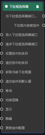
Case demonstration
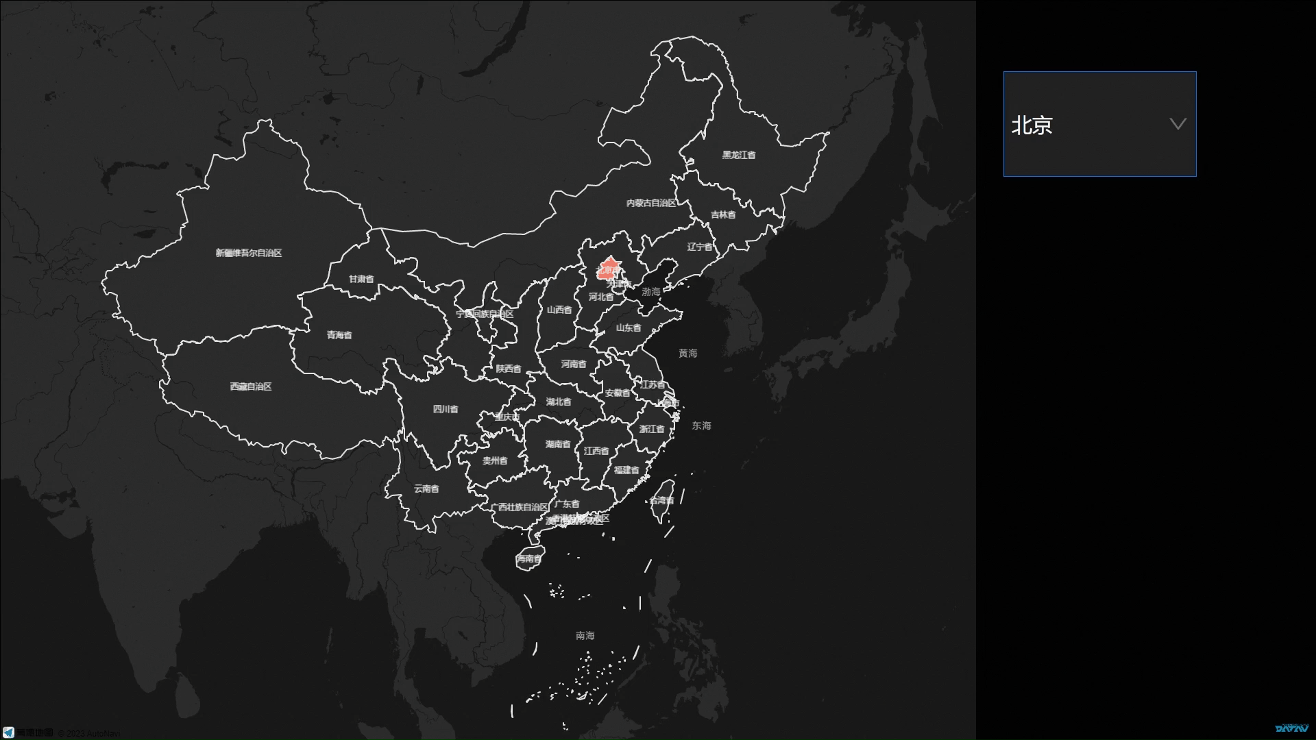
In this example, the selection function of the drop-down box selector is used to dynamically display the city area heatmap in the flat map.
Log on to the DataV console.
Select a dashboard and click Edit to go to the Canvas Editor page.
Add the drop-down selector and basic flat map components to the canvas.
Click the drop-down list and select Data Source Panel to modify static data.
[
  {
    "title": "Beijing",
    "value": "Beijlng",
    "lng": 116.40632076,
    "lat": 39.89450291,
    "isDefaultShow": true,
    "adcode": "110000",
    "colorField": 1200,
    "textureShapeField": "A",
    "textureColorField": 1200,
    "info": "Beijing"
  },
  {
    "title": "Shanghai",
    "value": "Shanghai",
    "lng": 121.47299061,
    "lat": 31.22716135,
    "adcode": "310000",
    "colorField": 1200,
    "textureShapeField": "B",
    "textureColorField": 150,
    "info": "Shanghai"
  },
  {
    "title": "Guangdong",
    "value": "Guangdong",
    "lng": 113.2571588,
    "lat": 23.09843572,
    "adcode": "440000",
    "colorField": 1200,
    "textureShapeField": "B",
    "textureColorField": 200,
    "info": "Guangdong Province"
  },
  {
    "title": "Shenzhen",
    "value": "Shenzhen",
    "lng": 114.05894426,
    "lat": 22.54231542,
    "adcode": "440300",
    "colorField": 1200,
    "textureShapeField": "B",
    "textureColorField": 700,
    "info": "Shenzhen"
  },
  {
    "title": "Tianjin",
    "value": "Tianjin",
    "lng": 117.19545325,
    "lat": 39.07749431,
    "adcode": "120000",
    "colorField": 1200,
    "textureShapeField": "B",
    "textureColorField": 1500,
    "info": "Tianjin"
  },
  {
    "title": "Chongqing",
    "value": "Chongqlng",
    "lng": 106.54702949,
    "lat": 29.53667791,
    "adcode": "500000",
    "colorField": 1200,
    "textureShapeField": "B",
    "textureColorField": 800,
    "info": "Chongqing"
  },
  {
    "title": "Jiangsu",
    "value": "Jiangsu",
    "lng": 118.7892579,
    "lat": 32.04676609,
    "adcode": "320000",
    "colorField": 1200,
    "textureShapeField": "B",
    "textureColorField": 100,
    "info": "Jiangsu province"
  },
  {
    "title": "Sichuan",
    "value": "Sichuan",
    "lng": 104.04941941,
    "lat": 30.5477514,
    "adcode": "510000",
    "colorField": 1200,
    "textureShapeField": "B",
    "textureColorField": 1200,
    "info": "Sichuan Province"
  },
  {
    "title": "Hubei",
    "value": "Hubei",
    "lng": 114.30359243,
    "lat": 30.57913598,
    "adcode": "420000",
    "colorField": 1200,
    "textureShapeField": "B",
    "textureColorField": 400,
    "info": "Hubei province"
  },
  {
    "title": "Shaanxi",
    "value": "Shanxi",
    "lng": 108.92574006,
    "lat": 34.30156022,
    "adcode": "610000",
    "colorField": 1200,
    "textureShapeField": "B",
    "textureColorField": 600,
    "info": "Shaanxi Province"
  },
  {
    "title": "Qinghai",
    "value": "Qlnghai",
    "lng": 101.78380219,
    "lat": 36.58760494,
    "adcode": "630000",
    "colorField": 1200,
    "textureShapeField": "B",
    "textureColorField": 200,
    "info": "Qinghai province"
  }
]
Click the Basic Flat Map widget. In the panel that appears, click the Region layer and delete static data in the Data Source section.
Click the
icon in the upper-left corner to go to the Blueprint page. On the Layer Nodes tab, add a thermal region layer, a basic plane map, and a drop-down selector to the main canvas.
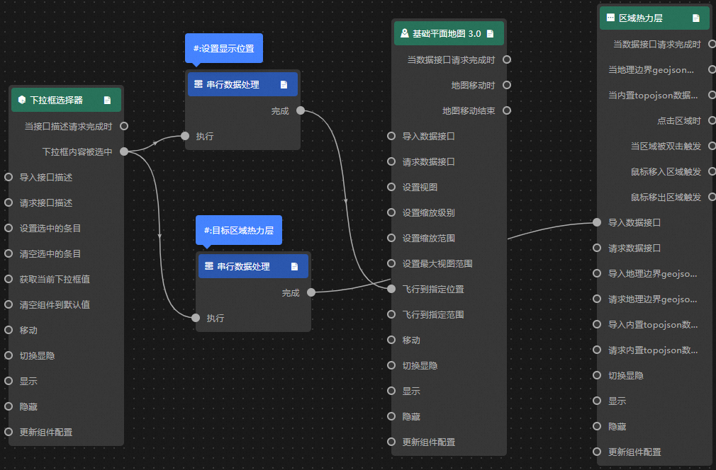
On the Logical Nodes tab, add two serial data processing nodes to the main canvas.
Connect components.
Configure the processing method of the Serial Data Processing node.
Set Display Position
return {
  "zoom": 7,// The zoom level.
  "lat": data.lat,// Dimension
  "lng": data.lng,// Longitude
  "duration": 0.25 // The response time interval.
}
Thermal layer of target area
return [{
  "adcode": data.adcode,
  "name": data.name,
  "colorField": data.colorField,
  "textureShapeField": data.textureShapeField,
  "textureColorField": data.textureColorField,
  "info": data.info
}]
Click Preview in the upper-right corner to preview the results.