This article introduces the concept of design library, asset classification, and how to use the design library to make a visual screen.
The design library features are new features of the 7.0 version of the product. You can use the new version of the console.
What is a design library
DataV helps users quickly retrieve the modules required for large visualization screens based on the standard links for users to build large visualization screens. It is convenient for users to create high-quality large visualization screens based on standard design specifications by dragging and dropping. What is the difference between a design library and a component library? Components usually contain a set of default styles, which are difficult to meet various scenarios at the same time. In the design library, each title, panel, and map have been carefully configured and optimized by the designer. The style is arbitrarily selected, out-of-the-box, and freely combined, which greatly improves the efficiency of large screen construction.
Visualization Suite Type
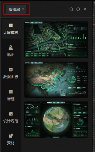
During the design process, users often use templates to create projects. However, the data panels or maps of a single template often cannot meet the diverse scenario requirements of users. When using materials from other templates, you will encounter the problem of style mismatch, resulting in a serious sense of patchwork of the page and affecting the appearance. DataV provides five visualization kits in the design library: Sunny Mountain Blue, Danxia Orange, Twilight Mountain Purple, Tourmaline Green, and Yunfeng White. You can click the All drop-down list in the upper-left corner to select a visualization kit. 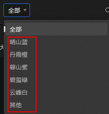
Visualization Suite Content
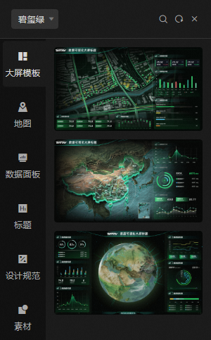
Each visualization kit contains the following for easy selection by users. For example: tourmaline green.
Dashboards: shows the regional map template, China map template, and 3D globe template to suit different scenarios.
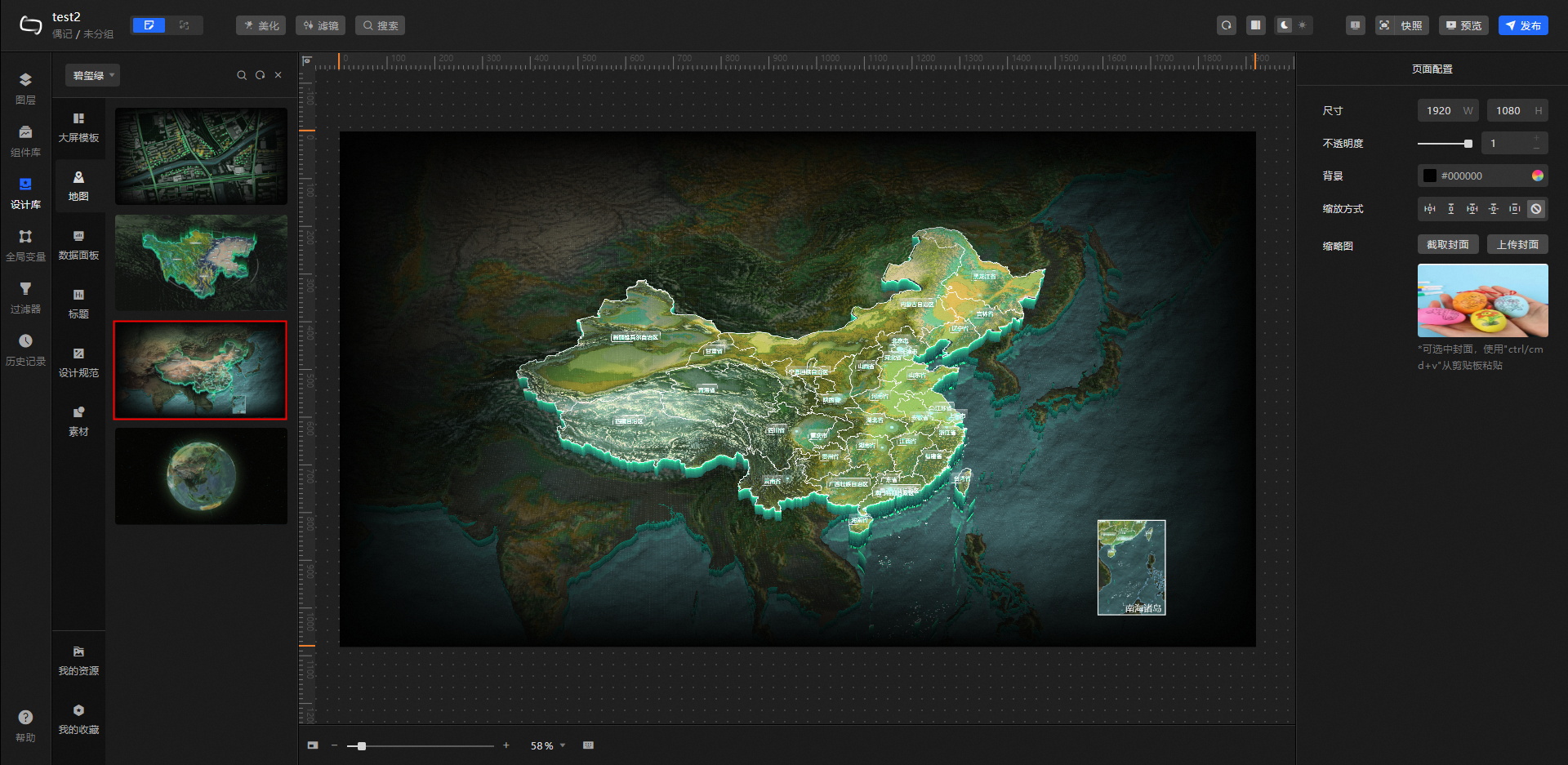
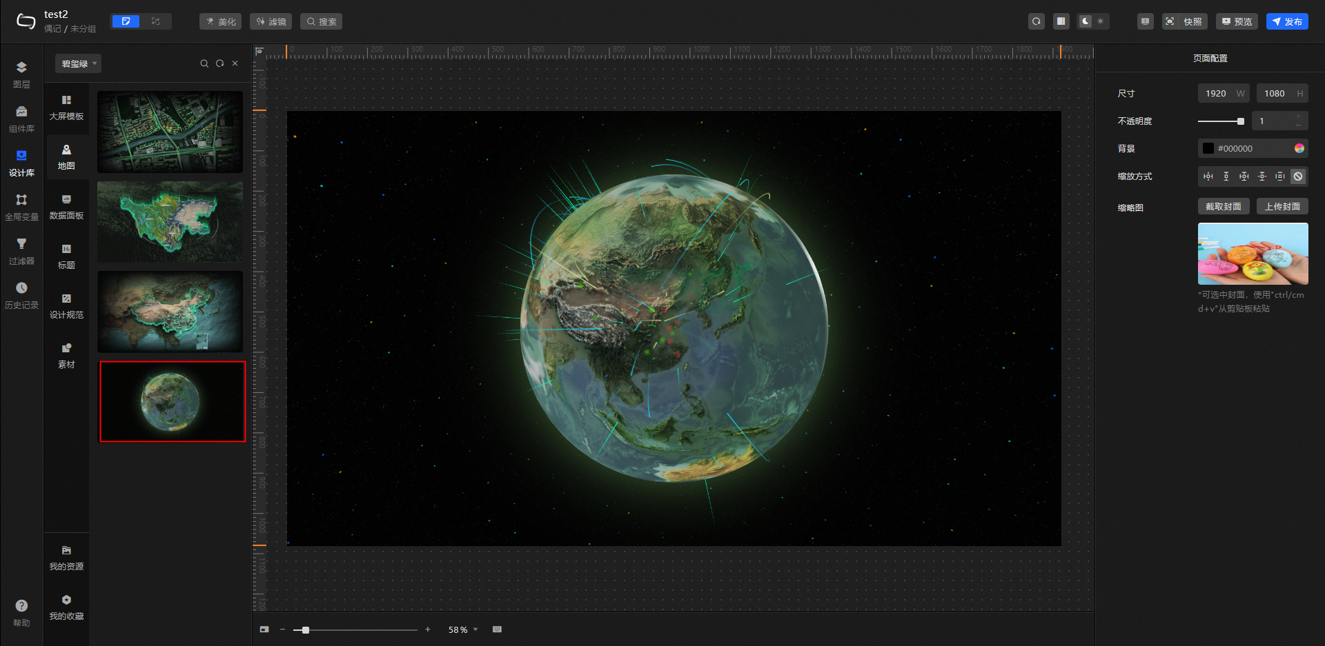
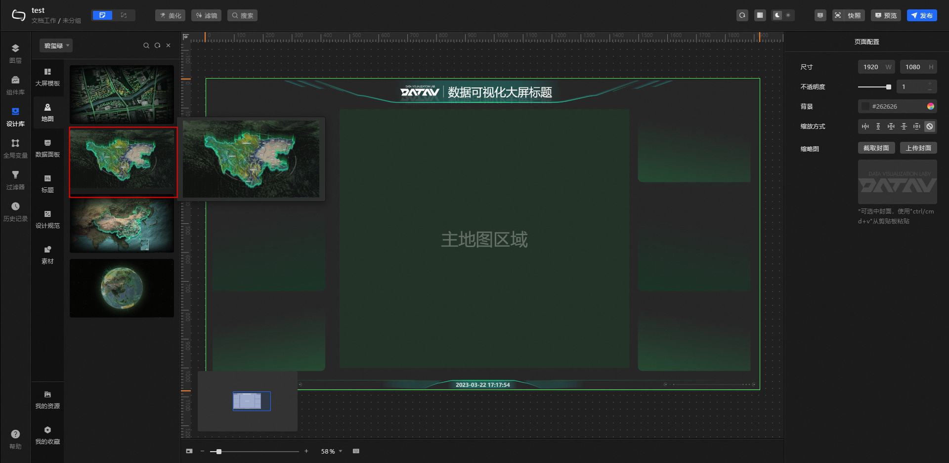
Map: displays a variety of map styles, including but not limited to a flat area map, a 3D province map, a 3D China map, and a 3D earth map. You can replace the map in the template when you modify the template. We will implement more map styles in the future, so stay tuned.
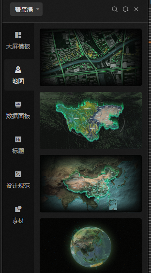
Flat Area Map
3D province map
3D China Map
3D Earth
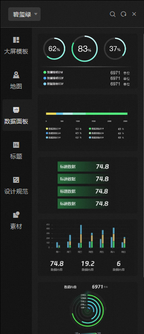
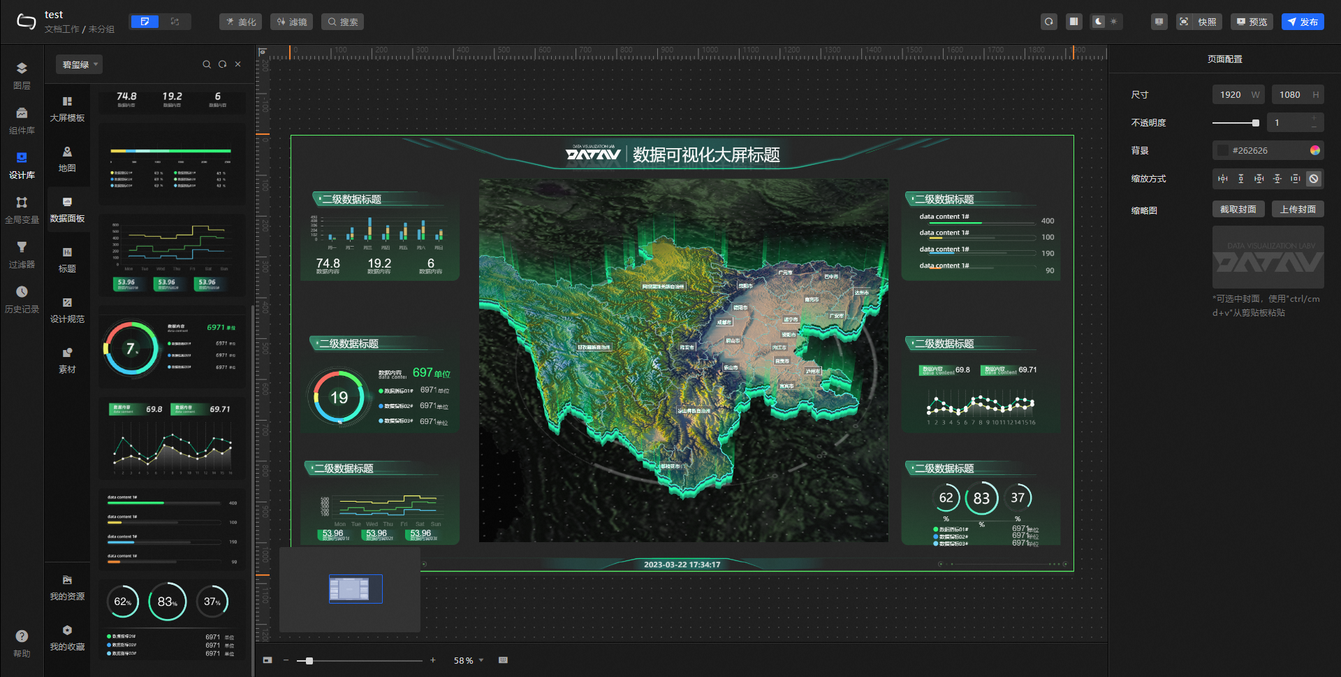
Data Panel: displays common types of data panels, including but not limited to ticker board, pie chart, line bar chart, and progress bar indicator. You can select some content to add to the custom big screen, or change the style, color, and other configuration items.
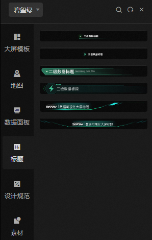
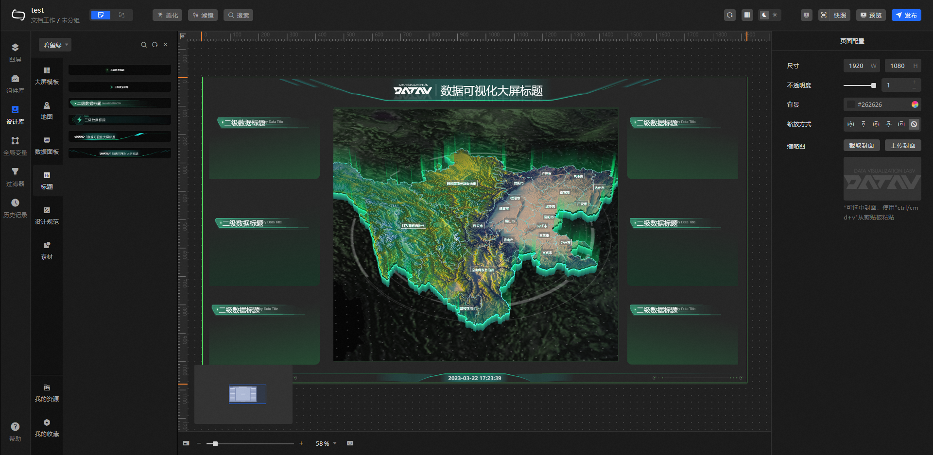
Title: displays common types of title widows, including but not limited to level -1, level -2, and level -3 titles. You can quickly select and change to a large screen to meet your design requirements.
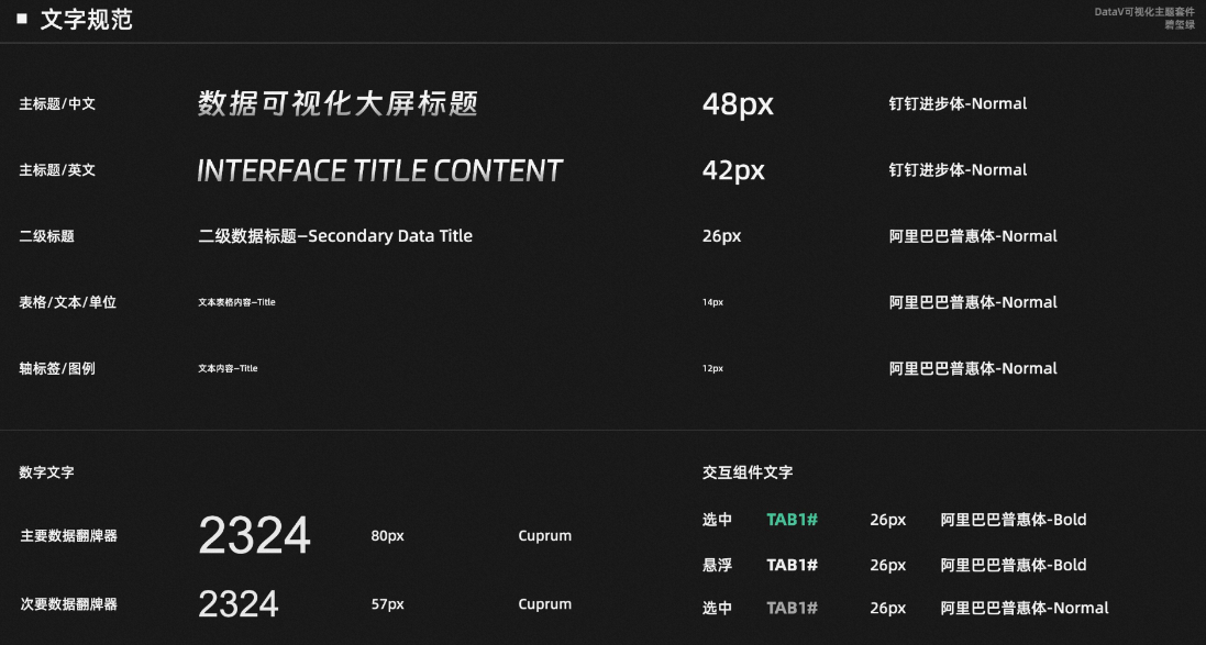
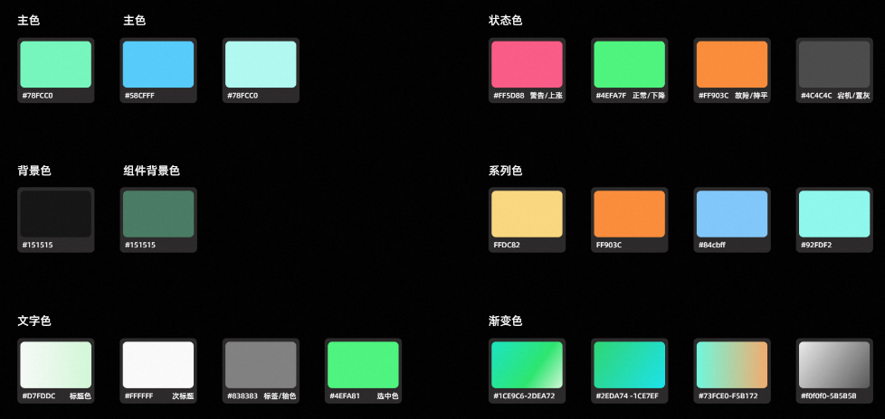
Design Specifications: displays the Main Visual Layout, Text Specifications, and Color Specifications of the current visualization suite. You can select asset types to add to the canvas based on your requirements.
Main visual layout example
Text specification
Color specification
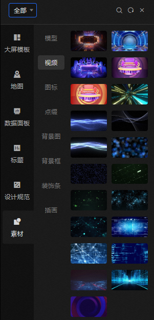
Materials: displays the materials that are commonly used in large-screen visualizations, including but not limited to models, videos, icons, embellishments, background images, background frames, decorative strips, and illustrations.
 Note
NoteThe material type is not distinguished in the visualization kit. Select All from the drop-down list in the upper-left corner to view the material type.
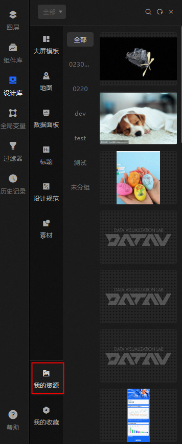
My Resources: shows the design resources in the console. You can click or drag the resources to the canvas.
 Note
NoteThe current module content is not affected by the visualization suite type.
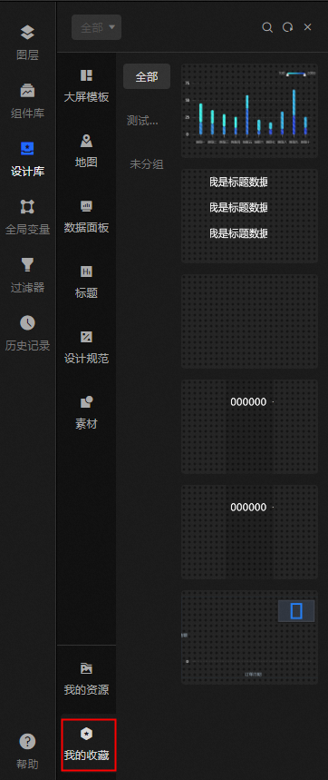
My Favorites: shows the widgets in the console. The widgets are saved in the current module. You can click or drag them to the canvas to use them again.
 Note
NoteThe current module content is not affected by the visualization suite type.
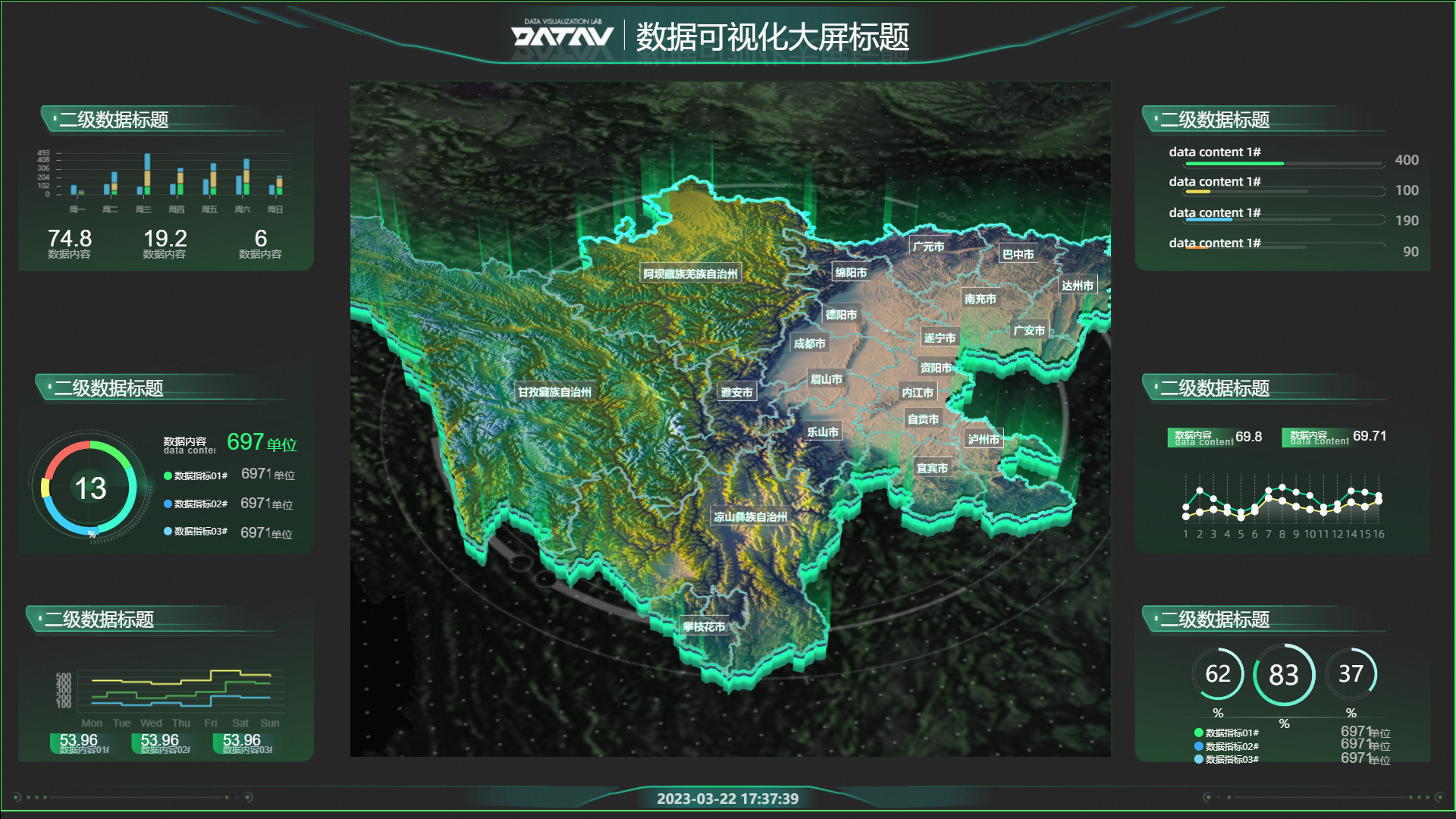
Case demonstration
This case describes how to quickly build a data dashboard by using the visualization kit.
Log on to the DataV console.
On the console page, move the pointer over Create PC Kanban Board and click Select Template.
On the Create Kanban Board page, select Blank Kanban Board and click Create Kanban Board.
Enter a name for the kanban and click Create kanban.
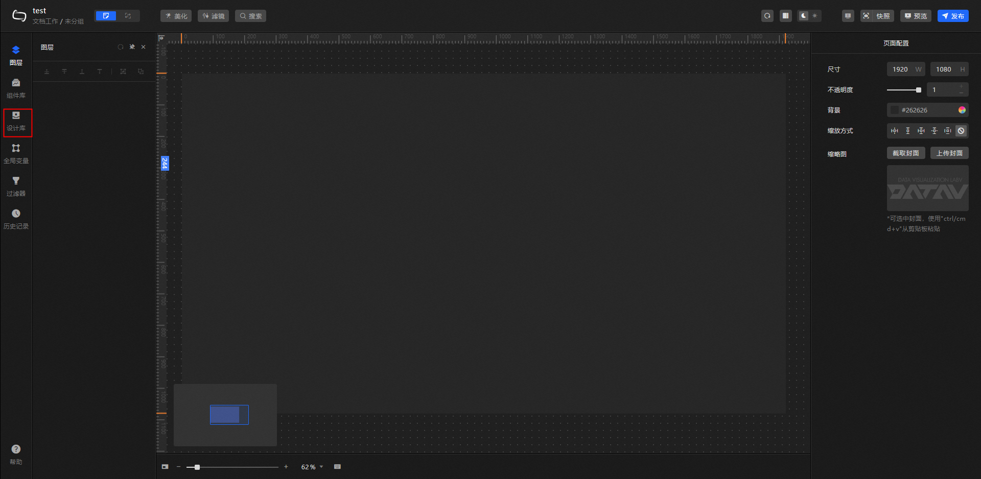
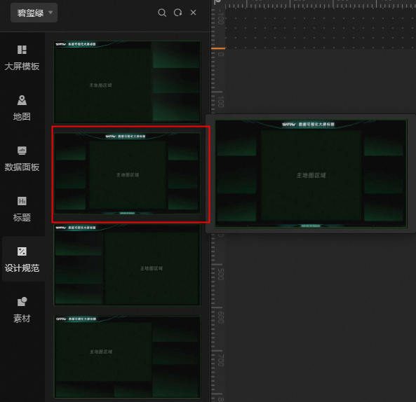
In the left-side navigation pane, click Design Libraries.
Click All in the upper-left corner of the Design Library page and select Tourmaline Green from the drop-down list.
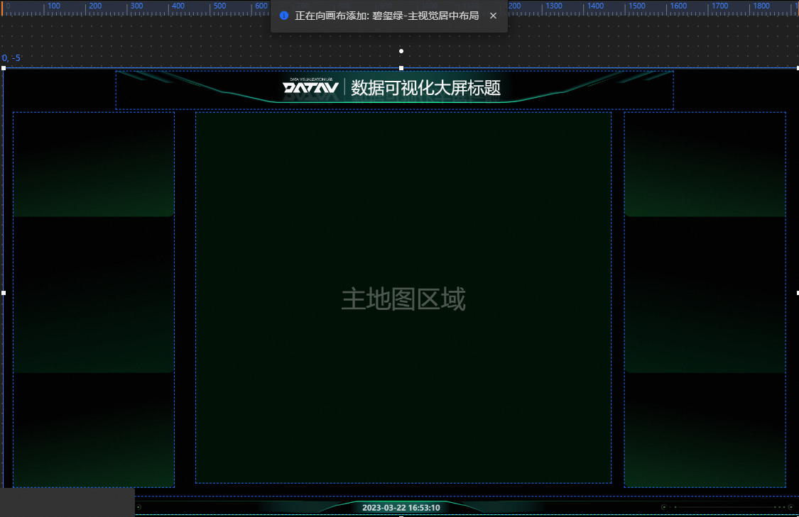
Click Design Specifications and select Main Visual Center Layout.
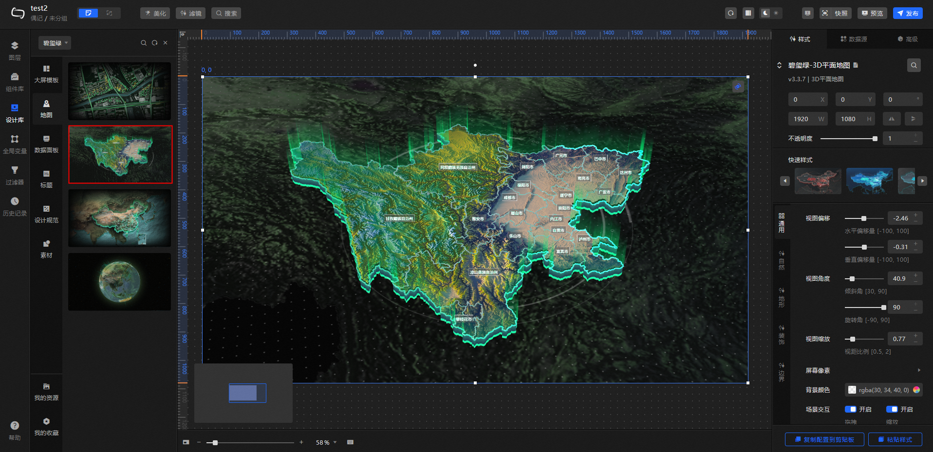
Click Map and insert a 3D province map in the main map section. Drag and drop the edit map size to the main map area.
Click Title to add a title widget to the background block. Check the size of the customized background and fit the title component above the background block.
Click Data Dashboard and select the assets that you want to add. Adjust the size and style of each asset individually to fit above the customized background.
(Optional) Select the assets to be added in the material to beautify and improve the digital screen.
After you complete the design, click Preview in the upper-right corner of the Canvas Editor page to preview the digital screen.
Video Demo
The video shows the demonstration process of a large map screen, which is for reference only. You can also flexibly use various elements in the kit according to your own usage habits.
Panel function
In the upper part of the Design Library panel, you can perform the following operations:
Click the
 icon to refresh the Design Library page.
 Click the
 icon to open the Shortcut Search panel and enter the design component that you want to query.
 Click the
 icon to close the Design Library panel.