This topic describes the chart style and configuration panel of the Echarts polar area chart.
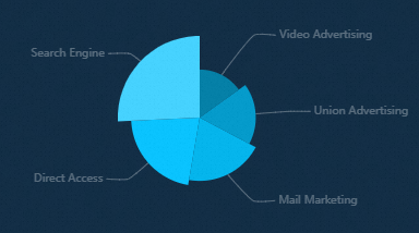
Chart Style
Configuration Panel 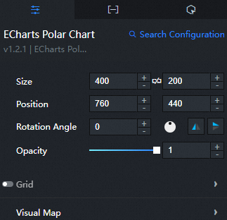
Search Configuration: Click Search Configuration in the upper-right corner of the Configuration panel. In the Search Configuration panel, enter the name of the configuration items that you want to search for to quickly locate the configuration items. Fuzzy match is supported. For more information, see Search for asset configurations.
Size: indicates the size of a widget, including its pixel width and height. You can click the
 icon to lock the aspect ratio of the widget and modify the width and height of the widget in equal proportion. After you click this icon again, you can adjust the width and height as needed.
 Position: the position of a widget, which is indicated by pixel X and Y coordinates. X-coordinate indicates the pixel distance between the upper-left corner of the widget and the left border of the canvas. Y-coordinate indicates the pixel distance between the upper-left corner of the widget and the upper border of the canvas.
Rotation Angle: the angle of a rotation that uses the center point of a widget as the rotation point. The unit is degrees (°). You can use one of the following methods to control the rotation angle of a widget:
Directly enter the degrees in the Rotation Angle spin box or click the plus sign (+) or minus sign (-) to increase or decrease the value in the Rotation Angle spin box.
Drag the
 black dot in the icon to control the rotation angle of the widget.
 Click the
 icon to flip the widget style.
 Click the
 icon to flip the widget style.
Opacity: Valid values: 0 to 1. If this parameter is set to 0, the widget is hidden. If this parameter is set to 1, the widget is completely displayed. Default value: 1.
Grid: Click the Eye icon on the right to display the grid style.
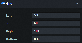
Left: the distance between the grid and the left border of the widget. Default value: 3%. The following types of input are supported:
The specific pixel value, for example, 20.
Percentage relative to the height and width of the container, such as 20%.
left, center or right, the components are automatically aligned according to the corresponding position.
Top: the distance between the grid and the upper border of the widget. Default value: 60. The following types of input are supported:
The specific pixel value, for example, 20.
Percentage relative to the height and width of the container, such as 20%.
left, center or right, the components are automatically aligned according to the corresponding position.
Right: the distance between the grid and the right border of the widget. Default value: 4%. The following types of input are supported:
The specific pixel value, for example, 20.
Percentage relative to the height and width of the container, such as 20%.
left, center or right, the components are automatically aligned according to the corresponding position.
Bottom: the distance between the grid and the lower boundary of the widget. Default value: 3%. The following types of input are supported:
The specific pixel value, for example, 20.
Percentage relative to the height and width of the container, such as 20%.
left, center or right, the components are automatically aligned according to the corresponding position.
Width: the width of the grid. Default value: auto. The width is adaptive.
Height: the height of the grid. Default value: auto.
Adaptive Layout: If you select this check box, the histogram is used to adapt the layout. If you clear this check box, the histogram is used to adapt the layout.
Background Color: Click the drop-down list and select a fill style for the grid background color, including Color Fill and Gradient Fill. Modify the background color of the mesh. The default color is transparent. For more information, see the color picker description.
Border Color: Click the drop-down list and select a fill style for the border color of the mesh, including Color Fill and Gradient Fill. Modify the border color of the grid. The default color is transparent. For more information, see the color picker description.
Border Width: Click + or-, or enter a value to adjust the border thickness.
Visual Mapping: The visual mapping component is used for visual encoding, that is, mapping data to visual elements.
Enable: Select the check box to enable visual mapping.
Minimum Value: the minimum value allowed for custom visual mappings.
Maximum Value: the maximum value allowed for custom visual mappings.
dialog box: Click the eye icon on the right to display the dialog box.
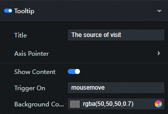
Tip Title: the title of the prompt that is displayed when the pointer is hover.
Axis Indicator
Type: the type of the indicator. Valid values: Line Indicator, Shadow Indicator, and Crosshair Indicator.
Automatic Adsorption: If you select this check box, the axis indicator is automatically adsorbed to the point. This function is more meaningful on the numerical axis and the time axis, and can automatically find small numerical points.
Label: Click the Eye icon on the right to display the label of the axis indicator.
precision: the decimal point precision of the value in the text label. By default, the value is automatically determined based on the value of the current axis. You can also specify an integer value, such as 2, which indicates that two decimal places are retained.
Outer Spacing: If you select this option, there is a certain distance between the axis indicator label and the axis. If you clear the check box, there is no spacing between the axis indicator label and the axis.
Text Style
Color: Modify the color of the axis indicator label text. For more information, see color picker description.
Font Style: the font style of the axis indicator label text.
Font weight: the font weight of the axis indicator label text.
Font: the font family of the axis indicator label text.
Font Size: the font size of the axis indicator label text.
Background Color: Modify the background color of the axis indicator text label. For more information, see color picker description.
Border Color: Modify the border color of the axis indicator text label. For more information, see color picker description.
Border: the border thickness of the axis indicator text label.
Axis Style
Color: Modify the color of the axis by referring to the color picker description.
Width: Click the + or-sign or enter a value to modify the width of the axis line.
Type: the type of the axis. Optional. Valids: solid lines and dashed lines.
Opacity: Click the + or-sign or enter a value to modify the transparency of the axis. The range is [0,1].
Shadow Style
Color: Modify the color of the shadow. For more information, see the color picker description.
Transparency: Click the + or-sign or enter a value to modify the transparency of the shadow. The range is [0,1].
Crosshair Style
Color: Modify the color of the crosshair by referring to the color picker description.
Width: Click the + or-sign or enter a value to modify the width of the crosshair.
Type: the type of the crosshairs. Optional. Valids: solid lines and dashed lines.
Transparency: Click the + or-sign or enter a value to modify the transparency of the crosshair. The range is [0,1].
Trigger Condition: the type of the trigger that you want to trigger. You can select Mouse Move Trigger, Mouse Click Trigger, and Mouse Move and Click Trigger.
Background Color: Change the background color of the dialog box. For more information, see color picker description.
Border Color: Modify the border color of the dialog box. For more information, see color picker description.
Border thickness: Click + or-, or enter a value to change the border thickness of the background frame.
Pin: Click the + or-sign, or enter a number manually to modify the inner margin of the background frame. Unit: pixels. The default inner margin is 5.
Text Style
Color: Modify the color of the dialog box text. For more information, see color picker description.
Font Style: dialog box the font style of the text.
Font weight: dialog box the font weight of the text.
Font: dialog box the font family of the text.
Font Size: dialog box the font size of the text.
Series
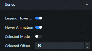
Legend Interaction Highlight: If you select this check box, the interaction is highlighted when the legend hover is started.
Hover Animation: If you select this option, the animation effect is displayed when the hover switch is enabled.
Selection Mode: Click the Eye icon to display the selection mode.
Displacement: Click the + or-sign or enter a value to change the distance between the selected sectors.
Clockwise: The sectors are sorted clockwise in ascending order.
Start Angle: Click the + or-sign or enter a value to modify the start angle of the sector.
Minimum Angle: Click + or-, or enter a value to modify the minimum angle of the sector.
Nightingale: Click the Eye icon on the right to display the Nightingale mode.
Label Overlapping Prevention: Click the Eye icon to display the label overlap prevention mode.
Show Zero Sectors: Click the eye icon on the right to show zero sectors.
Static: If you select this option, you cannot interact with the axes if they are static.
Labels
Normal Items: Click the Eye icon on the right to display the label text of normal items (columns that do not respond to mouse events).
Text Style
Color: Modify the color of the common item label text. For more information, see color picker description.
Font Style: the font style of the label text.
Font weight: the font weight of the label text.
Font: the font family of the label text.
Font Size: the font size of the label text.
Key Items: Click the Eye icon on the right to display the label text of the key item (the column that responds to mouse events).
Text Style
Color: Modify the color of the major item label text. For more information, see color picker description.
Font Style: the font style of the key item label.
Font weight: the font weight of the highlight label text.
Font: the font family of the highlight label text.
Font Size: the font size of the key item label.
Label Guide
Normal Items: Click the Eye icon on the right to display the label text of normal items (columns that do not respond to mouse events).
Length: Click + or-, or enter a value to modify the length of the label guide.
Second Length: Click the + or-sign or enter a value to modify the length of the second length of the label guide.
Smooth Curve: Click the + or-sign or enter a value to modify the smoothness of the curve.
Axis Style
Color: Modify the color of the axis by referring to the color picker description.
Width: Click the + or-sign or enter a value to modify the width of the axis line.
Type: the type of the axis. Optional. The value can be a solid line or a dashed line.
Opacity: Click the + or-sign or enter a value to modify the transparency of the axis. The range is [0,1].
Key Items: Click the Eye icon on the right to display the label text of the key item (the column that responds to mouse events).
Axis Style
Color: Modify the color of the axis by referring to the color picker description.
Width: Click the + or-sign or enter a value to modify the width of the axis line.
Type: the type of the axis. Optional. The value can be a solid line or a dashed line.
Opacity: Click the + or-sign or enter a value to modify the transparency of the axis. The range is [0,1].
Element Style
Ordinary Item
Default Color: Click the Eye icon on the right to display the default color mode.
Color: Modify the color of common elements by referring to the color picker description.
Border Color: Modify the border color of common item elements. For more information, see color picker description.
Border Width: Click the + or-sign or enter a value to modify the border thickness of the normal element.
Border Style: the stroke type of the border. The stroke type can be Solid Line or Dotted Line.
Major Items
Color: Modify the background color of the highlight element by referring to the color picker description.
Border Color: Modify the border color of the major item element. For more information, see color picker description.
Border Width: Click the + or-sign or enter a value to modify the border thickness of the major item.
Border Style: the type of the border. This parameter is optional. Valid values: Solid and Dotted.
Transparency: Click the + or-sign or enter a value to modify the transparency of normal elements. The value ranges from 0 to 1.
Animation: Select this check box to enable animation.
Data tab
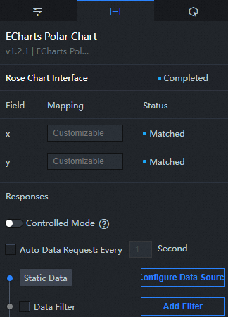
Configuration field description
Column | Description |
| Used to configure the category of each axis in the rose chart, that is, the value of the x-axis. |
| Used to configure the category of each axis in the rose chart, that is, the value of the y-axis. |
Interaction tab
No interaction event is configured for this widget.
Configure interactions in Blueprint Editor
In Canvas Editor, right-click a widget and select Export to Blueprint Editor.
Click the
 icon in the upper-left corner.
 In Blueprint Editor, click polar area chart in the Imported Nodes pane. You can view the polar area chart parameters in the canvas, as shown in the following figure.
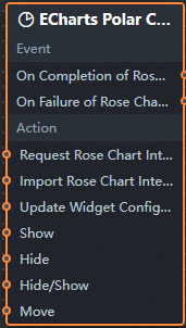
Events
Events
Description
When the data interface request is completed
The event is triggered with the processed JSON data after a data interface request is responded and processed by a filter. For more information about specific data examples, see the Data Response Result section of the Data tab in the right-side configuration panel of the canvas editor.
When a data interface request fails
The event that is returned when a data interface request fails (such as network problems or interface errors) and is processed by the filter. The event also throws the processed JSON data. For more information about specific data examples, see the Data Response Result section of the Data tab in the right-side configuration panel of the canvas editor.
When you click the pie chart
The event that is raised when a polar area chart sector is clicked, along with the data item corresponding to that sector.
When you select a pie chart
The event that is raised when a pie chart is selected, along with the data item corresponding to that slice.
action
Action
Description
Request Data Interface
This action is performed to request the server data again. The data sent by an upstream data processing node or layer node is used as a parameter. For example, polar area chart the API data source is
https://api.testand the data transferred to the request data interface is{ id: '1'}, the final request interface ishttps://api.test?id=1.Import data
After data of a widget is processed in accordance with its drawing format, the widget is imported for redrawing. You do not need to request server data again. For more information about specific data examples, see the Data Response Result section of the Data tab in the right-side configuration panel of the canvas editor.
Highlight
The input data of the action is of the object type. The parameters include
seriesName(series name),seriesIndex(series index),dataIndex(data index), andname(data name). Sample data:{ "seriesName": "", "seriesIndex": 1, "dataIndex": 1, "name": "" }Unhighlight
The input data of the action is of the object type. The parameters include
seriesName(series name),seriesIndex(series index),dataIndex(data index), andname(data name). Sample data:{ "seriesName": "", "seriesIndex": 1, "dataIndex": 1, "name": "" }Display dialog box
The input data of the action is of the object type. The parameters include
dataindex(data index),name(data name),x(x-axis position), andy(y-axis position). Sample data:{ "dataIndex": 1, "name": "", "x": 1, "y": 1 }Hide dialog box
Hide dialog box, no parameters required.
Pie chart sector selection status control
The input data of the action is of the object type. The parameters include
type(fan action type) andseriesName(series name). Sample data:{ "type": "pieToggleSelect", "seriesName": "", "seriesIndex": 1, "dataIndex": 1, "name": "" }Update component configurations
Style configurations of widgets are dynamically updated. In the Configuration panel, click Copy Configuration to Clipboard to obtain the configuration data of the component. After that, change the style field for the data processing node in Blueprint Editor.
Display
The following example shows the widget.
return{
  "animationType": "",
  "animationDuration": 1000,
  "animationEasing": "linear"
}
Hide
The following example shows how to hide a widget:
return{
  "animationType": "",
  "animationDuration": 1000,
  "animationEasing": "linear"
}
Switch to the implicit state
The following example shows whether to show or hide a widget.
return {
  "animationIn": {
    "animationType": "",
    "animationDuration": 1000,
    "animationEasing": "linear"
  },
  "animationOut": {
    "animationType": "",
    "animationDuration": 1000,
    "animationEasing": "linear"
  }
}
Move
Move a widget to a specified location. The following example shows the reference data.
    return{
      // The positioning type. to indicates absolute positioning, whereas by indicates relative positioning. The default value is to.
        "positionType": "to",
      // The location, which is indicated by the x and y coordinates.
      "attr": {
        "x": 0,
        "y": 0
      },
      // The animation type.
      "animation": {
        "enable": false,
        // The duration in which animation is displayed.
        "animationDuration": 1000,
        // The animation curve, which can be set to linear|easeInOutQuad|easeInOutExpo.
        "animationEasing": "linear"
      }
    }