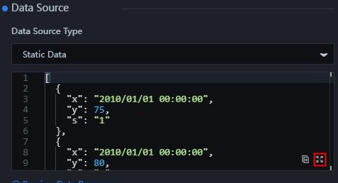
Overview of common and widget-specific configuration items in the DataV Assets panel.
Click a widget on the canvas of a DataV application. The configuration panel appears on the right with three tabs: Configuration, Data, and Interaction. 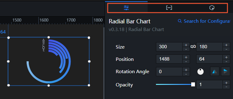
-
The Configuration panel controls the Chart Size, Chart Position, Rotation Angle, Opacity, and other widget properties. Chart Size, Chart Position, Rotation Angle, and Opacity apply to all widgets. For more information about how to configure these fields, see Basic Properties. Other properties vary by widget.
NoteTo configure color-related widget styles, use the color picker description section below.
-
The Data panel lets you copy data, edit data in full screen, and configure data sources. Copy data and Edit data in full screen apply to all widgets. For more information, see Copy data and Edit data in full screen. Data source configuration is widget-specific.
-
The Interaction panel lets you configure interaction events between widgets. Interaction configuration is widget-specific.
Basic Properties
The Basic Attributes section controls the size, position, rotation angle, and opacity of a widget. 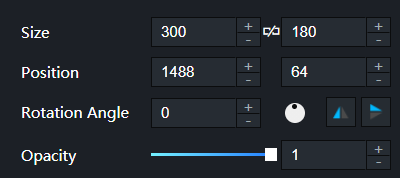
- Size: indicates the size of a widget, including its pixel width and height. You can click the
 icon to proportionally adjust the width and height of a widget. After you click this icon again, you can adjust the width and height as needed.
 - Position: the position of a widget, which is indicated by pixel X and Y coordinates. X-coordinate indicates the pixel distance between the upper-left corner of the widget and the left border of the canvas. Y-coordinate indicates the pixel distance between the upper-left corner of the widget and the upper border of the canvas.
- Rotation Angle: the angle of a rotation that uses the center point of a widget as the rotation point. The unit is degrees (°). You can use one of the following methods to control the rotation angle of a widget:
- Directly enter the degrees in the Rotation Angle spin box or click the plus sign (+) or minus sign (-) to increase or decrease the value in the Rotation Angle spin box.
- Drag the black dot in the
 icon.
icon. - Click the
 icon to horizontally flip a widget.
 - Click the
 icon to vertically flip a widget.
- Opacity: the opacity of a widget. Valid values: 0 and 1. If this parameter is set to 0, the widget is hidden. If this parameter is set to 1, the widget is completely displayed. Default value: 1.
Color picker
Use the color picker to set widget colors such as font, axis, grid line, and border colors. Two methods are available:
-
Click the Common Color Block icon and select a color.
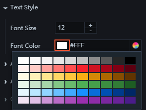
Use common color blocks to quickly apply frequently used colors.
-
Click the Color Picker icon to adjust color transparency, manage global colors, or select a recently used color.
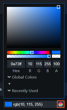
-
Adjust color transparency: Drag the Transparency slider or modify the A value.
-
Add or remove a global color: Select a color from the drop-down list and click the + icon below Global Color to add it. To remove a global color, move the pointer over the added global color and drag it outside the Global Color section.
NoteColors selected through the <g id="1">Global Colors</g> parameter are applied throughout the entire project, and saved in the <g id="2">Recently Used</g> bar of every screen and widget for your convenience.
-
Select a recently used color: The system automatically records your recently used color and displays it in the Recently Used section. Click a color block to apply it.
-
Copy data
In the data source editing box, click the  icon in the lower-right corner to copy all data in the current data editing box.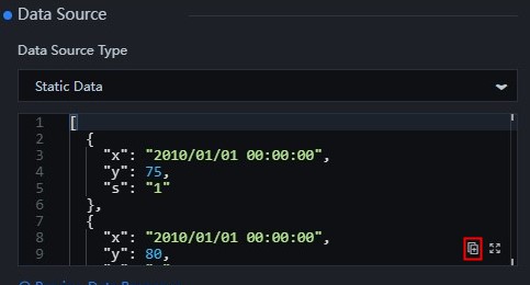
Edit data in full screen
In the data source editing box, click the  icon in the lower-right corner to view and edit data in full screen.