The hybrid scatter layer is a subcomponent of the basic flat map, which can represent point data information on geographic locations in the form of scatter points. The mixed scatter layer supports independent styles, data, and interaction configurations, including the scatter style, dimension style, pop-up style, and interaction configuration of the mixed scatter layer. This topic describes the meaning of each configuration items of the mixed scatter layer.
Settings
- Search for Configurations: In the right-side panel of Canvas Editor, click the Settings tab, and click Search for Configurations in the upper-right corner. Enter the required configuration item in the search box, and click the search icon to quickly locate the configuration item. Fuzzy match is supported. For more information, see Search for widget configuration items.
- Visibility Level: specifies the visible level of the mixed scatter layer. The mixed scatter layer is visible within the specified level, but not outside the level.
- Default Scatter Options: Set parameters such as the scatter type, radius, color, and edge options.
- Configuration Type: the type of the hybrid scatter layer. Valid values: default, DataBind, and iconConfig.
- default
Parameter Description Dot Radius Specifies the size of the scatter radius. Fill Color Sets the fill color of the scatter. Stroke Options Sets the edge color and thickness of the scatter. - dataBind
Parameter Description Dot Radius Sets the range value of the scatter radius and the default size of the radius. Fill Color Sets the color of the corresponding scatter point when the value value in the data source is Maximum, Minimum, and Empty. For a scatter with a value value between the maximum and minimum values, the system sets the color of the scatter to a gradient from the maximum color to the minimum color based on the scale. This option is displayed only if you set the Configuration Type parameter to Data Mapping. Stroke Options Sets the edge color and thickness of the scatter. - iconConfig: If you select iconConfig, scatter points are displayed as icons. In the iconConfig section, you can set the icon image, icon size, relative position, and label offset.
If you do not select Icons, the scatter is displayed as dots. You can configure the color, radius, and edge
of the scatter in the default or dataBind section.
Parameter Description Icon Image URL In the Icon Image URL section - Move the pointer over the image position and click Delete to delete the current image. Then, click the image area or drag the local image to the area to add a scatter style chart.
- Move the pointer over the image position and click Change to upload the local image again.
- You can also enter the URL of the image and use the image on the remote server as a scatter style chart.
Icon Image Size Set the width and height of the scatter icon to control the size of the image. Valid values: 0 to 600. Unit: px. Relative Position Select Bottom or Center. Label Offset Specifies the offset value of the label icon from the horizontal or vertical direction. Valid values: -600 to 600. Unit: px.
- default
- Series: Click the
 or
or  icon on the right to add or delete a series. Click the
  or
or  icon to configure the arrangement style for multiple series. Click the
  icon to copy the configurations of the selected series and add a series with the
same configuration.
icon to copy the configurations of the selected series and add a series with the
same configuration.
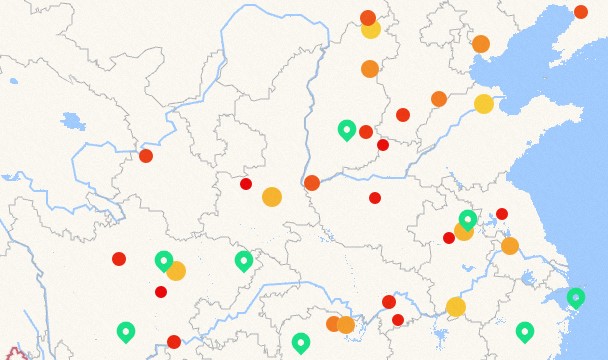
Parameter Description Type Filter Value This parameter corresponds to the type field in the data source. Configure the scatter style corresponding to the type value that you set. Figure 1. Mixed Scatter Layer Type Filter Value Style 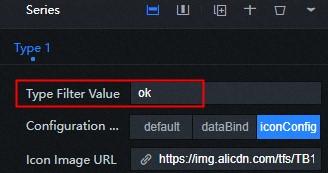
Figure 2. Mixed scatter layer types to filter value data 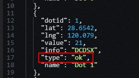
Configuration Type Set the configuration type of each series. For more information, see the default type under Settings to configure the corresponding series. - Label: the text annotation of the scatter point. Click the
 icon on the left of the label to control the display and concealment of the label.
Parameter Description Displayed Field To work with a data source in the Data panel, you need to match a field name in the data. For example, if you set this parameter to name, the scatter label on the visualization application will appear as the value of the name field. Figure 3. Label fields for mixed scatter layers 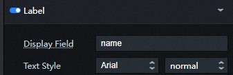
Figure 4. Mixed scatter layer data 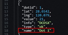
Text Style Set the font, text weight, font size, color, and shadow color of the label text. See the color picker instructions to modify the text color. Relative Position The position of the dimension text relative to the scatter point. Valid values: Center, Top, Bottom, Left, and Right. - Popup Info: On the preview or publish page, click the style of the pop-up box that appears.
Click the icon on the left to control the display of the box.
Note To enable the pop-up feature, you must first set the info field.
- info Field: Turn on the switch and set the info field as the content of the pop-up window. You can configure html tags for this field. If you turn off the switch, the compatible name and value field content are used as the content of the pop-up window.
- Trigger Action: Select the type of the event that is displayed in the dialog box by click or mouseover.
- Configuration Options: the configuration items content of the dialog box. You can select parent or custom.
- parent: the default style.
- custom: You can customize the text style, line height ratio, and fillet radius of the dialog
box.
Parameter Description Text Style Set the font, text weight, font size, color, and shadow color of the text in the dialog box. For more information, see color picker description for color modification. Row-Height to Font-Size Ratio Specifies the high proportion of rows in the popup format. Border Radius Set the fillet radius value of the dialog box. The larger the value, the more rounded the fillet. Padding Set the distance between the text in the box and the four sides of the box. Background Color Sets the background color of the popup. Close Button Set the color, size, distance of the button from the top, and distance from the right side of the closed pop button.
- Interaction Options
Style on Hover: Specify the ratio of the hover size to the original size when you move the pointer over. Click the
icon on the left to enable or disable the hover interaction feature.
- Configuration Type: the type of the hybrid scatter layer. Valid values: default, DataBind, and iconConfig.
Data
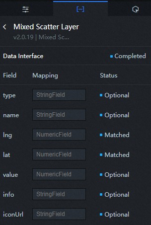
| Log field | Description |
|---|---|
| type | (Optional) Multi-series configuration, which is used in conjunction with the series
configuration of the configuration panel to configure the type of scatter.
Note Data points that do not have a series value or are not within the series value are
rendered using the default configuration in the configuration panel.
|
| name | Optional. The label name of the scatter point. The label name can be used to display the spot label. It corresponds to the label field in the configuration panel to set the label information style of a specific scatter point. |
| lng | The longitude of the scatter. |
| lat | The latitude of the scatter point. |
| value | Optional. The value of the scatter data map. This parameter is used in conjunction with the maximum, minimum, and no-data items of the Data Map parameter in the Scatter Settings section to specify the color and size of the scatter. |
| info | (Optional) Customize the content in the floating layer of the box when the mouse moves to the scatter. |
| iconUrl | Optional. The path of the custom scatter icon. |
| Parameter | Description |
|---|---|
| Controlled Mode | If you turn on the switch, data is not requested when a widget is initialized. Data requests are triggered only based on callback IDs or the method configured in Blueprint Editor. If you turn off the switch, data requests are automatically triggered. By default, the switch is turned off. |
| Auto Data Request | After you select the Auto Data Request check box, you can enable dynamic polling, and manually specify the polling interval. If you do not select this check box, data is not automatically requested. You must manually refresh the page to request data or use Blueprint Editor or callback ID events to trigger data requests. |
| Data Source | In the right-side panel of Canvas Editor, click the Data tab. Click Set next to Static Data. In the Configure Datasource panel, select a data source from the Data Source Type drop-down list. Enter code for data query in the code editor, click Preview Data Response to preview the response of the data source, and then view the response. For more information, see Configure widget data. |
| Data Filter | If you select the Data Filter check box, you can convert the data structure, filter data, and perform simple calculations. If you click the plus sign (+) next to Add Filter, you can configure the script for the data filter in the editor that appears. For more information, see Use the data filter. |
| Data Response Result | The response to a data request. If the data source changes, you can click the  icon next to Data Response Result to view the data response in real time. icon next to Data Response Result to view the data response in real time.
|
Interaction
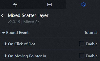
| Interaction | Description |
|---|---|
| On Click of Dot | Select the Enable check box to enable interactions between widgets. The sub-component of the Mixed Scatter Layer has interactive configurations. When a hash is clicked, a callback value is thrown. By default, the lng and lat fields in the data are thrown. For more information, see Configure callback IDs. |
| On Moving Pointer In | Select the Enable check box to enable interactions between widgets. The sub-component of the Mixed Scatter Layer has an interactive configuration. When the mouse moves to the scatter position, a callback value is thrown. By default, the lng and lat fields in the data are thrown. For more information, see Configure callback IDs. |
Configure interactions in Blueprint Editor
- On the Canvas Editor page, click the
 icon to the right of Mixed Scatter Layer in the Basic Plat Map Subcomponent Management List.
- Click the
 icon in the upper-left corner of the page.
- On the Blueprint Editor page, click the Mixed Scatter Layer component in the Import Nodes section. On the canvas, you can view the configuration
parameters of the Blend Scatter Layer in Blueprint Editor as shown in the following
figure.
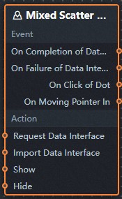
- Event
Event Description On Completion of Data Interface Request The event is triggered with the processed JSON data after a data interface request is responded and processed by a filter. For more information about specific data examples, see the Data Response Result section on the Data tab of the canvas editor. On Failure of Data Interface Request When a data interface request fails (the request may be caused by network problems or interface errors, etc.), the event is returned and processed by the filter, and the processed JSON-formatted data is also thrown. For more information about specific data examples, see the Data Response Result section on the Data tab of the canvas editor. On Click of Dot The event that is thrown when the scatter of the mixed scatter layer is clicked, and the longitude and latitude data items corresponding to the scatter are also thrown. On Moving Pointer In The event that is thrown when the mouse moves into the scatter of the mixed scatter layer, and the longitude and latitude data item corresponding to the scatter is also thrown. - Action
Action Description Request Data Interface This action is performed to request the server data again. The data sent by an upstream data processing node or layer node is used as a parameter. For example, if the API data source is configured as http://api.testat the hybrid scatter layer and the data passed to the Request Data Interface action is{ id: '1'}, the final request interface ishttp://api.test?id=1.Import Data Interface After data of a widget is processed in accordance with its drawing format, the widget is imported for redrawing. You do not need to request server data again. For more information about specific data examples, see the Data Response Result section on the Data tab of the canvas editor. Show Display components, no parameters required Hide A widget is hidden without the need to specify parameters.
- Event