You can use a dashboard to visualize the actual situation of a metric and display the percentage of the metric. For example, you can check the inventory of a commodity. If the inventory is insufficient, you can replenish the inventory in a timely manner. This topic describes how to add data to a dashboard and configure the style.
Prerequisites
A dashboard is created. For more information, see Create a dashboard.
Limits
When you add data to a dashboard, the Pointer Angle /Metric parameter is determined by the metric of the data. You can select only one metric.
Overview
Scenario
It is mostly used in scenarios such as progress, indicators, and trends, focusing on the business of an enterprise. You can quickly determine whether there are business exceptions based on the changes in indicators.
Benefits
Computing capacity: You can customize the start and end points of the pointer on the dashboard and calculate the percentage of metrics with one click.
Visualizations: ring style, sector style, and tick style.
Notes: You can configure notes and endnotes. You can also customize external links to interact with other systems.
Renderings

Create a chart
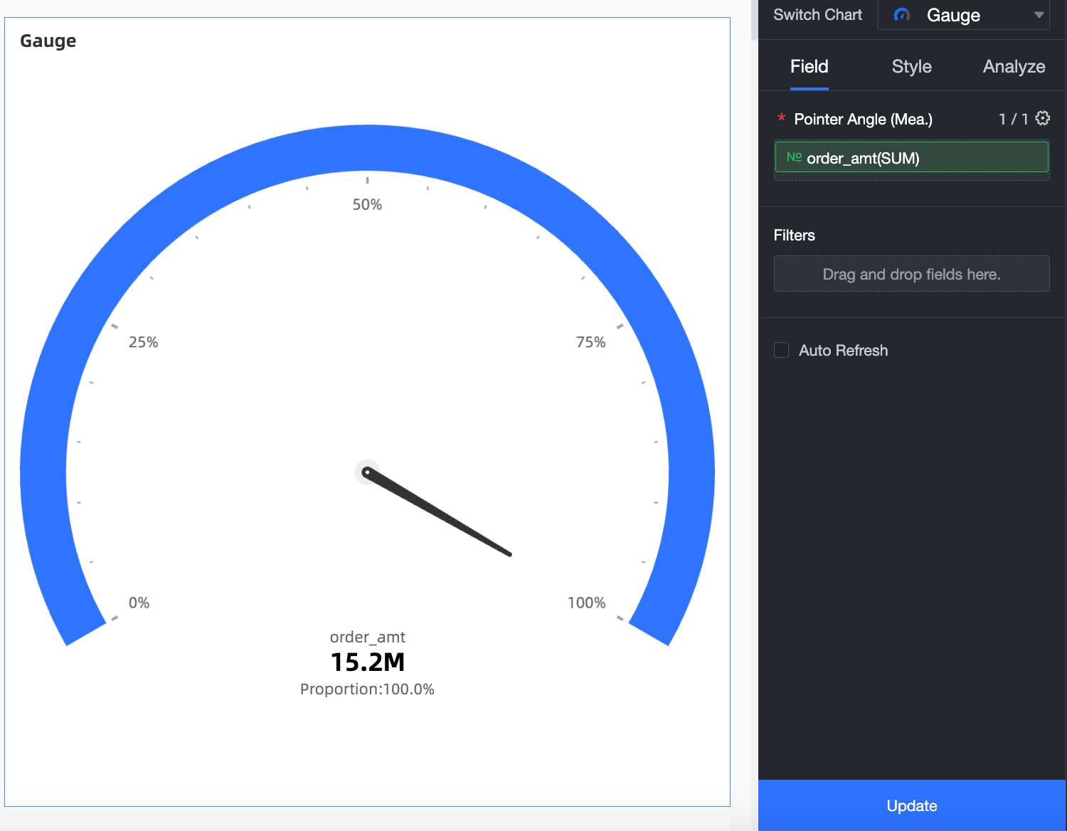
In the Measures list, double-click order_amt. You can also drag this measure to the Pointer Angle (Mea.) field.
Click Update to create the LBS heat map.
Configure the styles of the LBS heat map
The following section describes how to configure the styles of an LBS heat map. For information about the common style settings of charts, see Configure the chart title.
You can enter a keyword in the search box at the top of the configuration section to search for configuration items. Click ![]() Expand /Collapse All Categories in the right-side chart.
Expand /Collapse All Categories in the right-side chart.
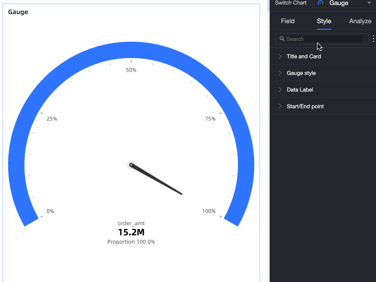
You can configure the dashboard style in the Instrument Style section.
Configuration item | Description |
Switch between visualization styles | Supports Standard, Sector, and Scale. 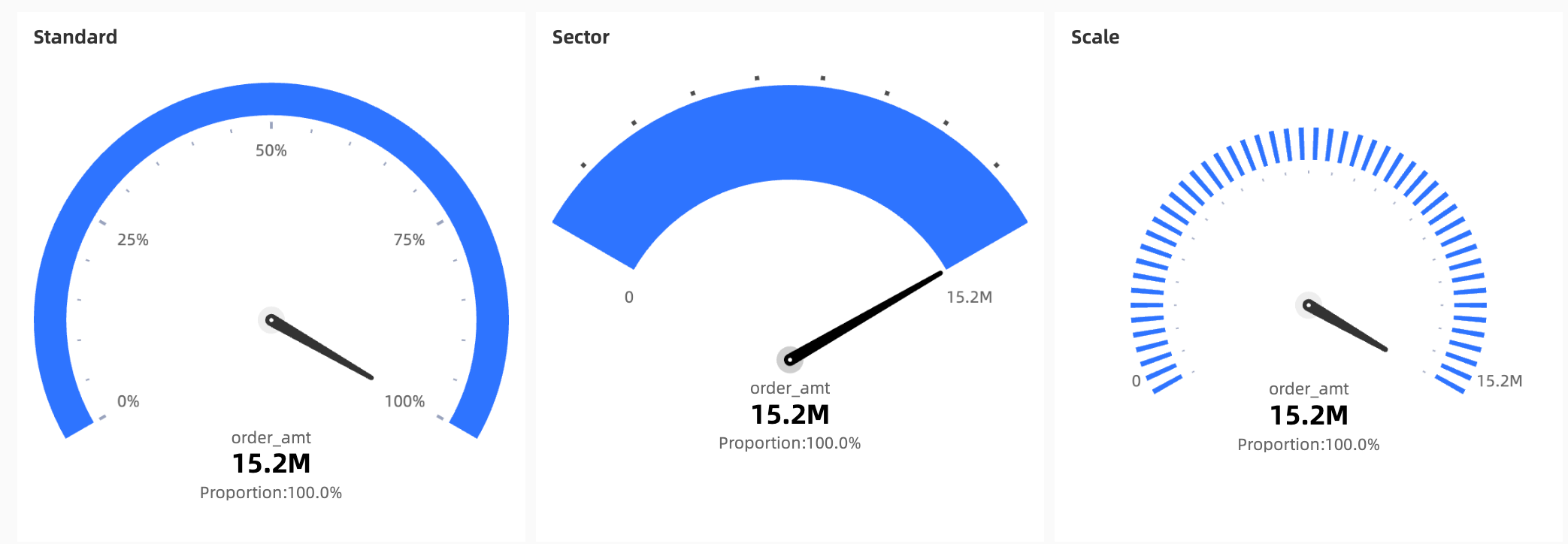 |
Block Color Configuration | You can set Theme Color and Data Mapping Range. You can select Equal Interval or Custom Interval. 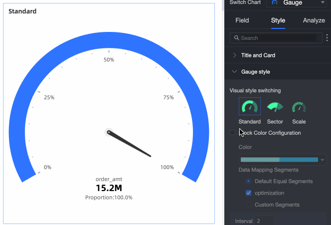 |
Show internal tick marks | Select Show Internal Tick Blocks. You can select Show Percentage or Show initial value. 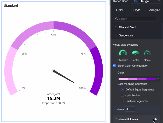 |
You can configure the styles of primary and secondary tags in the label.
Configuration item | Description |
Display the main tag of data | You can specify Display Pointer Value or Display Percentage. You can also modify the text style. 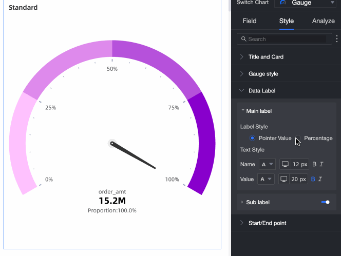 |
Show Data Labels | Select Show Data Subtags. You can specify the style of the subtag. |
In the Start /End section, you can set the Start Value and End Value parameters.
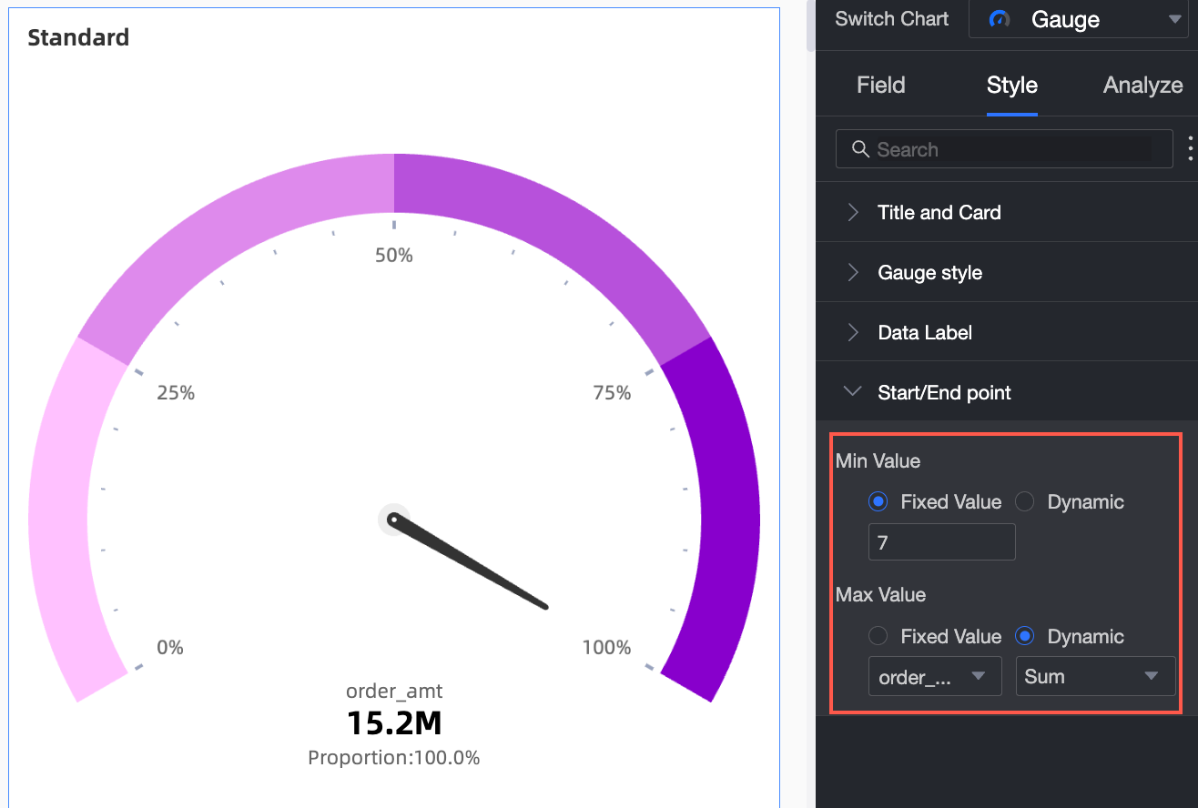
Configuration item | Description |
Set Start /End Value | You can set static field or Dynamic Value. In static field mode, you can enter a specific value. In Dynamic Value mode, you can select a measure and select a calculation method. The calculated value is the start value. |
What to do next
If you need to create a complex menu with navigation for topic analysis, you can integrate the created dashboard BI portal. For more information, see Create a BI portal.