A column chart shows trends over time and compares values across different categories. For example, you can use a column chart to compare traffic flow at an intersection during different time periods. This topic describes how to add data to a column chart and configure its style.
Overview
Scenarios
Column charts are simple and intuitive. The length of the columns clearly shows the values, making it easy to compare differences and trends across groups.
Benefits
Computing capabilities: You can configure year-on-year or month-on-month comparisons, cumulative calculations, intelligent auxiliary lines, and trendlines with a single click.
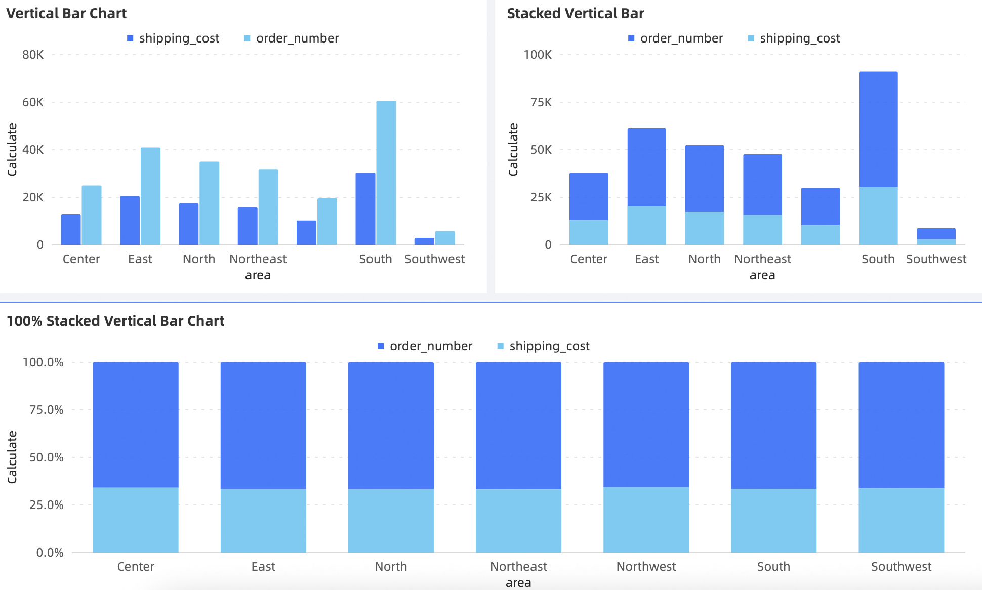
Visualization options: Supports column charts, stacked column charts, and 100% stacked column charts. You can also display labels, legends, and scroll bars.
Data comparison and labeling: You can compare data from the same period and label values numerically.
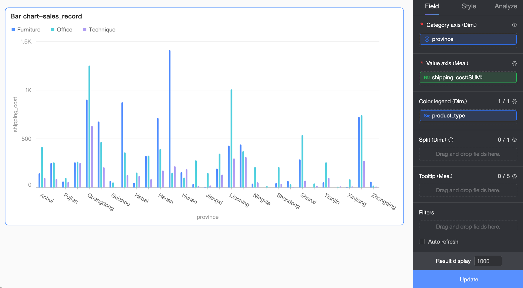
Example rendering
Limits
A column chart uses three components: Value Axis (Measure), Category Axis (Dimension), and Color Legend (Dimension).
You must select at least one dimension for the Category Axis (Dimension), such as province or product type.
You must select at least one measure for the Value Axis (Measure), such as order count or profit amount.
You can select only one dimension for the Color Legend (Dimension), such as shipping method.
NoteYou can enable the Color Legend (Dimension) only when the Value Axis (Measure) contains exactly one measure.
You can select only one dimension for Split (Dimension), such as product type.
Configure Chart Fields
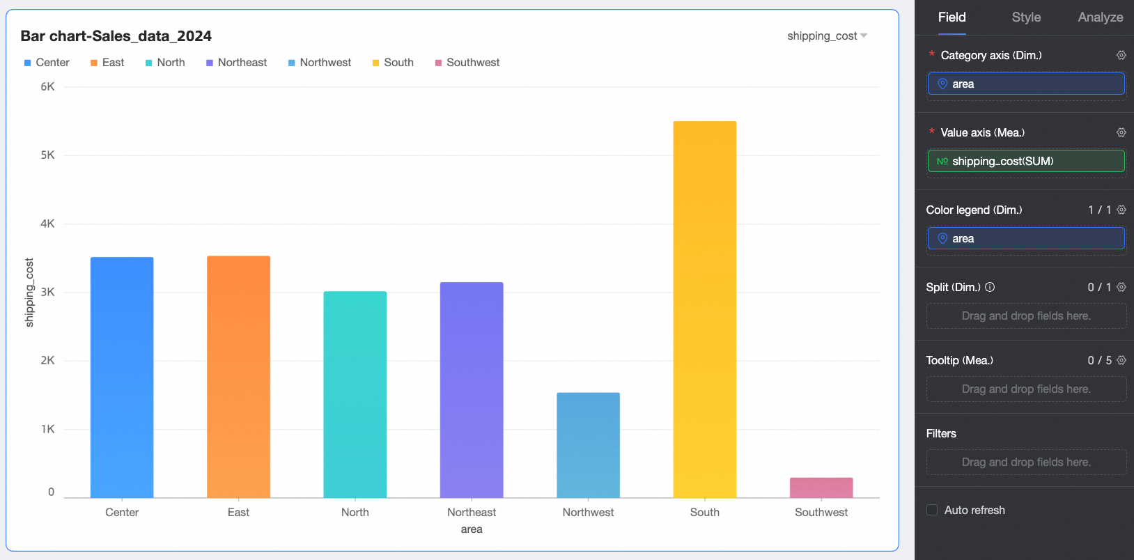
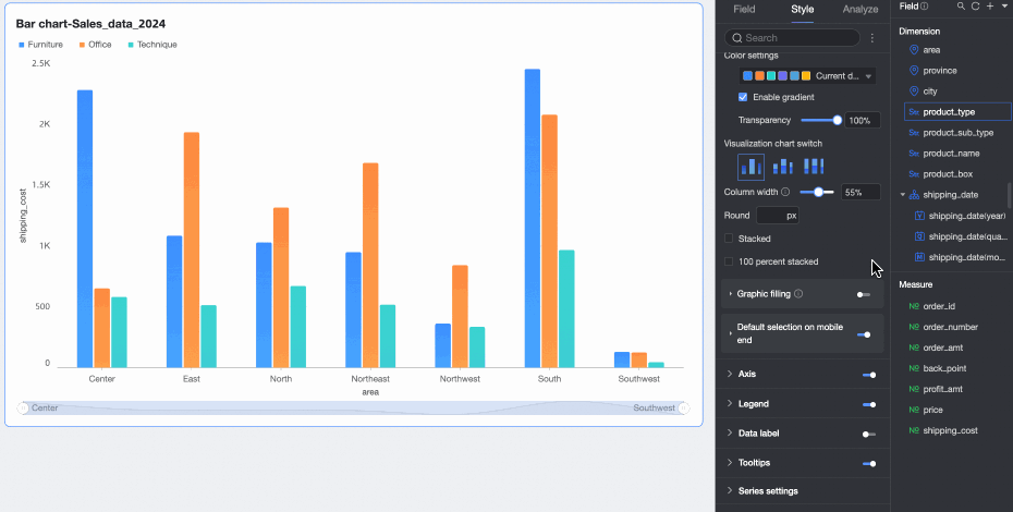
On the Data tab, select the required dimension and measure fields.
In the Dimension list, find Province and double-click it or drag it to the Category Axis (Dimension) area.
In the Dimension list, find Product Type and double-click it or drag it to the Color Legend (Dimension) area.
In the Measure list, find Shipping Cost and double-click it or drag it to the Value Axis (Measure) area.
NoteYou can drag the same field into both the Category Axis and Color Legend areas to assign a unique color to each dimension value. The behavior varies by scenario.
When there is only one field in the Category Axis and one in the Value Axis, the number of columns equals the number of category axis values.
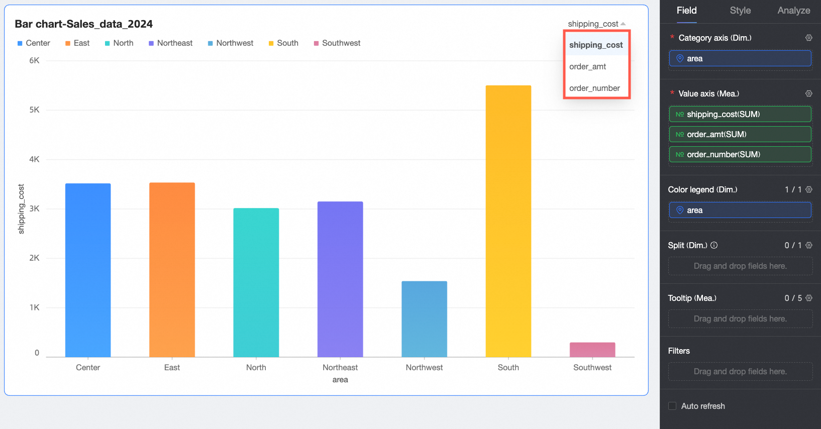
When multiple measures are in the Value Axis, the chart displays the first measure by default. To switch measures, you must manually open the field filter panel.
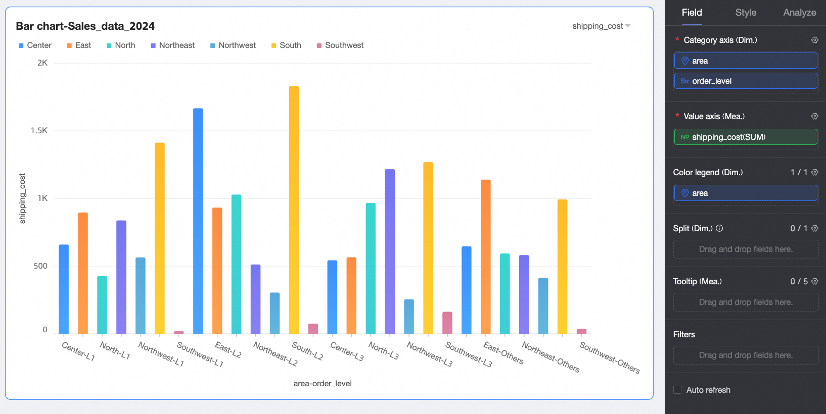
When multiple dimensions are in the Category Axis, the number of columns is the product of the number of values in each dimension. For example, in the figure below, the column count = (number of region values) × (number of order level values).
Click Update to refresh the chart.
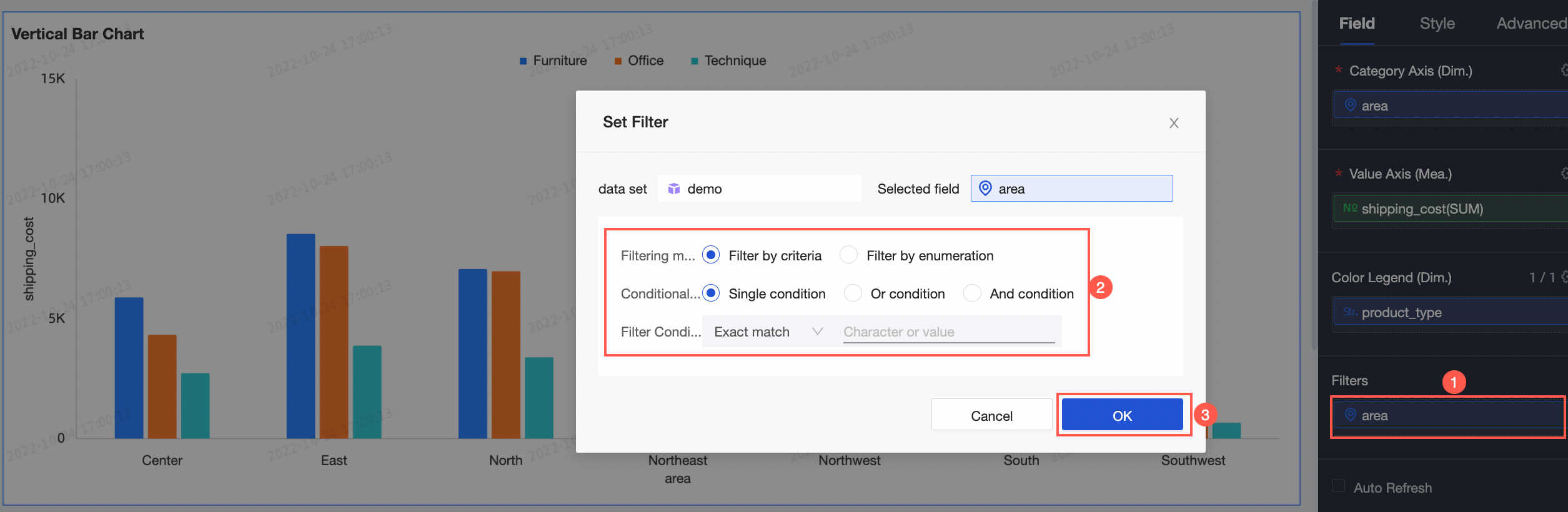
To view data for a specific Region, you can set a filter to extract the required data.
(Optional) Auto-refresh
You can enable this option to automatically refresh the chart at regular intervals. For example, if you enable auto-refresh, set the interval to 5, and select Minutes, the system refreshes the chart every 5 minutes.
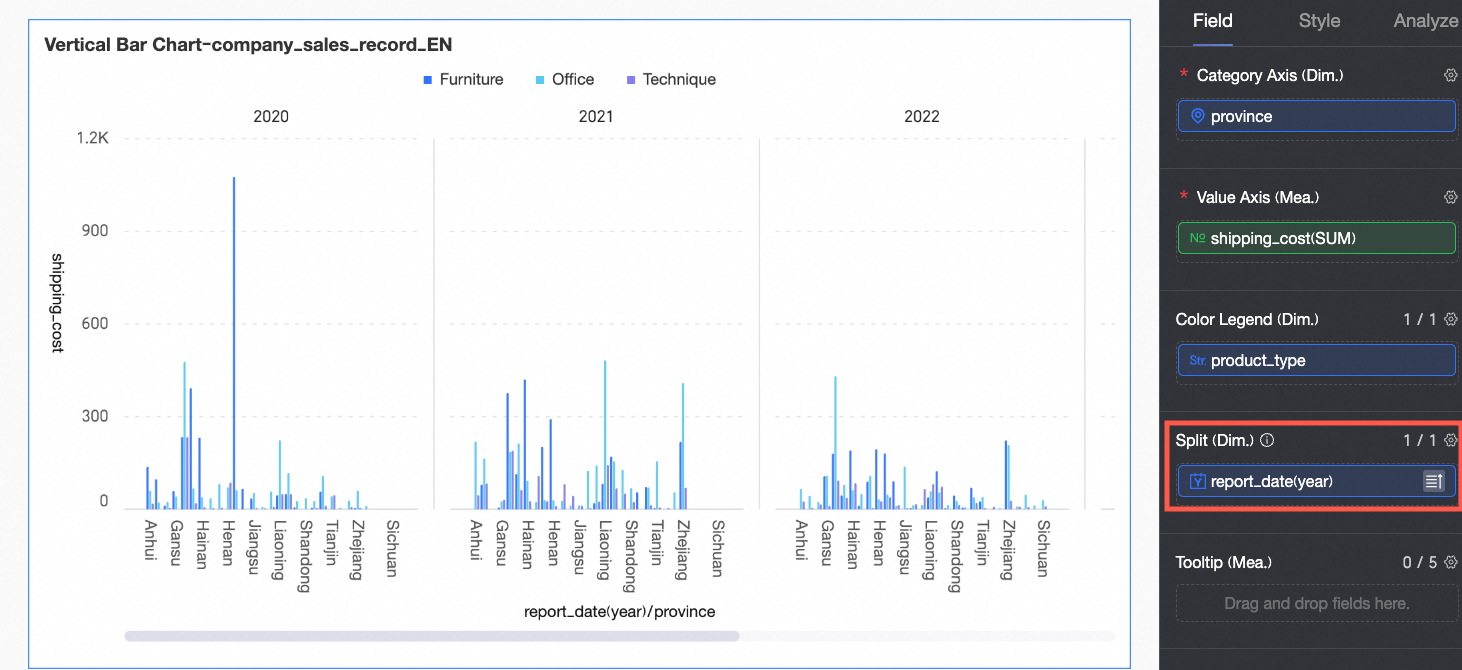
(Optional) You can add a dimension field to Split (Dimension) to display data trends across dimension values using faceted views.
NoteYou can add only one split dimension. Faceted views have the following limitations.
Fields: Advanced calculations for split dimension fields support only top N and none.
Style: The dual Y-axis is not supported for axes. Scroll bars are not supported for auxiliary display.
Analysis: Only data interaction is supported. Advanced settings, analysis alerts, annotations, or AI insights are not supported.
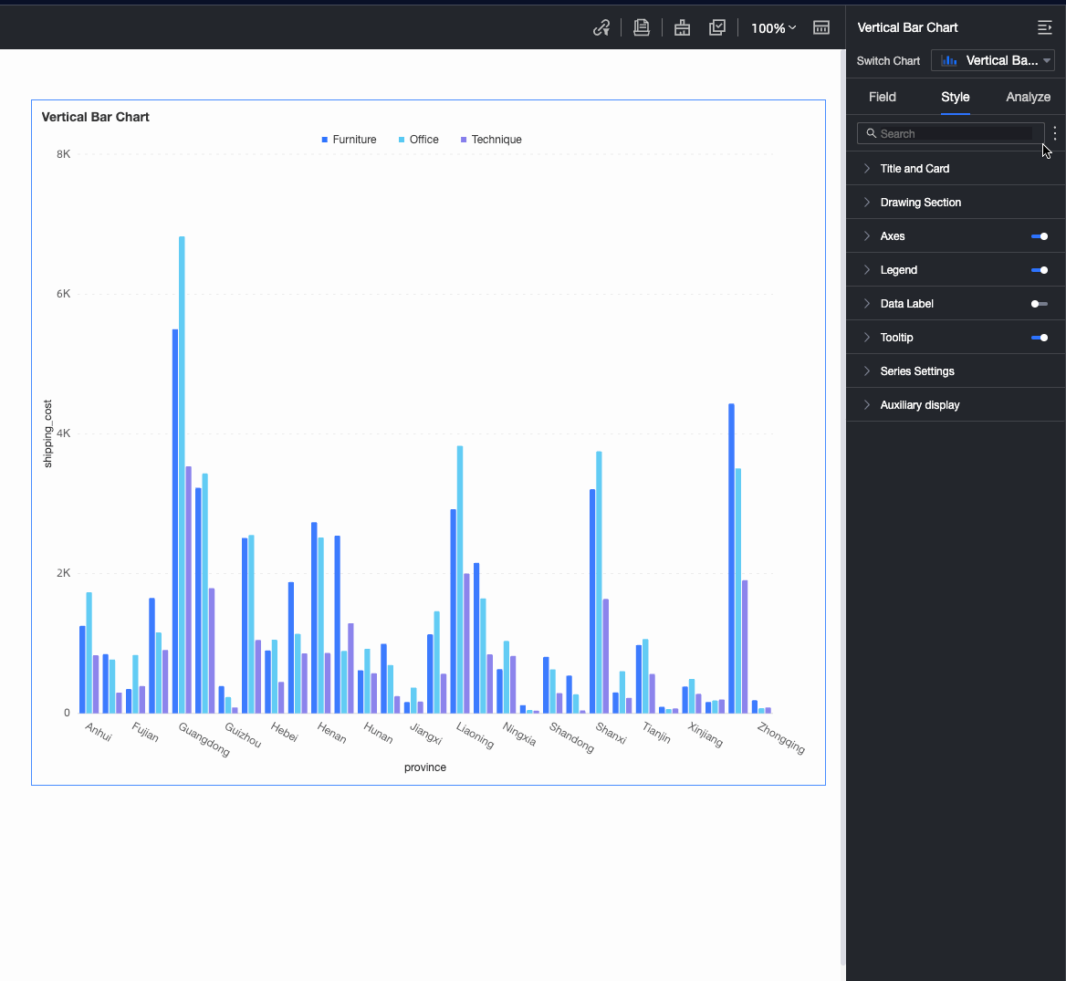
Configure Chart Style
Use the following sections to configure the chart style. For information about general title configuration, see Configure the Chart Title.
You can use the Search Box at the top of the configuration area to quickly find and configure Settings. Click the  icon on the right to expand or collapse all categories.
Plot Area
In the Plot Area section, you can configure the column chart style.
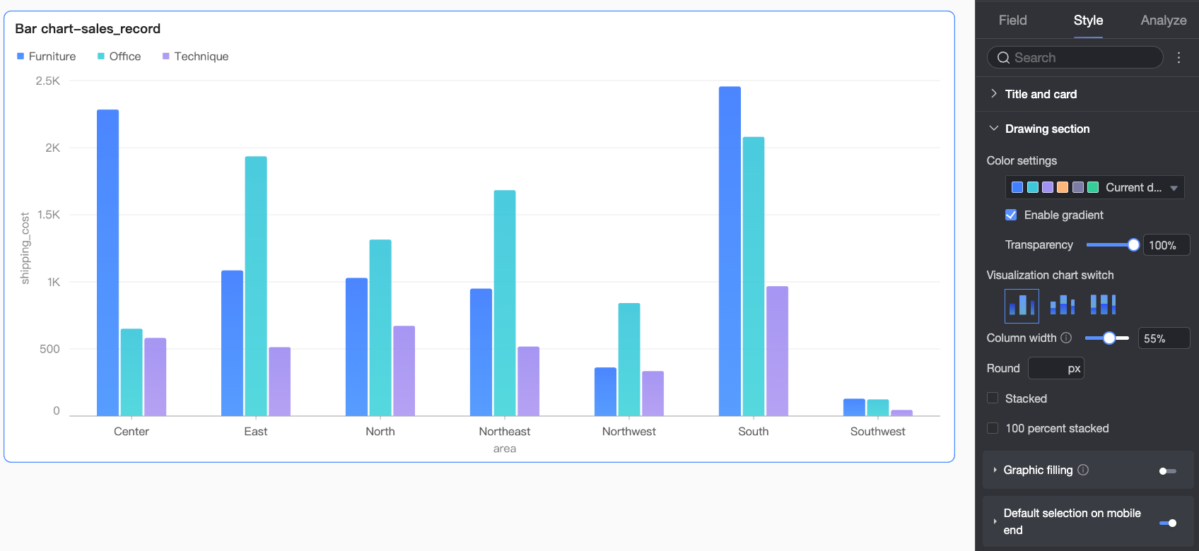
Chart configuration items | Description |
Color Settings | Set overall column colors. Enable gradient effects and adjust column transparency. |
Switching Chart Types | Select the chart type: Column Chart, Stacked Column Chart, or 100% Stacked Column Chart. |
Column Width and Border Radius | Set column width and border radius. |
Stacked and 100% Stacked | Switch between column chart, stacked column chart, and 100% stacked column chart.
|
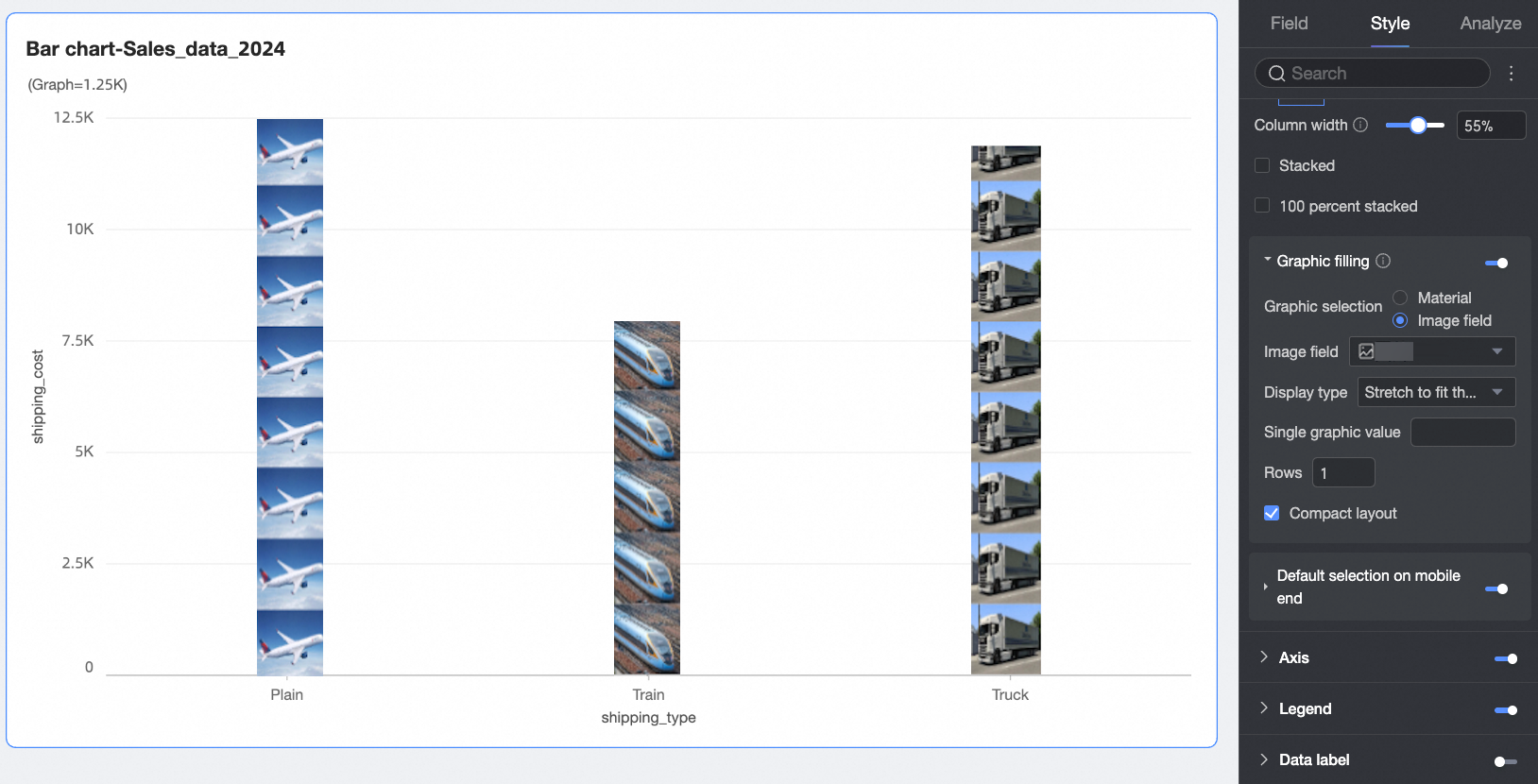
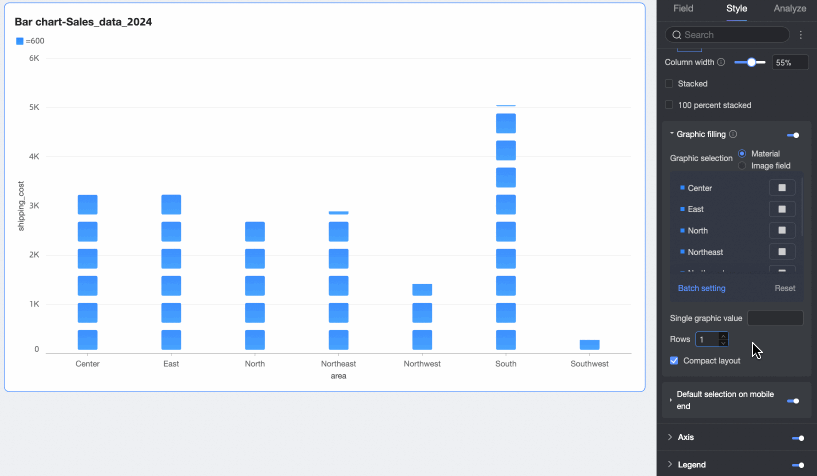
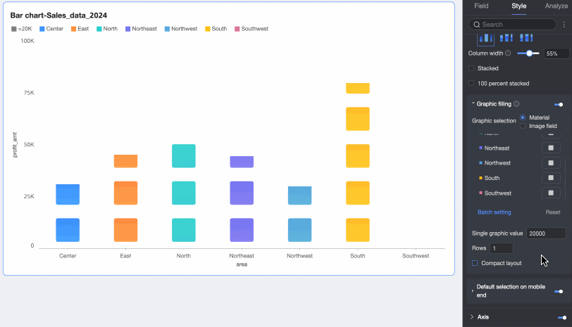
Graphic Fill | When Chart Type is set to Column Chart, fill columns with icons that represent numeric values. Disable the measure axis when using graphic fill. Choose from Assets or Image Field.
You can also set Value per Graphic, Rows, and Compress Layout.
|
Default Selection on Mobile | When enabled, set the Default Selection to Last Dimension Value (Global) or Last Dimension Value (Series). |

 ).
). 
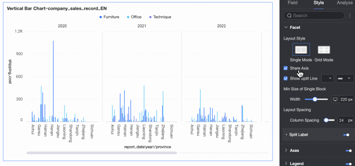
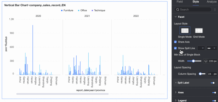
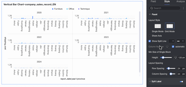
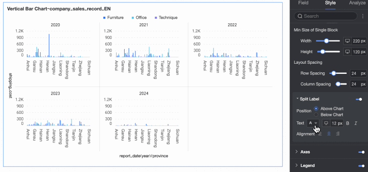
Facets
In faceted mode, you can configure the layout and style for the facet arrangement.
Faceted mode applies only when you configure a field in the Split (Dimension) area.
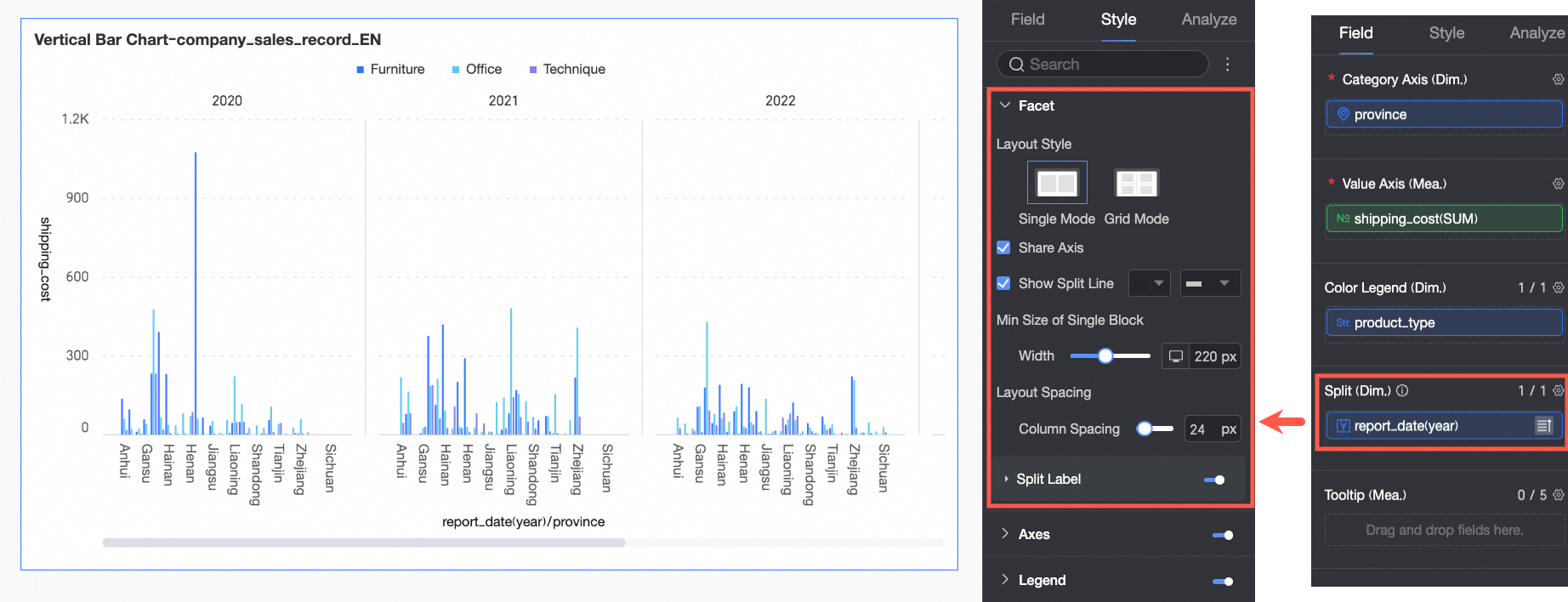
Chart configuration item | Description | |
Layout Style | Choose layout: Single-Column Comparison or Grid Distribution. | |
Shared Axis | Enable shared axis across facets.
| |
Show Separator Lines | Show separator lines between facets. When enabled, customize line color and style. | |
Columns | Set column count for Grid Distribution layout. Default is automatic. Customize based on your needs. Note
| |
Minimum Facet Size | Set minimum width and height for each facet. Options vary by layout:
| |
Row and Column Spacing | Set spacing between facets. Options vary by layout:
| |
Split Label | Position | Set label position: Above Chart or Below Chart. |
Text | Set font color and style for dimension value labels. | |
Alignment | Set alignment for dimension value labels. | |
 icon above the page to switch device targets.
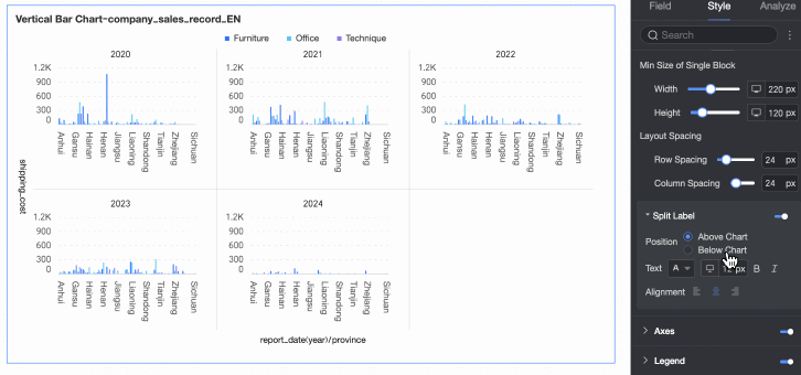
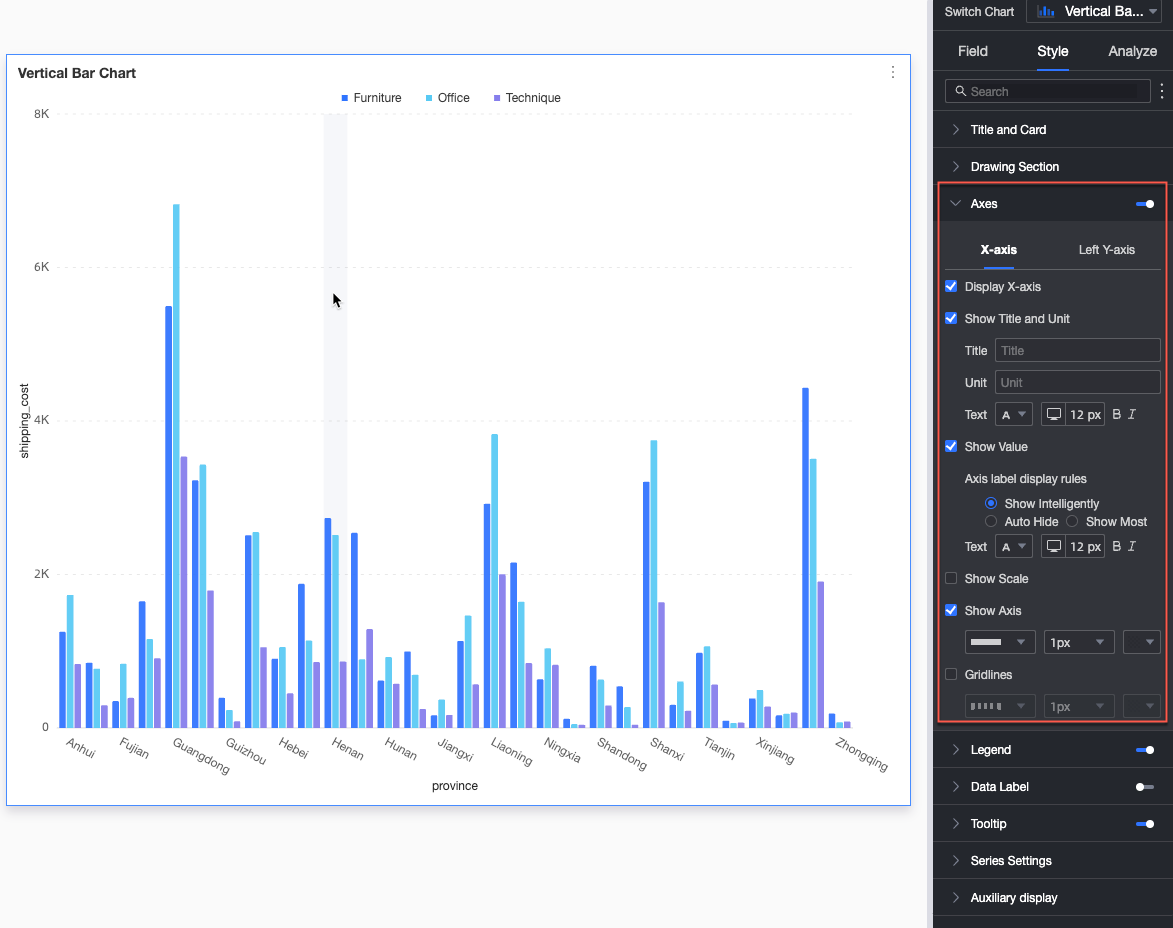
Axes
In the Axes section, you can configure the axis styles. The axes are displayed by default.
Select Display Dual Y-Axis. The dual Y-axis takes effect only when two or more measures are added. When this option is selected, the Right Y-Axis section appears in the Axes section.
Name | configuration item | Description |
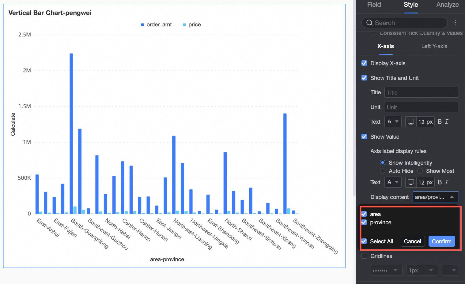
X-axis | Display X-axis | Toggle X-axis visibility. |
Show Title and Unit | Toggle visibility of Axis Title and Unit on the X-axis. | |
Show Axis Labels | Toggle X-axis label visibility and configure Label Display Rules and Text Style. | |
Content Display | Display partial or all dimensions.
| |
Show Scale Lines | Toggle X-axis scale line visibility. | |
Show Axis | Toggle X-axis visibility, including line style, width, and color. | |
Show Gridlines | Toggle X-axis gridline visibility, including line style, width, and color. | |
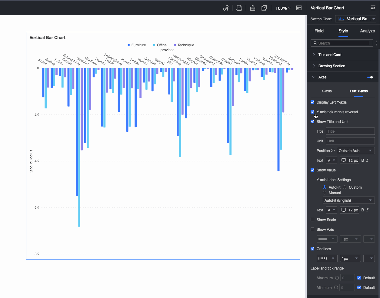
Left Y-axis | Flip Y-axis Scale | Flip Y-axis scale values.
|
Display Left Y-axis | Toggle left Y-axis visibility. | |
Show Title and Unit | Toggle visibility of Axis Title and Unit. | |
Show Axis Labels | Toggle left Y-axis label visibility and configure Label Range and Label Format. | |
Show Scale Lines | Toggle left Y-axis scale line visibility. | |
Show Axis | Toggle left Y-axis visibility, including line style, width, and color. | |
Show Gridlines | Toggle left Y-axis gridline visibility, including line style, width, and color. | |
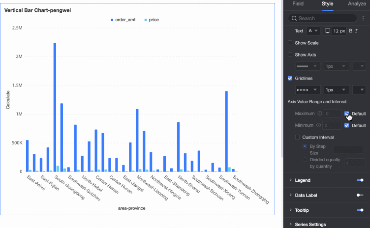
Axis Value Range and Interval |
|
You can configure the Right Y-axis only when Display Dual Y-Axis is selected. The settings for the right Y-axis are the same as the settings for the Left Y-axis.
Legend
In the Legend section, you can click the  icon to enable the legend and configure its style.
PC Configuration
Setting
Configuration Item Descriptions
Content
When the field in Category Axis matches the field in Color Legend, and Graphic Fill is enabled in the Plot Area, multiple legends appear. Select which legend content to display.
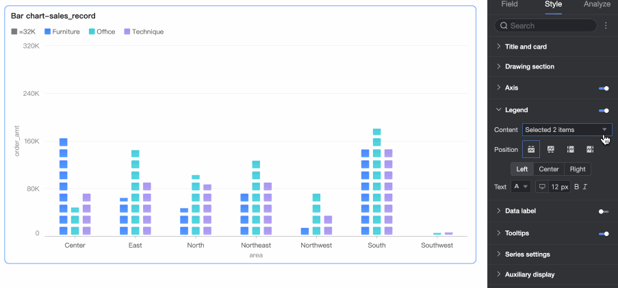
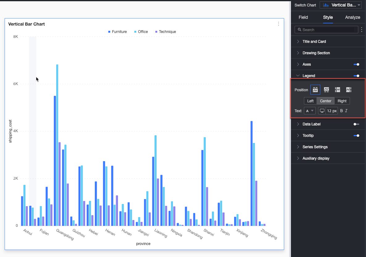
Position
Set legend position and alignment for PC.
For Top or Bottom: Align left, center, or right.
For Left or Right: Align top, center, or bottom. Adjust distance between legend and chart content.
Text
Set legend text style: color, size, weight, and italic.
Mobile Configuration
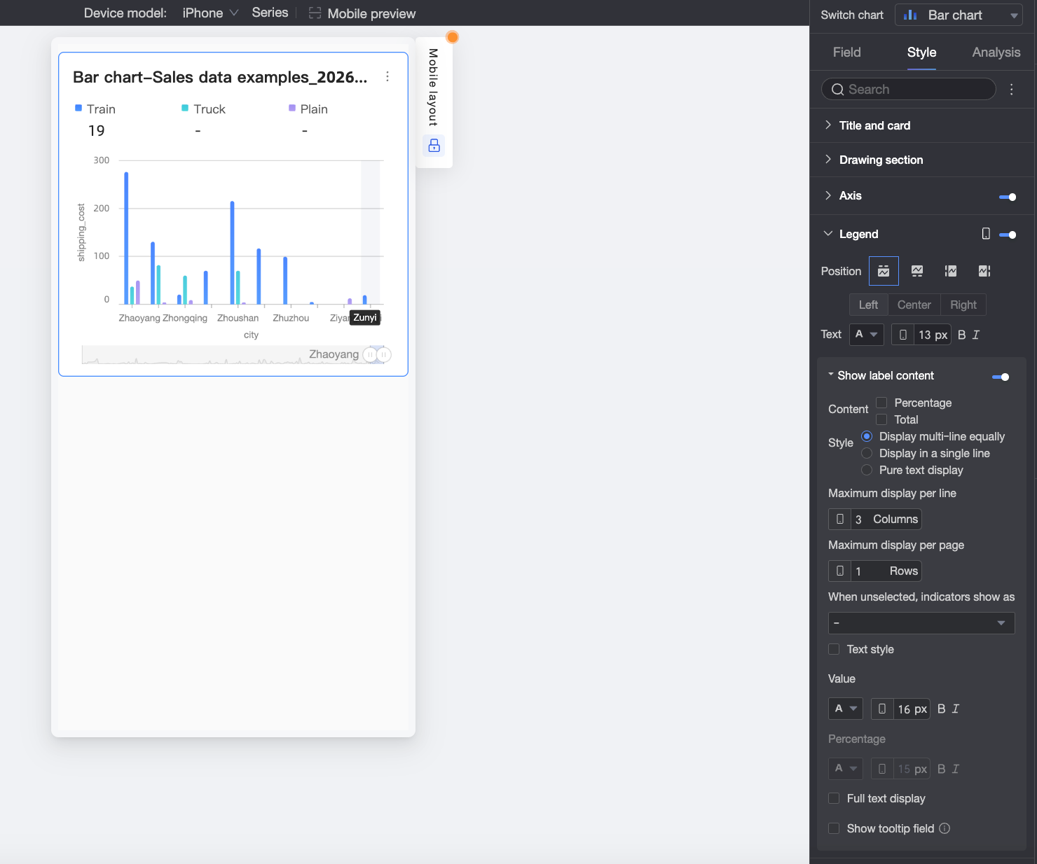
Chart Configuration Item
Description
Position
Set legend position and alignment for mobile.
For Top or Bottom: Align left, center, or right.
For Left or Right: Align top, center, or bottom. Adjust distance between legend and chart content.
NoteWhen position is Top, enable legend sub-labels. Alignment cannot be customized when sub-labels are enabled.
Text
Set text style for measure names in the mobile legend: color, size, weight, and italic.
Display tag content
When Position is set to Top, click the
 icon to enable labels under the legend.
Content
Select data content for sub-labels: Percentage or Total.
Percentage: Percentage of a data point within a dimension relative to the total. Example: Profit amount for office supplies as a percentage of total revenue.
Total: Sum of all measures within a dimension. Example: Total sales across regions for 2025.
Style
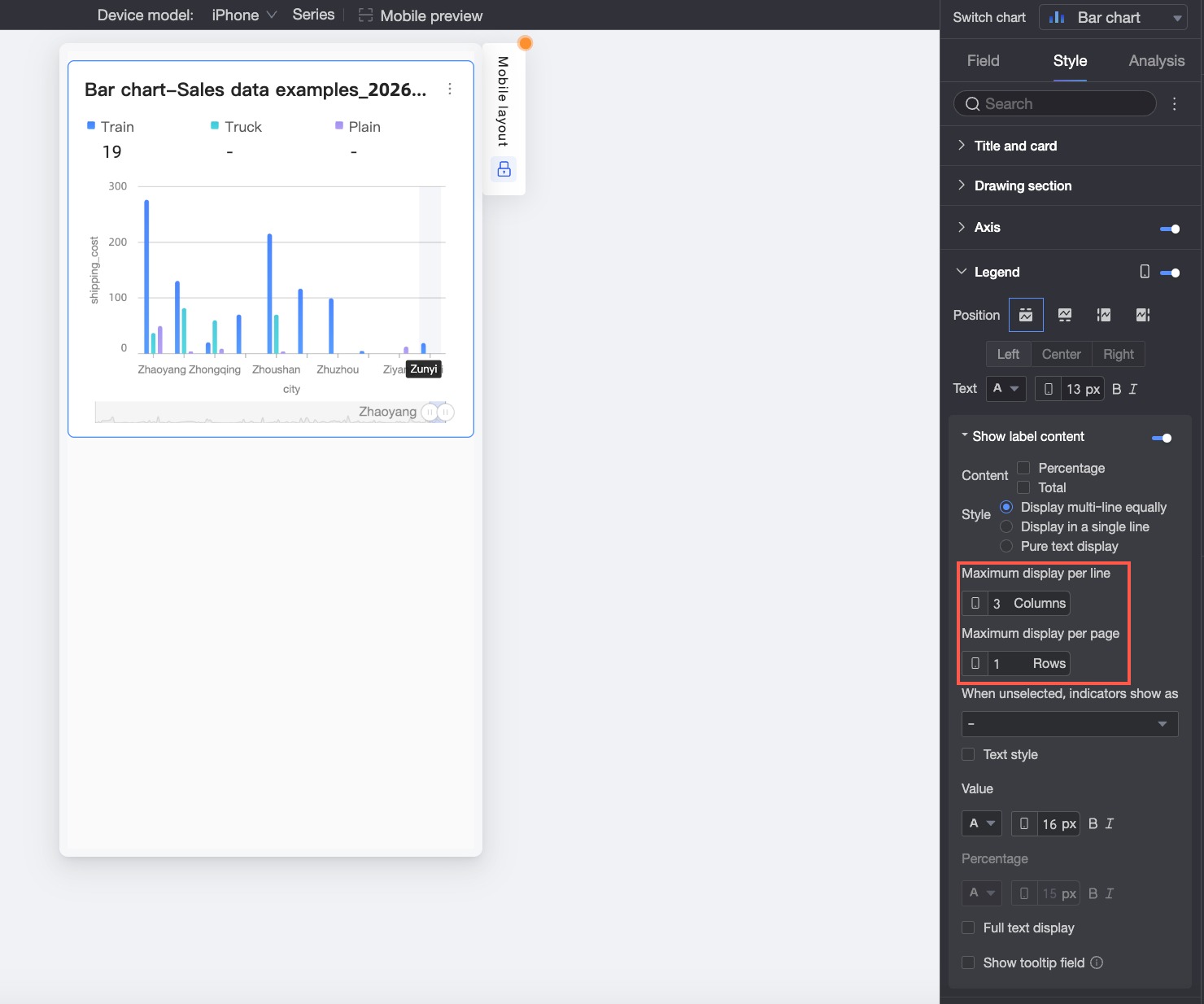
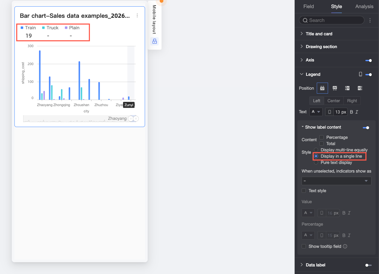
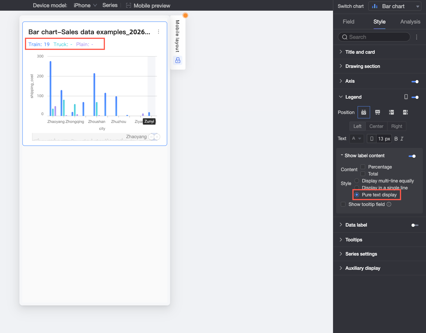
Choose sub-label text layout: Multi-Row Equal Division, Single-Row Tile, or Plain Text.
Multi-Row Equal Division: Automatically divide sub-labels based on columns per row and rows per page.
Single-Row Tile: Display all sub-labels in one row.
Plain Text: Show text only, with color matching the corresponding measure’s line color in the chart.
Unselected Indicator Display
When Style is Multi-Row Equal Division or Single-Row Tile, choose how unselected indicators display: - or Empty.
Percentage Position
Text Style
When Style is Multi-Row Equal Division or Single-Row Tile, set numeric text style.
If Content includes Percentage, format percentage text differently from numeric labels to improve visual distinction.
Percentage Decimal Places
Adjust decimal places for percentages when Content includes Percentage.
Full Text Display
When Style is Multi-Row Equal Division or Single-Row Tile, enable Full Text Display to show complete measure names if they are truncated.
Show Tooltip Fields
Enable to display fields configured in the Tooltip/Measure panel in the legend area.
NoteTooltip fields are not supported when splitting by dimension values (i.e., color legend is a dimension).
Data Labels
In the Data Labels section, you can toggle data label visibility and configure the label style.
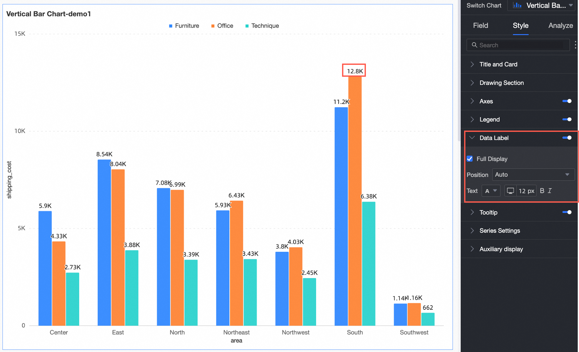
Chart Configuration | Description |
Full Display | Toggle full display of data labels. |
Position | Set label position. When Graphic Fill is enabled in the Plot Area, only Outside Graphic is supported. |
Text | Set label text style. |
Tooltip
In the Tooltip section, you can click the icon to enable tooltips and configure their display options.
PC Configuration
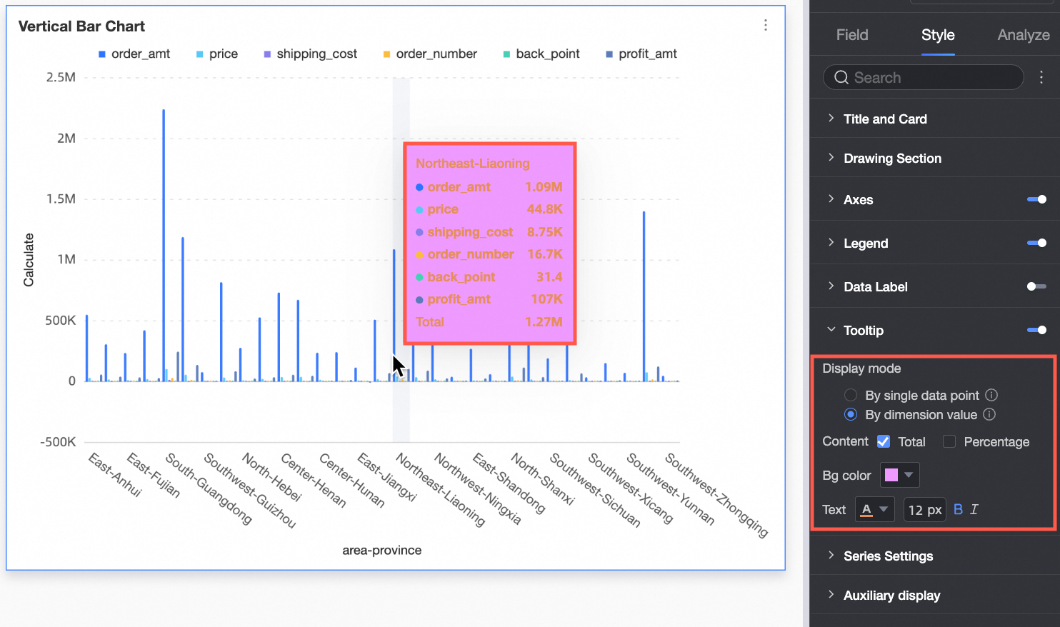
Chart configuration items
Description
Display Mode
Choose tooltip display mode: Per Data Point or Per Dimension Value.
Content
Select tooltip content. Options depend on display mode:
For Per Data Point: percentage. For Per Dimension Value: total and percentage.
Percentage: Percentage of a data point within a dimension relative to the total. Example: Profit amount for office supplies as a percentage of total revenue.
Total: Sum of all measures within a dimension. Example: Total sales across regions for 2025.
Background Color
Set tooltip background color.
Text
Set tooltip text style: color, size, weight, and italic.
Mobile Configuration
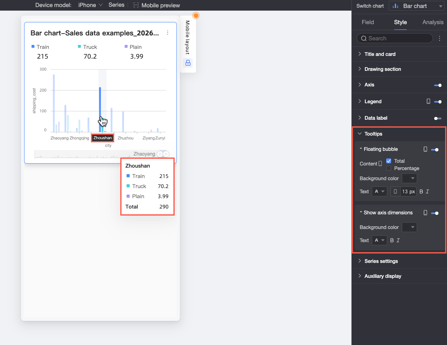
Chart Configuration Items
Description
Hover Bubble
Click the
icon to enable hover bubbles (①)Content
Select hover bubble content: Percentage or Total.
Percentage: Percentage of a data point within a dimension relative to the total. Example: Profit amount for office supplies as a percentage of total revenue.
Total: Sum of all measures within a dimension. Example: Total sales across regions for 2025.
Background Color
Set hover bubble background color.
Text
Set hover bubble text style: color, size, weight, and italic.
Axis Dimension Display
Click the
icon to enable axis dimension display (②)Background Color
Set axis dimension label background color.
Text
Set axis dimension label text style: color, weight, and italic.
Series Settings
In the Series Settings section, you can configure the series style.
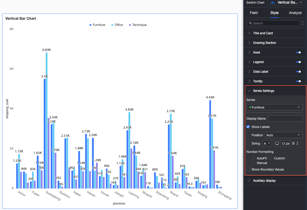
You need to set the alias and the value display format in Series Settings only when Color Legend/Dimension is enabled.
Chart Configuration Items | Description |
Select Series | Select a dimension or measure based on your use case. |
Show Data Labels | Toggle data label visibility, including color and position. |
Show Boundary Values | Display labels for maximum and minimum values on line charts. Note This feature is not supported for stacked or 100% stacked charts. |
Assisted Display
In the Assisted Display section, you can configure metric filters and view controls.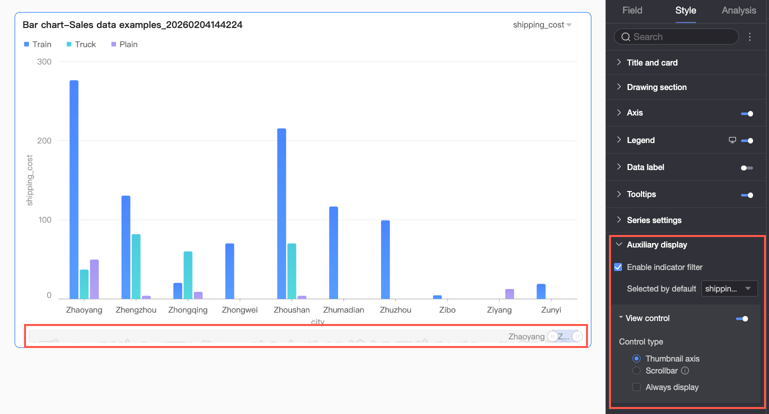
Setting | Description |
Enable Metric Filter Display | Toggle visibility of the metric filter inside the chart. When enabled, set the default selected metric field. |
View Controls | When axis data is dense and exceeds container width, click the Two control types manage visible axis range: Scroll Bar and Mini Chart.
Note If no view controls are configured and the chart is too small, the system enables view controls automatically, selects Mini Chart, and shows it only when data exceeds container width. |
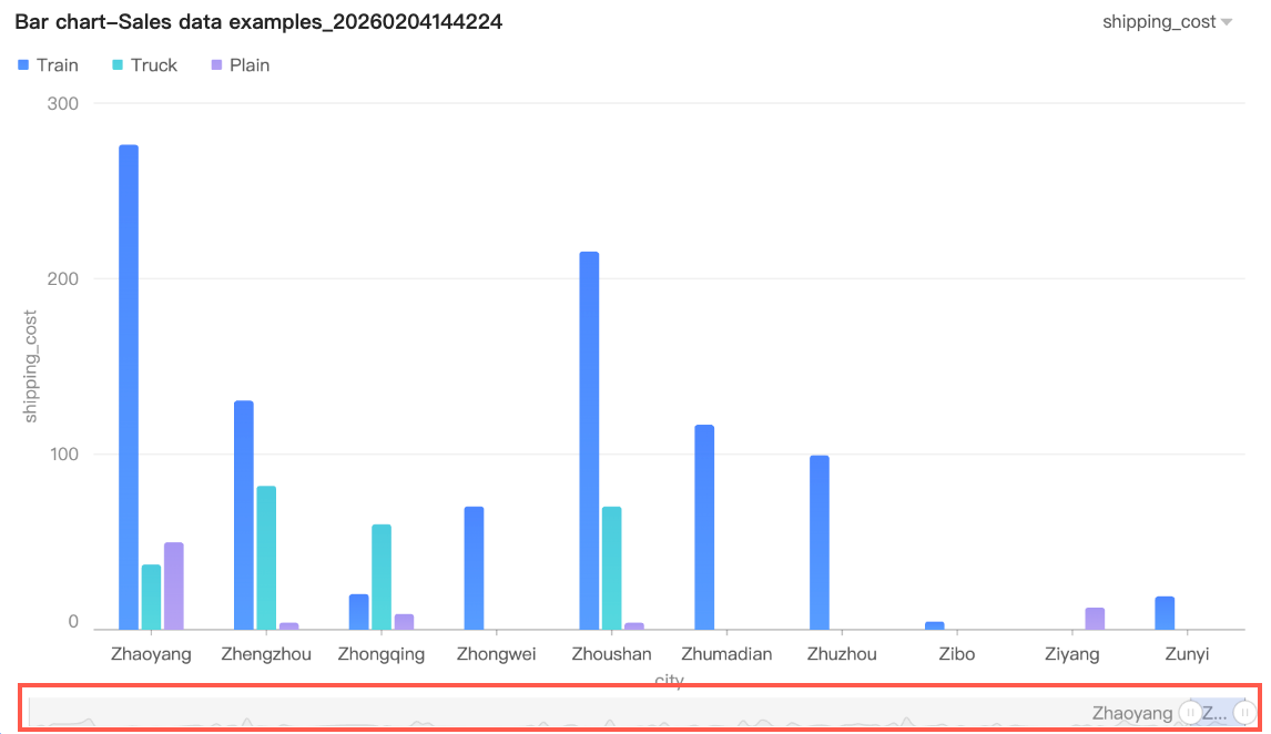 By default, mini charts appear only when data exceeds container width. To always show them, enable Persistent Display. When enabled, mini charts appear even if data fits fully.
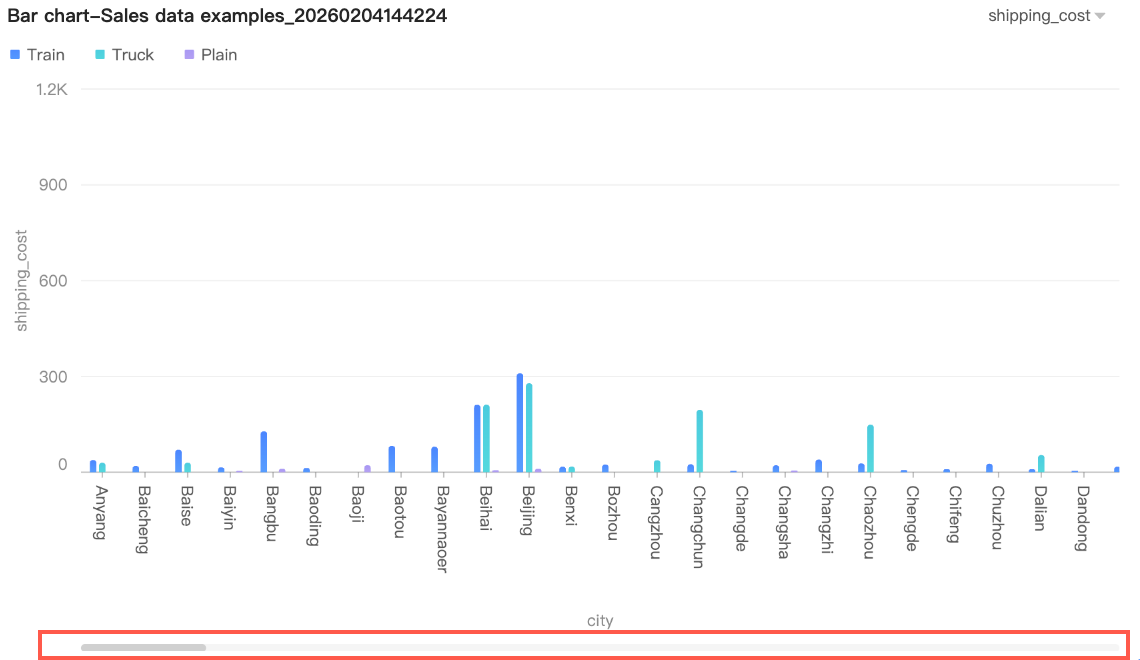 Set Minimum Category Width to limit visible data volume, ensuring clear axis ticks and avoiding label overlap or overcrowded data points. Default is 32 px. Range: 16–100 px.
Configure Chart Analysis
Setting | Name | Description |
Data Interaction | Drilling | Configure drill-down layer display style after setting drill-down fields in the field panel. |
Linkage | Link multiple charts for joint analysis when data resides in separate charts. For details, see Linkage Setup and Display. | |
Go To | Link multiple dashboards for joint analysis when data resides in separate dashboards. Hyperlinks support Parameter Linking and External Links. For details, see Hyperlink Setup and Display. | |
Analysis Alerts | Auxiliary Line | Compare current measure values against auxiliary line reference values. Reference values can be static or calculated. Calculated values include average, maximum, minimum, and median. For details, see Auxiliary Line. |
Trendline | Show overall data trends. Trendline types: Intelligent, Linear, Logarithmic, Exponential, Polynomial, and Power. For details, see Trendline. | |
Annotate | - | Highlight abnormal or critical data using color highlights, icons, comments, or data points. For details, see Annotate. |
What to do next
You can share the dashboard with specific users who need to view it. For more information, see Share a Dashboard.
You can integrate the dashboard into a BI portal to build complex navigation menus for thematic analysis. For more information, see Create a PC BI Portal.