A flow analysis chart displays data flow, including sources and destinations. It also shows the proportions of data coming from different sources and flowing to different destinations. You can typically calculate a webpage's conversion rate through page views (PV) and unique visitors (UV), helping you understand a website's overall operational effectiveness and the final transaction volume of specific products. This topic describes how to add data to a flow analysis chart and configure its style.
Prerequisites
A dashboard is created. For more information, see Create a Dashboard.
Overview
Scenarios
A flow analysis chart displays traffic data by dividing statistical data into source blocks, central blocks, and destination blocks. It is commonly used to analyze website traffic operational data. The results are intuitive, allowing you to clearly see changes in various dimensional metrics. It also supports viewing the process flow from a specific node.
Advantages
Calculation capability: Automatically calculates proportions.
Sample chart
Graph data configuration
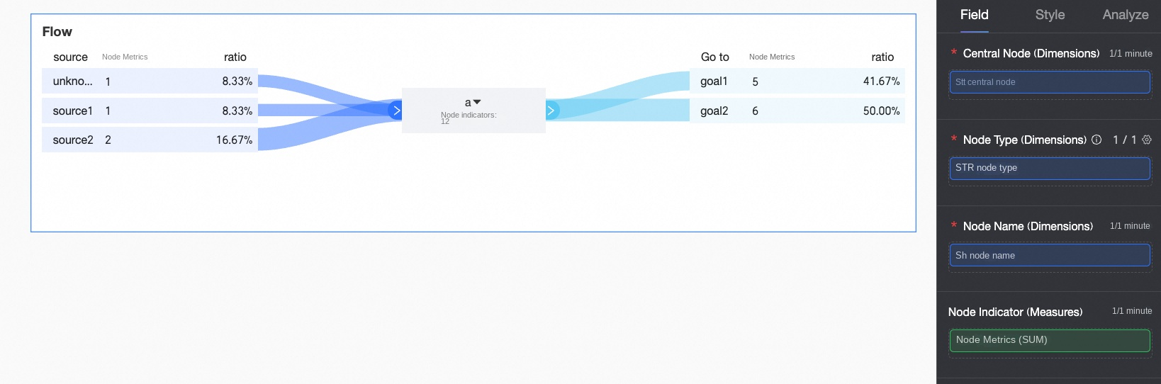
On the Data tab, select the required dimensions and measures:
In the Dimensions list, find Search Engine, double-click or drag it to the Central Node (Dimensions) area.
In the Dimensions list, find Node Type, double-click or drag it to the Node Type (Dimensions) area.
In the Dimensions list, find Name, double-click or drag it to the Node Name (Dimensions) area.
In the Measures list, find Traffic, double-click or drag it to the Node Indicator (Measures) area.
Click Update, and the system automatically updates the chart.
 Note
NoteWhen the node type is source and the node name is empty, Unknown Source is displayed.
When the node type is goal and the node name is empty, Unknown Destination is displayed.
The system filters out fields whose node type values are not source, center, or goal.
Relationship between flow analysis tables and flow analysis charts
The following figure helps you understand the relationship between flow analysis tables and flow analysis charts.
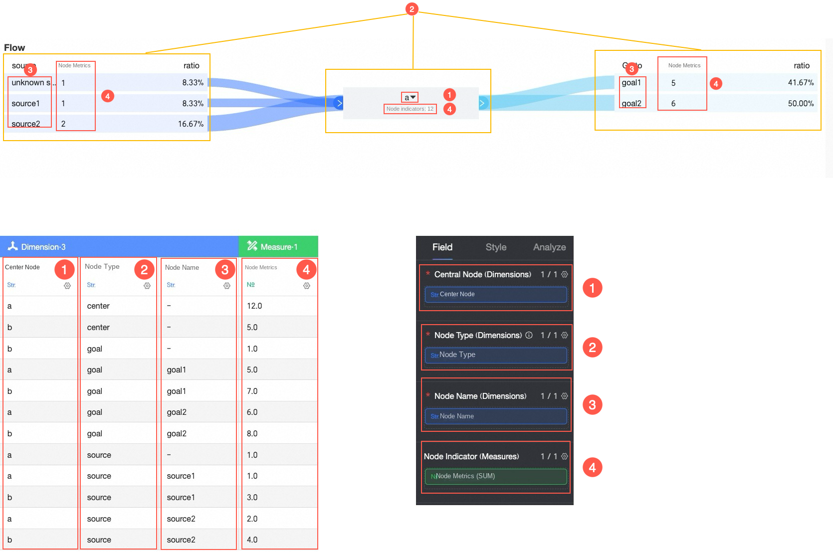
① Add central node data
② Add node type data
③ Add source and destination data
④ Add metrics for source and destination data
The values of the Node Type field must be source, center, or goal.
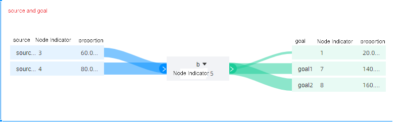
The following example shows how proportions are calculated when the Central Node value is Baidu:
When the source value is Alipay Homepage, the node indicator value is 1, and the proportion is 8.33% (calculated as 1÷12).
When the source value is Taobao Homepage, the node indicator value is 2, and the proportion is 16.67% (calculated as 2÷12).
Flow analysis table construction principles
A flow analysis chart created based on a flow analysis table contains three blocks: source block, central block, and destination block.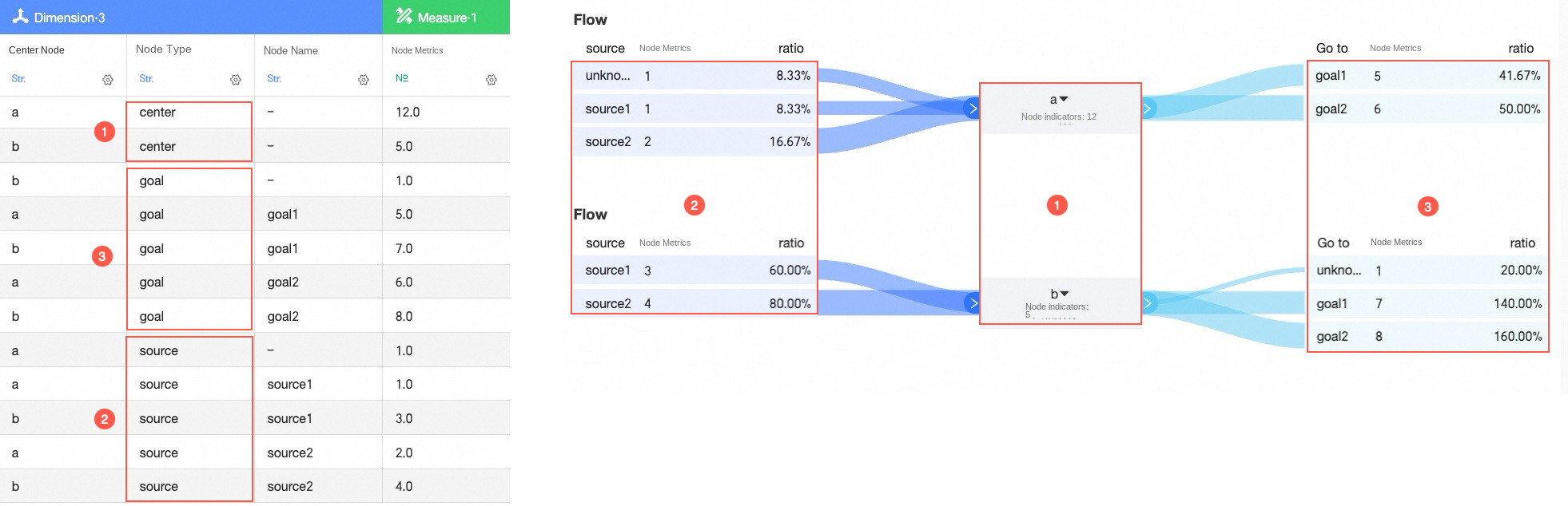
Therefore, you can split a flow analysis table into source tables, central node tables, and destination tables based on the node type.
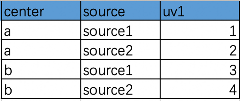
When the node type is source, the traffic from source1 and source2 to a and b is shown in the following source table:
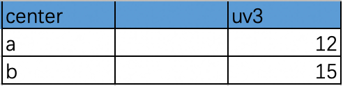
When the node type is center, the traffic from a and b to the central node is shown in the following central node table:
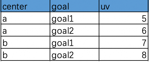
When the node type is goal, the traffic from a or b to goal1 and goal2 is shown in the following destination table:
To construct a flow analysis data table, you can associate data from the source table, central node table, and destination table by following these steps. The data source of the constructed flow analysis table is shown below.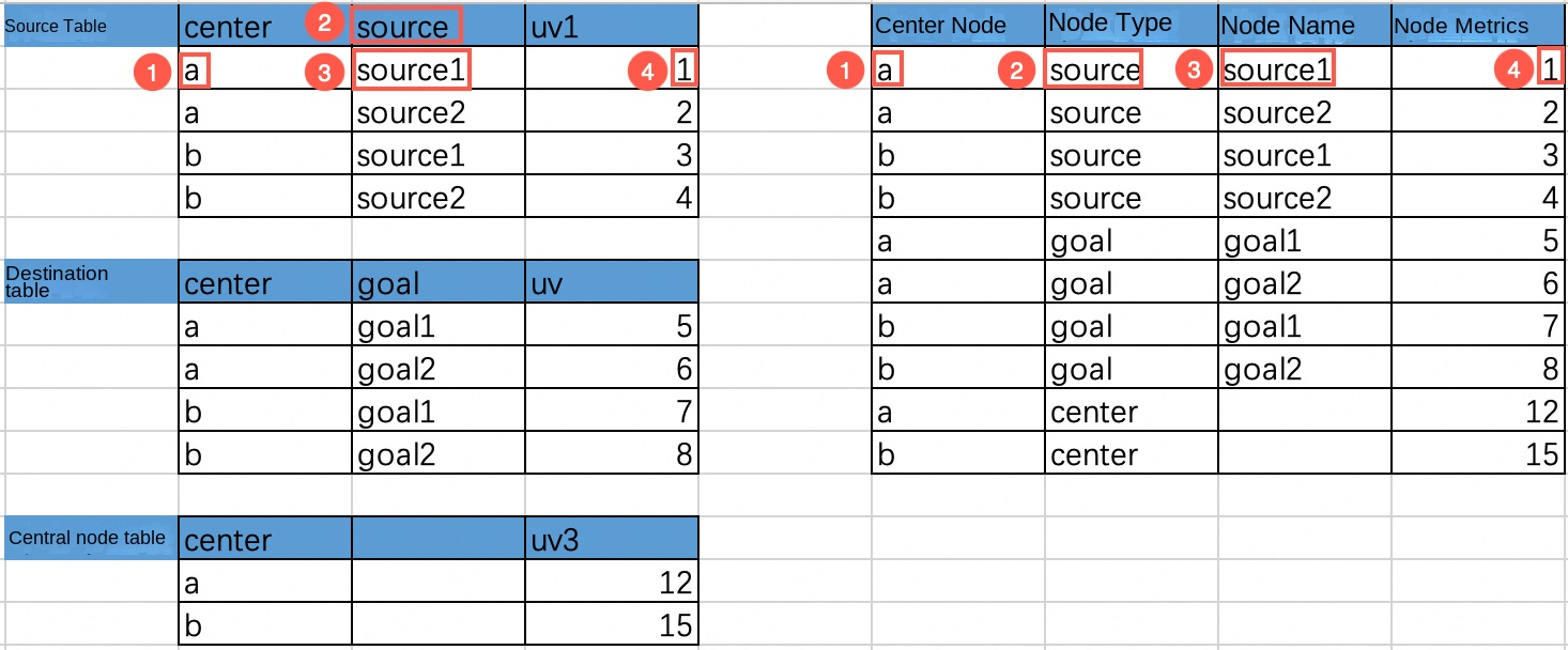
The central node is the value in the center column of the source table.
The node type is source, goal, or center.
The node name is the value in the source column or goal column.
The node indicator is the corresponding UV value.
If you need a sample flow analysis table, you can download Source and destination table.xlsx.
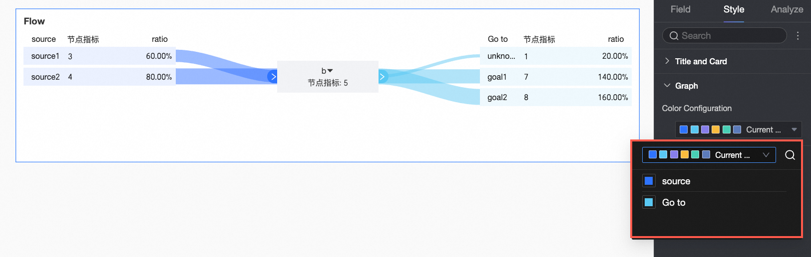
Configure the chart style
In Title And Card, configure notes, endnotes, and other information. For general chart style configurations, see Configure the Chart Title.
In Graph, configure Visualization Colors.
Limits
The values of the Node Type field must be source, center, or goal.
What to do next
When other people need to view the dashboard, you can share the dashboard with specific people. For more information, see Share a Dashboard.
When you need to create complex dashboards with navigation menus for specialized analysis, you can integrate the created dashboards into a data portal. For more information, see Create a PC data portal.