This topic describes how to create a dashboard and how to use the dashboard to create a report. This example involves only some of the chart types. For more information about basic dashboard operations and chart creation procedures, see Overview and Overview.
Dashboard only supports two display modes.
- Standard mode
- Full-screen mode (only available for Quick BI Enterprise Standard)
Create a dashboard using the dataset named company_sales_record. For more information about basic dataset operations, see Quick start: Create a dataset.
Create dashboards
- Log on to the Quick BI console, and click Workspace.
- In the left-side navigation pane, click Dashboards to go to the dashboard management page.
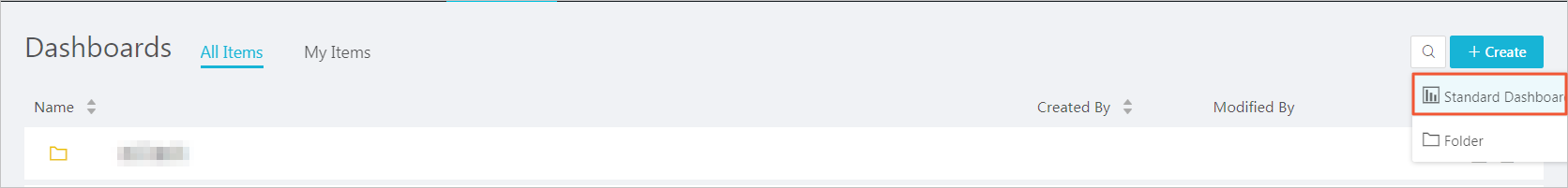
- Click Create Dashboard to go to the dashboard editing page.
- Select a display mode, as shown in the following figure.Note The full-screen mode is only available in the Workspace of Quick BI Enterprise Standard. The Personal Space only supports the standard mode.
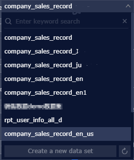
- Click the Switch icon, and select a dataset, as shown in the following figure.
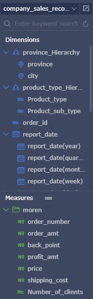
- Click the workbook company_sales_record. The data in the workbook is listed in the dimension list and the measure list respectively, as shown in the following figure.
If the dataset list is empty, click Datasets to return to the dataset management page and check whether the dataset has been successfully created.
Create charts (standard mode)
This topic only describes how to create a column chart in standard mode. For more information about how to create other charts, see Overview.
For more information about the data elements and applicable scenarios of each chart, see Dashboard overview.
For more information about basic dashboard operations, see Overview.
- Click the column chart icon.
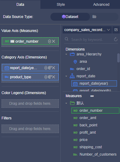
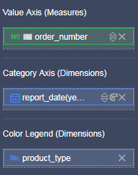
- Double-click a field on the Data tab page. The field data is automatically filled in a specified area, as shown in the following figure.
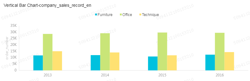
- Click Update. The system automatically draws a chart.If a large amount of data needs to be displayed, you can enable the Color Legend feature. Drag and drop a dimension field to the color legend area. Information of this field is displayed in different colors in the chart.Note This feature is only available when the Value Axis area is filled with only one measure field. When the color legend is unavailable, the system automatically provides prompts and reasons. You can manually adjust the dimension fields and measure fields as prompted.
- Click Update. The updated chart is shown in the following figure.
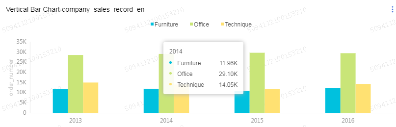
- When you hover your mouse cursor over a set of data, the details of the data (ToolTip) are listed automatically, as shown in the following figure.
You can choose to clear the Tooltip option.
- On the Style tab page, you can modify the titles, layouts, formats, and axis styles, and select a legend type, as shown in the following figure.
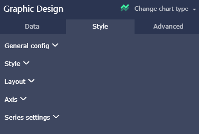
- General configuration: You can set the title and the background color of the chart, as well as the font and the color of the title.
- Style: You can set the display style of the chart on the Style tab page. For example, you can select Secondary Y Axis, Stacked Percentage, or Stacked.
- Layout: You can set the legend type and whether to show the tooltip of the chart.
- Axis: You can set the title and the display style of axes, the display mode of axis values, and the coefficient.
- Series Settings: You can set the alias, display type, and color for a series of data. You can also set the format, decimal digits of the values, and decide whether to display the labels.
To delete the current chart, choose in the upper right corner to delete the chart.
Create charts (full-screen mode)
This topic only describes how to create a geo bubble chart in full-screen mode.
- Click the Geo Bubble icon, as shown in the following figure.
- Double-click a field on the Data tab page. The field data is automatically filled in a specified area.Note Make sure you have changed the dimension type of Province from String to Location.
- Click Update, and the system automatically updates the chart.
- Click the Style tab to edit the title and legend of the chart.
- Click Page Setting to set the page scale, the background color, the time interval of data update, and the time interval of data carousel, as shown in the following figure.
To delete the current chart, click the Delete icon in the lower right corner of the chart.
Add widgets
Standard dashboard
- Filter Bar
- Text Area
- IFrame
- TAB
- Image
Full-screen mode
- Text area
- IFrame
- Image
- Add filter barsYou can click Filter Bar to search one or more charts for specific data.
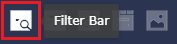
- Click the Filter Bar icon, as shown in the following figure.
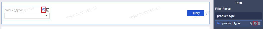
- Click the Filter Bar widget to open the editing menu.
- Select a dataset that can be operated, for example, company_sales_record.
- Select a field to be searched, for example, product_type.
The filter bar supports filter interactions for datasets from different sources or from the same source. This example uses the datasets from the same source.
- Click the Set Filter icon, and select Current Dataset. Select a chart, as shown in the following figure.
- Click Style to edit the title of the widget.
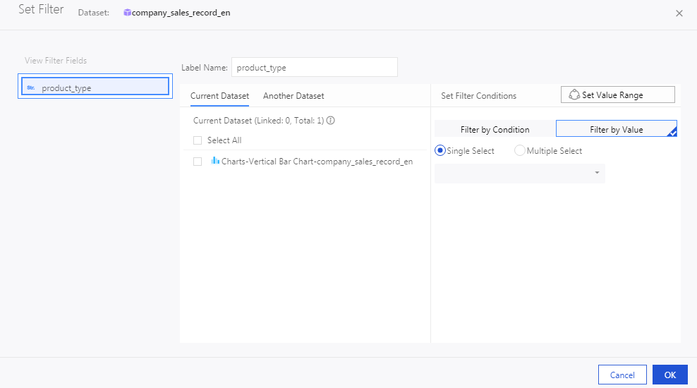
- In the Set Filter Criteria dialog box, click Filter by V and select Ratio or Multiple Select.
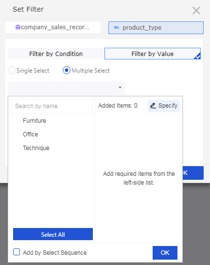
- Click the drop-down arrow and select the item to be searched, as shown in the following figure.Note If you have selected Ratio, you can select only one item. Otherwise, you can select multiple items.
- Click Search, and the charts that contain the queried items are updated.
To delete the current widget, click in the upper-right corner of the widget.
You can also search a field by date or value.
- Click the Filter Bar icon, as shown in the following figure.
- Add Text Area
You can enter a text in Text Area to specify content such as a report title.
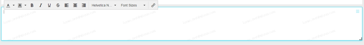
- Click the Text Area icon.
- Enter a text, as shown in the following figure.
To delete the current widget, click in the upper-right corner of the widget to delete the current widget.
- Add IFrame
You can use IFrame to insert required webpages to query web data in real time and browse webpages related to the data on the current dashboard.
- Click the IFrame icon.
- Enter a web address, as shown in the following figure.Note The web address must start with https.
To delete the current widget, click in the upper-right corner of the widget.
- Add TAB
You can use TAB to display multiple charts on different tab pages.
- Click the TAB icon.
- Click Add TAB Page to add a new tab page.
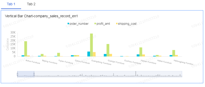
- Select a TAB to insert charts. For example, click TAB1, and TAB1 is highlighted with a blue line.
- Click the required chart icon, and a chart is automatically inserted to the TAB1 tab page.
- Create the chart by following the chart creation process. After the chart is created, the created TAB widget is shown in the following figure.
To delete the current widget, click in the upper-right corner of the widget to delete the current widget.
- Add pictures
You can use the PIC function to insert a picture as required.
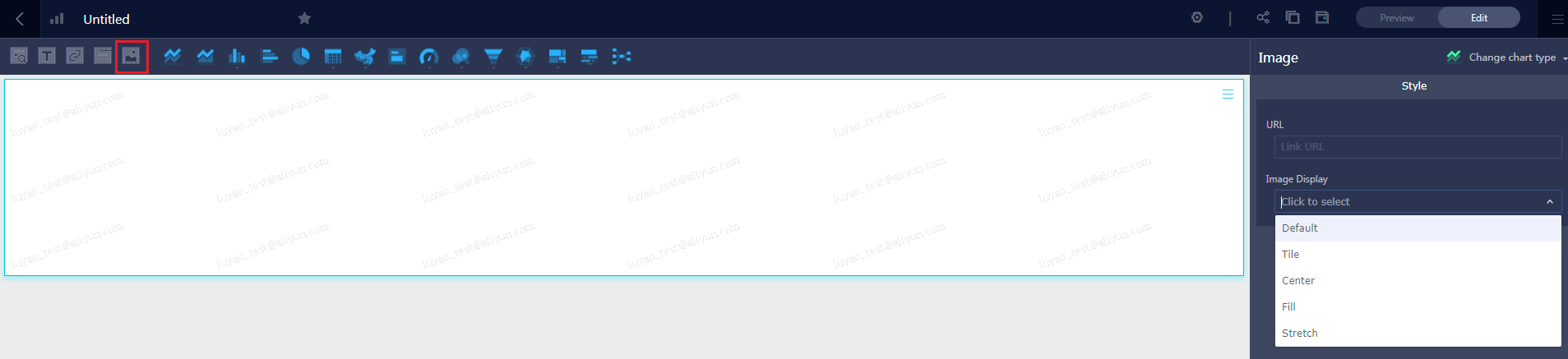
- Click the picture icon.
- Enter the picture URL.
- Click the drop-down arrow and select the picture display style, as shown in the following figure.
To delete the current widget, click in the upper-right corner of the widget.
Preview a dashboard
After a dashboard is edited, you can preview the charts in the dashboard.
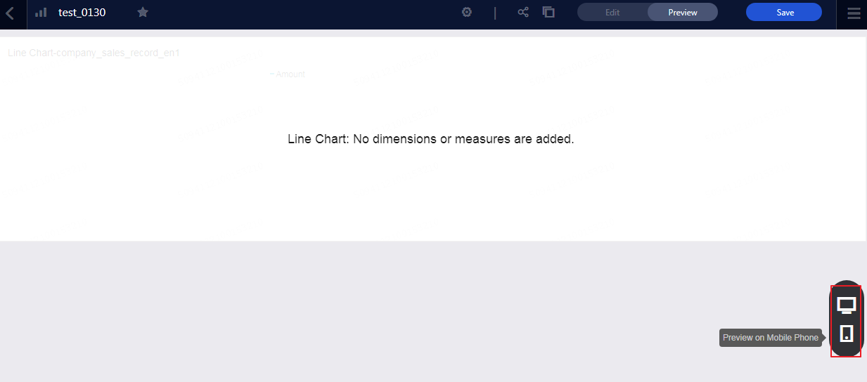
Click Preview, choose PC Preview or Mobile Preview, as shown in the following figure.
Save dashboards
After the dashboard is edited, you can click Save to save the dashboard.