Dashboards in Quick BI use a tile layout to visualize and analyze report data interactively.
Features
Dashboards use a flexible tile layout to present report data visually. You can filter, query, and highlight key fields:
-
Drag, drop, and double-click fields to build charts intuitively.
-
Built-in prompts guide you through interactive analysis.
-
Query dynamic data directly from the editing page for faster results.
Dashboard creation workflow
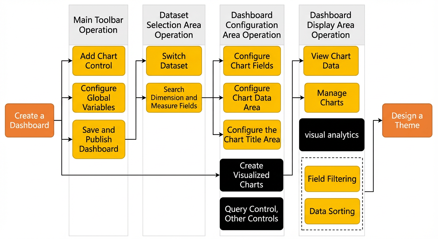
Start by creating a dashboard. All available actions are listed in Dashboard operations.
After creating a chart, filter data, adjust the layout, and customize its appearance. Configure advanced interactions such as drill-down, association, and alerts using the Filter bar and Other widgets.
Procedure
Dashboard areas
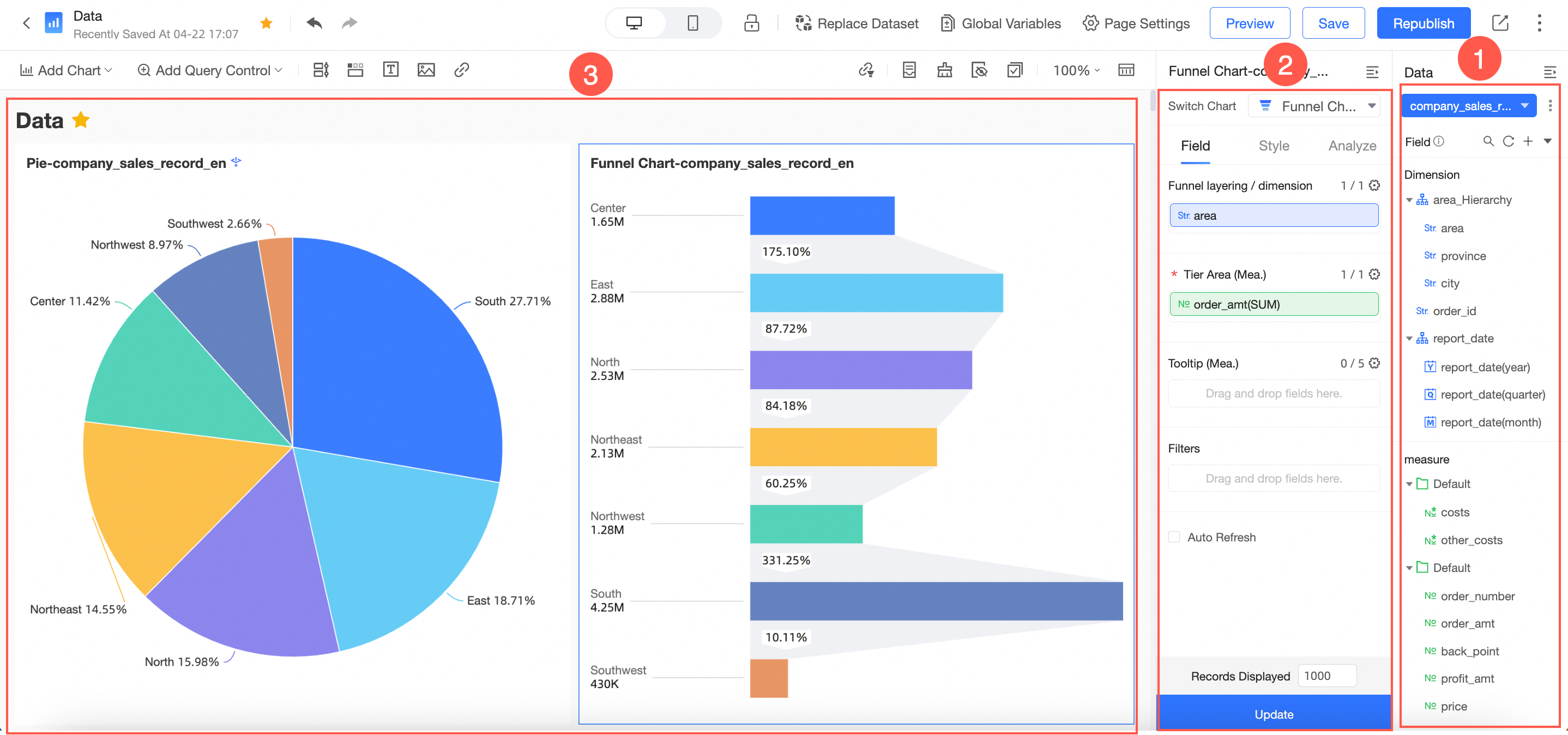
The dashboard has three main areas.
|
No. |
Area |
Description |
|
① |
Dataset selection area |
Switch between datasets. Fields from the selected dataset are automatically categorized into dimension and measure lists for chart configuration. Select the dimension and measure fields you need for your chart from these lists. |
|
② |
Dashboard configuration area |
Select data for your chart and edit its title, layout, and legend. On the Advanced tab, associate multiple charts for multi-perspective analysis. Add data filters or a filter bar to query key data. |
|
③ |
Dashboard presentation area |
Drag charts to reposition them and switch chart types at any time. For example, if you switch a column chart to a bubble map, the system alerts you to missing or incorrect elements based on the requirements of the new chart type. A guided tour is also available to help you learn how to create dashboards. |