This topic describes the meaning of each configuration items when you select a full draw image carousel widget.
Chart style
The draw image carousel a component used to simulate a carousel of randomly drawn prizes. 
Style Panel 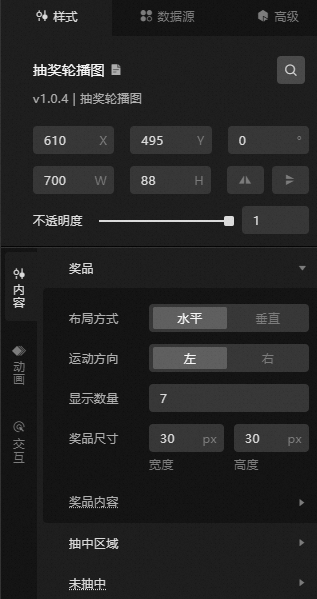
Search Configuration: Click the Search configuration items icon
 in the upper-right corner of the Style panel. In the Search Configuration panel, enter the name of the configuration items that you want to search for and locate the configuration items. Fuzzy match is supported. For more information, see Search configuration items.
 Size: the width and height of the widget. Unit: pixels.
Positioning: the x-axis and y-axis of the component. Unit: pixels. X-coordinate indicates the pixel distance between the upper-left corner of the widget and the left border of the canvas. Y-coordinate indicates the pixel distance between the upper-left corner of the widget and the upper border of the canvas.
Rotate: The widget is rotated around the center of the widget. Unit: degrees.
Directly enter the degrees in the Rotation Angle spin box or click the plus sign (+) or minus sign (-) to increase or decrease the value in the Rotation Angle spin box.
Click the
 icon to flip the widget style.
 Click the
 icon to flip the widget style.
Opacity: Valid values: 0 to 1. If this parameter is set to 0, the widget is hidden. If this parameter is set to 1, the widget is completely displayed. Default value: 1.
Content: sets the style of the content part of the lottery image carousel widget.
Metric
description
Prizes
The style of the prize.
Layout Mode: the layout mode of the prize. You can select Horizontal or Vertical.
Movement Direction: the movement direction of the prize during the carousel draw. You can select Left or Right.
Display Quantity: the number of prizes to be displayed in the carousel. Default value: 7.
Size: the width and height of the prize. Unit: pixels.
Prizes: Select a style to display prizes. Click the
 or
or  icon to add or delete a prize. Click the
  or
or  icon to configure the arrangement style for multiple prizes. Click the
  icon to copy the currently selected prize configuration and add a prize with the same configuration.
 ID: specifies the ID of the prize.
Name: Enter a name for the prize.
Image: the image of the prize. To use an image on a remote server, enter the URL of the image in the upper-right corner. Click Preview in the image box to preview the image format. Click Change in the dashed box below the image box. For more information about how to change the image design asset, see Use the interface.
NoteIf data is configured for the data field in the Data Sources panel, the content in the Data Sources panel is displayed first.
Middle area
Sets the style of the drawn area.
Mode: Select the mode of the selected area. You can select Debug Mode or Normal Mode.
Position: Select the position of the drawn area. You can select Head, Middle, or Tail. You can set this option only when you turn off Custom Position.
Custom Position: the horizontal position of the selected area. Unit: pixels. Click the
 icon to control the display of the custom location.
 Size: the size of the area, including the width and height. Unit: pixels.
Fillet: the fillet value of the selected area. Unit: pixels.
Fill Color: the fill color of the drawn area.
Border: the border style of the selected area, including the line type, line thickness, and line color.
Not drawn
Set the style when the prize is not drawn.
ID: Set the ID when the prize is not won.
Name: the name that is displayed when the custom settings are not selected.
Image: the image that is used when the prize is not won. To use an image on a remote server, enter the URL of the image in the upper-right corner. Click Preview in the image box to preview the image format. Click Change in the dashed box below the image box. For more information about how to change the image design asset, see Use the interface.
NoteIf no prize is drawn, the data throw value is configured.
Animation: Set the animation style of the lottery image carousel.
Metric
description
Prize Speed
Sets the amount of time spent rolling each item of the prize, in s.
Increment Speed
Set the value of the speed incremented after each draw, clear the animation, or restart the animation, and the speed will be restored. Click the
icon to control the increase speed. Middle Area Animation
The playback mode of the animation in the middle area. You can select Fixed or Scroll.
Interactive: the style of the button of the lottery image carousel widget.
Metric
description
Lottery difficulty
The difficulty of the draw. Valides include Simple, Normal, and Inferno.
NoteIt simply means that as long as there is any overlap between the area and the prize, it will be counted as the draw. General refers to the 1/3 overlap between the area and the prize, and then the draw is counted. Hell means that the area and the prize must have a 4/5 overlap before they are drawn.
Draw suspended
Turn on the switch to set the function of pausing the lottery after each lottery. Turn off the switch and do not pause the lottery.
Data Sources panel 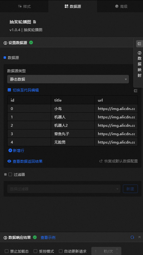
Column | Description |
| The ID value of the prize. |
| The name of the prize. |
| The URL of the prize image. |
Configure data items | Description |
Data sources | You can use the code editor or visual editor to view the data fields contained in the widget. You can also modify the data type to flexibly configure the component data. |
Data Mapping | If you need to customize chart field configurations, you can set different field mapping content in the Data Mapping module and field mapping these content to the corresponding fields of the widget. This allows you to match data without modifying the fields in the data source. You can also click the |
Configure a filter | Turn on Filter, select an existing data filter or create a data filter, and configure a data filter script to filter data. For more information, see Manage data filters. |
Data Response Result | The Data Response Result section displays widget data in real time. If the data source of the widget changes, this section displays the latest data. If the system response is delayed, you can click the |
Forbid Loading | If you select the check box, you will not see the loaded content during component initialization when you update the component and preview the data kanban. If you select the check box, the opposite is true. By default, the status is deselected. |
Controlled Mode | If you select the check box, the component does not request data in the initialized state, and only requests data by using global variables or the method configured in Blueprint Editor. If you clear the check box, you can use automatic update to request data. By default, the status is deselected. |
Auto Data Request | Select the check box to manually enter the time frequency of polling to set dynamic polling. If you clear the page, the page is not automatically updated. You need to manually refresh the page or use Blueprint Editor and global variable events to trigger a request to update data. |
 icon to configure the field style.
  icon on the right to view the data response result. You can also click the
  icon on the right to obtain the latest data of the widget. You can also click View Example to view an example of the response result of the current component.
 Advanced Panel 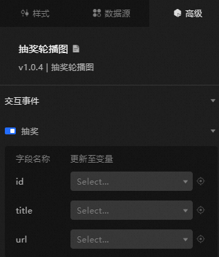
Turn on the switch to enable the widget interaction feature. When a lottery is drawn, a data request is triggered, a temporary variable is thrown, and the data in the lottery image carousel is dynamically loaded. By default, the id, title, and url values in the data are displayed. For more information, see Component interaction configuration.
Blueprint Interaction
Click the
 icon in the upper-left corner to go to the Blueprint page.
 On the Layer Nodes tab, add the widget to the main canvas.
View blueprint configuration parameters.
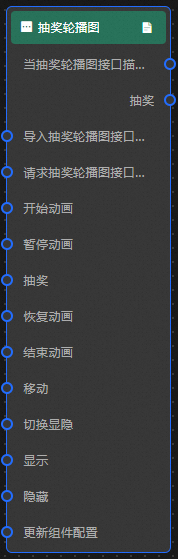
Event
Event
Description
When the lottery image carousel interface description request is completed
The event is triggered with the processed JSON data after a data interface request is responded and processed by a filter. For more information about specific data examples, see the Data Response Result section of the Data Source tab in the right-side configuration panel of the canvas editor.
Lucky Draw
When a lottery is drawn, an event of the drawn data is thrown, and the data item of the object type corresponding to the event is also thrown. For more information, see the data example.
{
  "id": "", // The ID of the prize.
  "title": "", // The name of the prize.
  "url": "" // The URL of the prize image.
}
Action
Action
Description
Request Lottery image carousel Interface Description
This action is performed to request the server data again. The data sent by an upstream data processing node or layer node is used as a parameter. For example, if the lottery image carousel is configured with the API data source as
https://api.testand the data passed to the request lottery image carousel interface to describe the action as{ id: '1'}, the final request interface ishttps://api.test?id=1.Import Lottery image carousel Interface Description
After data of a widget is processed in accordance with its drawing format, the widget is imported for redrawing. You do not need to request server data again. For more information about specific data examples, see the Data Response Result section of the Data Source tab in the right-side configuration panel of the canvas editor.
Start Animation
Starts the carousel draw animation. No parameters are required.
Pause Animation
Pause the carousel draw animation. No parameters are required.
Lucky Draw
Draw, no parameters are required.
Restore Animation
Restores the animation without parameters.
End Animation
Ends the animation. No parameters are required.
Move
Move a widget to a specified location. For more information, see the data example.
    {
      // The positioning type. to indicates absolute positioning, whereas by indicates relative positioning. The default value is to.
        "positionType": "to",
      // The location, which is indicated by the x and y coordinates.
      "attr": {
        "x": 0,
        "y": 0
      },
      // The animation type.
      "animation": {
        "enable": false,
        // The duration in which animation is displayed.
        "animationDuration": 1000,
        // The animation curve, which can be set to linear|easeInOutQuad|easeInOutExpo.
        "animationEasing": "linear"
      }
    }
Switch to the implicit state
Specifies whether to show or hide a widget. No parameters are required.
Display
Display the widget. For more information, see Data example.
{
  "animationType": "",// The animation method. Valid value: fade. If you do not specify this parameter, no animation is generated.
  "animationDuration": 1000,// The animation delay. Unit: ms.
  "animationEasing": ""// animation curve
}
Hide
Hide the component. For more information, see Data example.
{
  "animationType": "",// The animation method. Valid value: fade. If you do not specify this parameter, no animation is generated.
  "animationDuration": 1000,// The animation delay. Unit: ms.
  "animationEasing": ""// animation curve
}
Update component configurations
Style configurations of widgets are dynamically updated. In the Style panel, click Copy Configuration to Clipboard to obtain the configuration data of the widget. After that, change the style field for the data processing node in Blueprint Editor.