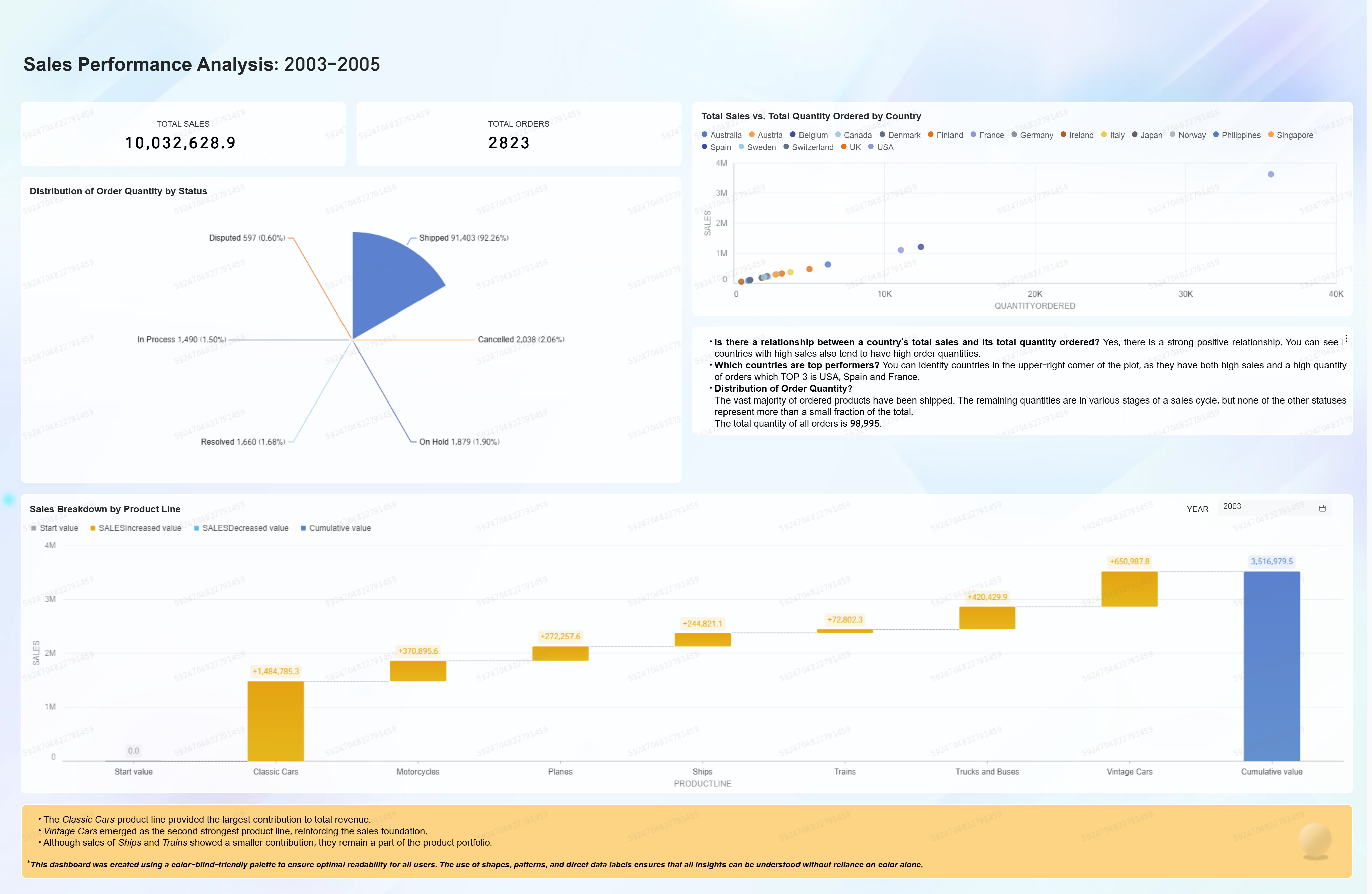
This project is from Daisy team, which was awarded the Most Voted Award in the 2025 Quick BI Global Data Visualization Hackathon.

This project is a visual analysis of a public Kaggle dataset on sales performance from 2003-2005, created using Alibaba's Quick BI.
As a statistics student, my goal was to apply data visualization techniques to a real-world dataset to identify and communicate key business patterns effectively.
The dashboard I built explores the data to answer several questions:
The final result is an interactive dashboard that translates a complex raw dataset into clear, accessible insights, demonstrating the power of Quick BI tools for rapid and effective data analysis.
🔗 Explore the project here
The main value of my dashboard is its ability to provide immediate statistical clarity from complex data. It transforms a raw dataset of nearly 100,000 orders into a powerful tool for making data-driven decisions.
Its core value is demonstrated in three ways:
1. Reveals Hidden Correlations. Instead of just showing totals, the dashboard instantly visualizes the statistical relationship between sales and order quantities, making it easy to identify which countries are true high-performers.
2. Quantifies Performance. It provides a precise, data-driven measure of what works. Users can see exactly what percentage of orders are successful (92.26%) and which product line, ""Classic Cars"", is the undisputed leader in revenue.
3. Removes Guesswork. The dashboard provides a robust statistical foundation for strategy. It replaces assumptions with clear data, allowing for faster, more confident decisions on where to focus resources for growth.
Here’s how the solution works:
The dashboard provides a direct comparison of country performance by plotting total sales against the quantity ordered. This method immediately identifies key markets and outliers, such as the top-performing USA, Spain, and France.
The solution includes a breakdown of the 99,067 total orders by their status. This serves as a quick operational audit, quantifying the efficiency of the sales pipeline and showing that the vast majority of orders (92.26%) were successfully shipped.
To understand performance over time, the solution incorporates a monthly visualization of sales from 2003 to 2005. This allows for easy identification of growth periods, potential seasonality, and overall revenue trends.
Finally, the solution breaks down total sales by product line to attribute revenue to its source. This analysis clearly isolates the most profitable products, identifying Classic Cars as the largest contributor to the company's revenue.
The analysis of the sales data from 2003-2005 revealed several key performance highlights, providing a clear picture of the business's strengths.
Top Performing Markets Identified The dashboard confirms a strong positive relationship between a country's sales and its order quantity. Based on this, the analysis pinpoints the USA, Spain, and France as the top three performing markets, which consistently lead in both sales volume and the number of orders placed.
"Classic Cars" as the Primary Revenue Driver The product line analysis shows that Classic Cars are the single largest contributor to total revenue. This identifies them as the most critical product category, with Vintage Cars ranking as the second strongest.
High Operational Efficiency The data highlights a highly effective and reliable order fulfillment process. An analysis of all 99,067 orders shows that an overwhelming majority, 92.26%, were successfully shipped to customers.
Significant Overall Growth Across the three-year period, the analysis confirms a substantial sales record, with the company achieving $10 million in total sales. This provides a strong benchmark for overall business performance.
Hello! I'm Nurul Alawiyah, a third-year Statistics student and this "Sales Performance Analysis" dashboard is a project I developed using Alibaba Quick BI.
My aim with this dashboard was to showcase how effective data visualization can transform raw data into clear, actionable insights. By applying statistical analysis to a public Kaggle sales dataset (2003-2005), I focused on identifying key trends, market performance, and operational efficiency.
I paid particular attention to creating an accessible experience, incorporating a color-blind-friendly palette and IBCS-inspired design principles to ensure the data is easily interpretable for everyone. I hope you find the insights valuable and the dashboard intuitive!
134 posts | 27 followers
FollowNick Patrocky - January 30, 2024
Rupal_Click2Cloud - December 23, 2024
Alibaba Cloud Community - August 27, 2025
Apache Flink Community - April 25, 2025
Apache Flink Community - March 7, 2025
Shane Duggan - March 8, 2023
134 posts | 27 followers
Follow Quick BI
A new generation of business Intelligence services on the cloud
Learn More Big Data Consulting for Data Technology Solution
Alibaba Cloud provides big data consulting services to help enterprises leverage advanced data technology.
Learn More Big Data Consulting Services for Retail Solution
Alibaba Cloud experts provide retailers with a lightweight and customized big data consulting service to help you assess your big data maturity and plan your big data journey.
Learn More Cloud Migration Solution
Secure and easy solutions for moving you workloads to the cloud
Learn MoreMore Posts by Alibaba Cloud Project Hub