Performance monitoring metrics are quantitative indicators used to measure the performance of a system or application. These metrics help developers and system administrators understand the system or application's running status and identify potential performance issues. Common performance monitoring metrics include CPU usage, memory usage, disk I/O, network bandwidth, response time, concurrency, error rate, logging, resource utilization, and transaction volume. By monitoring these metrics, system or application performance issues can be identified in a timely manner, and appropriate measures can be taken to optimize performance and improve user experience. The following are some common performance monitoring metrics:
Latency
Latency is one of the "Golden Trio" used to measure application interface performance. Unlike request volume or error count, statistical measures of latency occurrences or totals often do not have practical value. The most commonly used measure of latency is average latency. For example, the latency of 10,000 calls may vary, but if you sum up these latencies and divide by 10,000, you get the average latency per request, which directly reflects the system's response speed or user experience.
However, average latency has a fatal flaw: it can be easily disrupted by outlier values of exceptional requests. For example, in 100 requests, 99 requests have a latency of 10ms, but one exceptional request has a latency of 1 minute. The average latency would then be (60000 + 10*99) / 100 = 609.9ms. This obviously does not reflect the true performance of the system. Therefore, in addition to average latency, we often use latency quantiles and latency histograms to express the response of the system.
Latency Quantiles
Quantiles are values that divide the cumulative probability distribution of a random variable into several equal parts. For example, the median (50th quantile) divides the sample data into two parts. One part is greater than the median and the other part is smaller than the median. Compared to the average, the median can effectively eliminate random disturbances in the sample values.
Quantiles are widely used in various fields of daily life. For example, the distribution of scores in the education field uses quantiles extensively. For example, a university in Province A recruits 100 students, while there are 10,000 applicants in the province. The admission cutoff for the university is the P99 quantile of all applicants' scores, which is the top 1% of students who can be admitted. Regardless of whether the college entrance examination questions in the province are difficult or easy, the admission of the planned number of students can be accurately determined.
When quantiles are applied to latency metrics in the IT field, they can accurately reflect the response time of interface services. For example, the P99 quantile can reflect the processing time of the top 1% of slowest API requests. For these requests, the response time of the service may have reached an intolerable level (e.g., 30 seconds). The latency P99 quantile provides the following important information relative to the average latency:
1% of service requests may be suffering from a long response time, affecting a proportion of users much greater than 1%. This is because a single end-user request directly or indirectly invokes multiple node services, and if any of them slows down, it will slow down the overall end-user experience. In addition, a user may perform multiple operations, and if one operation becomes slow, it will affect the overall product experience.
The latency P99 quantile is an early warning for application performance bottlenecks. When the P99 quantile exceeds the availability threshold, it indicates that the system's service capacity has reached a certain bottleneck. If not addressed, as traffic continues to grow, the proportion of users affected by timeout requests will continue to increase. Although you are currently dealing with only 1% of slow requests, in fact, this optimization is also done for a future 5%, 10%, or even higher proportion of slow requests.
According to experience, it is often the "high-end" users with large data volumes and complex query conditions that are more likely to trigger slow queries. At the same time, these users are usually high-value users who have an impact on product revenue and reputation and need to be responded to and resolved as a priority.
In addition to the P99 quantile, commonly used latency quantiles include P99.9, P95, P90, and P50, which can be selected for monitoring and early warning based on the importance of the application interface and the service level agreement (SLA). When the quantiles on a time series are connected, they form a "quantile line" that can be used to observe whether there are abnormal changes in latency:
Latency Histogram
Latency quantiles and average values abstract the response speed of the system into a few finite values, which are suitable for monitoring and alerting. However, if you want to perform in-depth analysis and identify the distribution of latencies of all requests, histograms are the most suitable statistical method.
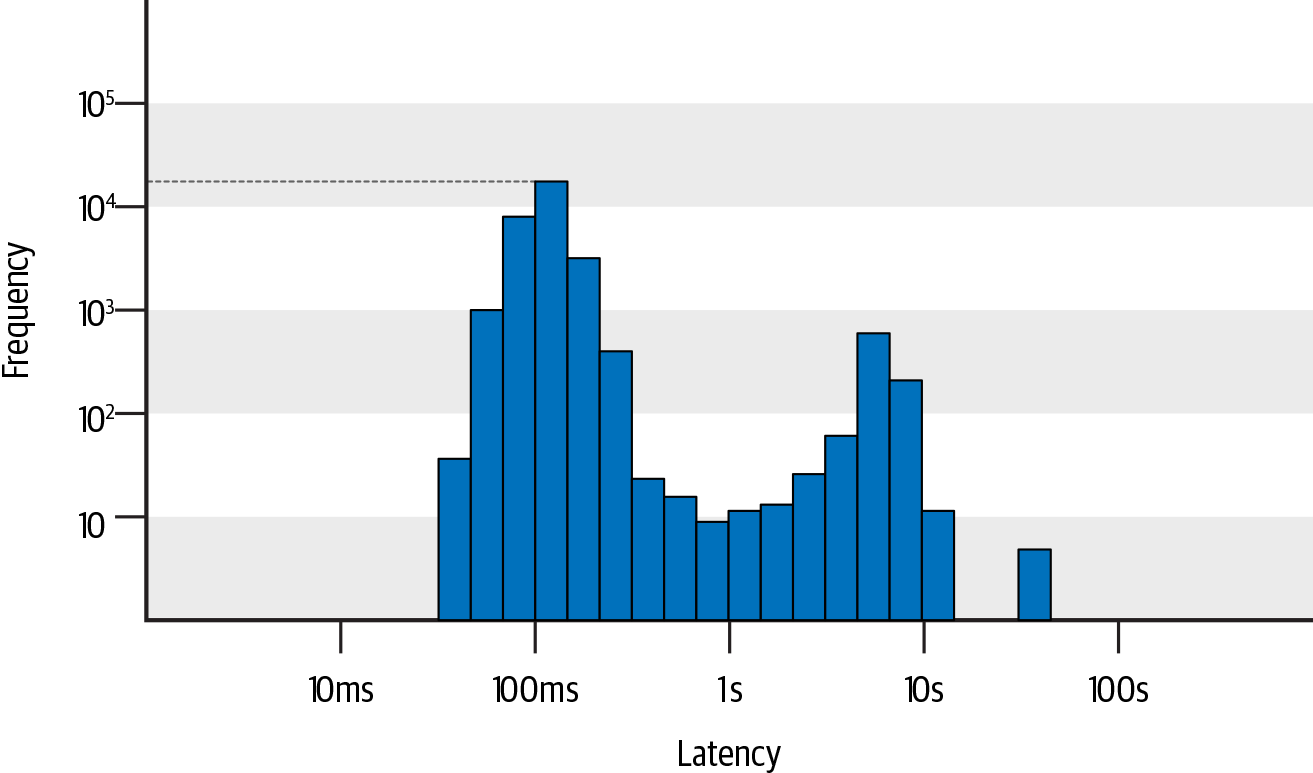
In a histogram, the x-axis represents request latency, and the y-axis represents the number of requests. The x/y values on the histogram are usually non-uniform because the distribution of latency and request counts is usually unbalanced. This non-uniform axis layout makes it easier to observe the distribution of slow requests with low frequency but high importance, while the uniform axis layout tends to ignore low-frequency values. For example, in the following figure, you can intuitively observe the distribution of request counts in different latency ranges: there are the most requests with a latency of around 100ms, exceeding 10,000 times; there are also quite a few requests with latencies in the range of 5-10s, close to 1,000 times; and there are nearly 10 requests with latencies over 30s.
By combining quantiles and histograms, each quantile of latency falls within a specific range on the histogram. This allows us to not only quickly identify the slowest 1% of requests with a threshold of 3s, but also further distinguish the specific distribution quantities of the slowest 1% of requests in ranges such as 3-5s, 5-7s, 7-10s, and over 10s. The severity of the problem reflected by the slowest 1% of requests concentrated in the 3-5s range is completely different from that of requests concentrated in the range of over 10s, as well as the underlying causes.
By comparing the histogram distributions during different periods, changes in each latency range can be accurately identified. If the business is aimed at end users, each long tail request represents a terrible user experience, and you should focus on the changes in the highest latency ranges, such as the range in which the P99 quantile is located; if the business system is responsible for graphic and image processing and focuses more on throughput per unit time and pays less attention to long tail latencies, you should focus on changes in latency in the range where the majority of requests are located, such as the distribution changes of the P90 or P50 ranges.
Cache Hit Rate
Caching can effectively improve the response speed of high-frequency repetitive requests. For example, the order center can store product details in the Redis cache, and only query the database when the cache is missed. Therefore, cache hit rate is an important metric for measuring system performance in actual production environments.
For example, during a promotion activity in an order center, there can be a surge in access traffic, followed by a decline and then a slow recovery, accompanied by significant fluctuations in latency and changes in cache and database request volumes.
From the figure, we can see that the changes in cache request volume are roughly the same as the create order interface, while the changes in database request volume are greater. It can be preliminarily concluded that there were a large number of cache misses during the initial stage of the promotion, which led to an abnormal increase in the latency of creating order interfaces because querying the database incurs a much larger latency cost than querying the cache. Cache misses can occur for two main reasons: one is a decrease in cache hit rate caused by querying a large amount of cold data, and the other is an increase in cache connection due to high query volume, exceeding the service capacity of the cache. The specific manifestations of these two reasons can be further distinguished with the help of the cache hit rate.
In order to minimize the impact of cold data on the promotion experience, cache warming can be performed in advance to increase the cache hit rate. For the problem of cache connection overload, the maximum number of cache connections in the client or server cache connection pool can be adjusted in advance, or capacity planning can be conducted in advance. The serious consequence of a decrease in cache hit rate is a large number of requests hitting the database, resulting in overall service unavailability. Therefore, it is recommended to set an alarm for the cache hit rate to detect risks in advance.
CPU Usage and Average Load
CPU Usage
CPU usage refers to the percentage of time that the CPU is busy, and it reflects the busyness of the CPU. For example, if the non-idle runtime of a single-core CPU within 1 second is 0.8 seconds, then the CPU usage is 80%; for a dual-core CPU, if the non-idle runtime within 1 second is 0.4 seconds and 0.6 seconds respectively, then the overall CPU usage is (0.4 seconds + 0.6 seconds) / (1 second x 2) = 50%, where 2 represents the number of CPU cores. This logic applies to multi-core CPUs as well.
In Linux systems, you can use the top command to view CPU usage, as shown below:
Cpu(s): 0.2%us, 0.1%sy, 0.0%ni, 77.5%id, 2.1%wa, 0.0%hi, 0.0%si, 20.0%stus(user): indicates the percentage of time the CPU runs in user mode, usually a high user-mode CPU indicates that there are relatively busy application programs. Typical user-mode programs include databases, web servers, etc.sy(sys): indicates the percentage of time the CPU runs in system mode (excluding interrupts), usually a lower system-mode CPU indicates that the system does not have certain bottlenecks.ni(nice): indicates the CPU time consumed by user-level processes that use thenicecommand to modify the process priority.niceis a nice value for the process priority, which can be used to separately count CPU costs for processes that have modified their priorities.id(idle): indicates the percentage of time the CPU is in the idle state. At this time, the CPU executes a special virtual process called System Idle Process.wa(iowait): indicates the time the CPU spends waiting for I/O operations to complete. Usually, this metric should be as low as possible, otherwise it indicates an I/O bottleneck, and further analysis can be performed using tools such asiostat.hi(hardirq): indicates the time the CPU spends handling hardware interrupts. Hardware interrupts are sent by peripheral devices (such as keyboard controllers, hardware sensors, etc.), and interrupt controllers are involved, and they are executed rapidly.si(softirq): indicates the time the CPU spends handling software interrupts. Software interrupts are interrupt signals sent by software programs (such as network sending/receiving, scheduled scheduling, etc.), and their characteristics are delayed execution.st(steal): indicates the time the CPU is occupied by other virtual machines, only appearing in multi-virtual machine scenarios. If this metric is too high, you can check the host or other virtual machines for abnormalities.
Because there are multiple non-idle states for the CPU, the CPU usage formula can be summarized as: CPU usage = (1 - idle runtime / total runtime) * 100%.
According to empirical rules, the total CPU usage of a production system is recommended not to exceed 70%.
Average Load
Average load is the average number of processes in the running (or runnable) state and uninterruptible state within a unit of time, namely, the average number of active processes.
Running processes include processes that are currently using the CPU or waiting for the CPU. Uninterruptible processes are processes in critical kernel flows that cannot be interrupted. For example, when a process writes data to a disk, if it is interrupted, there may be inconsistencies between the disk data and the process data. The uninterruptible state is essentially a protective mechanism of the system for processes and hardware devices.
In Linux systems, you can use the top command to view the average load, as shown below:
load average: 1.09, 1.12, 1.52These three numbers represent the average load of the system in the last 1 minute, 5 minutes, and 15 minutes. The smaller the value, the lower the system workload and the lower the load. Conversely, the higher the load.
In ideal conditions, each CPU should work at full capacity and there should be no waiting processes. In this case, the average load = number of CPU logical cores.
However, in actual production systems, it is not recommended to run the system at full load. The general empirical rule is that the average load = 0.7 * number of CPU logical cores.
When the average load continues to be greater than 0.7 * number of CPU logical cores, it is necessary to investigate the cause and prevent the system from deteriorating.
When the average load continues to be greater than 1.0 * number of CPU logical cores, countermeasures must be taken to reduce the average load.
When the average load continues to be greater than 5.0 * number of CPU logical cores, it indicates that the system has serious problems, being unresponsive for a long time or close to crashing.
In addition to focusing on the value of the average load itself, attention should also be paid to the trend of the average load, which includes two levels of meaning. One is the trend of change between load1, load5, and load15; the other is the historical trend of change.
When the load1, load5, and load15 values are very close, it indicates that the system load is relatively stable in the short term. At this time, it should be compared with the historical load at the same time of day or week to observe whether a significant increase has occurred.
When load1 is much smaller than load5 or load15, it indicates that the system load has been decreasing in the past minute, but the average load in the past 5 minutes or 15 minutes is still high.
When load1 is much larger than load5 or load15, it indicates that the system load is rapidly increasing. If it is not a temporary fluctuation but continues to increase, especially when load5 has already exceeded 0.7 * number of CPU logical cores, the cause should be investigated and the system load should be reduced.
Relationship Between CPU Usage and Average Load
CPU usage statistically measures the busyness of the CPU within a unit of time. Average load includes not only the processes using the CPU, but also the processes waiting for the CPU or I/O. Therefore, the two cannot be equated, and there are two common scenarios as described below:
CPU-intensive applications: where many processes are waiting or using the CPU, CPU usage is positively correlated with average load.
I/O-intensive applications: where many processes are waiting for I/O, the average load will increase, but CPU usage may not be very high.