Official components
ApsaraVideo Player SDK provides built-in components for ads, subtitles, playlists, and other common scenarios. Use them as-is or customize them.
Overview
-
Source code is available on GitHub.
-
Try the components in the Functions tab.
-
Some features do not work in built-in mobile browsers.
-
GitHub is a third-party site. Connection issues may occur.
Component list
|
Component name |
Type |
Description |
Effect |
|
Bullet comment |
|
Adds a text input box and control bar buttons for enabling, disabling, and sending live comments. Danmu component. |
|
|
Animated watermark (Marquee component) |
|
Adds a scrolling text watermark (such as a user ID) to deter unauthorized copying. Supports custom position, color, and font size. Marquee component. |
|
|
Subtitle |
|
Switches subtitles between languages. Subtitle component. |
|
|
Video ad pod |
|
Plays a sequence of video ads before the main content. Video ad pod component. |
|
|
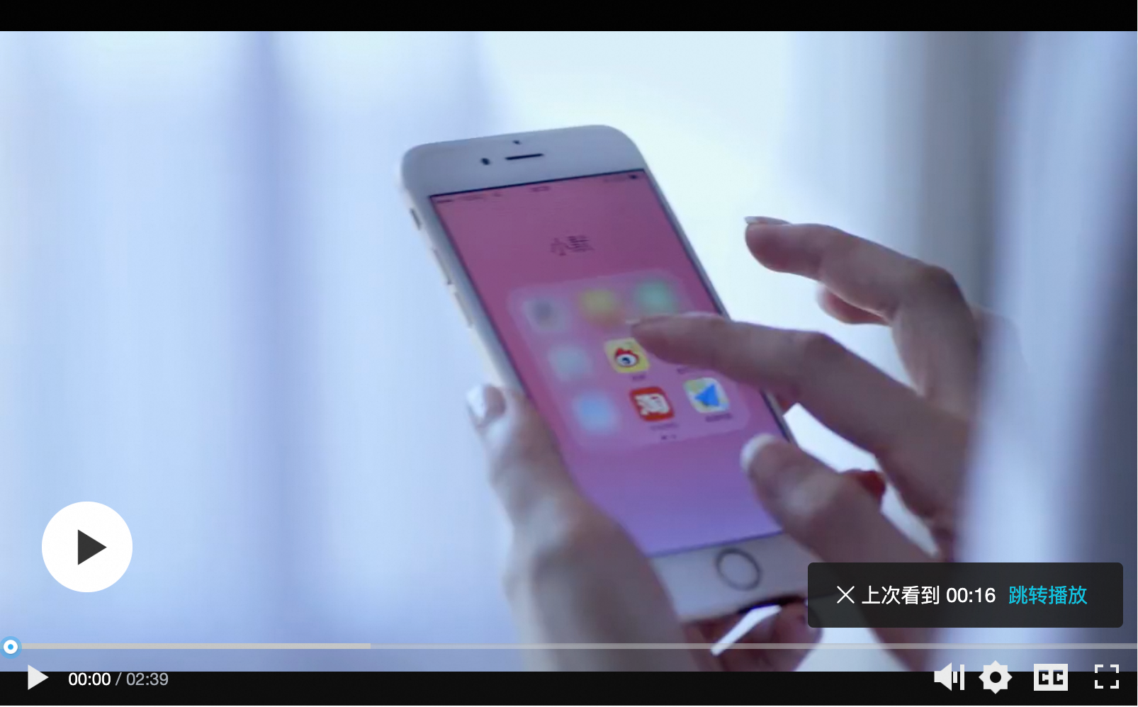
Resume playback |
|
Saves the last playback position automatically. Two modes:
Note
Requires localStorage support in the browser. |
|
|
Pause ad (image) |
|
Displays an image ad overlay in the center of the player when paused. Pause ad component. |
|
|
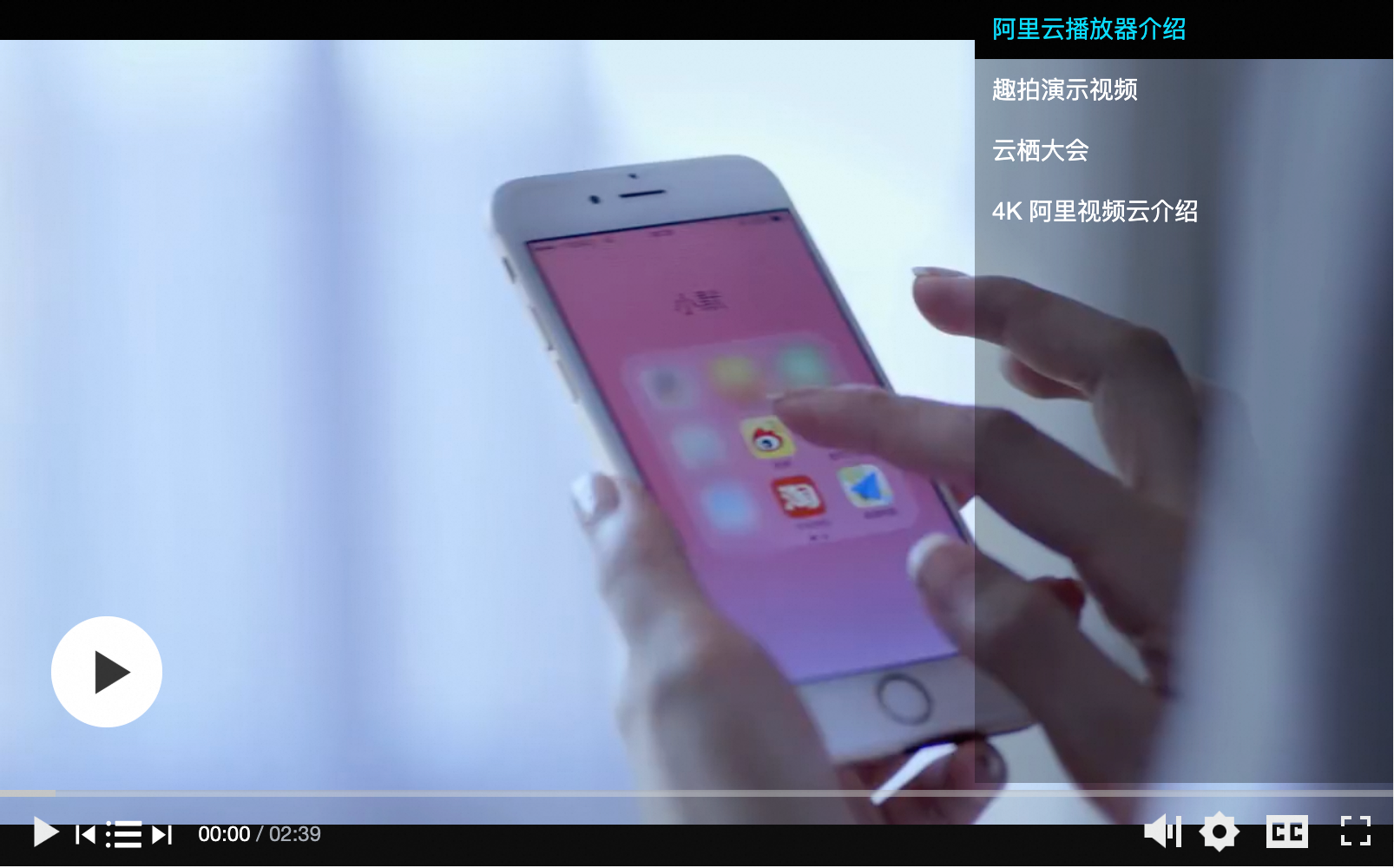
Video playlist |
|
Adds a playlist button to the control bar for switching between videos. Video playlist component. |
|
|
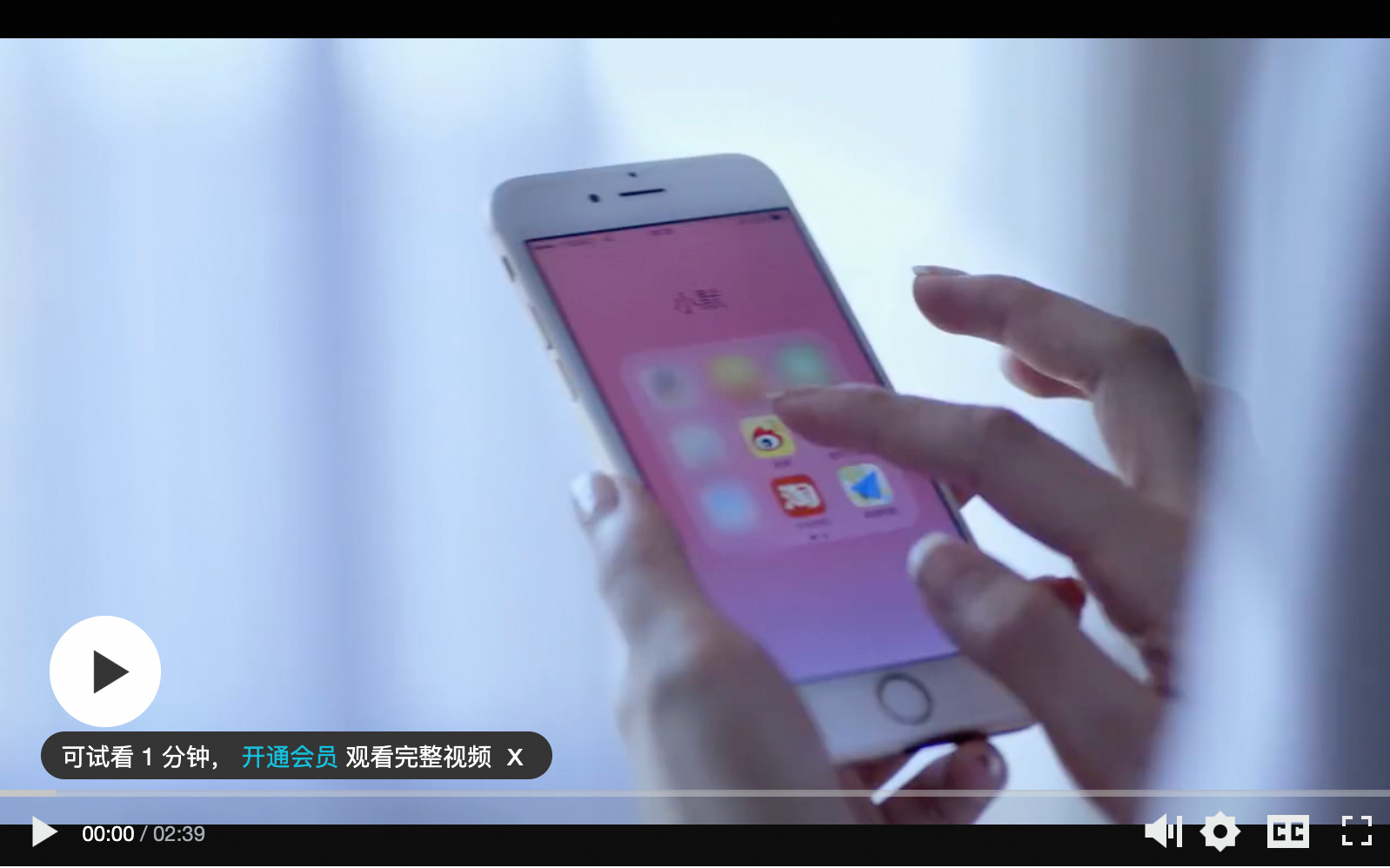
Preview |
|
Limits playback to a preview duration, then prompts for full access (e.g., subscribe or purchase). Preview component. |
|
|
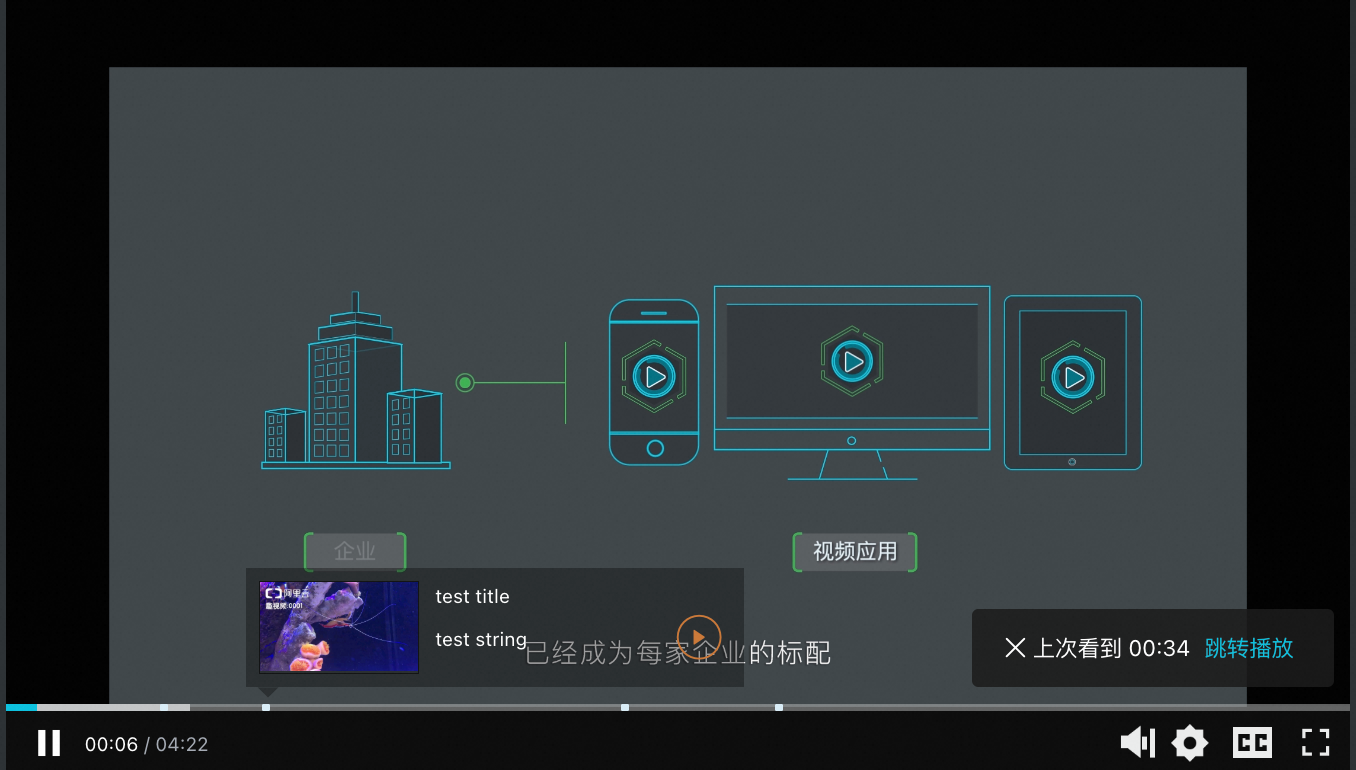
Progress marker |
|
Adds markers to the progress bar for key points. Hovering a marker shows a thumbnail preview. Progress marker component. |
|
|
Definition |
|
Switches video definitions (resolution). Definition component. |
|
|
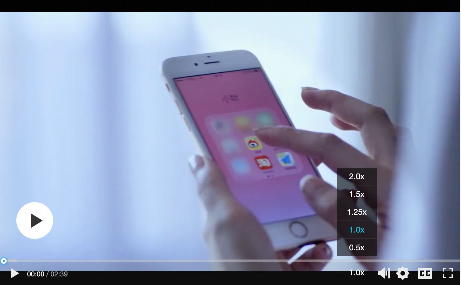
Playback speed |
|
Adjusts video playback speed. Playback speed component |
|
|
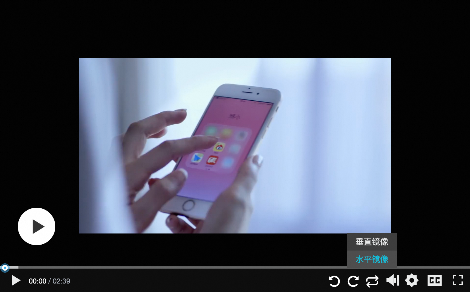
Rotation and mirroring |
|
Adds rotate and mirror buttons to the control bar. Rotation and mirroring component. |
|
|
Start ad (image) |
|
Displays an image ad before video playback starts. Start ad component. |
|
|
Audio track switching |
|
Switches audio tracks between languages. Audio track switching component. |
- |
|
Video ad |
|
Plays a time-limited video ad before the main content. Video ad component. |
|
|
Play next |
PlayerNextComponent |
Adds a Play Next button to the control bar. The click event can be custom-defined and passed as a parameter. Play next component. |
|


Use components
-
Add the components to Web Player SDK. No CDN URL is currently available. Download the components package and include it in your project. Use the latest version.
<script type="text/javascript" src="your-public-path/aliplayercomponents-1.0.9.min.js"></script> -
Mount the components to Web Player SDK.
var player = new Aliplayer(
  {
    id: "player-con",
    source: "//player.alicdn.com/video/editor.mp4",
    components: [
      {
        name: "StartADComponent",
        type: AliPlayerComponent.StartADComponent,
        args: [
          "https://img.alicdn.com/tfs/TB1byi8afDH8KJjy1XcXXcpdXXa-1920-514.jpg",
          "https://promotion.aliyun.com/ntms/act/videoai.html",
          3,
        ],
      },
      {
        name: "BulletScreenComponent",
        type: AliPlayerComponent.BulletScreenComponent,
        args: [
          "Welcome to use Aliplayer",
          { fontSize: "16px", color: "#00c1de" },
          "random",
        ],
      },
    ],
  },
  function (player) {}
);
Component properties:
Property
Description
name
Unique name for the component, used to retrieve its instance.
type
Component class.
args
Constructor arguments. Must match the required parameters.
Create a custom build
All components
Builds all components. Output: /dist/aliplayer-components/aliplayercomponents-[version].min.js
$ npm run buildCustom set of components
To reduce bundle size, build only specific components:
$ npm run build componentsName # componentsName is the component namecomponentsName is a space-separated list. Example:
$ npm run build AliplayerDanmu BulletScreen # Package the AliplayerDanmu and BulletScreen components.