Configure grouped and stacked column charts to compare metrics across categories in Log Service dashboards.
Prerequisites
-
You have collected log data. For more information, see Collect text logs from a host.
-
You have created indexes. For more information, see Create an index.
Overview
On the Search & Analysis page, run an SQL statement such as * | select request_url, COUNT(*) as pv, approx_distinct(remote_address) as uv where request_url is not null GROUP BY request_url ORDER BY uv to calculate pv and uv statistics grouped by URL, then display the results as a grouped column chart.
-
Search & Analysis: Query and analyze logs, including searches, aggregations, and statistics.
-
Add a chart: Each dashboard chart represents one or more query statements.
-
Configure a grouped or stacked column chart: Set two Y-axis fields and enable stacking as needed.
Step 1: Query and analyze data
Log on to the Simple Log Service console. In the Projects section, click the project you want.

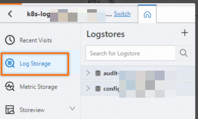
On the tab, click the logstore you want.
-
Enter a query and analysis statement, and click Last 15 Minutes to set the time range.
Example:
-
Use the approx_distinct function to estimate the number of unique remote addresses per request URL.
* | select request_url, COUNT(*) as pv, approx_distinct(remote_address) as uv GROUP BY request_url ORDER BY uv
-
Step 2: Add a chart
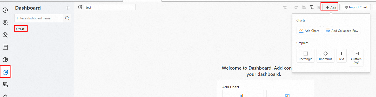
In the left-side navigation pane, choose . In the Dashboard list, click the dashboard you want. In the upper-right corner of the dashboard page, click Edit. In edit mode, choose .
-
On the General Configurations > Chart Type >
 . On the Query and Analysis tab, select Logstore (SQL), select the target Logstore, and enter a query statement.
Select a time range from the upper-right drop-down list, such as Last 15 Minutes. Click .
Under , select
request_urlas the Axis X Field, anduvandpvas the Axis Y Field.
Step 3: Configure stacking and colors
Configure stacking
In the to stack the grouped column chart.
On the Search & Analysis page of the Log Service console, you can run an SQL statement such as * | select request_url, COUNT(*) as pv, approx_distinct(remote_address) as uv where request_url is not null GROUP BY request_url ORDER BY uv to calculate pv and uv statistics grouped by URL. The query results are then displayed as a grouped column chart to compare traffic across URLs.
Configure colors
In the , then specify display colors for the pv and uv fields.