Control axis visibility, date formatting, value ranges, and thresholds for line charts in SLS dashboards.
Prerequisites
-
You have collected log data. For more information, see Collect text logs from a host.
-
You have created indexes. For more information, see Create an index.
Overview
In the chart editor of an SLS dashboard, enabling time series mode lets you add multiple query statements (such as Query A and Query B) in the Search & Analysis area and select a date format (such as YYYY-MM-DD HH:mm:ss) for the X axis in the General Configurations panel.
-
Search & Analysis: Search, aggregate, and statistically analyze logs in the console.
-
Add a chart: Add charts to a dashboard. Each chart corresponds to one or more query and analysis statements.
-
Configure the X and Y axes of a line chart: Set axis display, formatting, ranges, and thresholds.
Step 1: Query and analyze
Log on to the Simple Log Service console. In the Projects section, click the project you want.

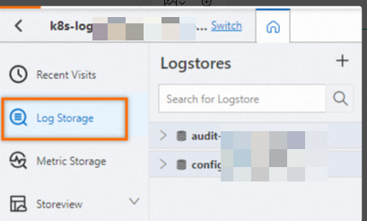
On the tab, click the logstore you want.
-
Enter a query and analysis statement, and then click Last 15 Minutes to set the time range for Search & Analysis.
Example:
-
The query statement for Query A is:
* | select __time__,count(request_url) as pv group by __time__
-
Step 2: Add a chart
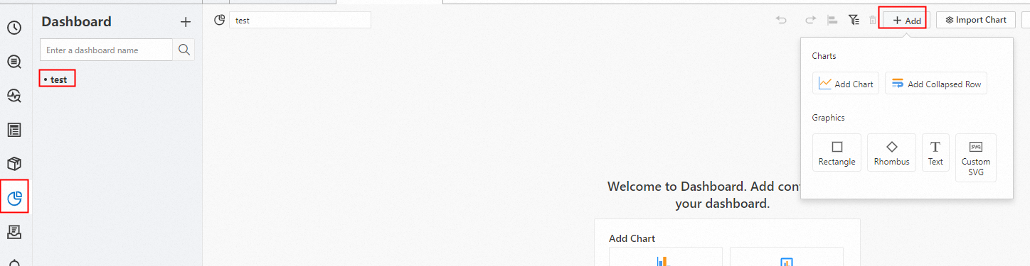
In the left-side navigation pane, choose . In the Dashboard list, click the dashboard you want. In the upper-right corner of the dashboard page, click Edit. In edit mode, choose .
-
In the section, select the line chart icon
 . On the Query and Analysis tab, select Logstore (SQL), select your Logstore, and enter the query statement.
In the upper-right corner, select a time range such as Last 15 Minutes, and then click .
-
In the section, select
__time__for Axis X Field andpvfor Axis Y Field.
-
Step 3: Configure X and Y axes
X axis
Show or hide X axis
Go to . Toggle the Display Axis X switch to show or hide the X axis on the chart.
X axis format
X axis formatting is available only in time series mode.
Y axis
Show or hide Y axis
Go to . Toggle the Display Axis Y switch to show or hide the Y axis on the chart.
Maximum and minimum values
To limit the Y-axis range, specify values in the Maximum and Minimum fields.
Configure multiple series
Modify the query statement for Query A to: * | select __time__,count(request_url) as pv,count(request_url)-50 as pv1,count(request_url)+50 as pv2 group by __time__.
Go to and select the pv, pv1, and pv2 fields.
Threshold
In the section, select pv2 for Upper Boundary and pv1 for Lower Boundary. Set Boundary Fill Color to red.