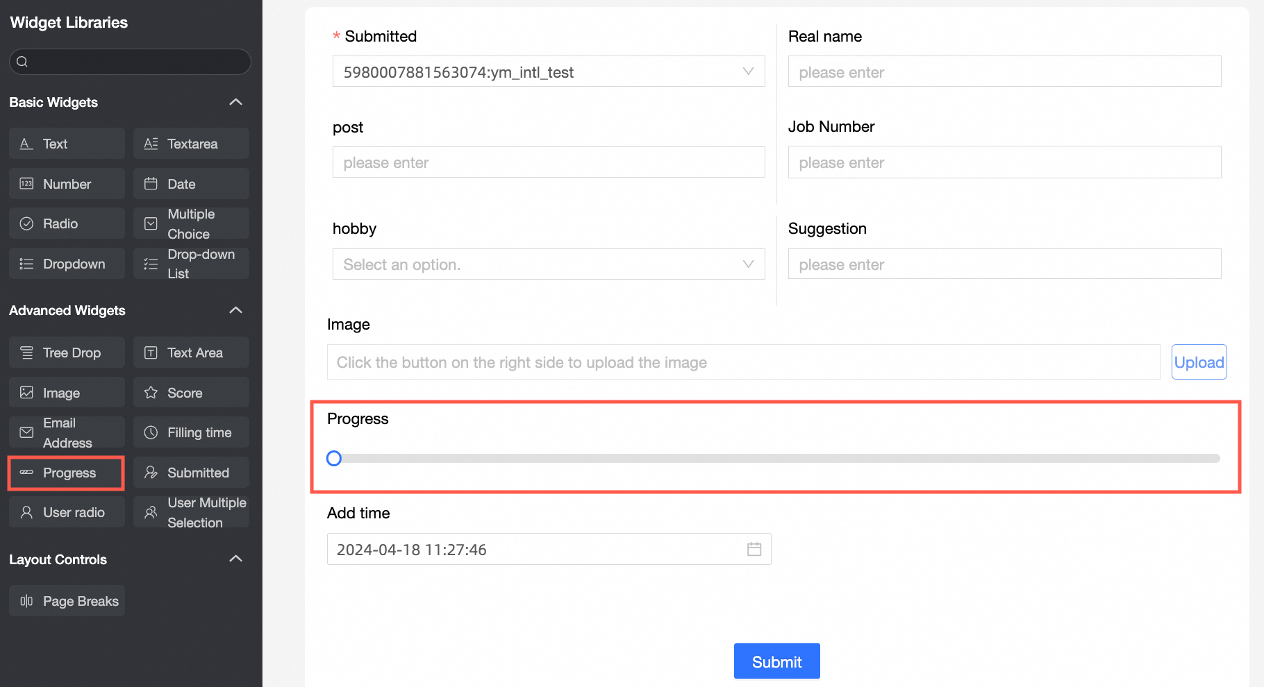
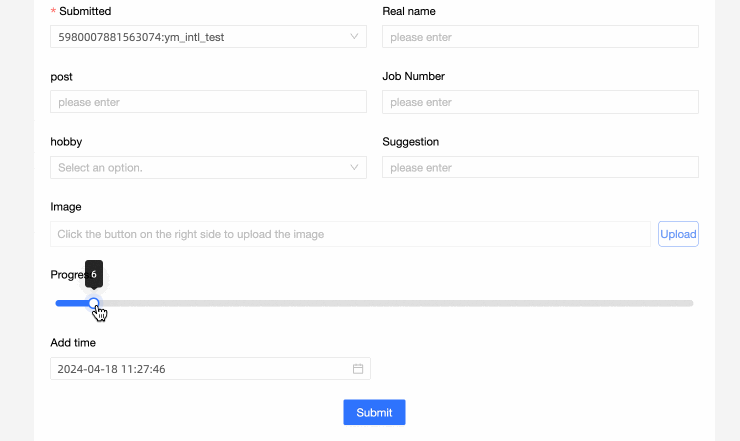
The progress control is an advanced control that visualizes the progress and completion of tasks in the data form.
Scenarios
The progress control allows you to visualize the percentage value of an item of data, for example:
When filling in the project progress record form, the progress of the project is visually represented by the progress control graph;
When filling in the sales analysis form, you can display the sales target achievement of different products through the progress bar.
TensorBoard
Control configuration
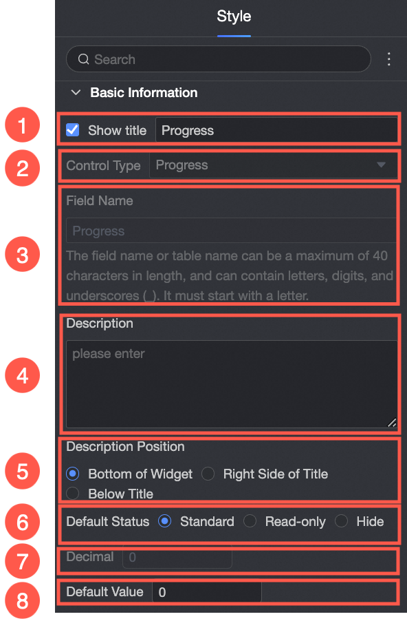
Basic parameters
Parameter | Description |
| ① Display Title: Select whether to display the title of the control. You can customize the display name as the column name of the data form. |
② Control type: After you select a control, you can replace the control type. The drop-down options can be replaced with other basic and advanced control types. | |
③ Table Field Name: the name of the corresponding field in the table created based on the data form. Note The field or table name must start with a letter and can contain letters, digits, and underscores (_). The name can be up to 40 characters in length. | |
④ Description: the description of the custom control. | |
⑤ Description Information Location: specifies the location of the description information. The following options are available: Control Bottom, Title Right, and Title Below. | |
Default State: specifies the default state of the widget. The valid values are Normal, Read-only, and Hidden. | |
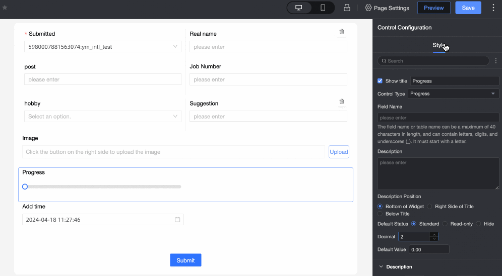
⑦ Decimal: Customize the setting of decimal places in the progress bar.
| |
⑧ Default: Set the default value displayed in the progress bar. The default value is 0. |
The content of the index.
Description | Sample graph |
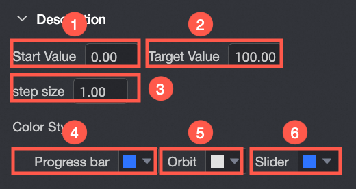
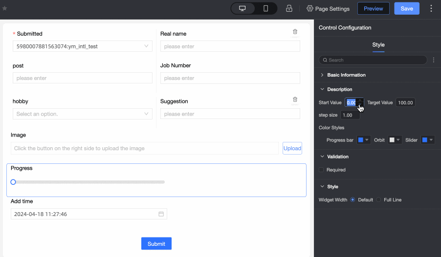
① Initial Value: Set the initial value of the progress bar. The default initial value is 0. The initial value must be lower than the target value. |
|
② Target Value: The final value of the progress bar is set. The default target value is 100. The target value needs to be higher than the initial value. | |
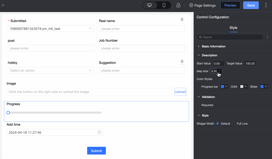
③ step size: The jump range of the progress bar each time it is updated. The default value is 1. |
|
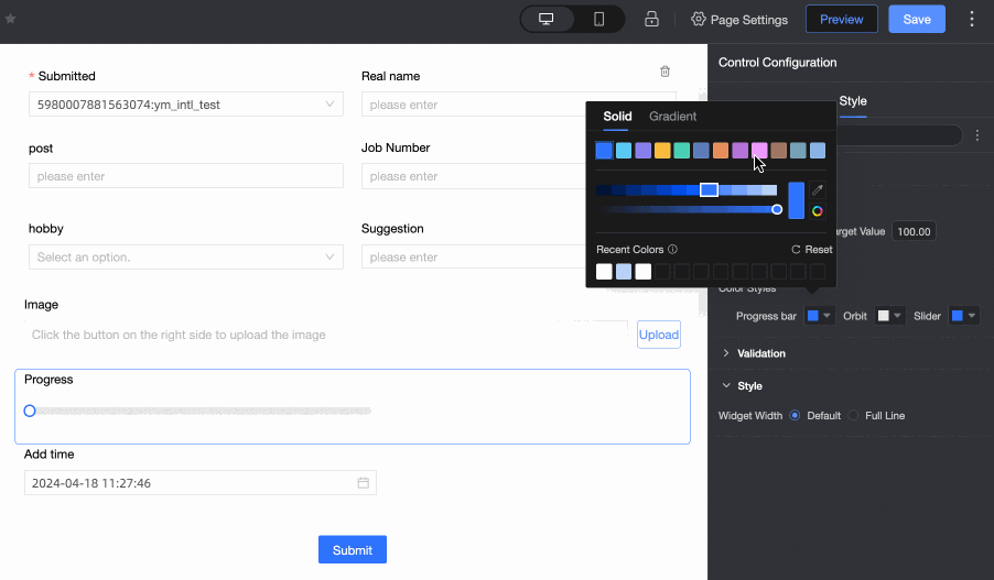
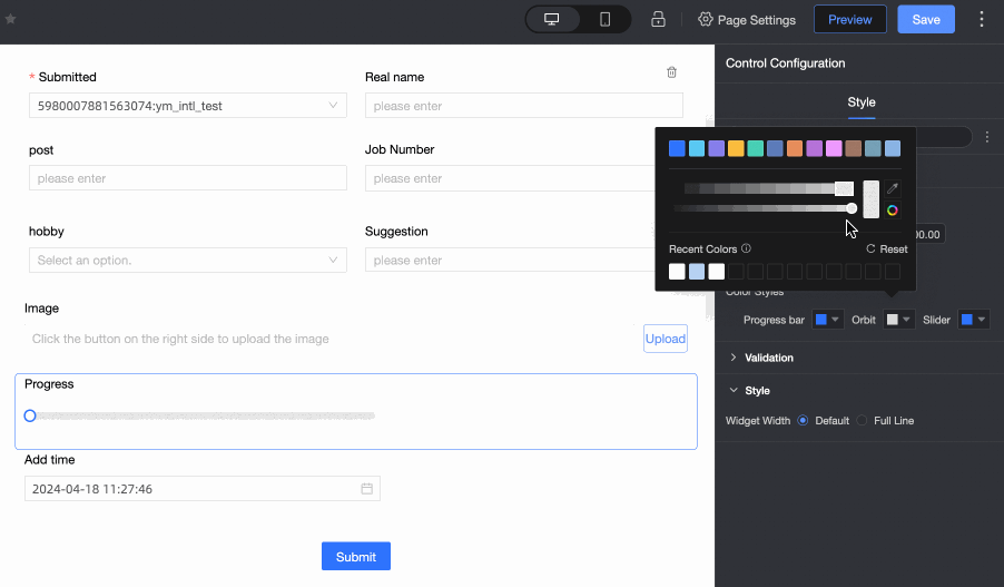
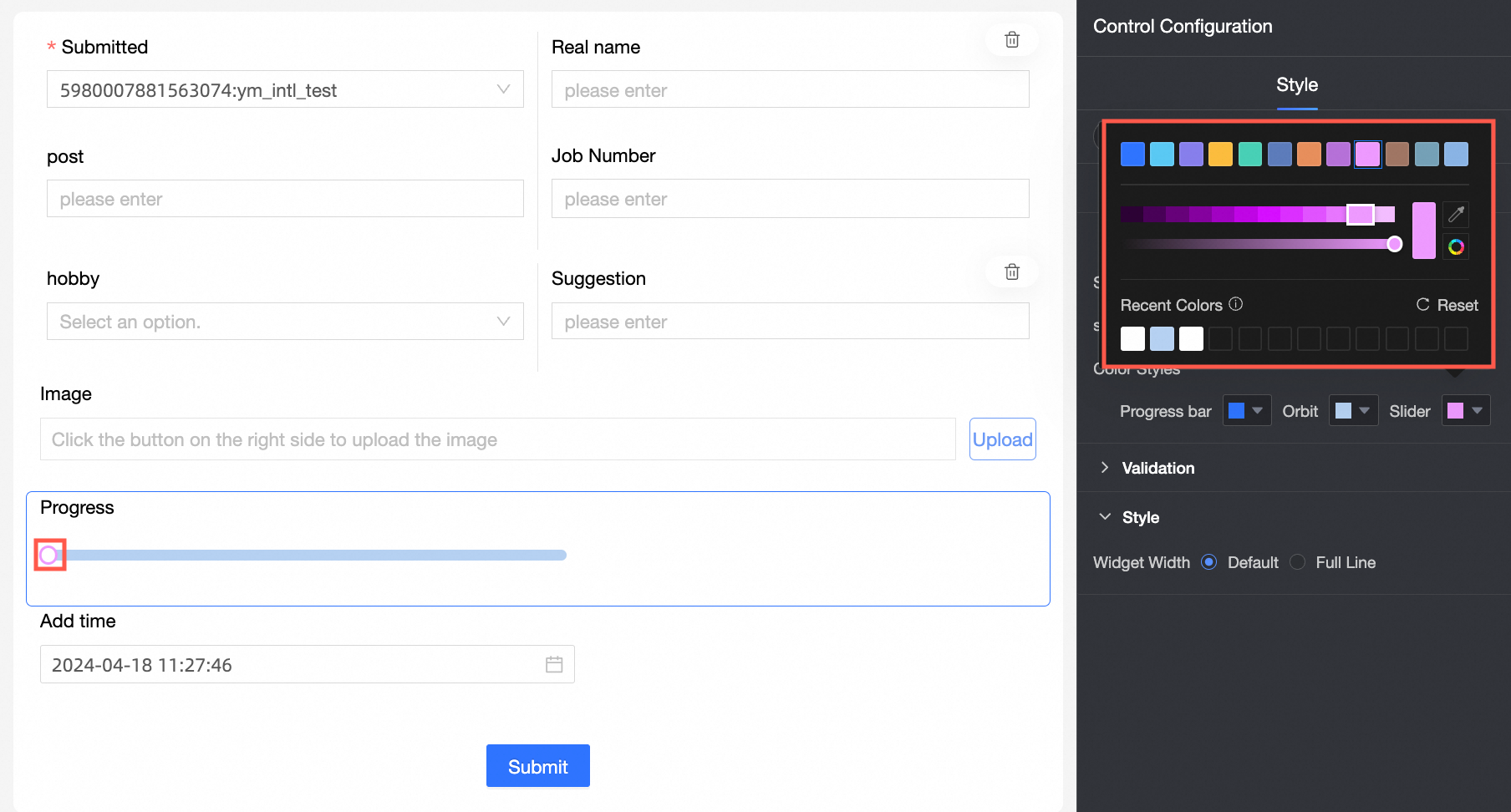
④ progress bar color: progress bar color setting, can achieve solid color and gradient two display effect. |
|
⑤ Track Color: You can set the track color. |
|
⑥ Slider Color: Customization of the slider color in the progress bar is supported. |
|
Yes
Parameter | Description |
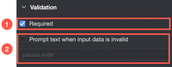
| ① Required: Select whether to set this configuration items. If you select this option, the control is set to Required. |
② Input data invalid prompt text: This configuration items takes effect only when a verification condition takes effect. For example, if Required is selected and no option value is specified, a custom error copy is displayed. |
styles
Parameter | Description |
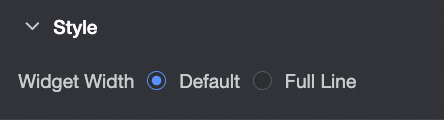
| Widget Width: You can select Default or Whole Line. Note You can also use the Manual Drag Control widget to adjust the border width. |