DateTime is a basic control that is used in scenarios where date-like data is added.
Scenarios
DateTime is used to add date-related data such as time information, such as birth time and questionnaire filling date.
Renderings
Control configuration
Basic parameters
Parameter | Description |
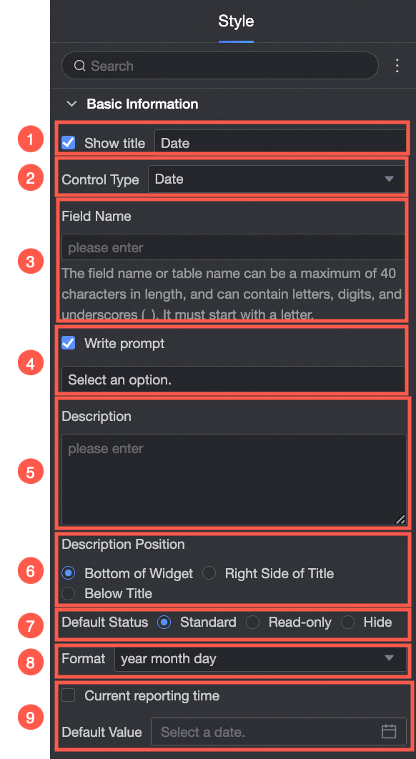
| ① Show Title: Select whether to show the title of the date and time control. You can customize the display name as the column name of the data form. |
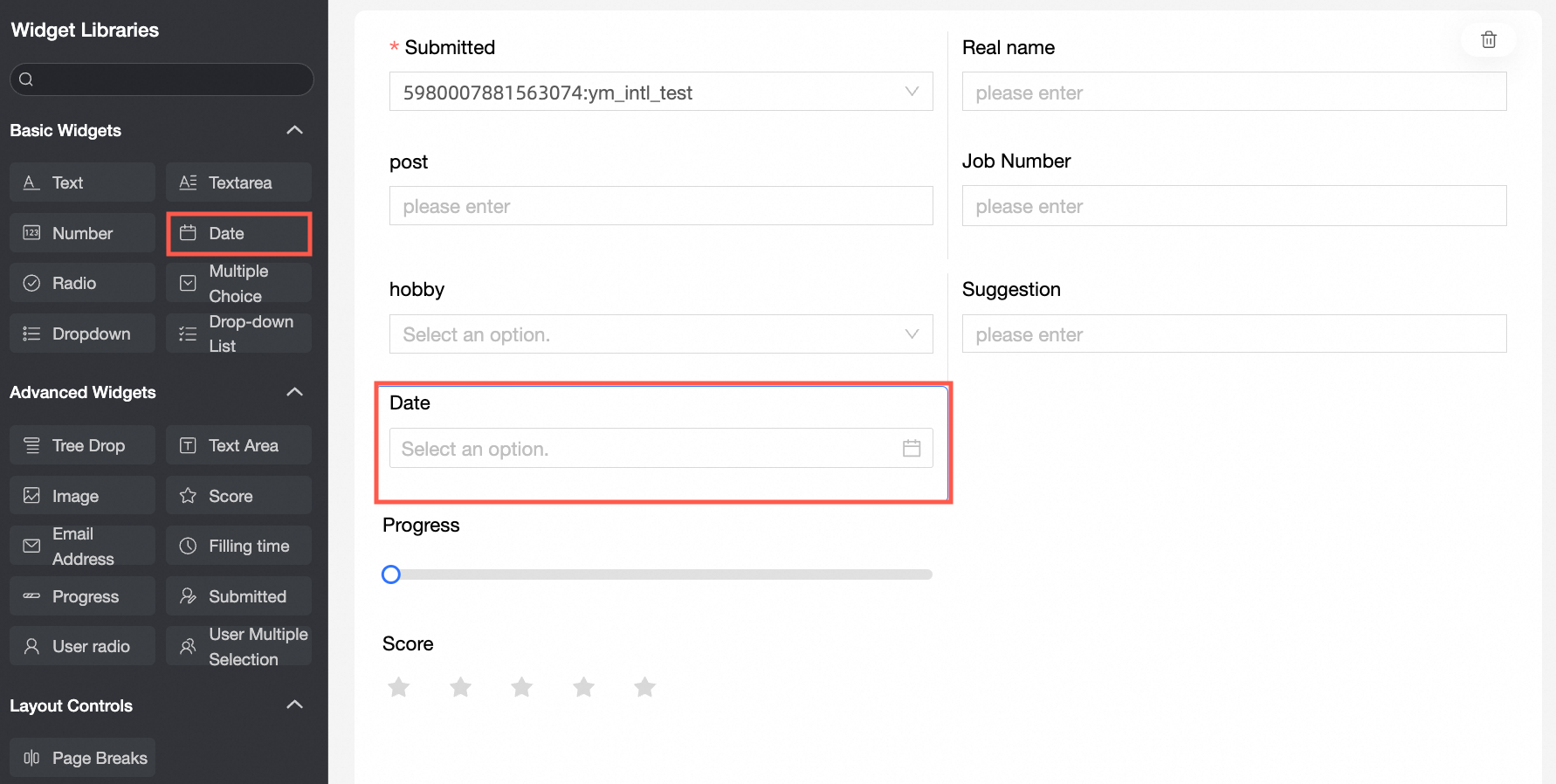
② Control type: After you select a control, you can replace the control type. The drop-down options can be replaced with other basic and advanced control types. | |
③ Table Field Name: the name of the corresponding field in the table created based on the data form. Note The field or table name must start with a letter and can contain letters, digits, and underscores (_). The name can be up to 40 characters in length. | |
④ Prompt: Set Prompt. For example, enter. | |
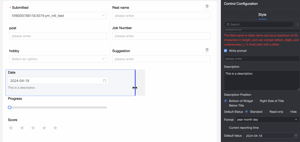
⑤ Description: the description of the custom control. | |
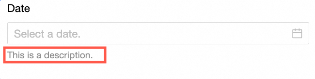
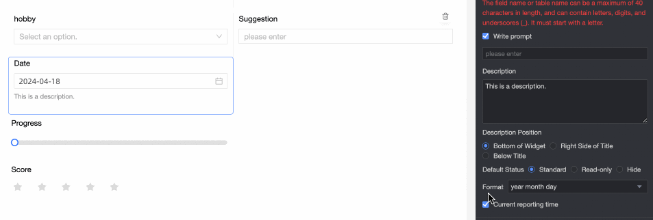
⑥ Description Information Location: Specify the location of the description information. The options are Bottom, Right, and Below. For example, set the description information at the bottom of the control:
| |
Default State: specifies the default state of the widget. The valid values are Normal, Read-only, and Hidden. | |
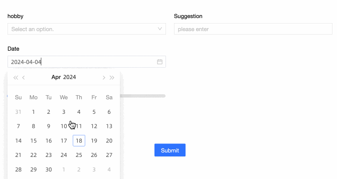
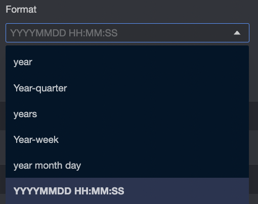
Format: specifies the format of the widget. Valid values:
| |
⑨ Default Value: Set the default value of the widget. If you select Current Time, the current local time is automatically entered.
|
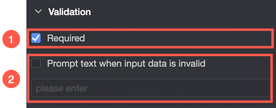
Validation
Parameter | Description |
| ① Required: Select whether to set this configuration items. If you select this option, the control is set to Required. |
② Input data invalid prompt text: This configuration items takes effect only when a verification condition takes effect. For example, if Required is selected and no option value is specified, a custom error copy is displayed. |
Section
Parameter | Description |
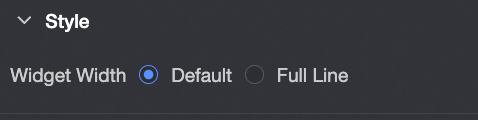
| Widget Width: You can select Default or Whole Line. Note You can also use the Manual Drag Control widget to adjust the border width.
|