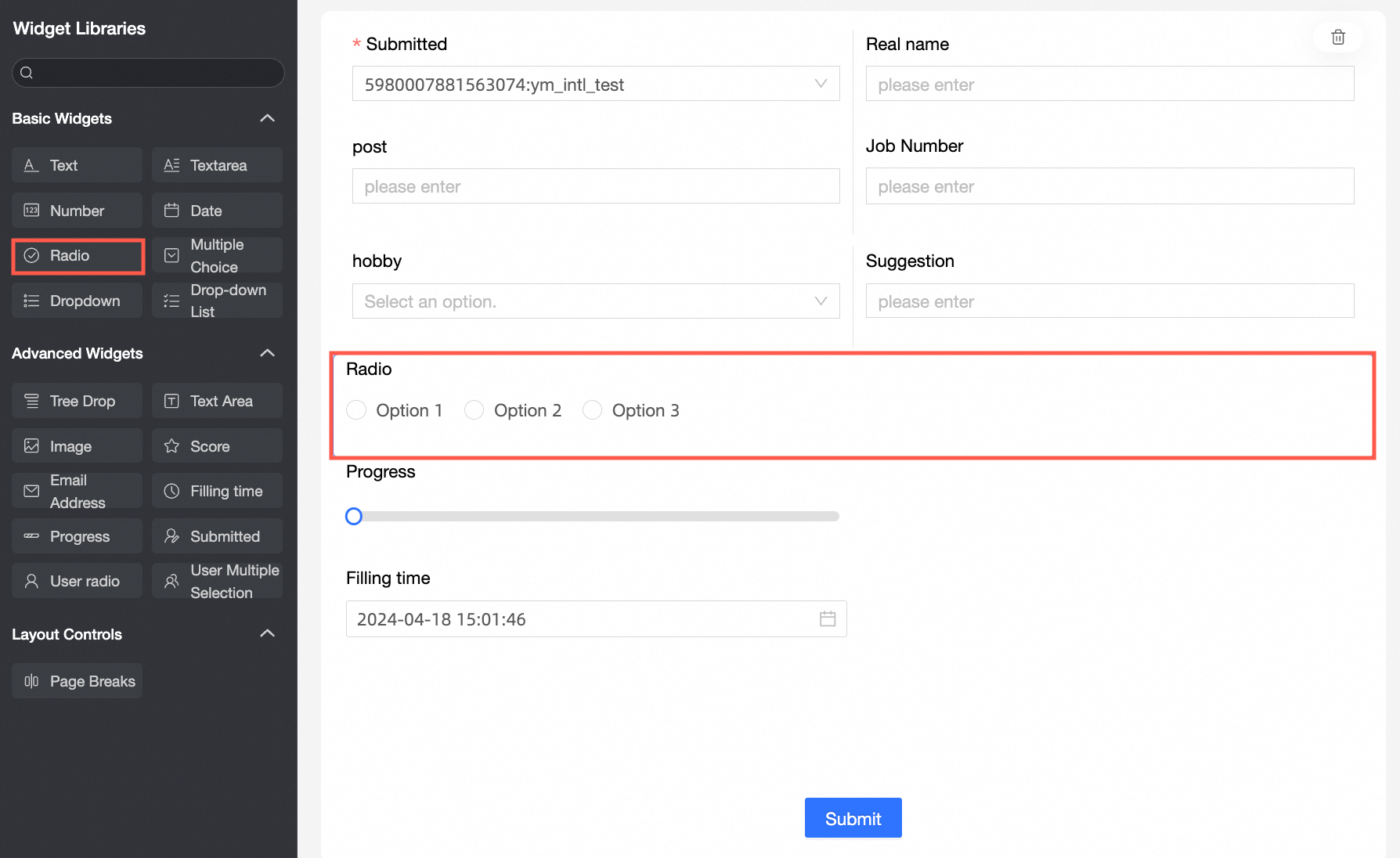
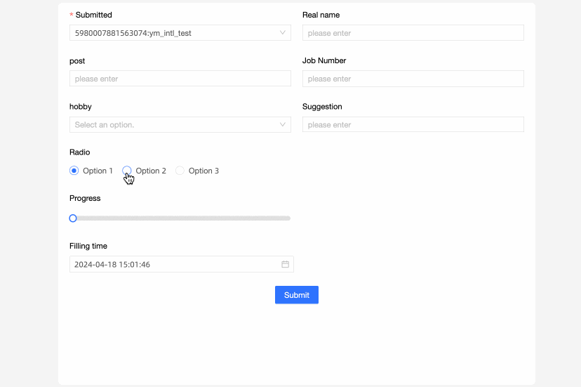
Single-select is a basic control that is directly clicked for selection and is widely used in forms.
Scenarios
Single selection is used in scenarios where data options are few and can be displayed directly. such as Gender and Income Type.
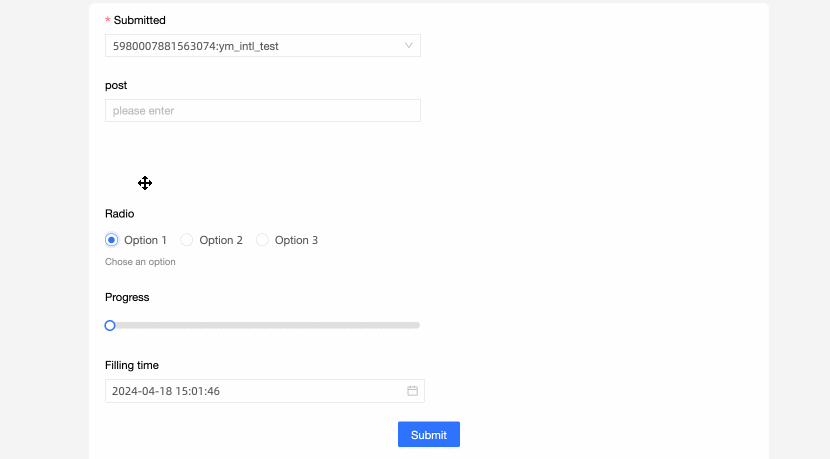
Renderings
Control configuration
Basic parameters
Parameter | Description |
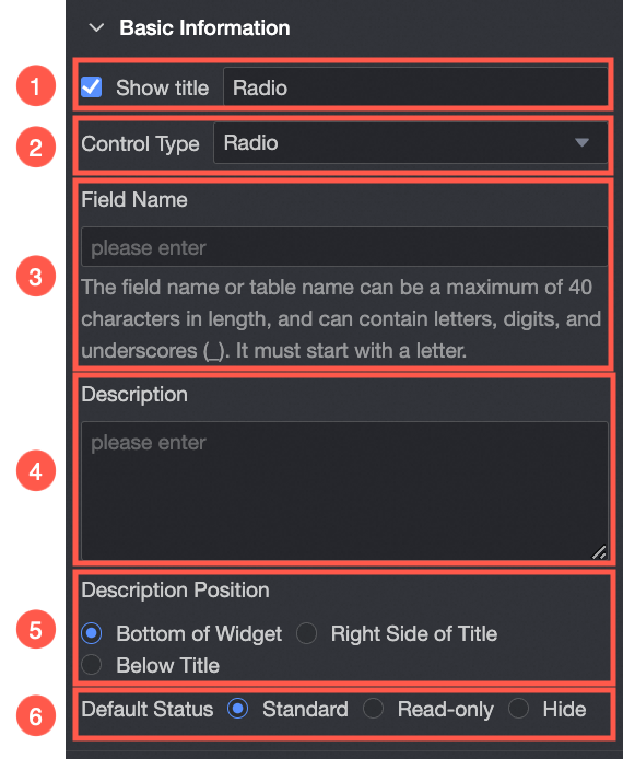
| ① Display Title: Select whether to display the title of a single-line text control. You can customize the display name as the column name of the data form. |
② Control type: After you select a control, you can replace the control type. The drop-down options can be replaced with other basic and advanced control types. | |
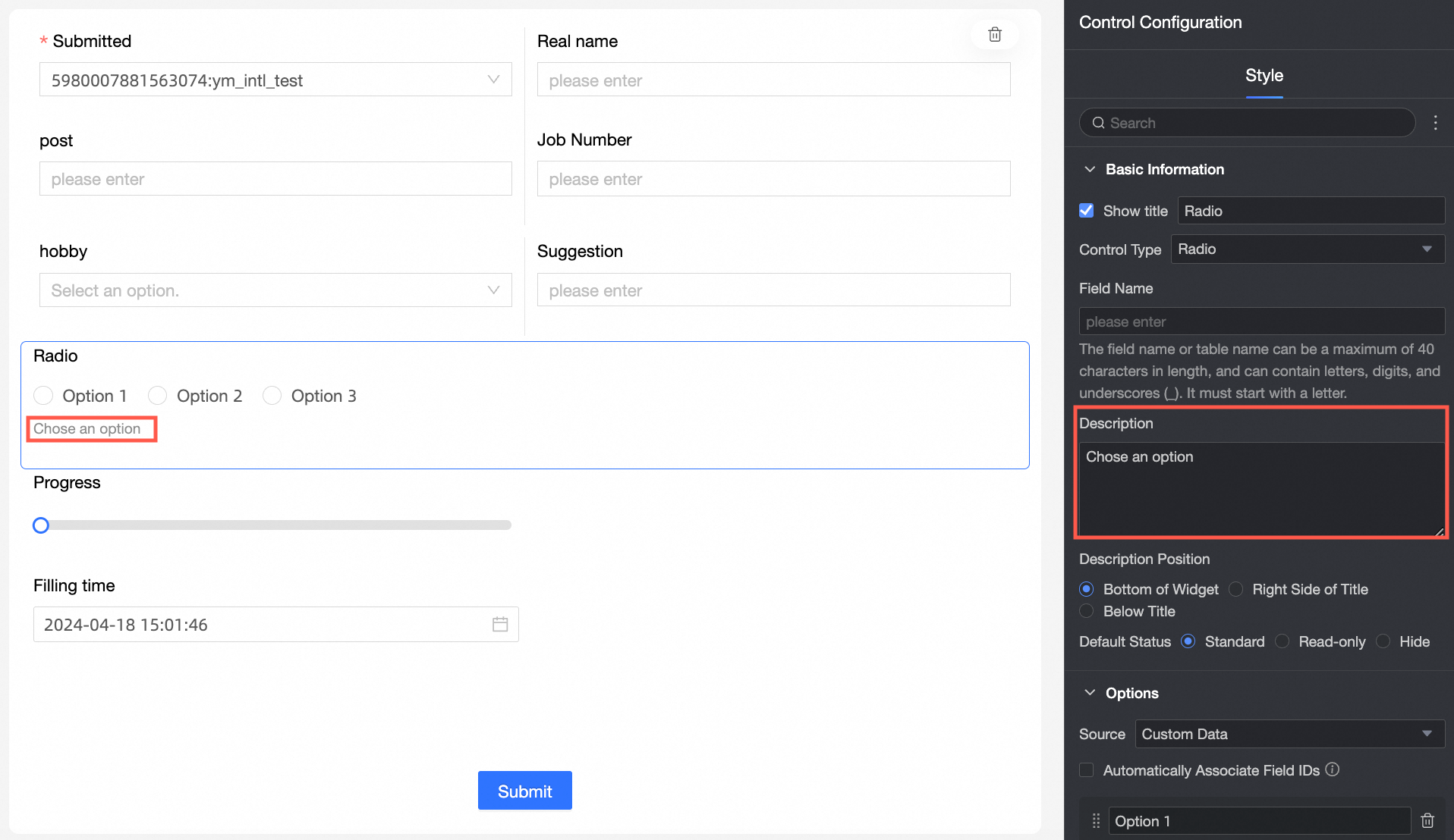
③ Table Field Name: the name of the corresponding field in the table created based on the data form. Note The field or table name must start with a letter and can contain letters, digits, and underscores (_). The name can be up to 40 characters in length. | |
Description: the description of the custom control. | |
⑤ Description Information Location: specifies the location of the description information. The options are Bottom, Right, and Below. | |
Default State: specifies the default state of the widget. The valid values are Normal, Read-only, and Hidden. |
Option
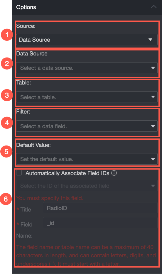
From: You can select Custom Data, Data Source, or Dataset.
Parameter | Description |
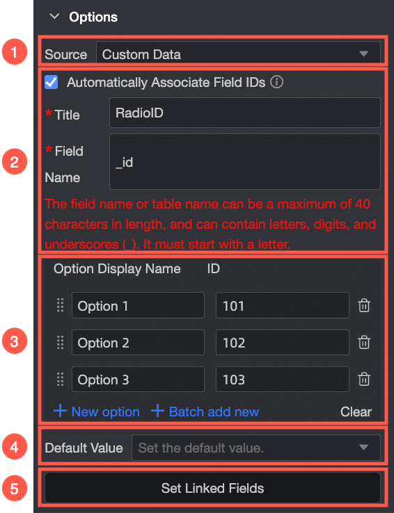
Select Custom Data from the Source drop-down list.
| ① From: From Custom Data: If you select Custom Data, you can set Display Name and Correlation ID as required. |
② Automatically Associate Field ID Value: Select whether to automatically associate the field ID value. If you select this option, you can configure Display Name to associate the field ID value with the corresponding field ID value. Supports the Add Option, Batch Add, Edit, and Delete operations.
| |
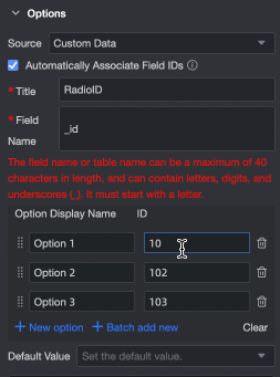
③ Option Name: You can add, edit, and delete options. | |
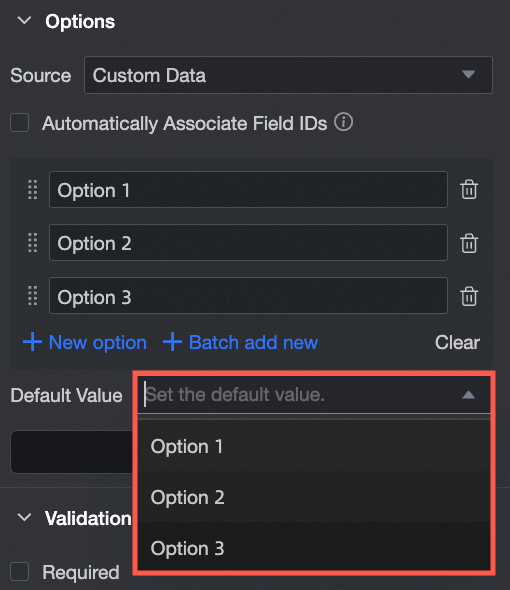
④ Default Value: Select a value based on the Options drop-down list.
| |
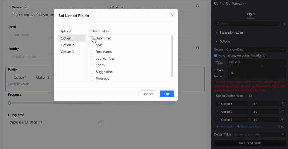
⑤ Associated option settings: If the current form has more than two single-choice, single-choice, or multiple-choice drop-down controls, you can configure the associated option settings. Note Only fields after the current field can be associated.
| |
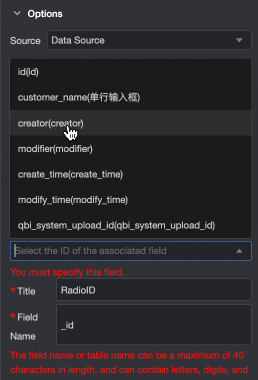
Select Data Source from the Source drop-down list.
| ① From: After you select Data Source, you can select the required options for the data table in the data source. |
② Data Source: Select a data source from the drop-down list. | |
③ Data Table: Select a data table from the drop-down list. | |
④ Data field: Select a data field from the drop-down list. | |
⑤ Default Value: Data Field Content.
| |
⑥ Automatically Associate Field ID Value: Select whether to automatically associate the field ID value. If you select this option, you can configure Display Name to associate the field ID value with the corresponding field ID value.
| |
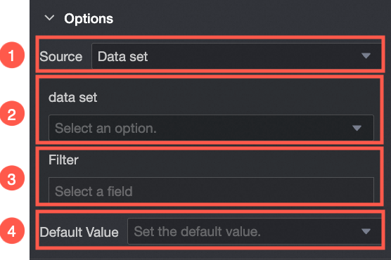
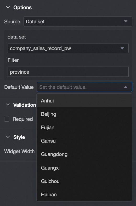
Select Dataset from the Source drop-down list.
| ① From Dataset: If you select Dataset, you can select Data Fields in the dataset. |
② Dataset: Select a dataset from the drop-down list. | |
③ Data Field: Select a data field from the drop-down list. | |
④ Default Value: Select a value based on the Data Field Content drop-down list.
|

Validation
Parameter | Description |
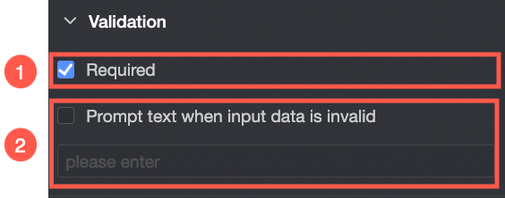
| ① Required: Select whether to set this configuration items. If you select this option, the control is set to Required. |
② Input data invalid prompt text: This configuration items takes effect only when a verification condition takes effect. For example, if Required is selected and no option value is specified, a custom error copy is displayed. |
Section
Parameter | Description |
| Widget Width: You can select Default or Whole Line. Note You can also use the Manual Drag Control widget to adjust the border width. |
