Configure the style of widgets on the Data Dashboards page, including position, size, animation, conditional formatting, labels, click events, series settings, and legends.
Adjust position and size
Configure the following widget properties in the configuration section:
-
Adjust widget alignment (①): Left, center, and right alignment are supported.
-
Adjust the position of the widget (②): Set the X and Y axis values relative to the upper-left corner as the origin.
-
Adjust the angle of the widget (③): Set the rotation angle.
-
Adjust the size of the widget (④): Set the W and H values to change the width and height.
-
Lock component aspect ratio (⑤): After locking, the widget cannot be resized.
-
Adjust Transparency (⑥): Set the transparency of the widget.

Animation type
-
Flip animation effect:
In the Animation section, configure the flip animation:

-
Scroll and streamer effects:
-
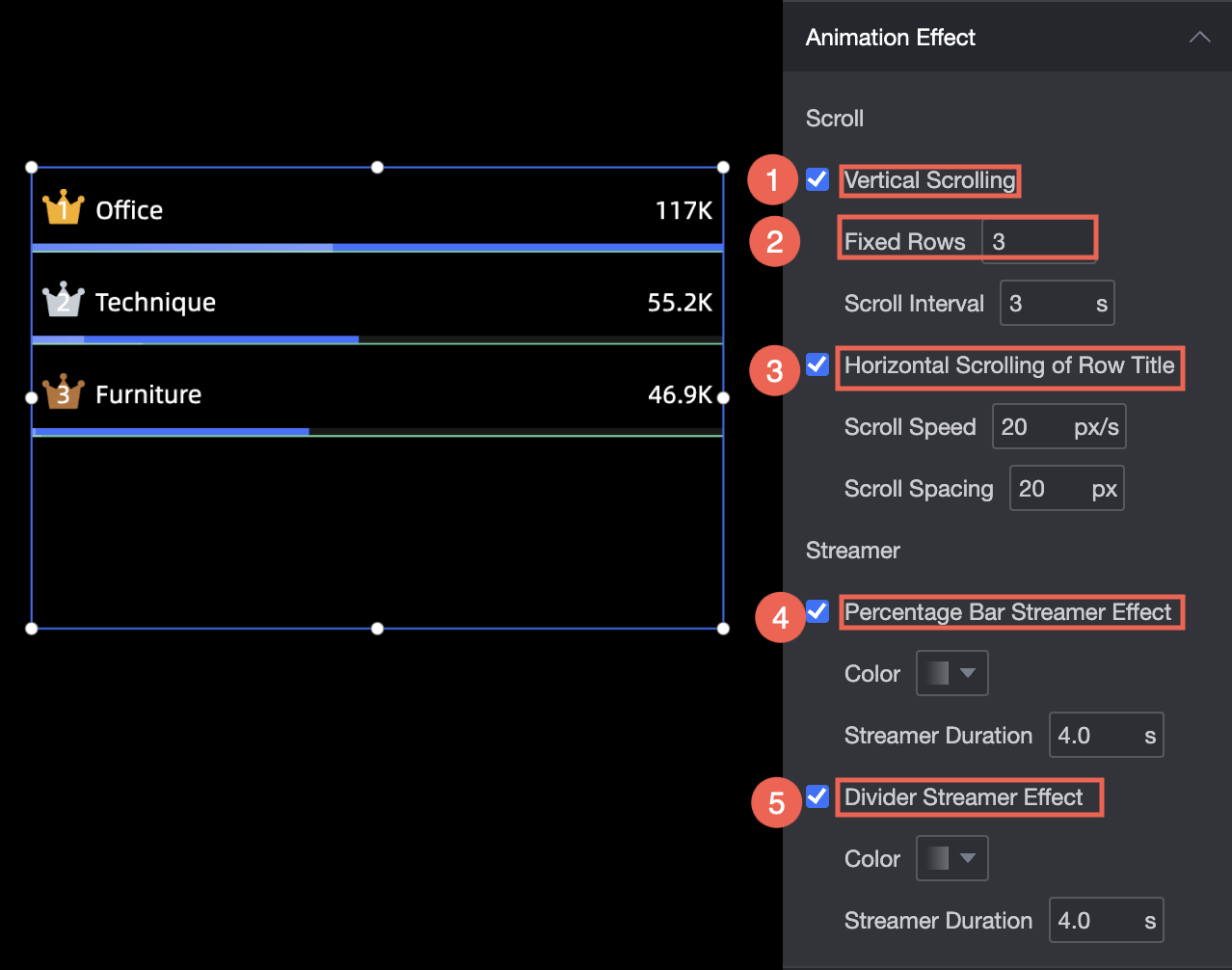
Enable Vertical Scrolling: Set the number of rows to scroll vertically on the leaderboard and the scrolling interval.
-
Turn on Row Header Scrolling: Set the horizontal scrolling speed and interval.
-
Enable Stream Effect: Specify the color and duration of the Stream Effect.
-
Turn on Split Stream: Specify the color and duration of the split streamer.
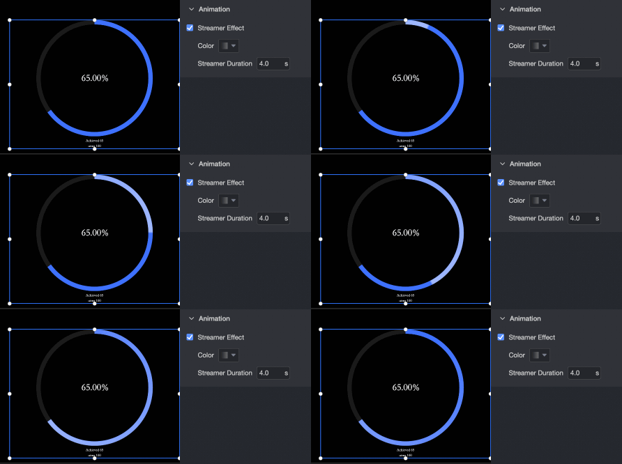
The following figure shows the streamer effect.
-
-
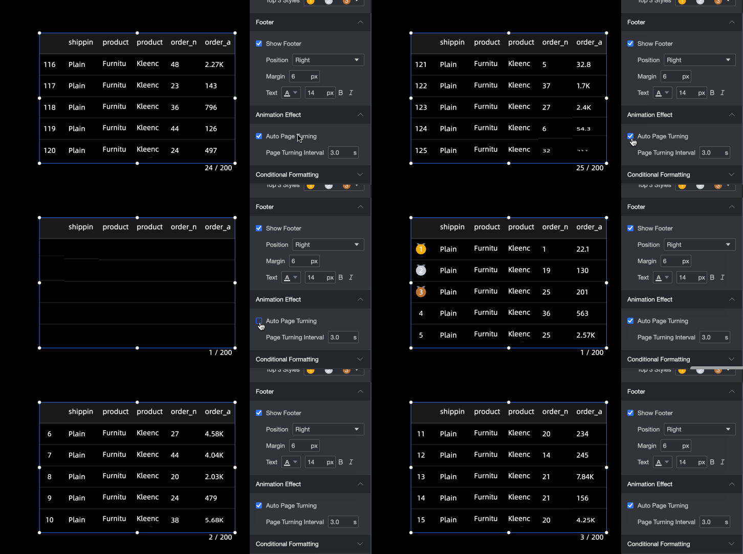
Automatic page turning effect
Set the page-turning interval.
Set Conditional Formatting
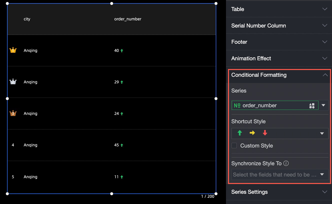
In the Conditional Formatting section, specify conditional formats for metrics.
-
Select Series: Select any measure added to the Indicators section.
-
Shortcut Style: Specify the color of the marker icon and font.
-
Custom Style: Customize text and icon styles, including the icon, range value, and font color.
-
Sync Style To: Synchronize the current conditional format to other metrics.
Set label
-
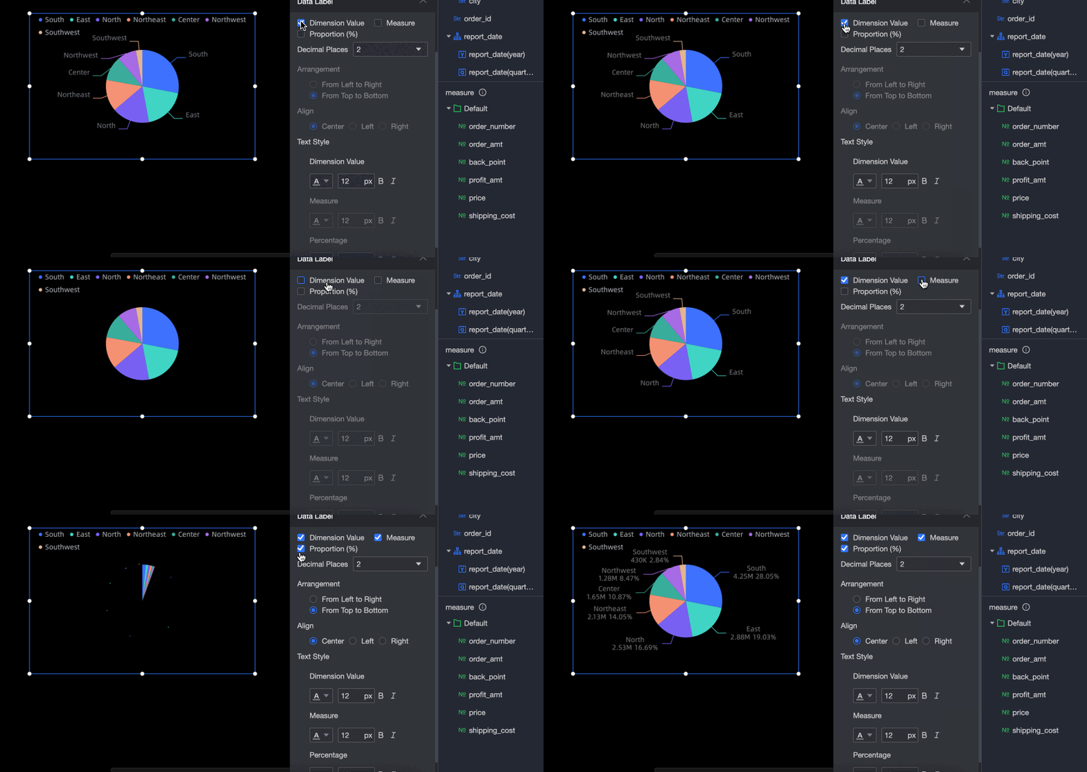
Configure labels in the label section.
Take a pie chart as an example:
-
Adjust display data: Set one or more dimensions, measures, and ratios to display in the sector area.
-
Adjust the decimal places: Set the scale to 0, 1, or 2.
-
Adjust the data arrangement: Left-right and up-down arrangements are supported.
-
Adjust the data alignment: When the label uses up-down arrangement, set the alignment to center, left, or right.
-
Adjust text style: Set the color, font size, bold, or italic of the display data text.
-
-
For a progress bar, specify the decimal places, text, position, current value, display name, and arrangement of target values.
The following example uses a ring progress bar.

Set click events
In the Click Event section, configure link redirection. Three types are supported: Click to Switch Overlay Layer, Click to Popup Layer, and Click to Jump Page.
Button, drop-down list, tile button, video, and embedded page widgets do not support click event page redirects.
-
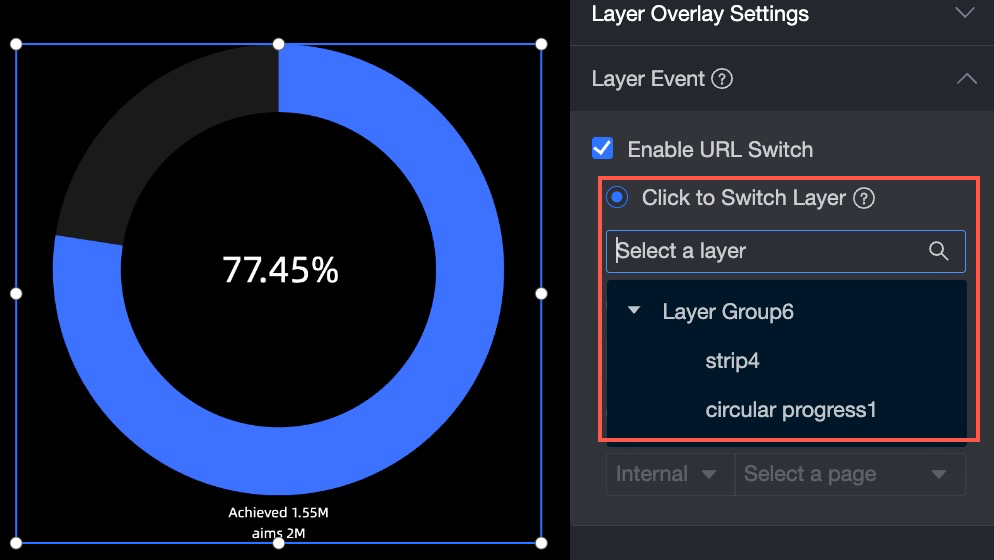
Click to Toggle Overlay Layer
Place a layer at the same level as a switchable object (a layer group with overlay enabled). Select the layer to switch to from the drop-down list.
-
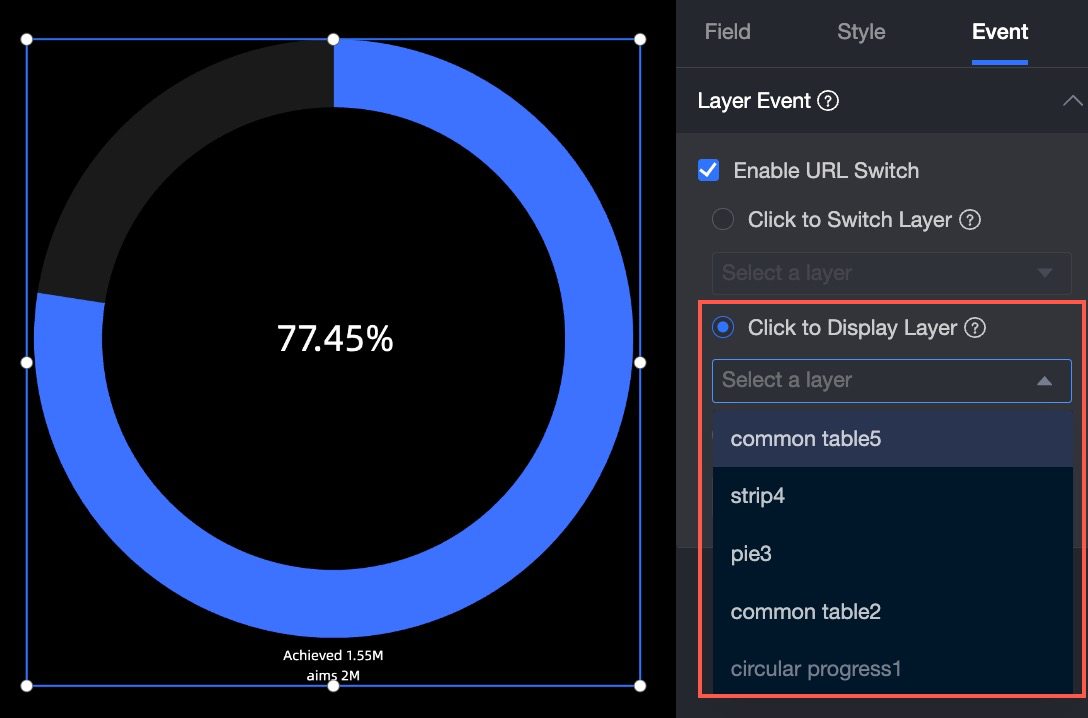
Click Pop-up Layer
Select the pop-up object from the drop-down list. The pop-up object must be a layer or layer group at the root node.
-
Click a page
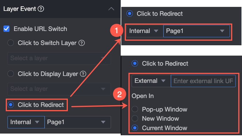
Redirect to Internal or External pages. For external pages, enter the External Link and select an Open Method: pop-up window, new window, or current window.
NoteLayer groups do not support redirects to external links.
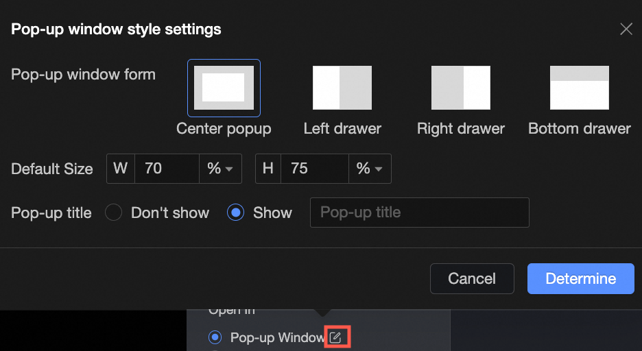
 If you set Open Method to Popup, you can configure the Popup Format, Default Size, Popup Title, and Page Mask parameters.
  Note
NoteWhen the pop-up form is centered, the pop-up title can be shown or hidden. For other pop-up forms, the pop-up title is displayed by default and cannot be hidden.
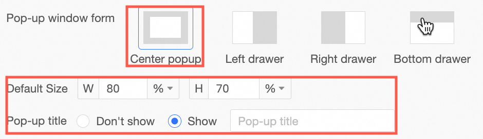
Only the left drawer, right drawer, and bottom drawer support toggling the page mask. When the page mask is hidden, you can click to switch dimension values.
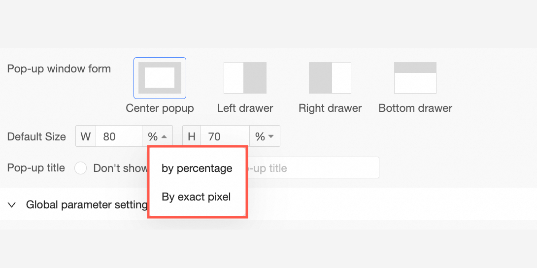
The default size can be set by percentage or by exact pixel value.
After the pop-up window opens, you can drag the window size and adjust the display position.
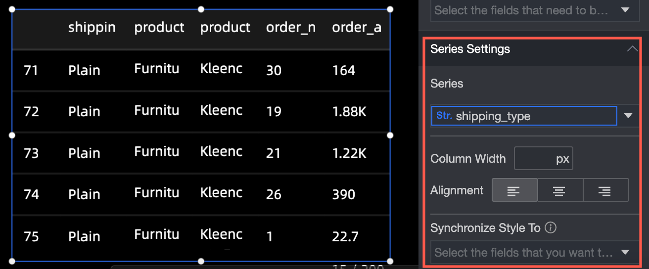
Series Settings
In the Series Settings section, configure the following parameters:
-
Select Series: Select a dimension or measure based on the business scenario.
-
Display label: Specify whether to display label and the color and size of label text.
-
Synchronize Style to: Synchronize the current conditional format to other metrics.
Set Legend
Configure the widget legend with the following options:
-
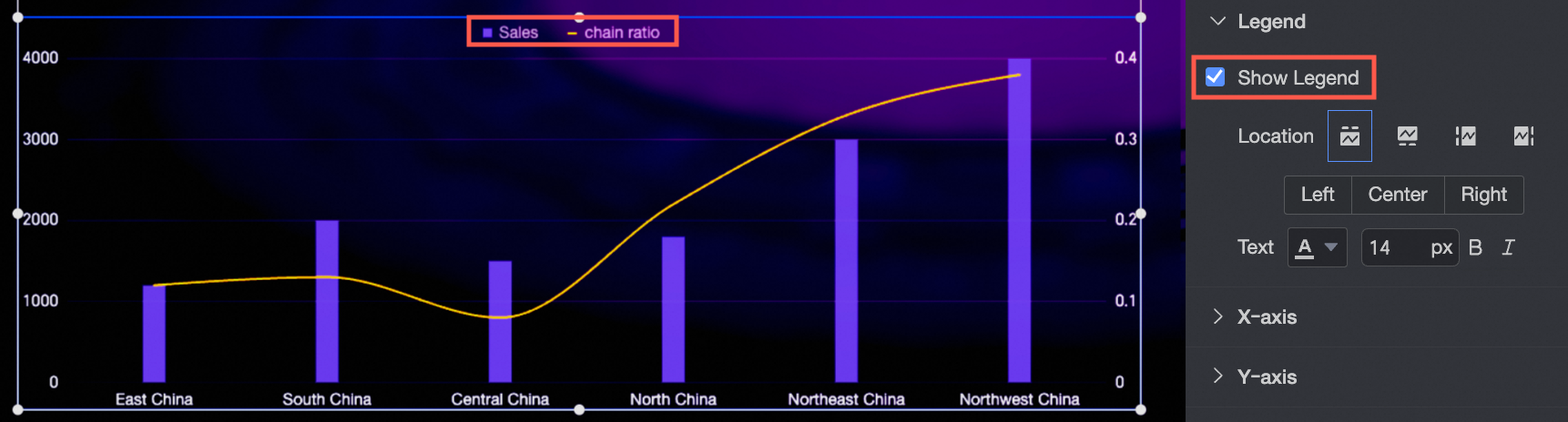
Show Legend: Specify whether to show the legend.
-
Position: Set the position of the legend when it is displayed.
-
Text: Set the size and color of the legend text.