The drop-down multiple selection widget lets users select multiple values from a drop-down list, ideal for scenarios with many data options.
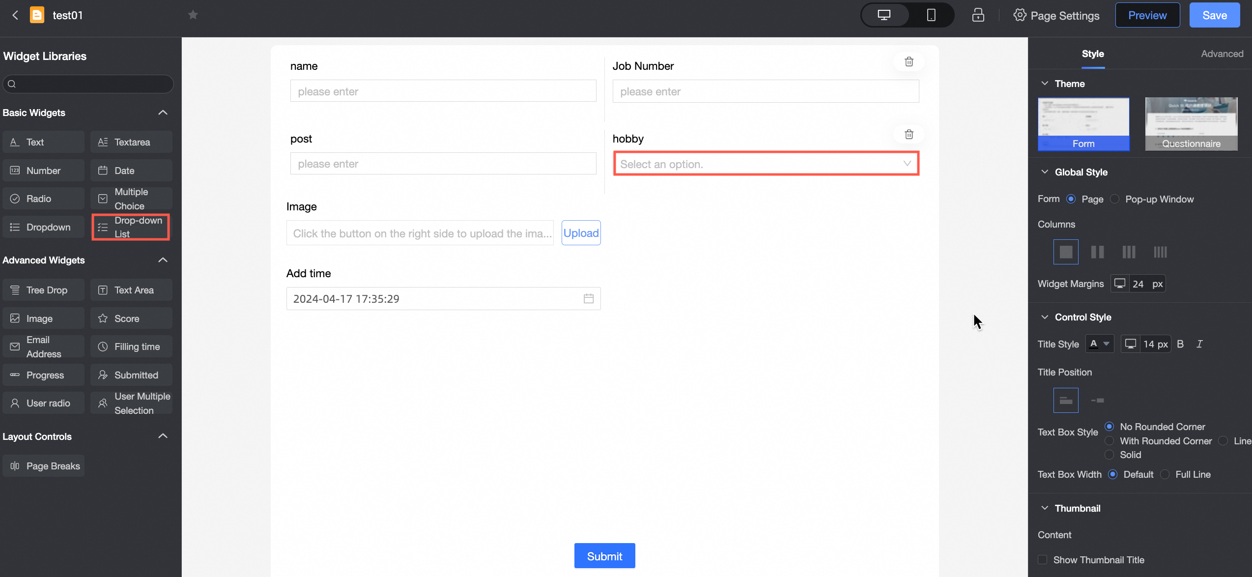
Scenarios
Use this widget when users need to select multiple values, such as Product ID.
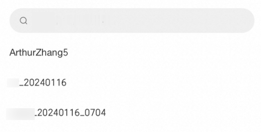
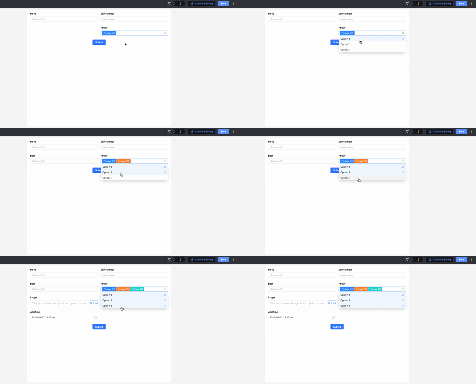
Renderings

Control configuration
Basic parameters
|
Parameter |
Description |
|
|
① Display Title: Specifies whether to display the widget title. You can customize the display name, which serves as the column name in the data form. |
|
② Control type: After you select a control, you can replace it with other basic or advanced control types. |
|
|
③ Table Field Name: The name of the corresponding field in the table created from the data form. Note
The field or table name must start with a letter and can contain letters, digits, and underscores (_). The name can be up to 40 characters in length. |
|
|
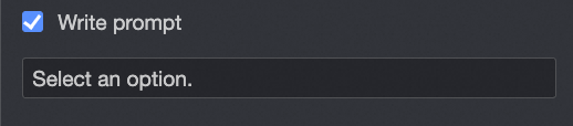
④ Prompt: Sets the placeholder text. For example, Select Customer Type. |
|
|
⑤ Description: A custom description for the control. |
|
|
⑥ Description Information Location: Sets where the description appears. Options: Control Bottom, Title Right, and Title Below. |
|
|
Default State: The initial state of the widget. Valid values: Normal, Read-only, and Hidden. |

Option
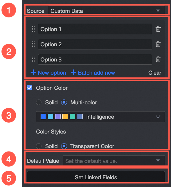
From: Select one of the following sources: Custom Data, Data Source, Dataset, or Organization Member.
|
Parameter |
Description |
|
Select Custom Data from the Source drop-down list. |
① Source: When Custom Data is selected, you can set Display Name and Correlation ID. |
|
② Option Name: Add, batch add, edit, or delete options. |
|
|
③ Color Options: Select Monochrome or Multicolor, and choose Solid or Transmitted. |
|
|
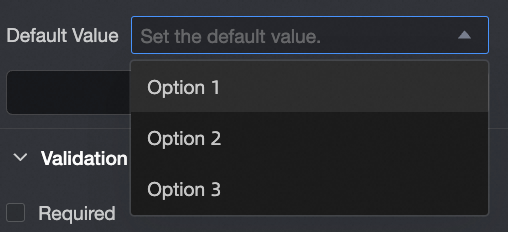
④ Default Value: Select a value from the Options drop-down list.
|
|
|
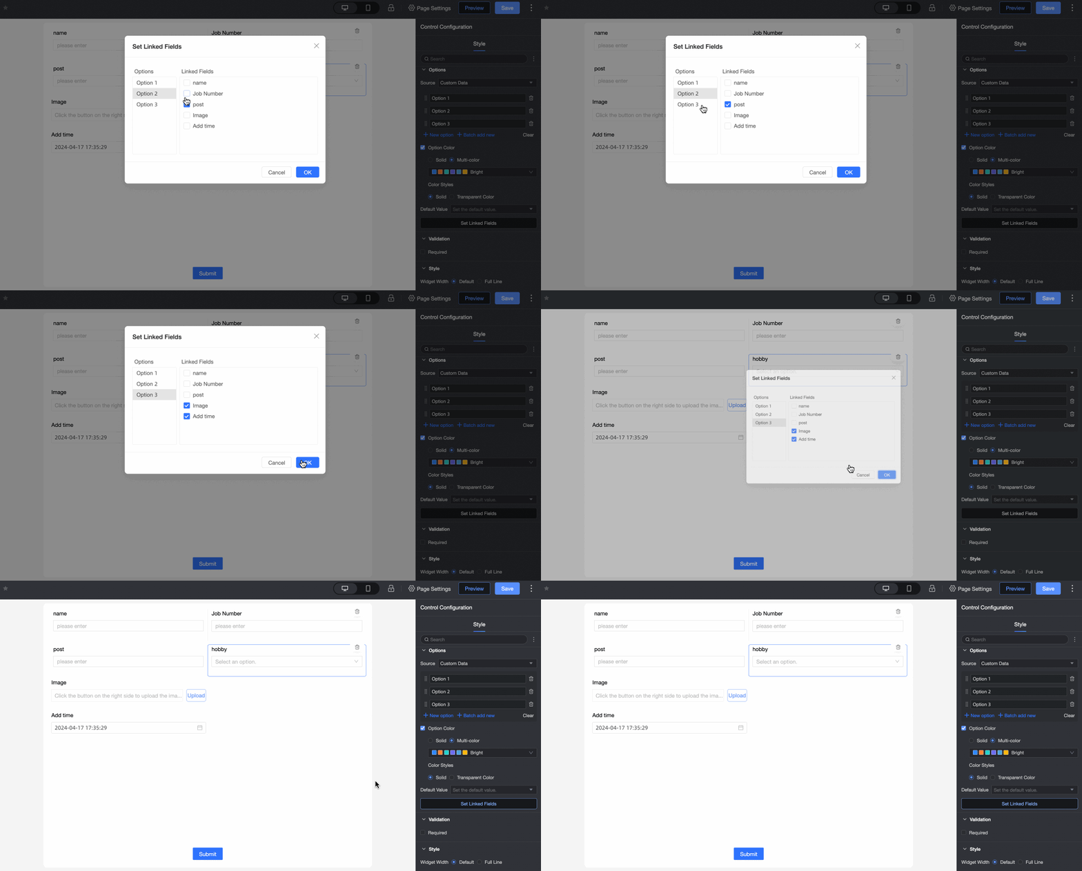
⑤ Associated option settings: If the current form has more than two single-choice, single-choice, or multiple-choice drop-down controls, you can configure associated options. Note
Only fields after the current field can be associated.
|
|
|
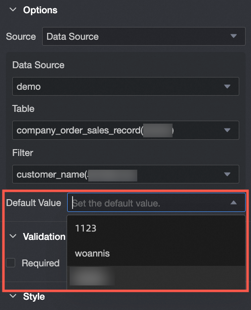
Select Data Source from the Source drop-down list.
|
① From: When Data Source is selected, you can choose options from the data table in the data source. |
|
② Data Source: Select a data source from the drop-down list. |
|
|
③ Data Table: Select a data table from the drop-down list. |
|
|
④ Data field: Select a data field from the drop-down list. |
|
|
⑤ Default Value: Data Field Content.
|
|
|
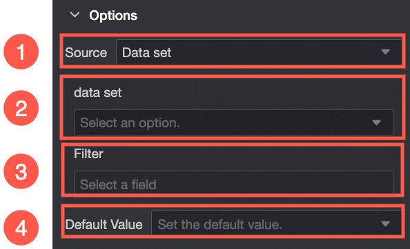
From Select Dataset |
① From Dataset: When Dataset is selected, you can choose Data Fields in the dataset. |
|
② Dataset: Select a dataset from the drop-down list. |
|
|
③ Data Field: Select a data field from the drop-down list. |
|
|
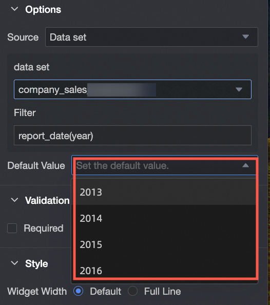
④ Default Value: Select a value from the Data Field Content drop-down list. |
|
|
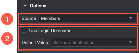
Select Organization Member from the Source drop-down list. |
① From Organization Member: When Organization Member is selected, you can add names of users within the same organization. |
|
② Default Value: Sets the default value of the control. If you select Use Logon Username, the current account's logon username is automatically populated. |
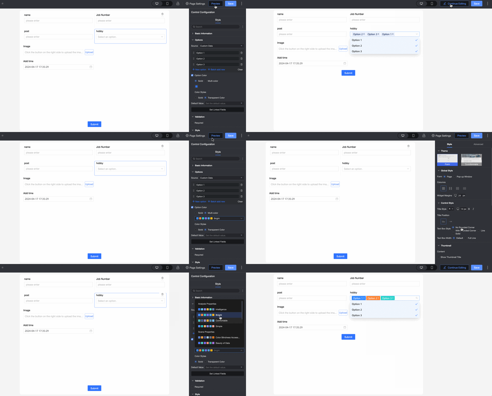

Validation
|
Parameter |
Description |
|
|
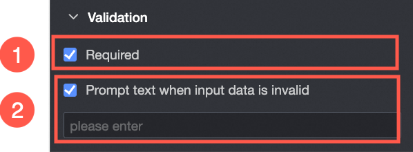
① Required: Specifies whether this field is required. When enabled, the control is marked as Required. |
|
② Input data invalid prompt text: Takes effect only when a validation rule is triggered. For example, if Required is enabled and no value is selected, a custom error message is displayed. |
Section
|
Parameter |
Description |
|
PC side |
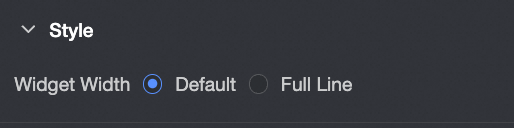
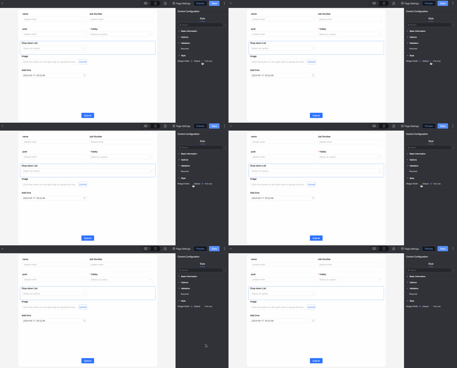
Widget Width: You can select Default or Whole Line. Note
You can also manually drag the border of the widget to adjust the width.
|
|
Mobile terminal |
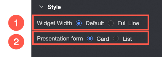
① Control width: Same as the PC-side setting. |
|
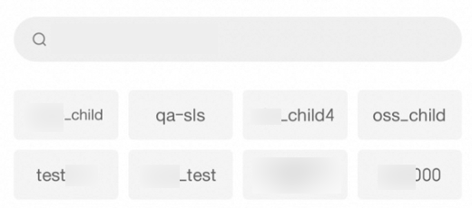
Display form: Options can be displayed in two formats: Card and List. Example of the card display effect:
List:
|