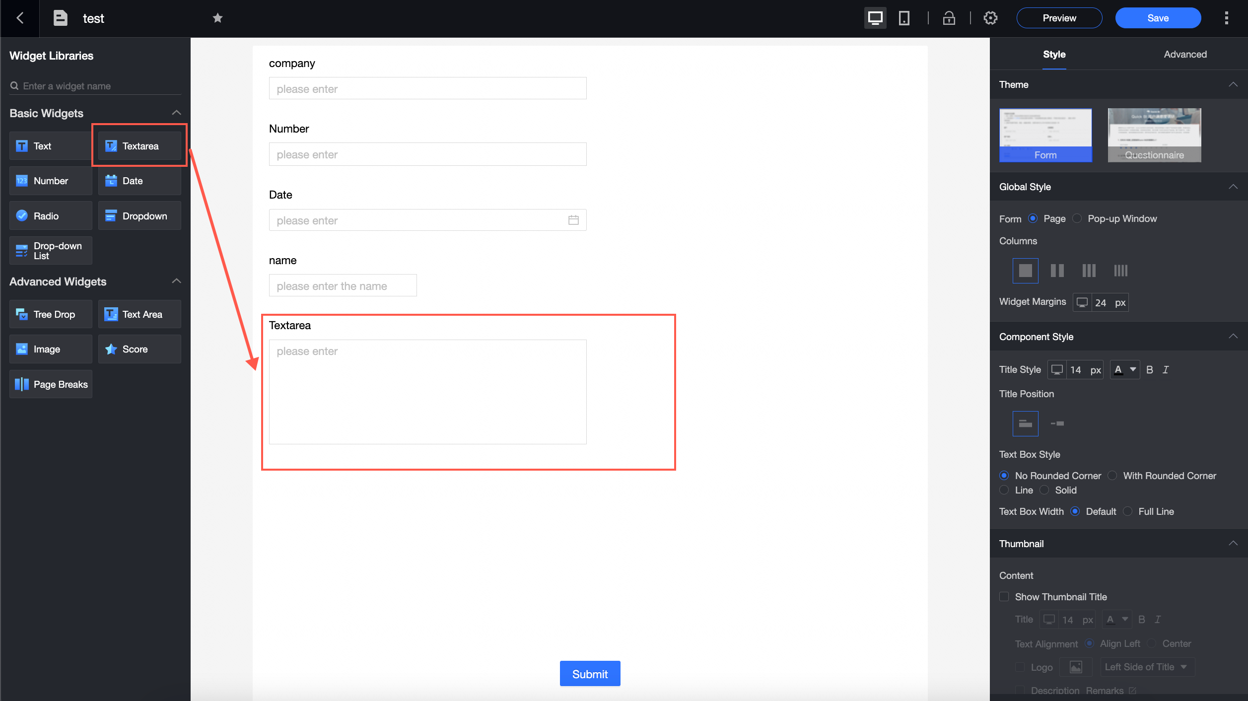
Multi-line text is a basic component and is widely used in forms. It is often used in scenarios where complex content and multi-line text data are added.
Scenarios
You can use this method to add complex content and long text, such as detailed addresses and notes.
Component configuration
Basic Settings
Parameter | Description |
 | ① Show Title: Select whether to show the title of the multi-line text widget. You can customize the display name as the column name of the widget. |
② Table Field Name: the name of the corresponding field in the table created based on the data form. Note The field or table name must start with a letter and can contain letters, digits, and underscores (_). The name can be up to 40 characters in length. | |
③ Prompt Text: the prompt message for the widget. For example, enter a comment. | |
Description: the description of the custom component. | |
⑤ Description Information Location: Specify the location of the description information. The following options are available: Bottom, Right, and Below. For example, set the description below the title. | |
Default Status: the default status of the widget. The valid values are Normal, Read-only, and Hidden. | |
⑦ Default Value: Set the default value of the widget. | |
Use Logon Username: You can specify whether to use the Logon Username parameter. If you select this parameter, the current logon username is used by default. |
Validation
Parameter | Description |
 | ① Required: Select whether to set this configuration items. If you select this option, the component is set to Required. |
② Minimum Length: Select whether to set the length limit. If you select this option, you can set the Minimum Length parameter. | |
③ Maximum Length: Select whether to set the length limit. If you select this option, you can set the Maximum Length parameter. |
Style
Parameter | Description |
 | Widget Width: You can select Default Width or Entire Line. Note You can also manually drag the border of the widget to adjust the width. |