A combination chart displays data series of different magnitudes by using two axes. A combination chart can be a combination of line charts, vertical bar charts, and area charts in stacked or 100% stacked mode. For example, you can use a combination chart to compare the changes of different projects. This topic describes how to add data to a combination chart and how to configure the style of a combination chart.
TensorBoard
Configuration data
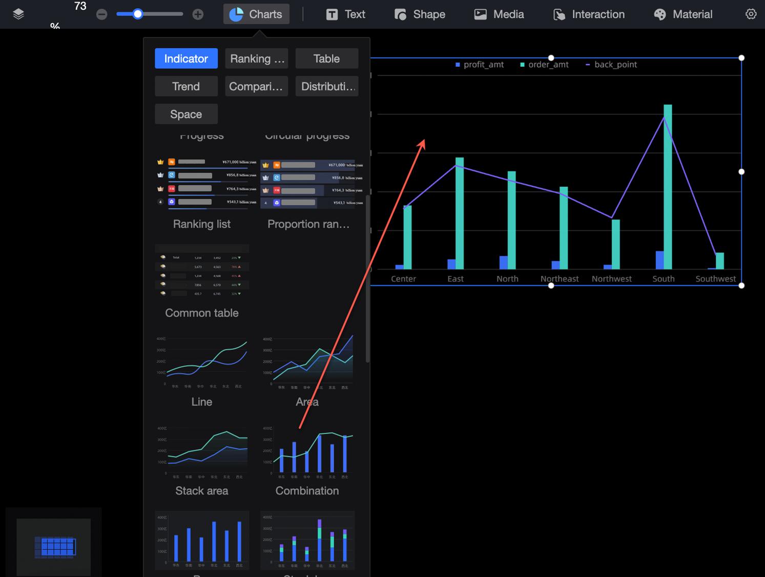
On the Charts page in the Component Library section, find and drag a combination chart to the canvas.
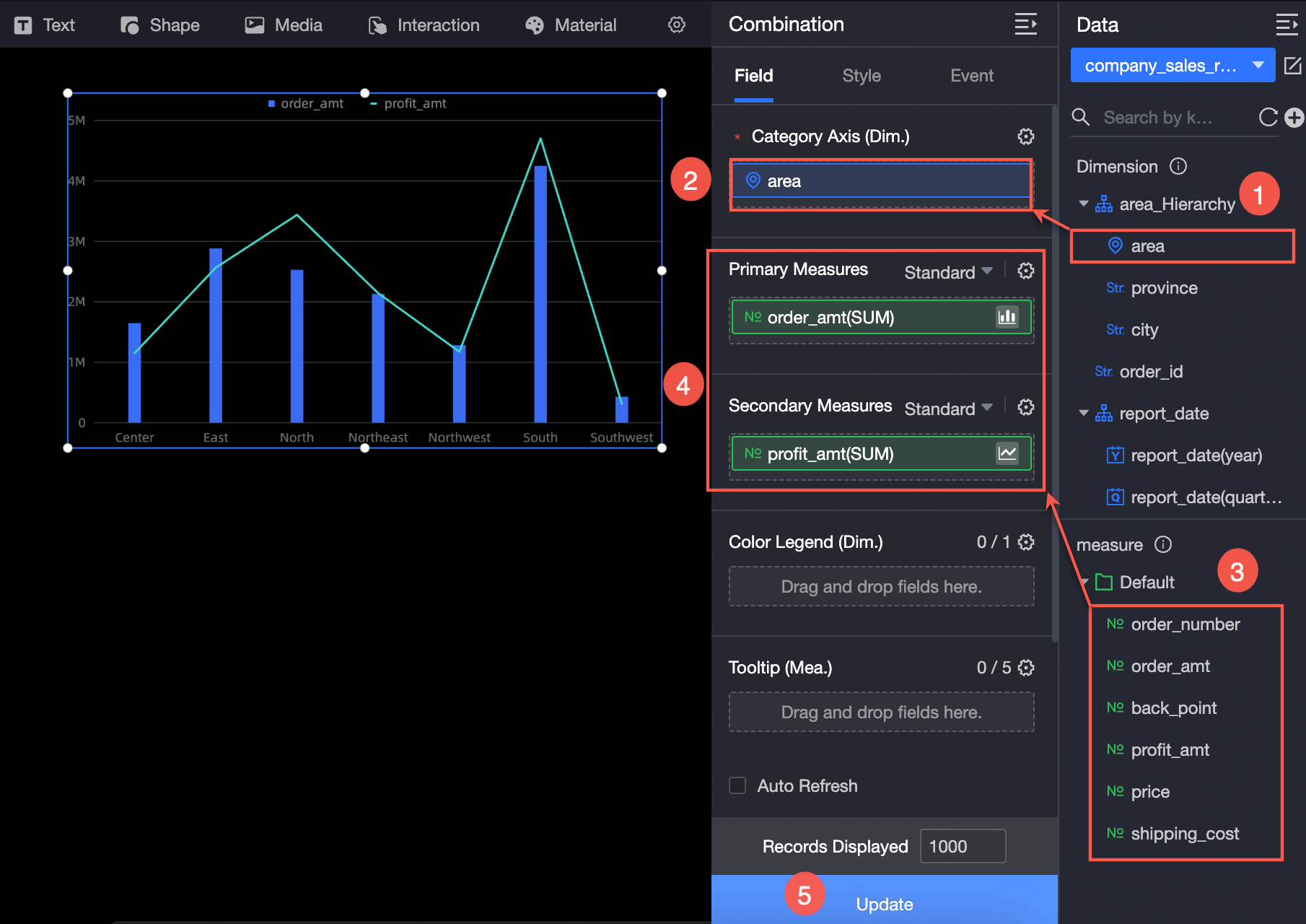
Click Select Dataset and follow the instructions in the following figure to add data.
Configure styles
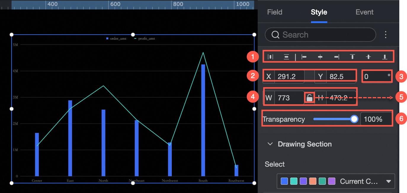
Location and size
You can configure the components in the configuration section as follows:
Adjust widget alignment (①): supports left alignment, center alignment, and right alignment.
Adjust the size of the widget (②): Use the upper left corner as the origin, set the values of the X and Y axes, and adjust the position.
Adjust the angle of the component (③): Set the value of the rotation angle.
Adjust the size of the component (④): Set the values of W and H to adjust the width and height of the component.
Lock component (⑤): After locking the component, the size of the component cannot be adjusted.
Adjust Transparency (⑥): Set the transparency of the widget.
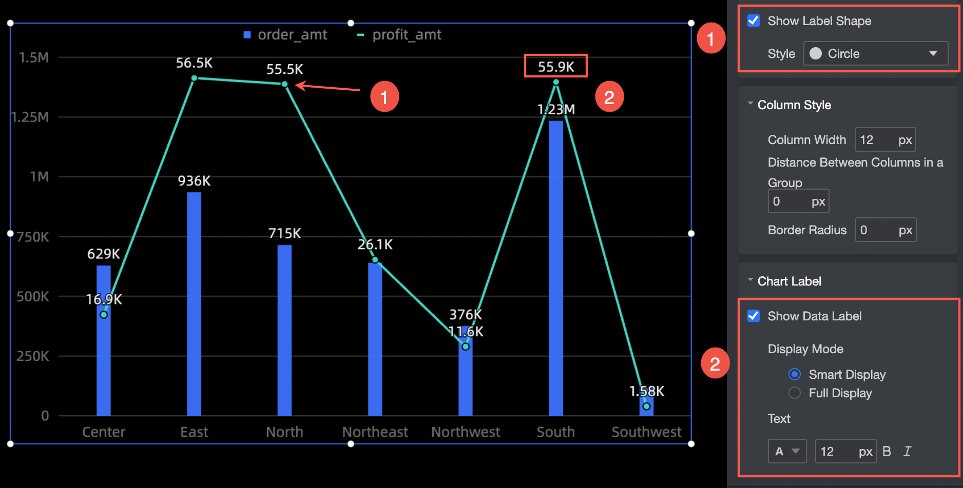
Drawing area
In the Drawing section, you can set the style of a combined chart. The following operations are supported:
Color: Specify the color of the combination chart.
Line Type: Set the line type, including Curve and Line.
Null Value Processing: If the data is empty, you can set the parameter to 0 (the line is not disconnected) or the line is disconnected.
Line Width: Specify the line type and line thickness.
Show Marker Point: Set the marker point style, which supports circle, hollow circle, diamond, and hollow diamond (①).
Column Style: Specify the width of columns, the distance between columns in the same group, and the fillet radius.
Display label: Select the display mode of the label (Smart Display or Full Display) and the text style (②).
Legend
In the Legend section, you can set the position (up, down, sit, right) and text style of the legend. 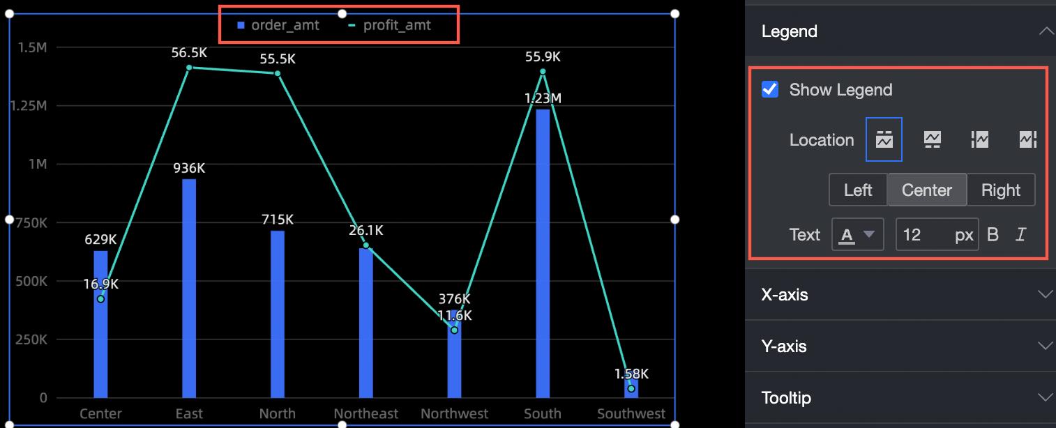
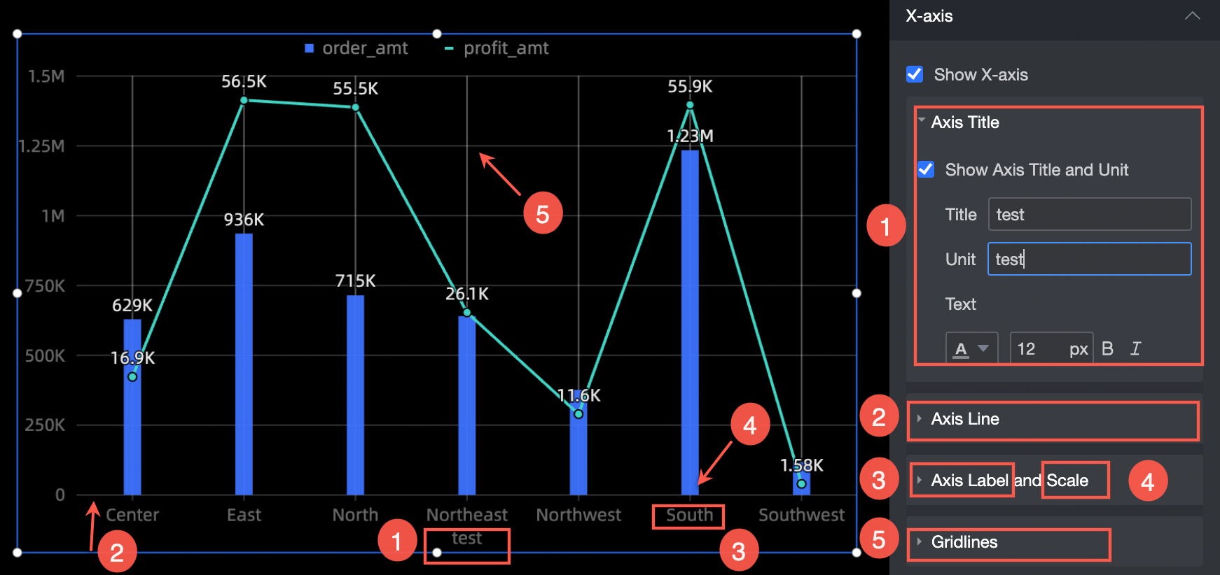
Axes
Take x-axis as an example. In the x-axis section, you can perform the following operations:
Show Axis Title and Unit: Set the axis title, unit, and text style (①).
Axis: Set the type, thickness, and color of the axis (②).
Axis Label and Scale: Specify the text style, scale weight, and color of the axis label.
Network Line: Specify the type, thickness, and color of the grid line.
Tooltips
You can set the tooltip mode in the Tooltip section.
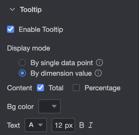
Chart configuration items | Description |
Display mode | The display mode of the prompt information. You can select By Single Data Point or By Dimension Value. |
Description | If the display method is By Single Data Point, Proportion is supported. If you set the Display Method parameter to By Dimension, you can set this parameter to Total or Proportion. When the secondary value axis /measure is dragged into the field, you can set the contents of the left and right Y axes separately. |
Background color | Set the background color. |
Text | Sets the prompt text style. |
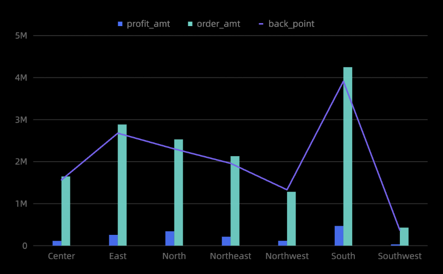
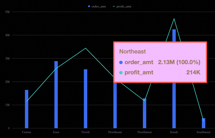
The following figure shows the output:
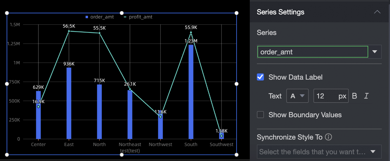
Series settings
In the Series Settings section, you can specify the series of a combined chart. You can perform the following operations:
Select Series: Select a measure in the Indicators section.
Display label: set the size of the label, bold italic.
Show Top Value: Highlight the top value.
Synchronize Style to: synchronizes the current series settings to other metrics.