Build a model to predict air quality by analyzing a year's worth of real data from Beijing, and identify the pollutants that have the greatest impact on PM 2.5 levels.
Dataset
This experiment uses hourly air quality data from Beijing for 2016. The following table describes the fields in the dataset.
|
Field name |
Type |
Description |
|
time |
STRING |
The date of data collection. |
|
hour |
STRING |
The hour when the data was collected. |
|
pm2 |
STRING |
The PM 2.5 index. |
|
pm10 |
STRING |
The PM 10 index. |
|
so2 |
STRING |
The sulfur dioxide (SO2) index. |
|
co |
STRING |
The carbon monoxide (CO) index. |
|
no2 |
STRING |
The nitrogen dioxide (NO2) index. |
Predicting air quality
Go to the Machine Learning Designer page.
Log on to the PAI console.
In the left-side navigation pane, click Workspaces. On the Workspaces page, click the name of the workspace that you want to manage.
In the left-side navigation pane, choose .
-
Build a pipeline.
-
On the Designer page, click the Preset Templates tab.
-
In the Air Quality Prediction section, click Create.
-
In the Create Pipeline dialog box, configure the parameters. You can use the default settings for all parameters.
The Data Storage parameter specifies an OSS Bucket path to store temporary data and models generated during the pipeline run.
-
Click Confirm.
It takes about 10 seconds to create the pipeline.
-
In the pipeline list, double-click the Air Quality Prediction pipeline to open it.
-
The system automatically builds the pipeline from the preset template.
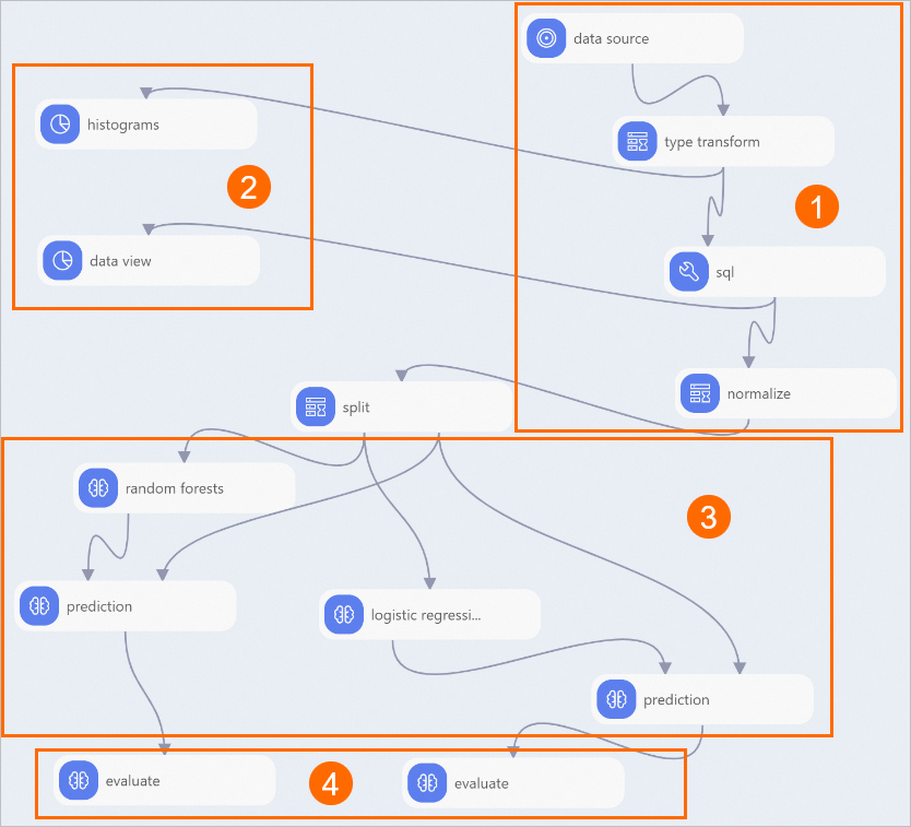
Region
Description
①
Data import and preprocessing:
-
The Read Data Table component imports the dataset.
-
The Type Transform component converts data from STRING to DOUBLE.
-
The SQL Script component converts the label column to a binary type of 0 or 1. In this experiment, the pm2 column is the label column. Values greater than 200, which indicate heavy air pollution, are marked as 1. Other values are marked as 0. The following SQL statement is used:
select time,hour,(case when pm2>200 then 1 else 0 end),pm10,so2,co,no2 from ${t1}; -
The Normalization component standardizes pollutant indicator data to remove dimensionality.
②
Statistical analysis:
-
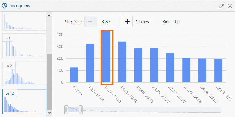
The Histogram component visualizes the distribution of each pollutant.
For example, for PM2.5, the most frequent value range is 11.74 to 15.61, which occurs 430 times, as shown in the following figure.
-
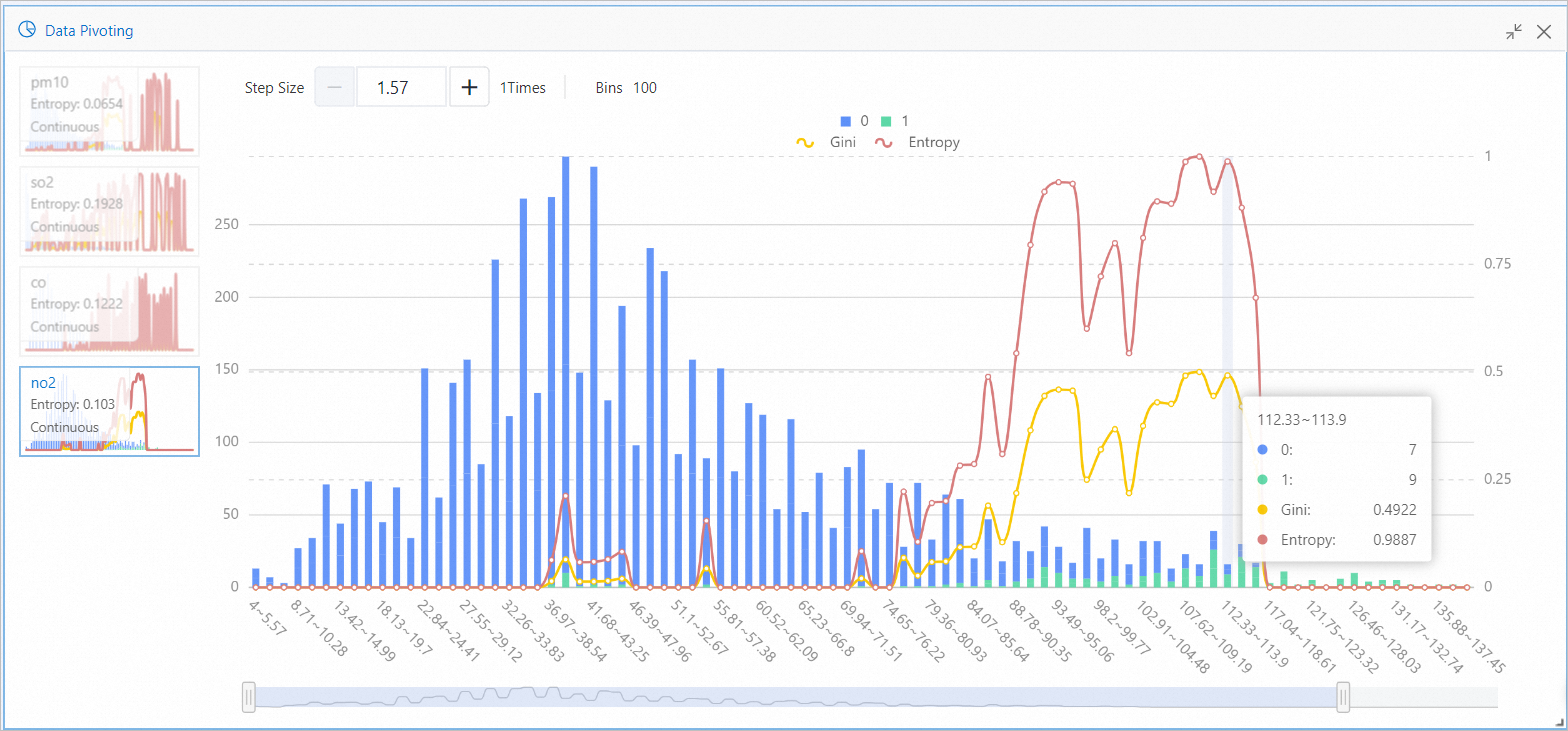
The Data View component visualizes how value ranges for each pollutant affect the outcome.
For example, for the no2 feature, the range 112.33 to 113.9 contains 7 instances of the target label 0 and 9 instances of the target label 1, as shown in the following figure. This indicates a higher probability of heavy air pollution when the no2 value is in this range. Entropy and Gini measure the information gain, or impact, of this feature range on the target value. A larger value indicates a greater impact.
③
Model training and prediction: The Random Forest and Binary Logistic Regression components train the model.
④
Model evaluation.
-
-
-
Run the pipeline and view the model results.
-
Click the Run icon
 at the top of the canvas.
 -
After the pipeline finishes, right-click the Binary Classification Evaluation component downstream of the Random Forest component on the canvas and select Visual Analysis from the shortcut menu.
-
In the Binary Classification Evaluation dialog box, click the Evaluation Charts tab to view the prediction results of the Random Forest model.
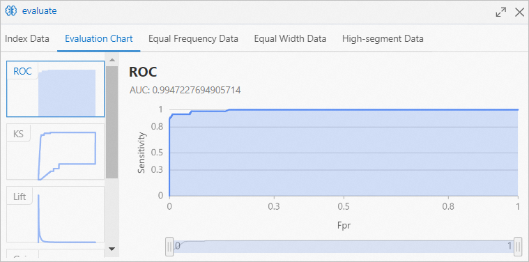 The Area Under the Curve (AUC) is over 99%, indicating high prediction accuracy for the Random Forest model.
 -
Right-click the Binary Classification Evaluation component downstream of the Binary Logistic Regression component on the canvas and select Visual Analysis from the shortcut menu.
-
In the Binary Classification Evaluation dialog box, click the Evaluation Charts tab to view the prediction results of the Binary Logistic Regression model.
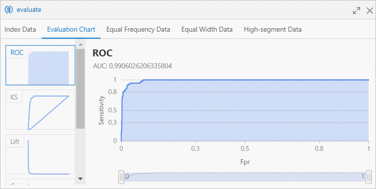 The AUC is over 98%, indicating high prediction accuracy for the Binary Logistic Regression model.
-