This topic describes the layout styles in Ant Dynamic Cards.
Flexbox
The card layout model is based on CSS Flexbox, a one-dimensional layout model. This model ensures that the layout of all page elements is consistent and predictable, and can adapt to different devices or screen sizes.
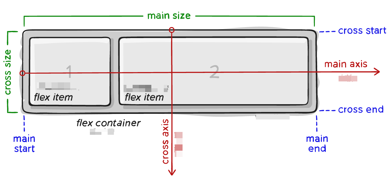
Flex containers
Flexbox is the only layout model used in cards. You must set display:flex. A card element becomes a Flex container if it can nest other elements.
Property | Description | Value type | Default value | Optional values | Syntax | Remarks |
display | Flex layout | string | flex | flex | display:flex | Explicitly specify the node as a flex layout. |
The main difference from web development is the calculation of text nodes. In cards, the size of a text node cannot exceed the size of its parent node.
Property | Description | Value type | Default value | Optional values | Syntax | Remarks |
flex-wrap | Determines whether flex members are distributed on a single line or multiple lines. | string | nowrap | wrap, nowrap | flex-wrap:wrap; | |
flex-direction | Defines the arrangement direction of flex members. | string | column | column, row, row-reverse, column-reverse | flex-direction:row; | |
align-items | Defines how flex members are arranged on the cross axis to handle white space. | string | stretch | stretch, center, flex-start, flex-end, baseline | align-items:center; | |
align-content | Defines how space is distributed between and around content items along the cross axis. | string | flex-start (web: stretch) | auto, stretch, center, flex-start, flex-end | align-content:center; | This property has no effect when flex-wrap is set to nowrap. |
justify-content | Defines how flex members are arranged on the primary axis to handle white space. | string | flex-start | flex-start, flex-end, center, space-between, space-around | justify-content:center; |
Flex members
The differences from the web are as follows:
Text node calculation: If the width and height properties are not set, the size of a text node in a card is calculated by Yoga. The result is then adjusted based on flex constraints. On the web, a text node's size is calculated based on its content and is not subject to flex constraints.
flex-basis difference: In a card, if the width and height properties are not set, the flex-basis value is used as the initial value for flex style calculations, and the actual content size is ignored. On the web, the layout is based on the actual content size, and flex constraints are not considered.
Property | Description | Value type | Default value | Optional values | Syntax | Remarks |
flex | Defines the size of a flex member relative to the remaining space in the container. | Length unit or percentage | 0 | flex:1; flex:1 1 30px; | Supports the shorthand for flex: <flex-grow> | <flex-shrink> | <'flex-basis>. | |
flex-grow | Defines the stretch ratio of a flex member when there is available space. | Length unit | 0 | flex-grow: 1; | ||
flex-shrink | Defines the ability of a flex member to shrink. | Length unit | 0 (web: 1) | flex-shrink: 1; | ||
flex-basis | Defines the default size of a flex member before the remaining space is distributed. | Length unit or percentage | auto | auto, pixel value, percentage | flex-basis: auto; flex-basis: 50px; flex-basis: 30%; | |
align-self | Lets an individual flex member overwrite the default alignment. | string | auto | auto, center, stretch, flex-start, flex-end | align-self:flex-start; |
Positioning
The position property sets the positioning type for an element. You can then use the top, bottom, left, and right properties to set the element's coordinates.
Property | Description | Value type | Default value | Optional values | Syntax |
position | Positioning type | string | relative | relative, absolute, fixed | position: fixed; |
top | Offset from the top | Length unit or percentage | 0 | top: 10px; | |
bottom | Offset from the bottom | Length unit or percentage | 0 | bottom: 10px; | |
left | Offset from the left | Length unit or percentage | 0 | left: 10px; | |
right | Offset from the right | Length unit or percentage | 0 | right: 10px; |
Other
Property | Description | Value type | Default value | Optional values | Syntax |
overflow | Controls whether content is clipped when it overflows the element's box. | string | visible | visible, hidden | overflow:hidden; |
visibility | Specifies whether an element is visible. | string | visible | visible, hidden | visibility:hidden; |
Basic usage of Flexbox
The following is a basic example of how to use Flexbox.
When you use the shorthand for a property, any styles not included in the shorthand are set to their default values.
If you define both shorthand and non-shorthand versions of a property, the one that appears later overwrites the earlier one.
.flex-container {
    display: flex;
    width: 400px;
    height: 250px;
    background-color: lightgrey;
    flex-direction: row;
}

.flex-item {
    background-color: cornflowerblue;
    width: 100px;
    height: 100px;
    margin: 10px;
}


<div class="flex-container">
  <text class="flex-item">flex item 1</text>
  <text class="flex-item">flex item 2</text>
  <text class="flex-item">flex item 3</text>
</div>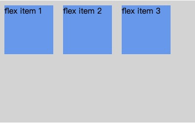
Sample code
Click detailFlex.zip to download the complete sample code.