Users often enter, edit, and delete information when interacting with an application. A variety of specialized input components helps users complete tasks quickly and efficiently. This improves the overall user experience.
A button initiates an immediate action, such as submitting data in a form.
Definition and principles
A button is the primary call to action on a page that guides users to perform a specific action. A button must be prominent to encourage users to click it. After a user clicks the button, the application must provide feedback.
Buttons are divided into primary, secondary, and auxiliary types.
Primary button: A page can have only one primary button. It represents the main user conversion point.
Secondary button: A page can have multiple secondary buttons. They provide supplementary actions for the current scenario.
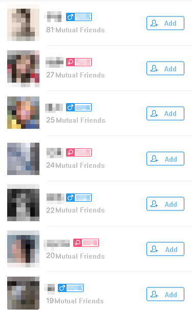
Auxiliary button: An action button located on the right side of a list item. It provides a direct action for that specific item.
Visual style
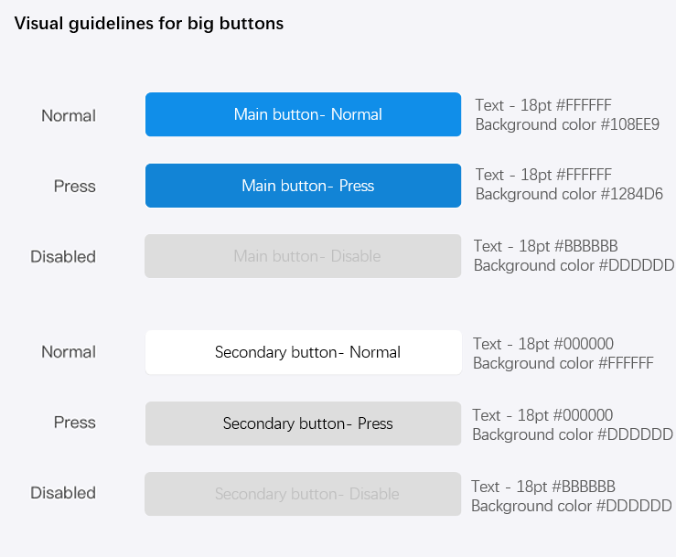
Large button
The main purpose of a large button is to encourage users to perform an action. The specifications for large buttons are as follows:
The button text must be centered vertically and horizontally.
The button height is fixed at 94 px (47 pt). The border radius is 10 px (5 pt).
NoteA page can have only one primary button.
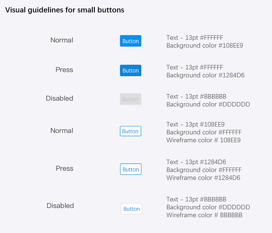
Small button
Small buttons are used for actions or selections on a specific item or option within a page. They can be reused. The specifications for small buttons are as follows:
The button text must be centered vertically and horizontally.
The button height is fixed at 60 px (30 pt). The minimum width is 112 px (56 pt). The border thickness is 2 px (1 pt). The border radius is 6 px (3 pt).
The padding between the button text and the border is 30 px (15 pt). If the text does not fit, you can extend the width of the button.
Examples
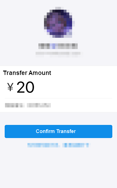
Buttons are meaningful only when presented in the context of page content.
Primary button:
Auxiliary button:
Checkboxes
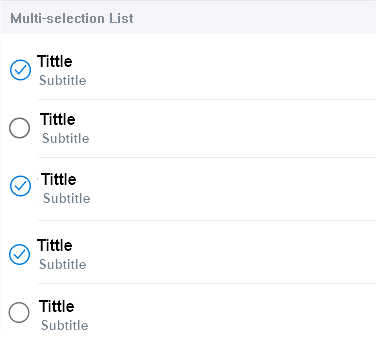
Checkboxes allow users to select multiple elements at the same time.
Definition and principles
Checkboxes usually appear in lists where users can select multiple items for a batch operation. After the user makes selections, the selected elements can be edited together. A checkbox has two states: selected and unselected.
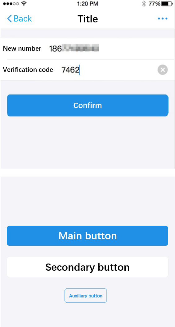
Text input fields
A text input field is the simplest input component. It allows users to enter a single line of data using a keyboard, picker, or other components.
Definition and principles
Single-line input fields typically have a character limit, which is often set to 15 characters. You can also restrict the input to specific types of information, such as Chinese characters, English letters, numbers, or email addresses.
When a user activates an input field, the application should display the corresponding keyboard type, such as a text, English, numeric, or email keyboard. This helps improve the user's input efficiency.
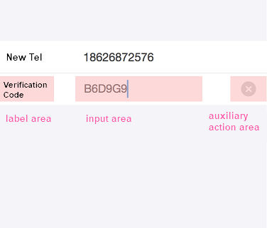
An input field generally consists of three parts: a label area, an input area, and an auxiliary action area. The label area has a four-character limit. The input area usually contains placeholder text. The auxiliary action area can contain buttons for input assistance or a button for more detailed instructions.
If the input data is sensitive information, such as passwords or phone numbers, you should mask it.
Visual style
Different components, such as labels, icons, and auxiliary input buttons, can be combined to form various styles of input fields.
Pickers
A picker provides a preset group of data. It allows users to complete an input or a setting by making a selection.
Definition and principles
A picker is triggered when a user clicks an input field on the page. When the picker appears, the page is covered with a semi-transparent overlay. This focuses the user's attention on the picker selection.
The data in a picker should have a logical order that matches user expectations. Because a picker may not display all data at once, users might need to scroll. A logical order helps users quickly find their desired option.
A picker can be set up for combined selections from multiple columns, up to a maximum of four. However, the text in the longest column must not exceed the specified width limit.
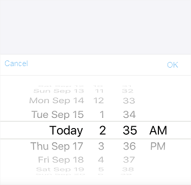
Date pickers
A date picker allows users to quickly select a time. You can configure it to select the year, month, day, hour, minute, and second.
Radio buttons
A radio button allows a user to select only one element from a set.
Definition and principles
Radio buttons usually appear on the right side of a list. A check mark indicates the currently selected option.
Search bars
A search bar allows users to quickly find the content they want from a large amount of information.
Definition and principles
A search bar is usually located below the navigation bar. Clicking it activates the search bar and displays the system keyboard. You can click the Cancel button to exit the active state.
If the input field is displayed by default, you should provide placeholder text, such as "Keywords", to guide users. Below the search bar, you can provide helpful labels, such as recent searches. This allows users to complete the input by clicking a label.
Toggle switch
A switch is a control that visually represents two mutually exclusive states.
Definition and principles
Switches are used within lists to represent two mutually exclusive options, such as on or off.