Ant Cube Card provides several properties to customize the background of an element.
Background styles
There are several ways to set the background style of an element:
background-color defines the background color of an element.
Property
Value type
Default value
Syntax
background-color
Color unit
transparent
background-color: red;
background-image defines the background image of an element.
Property
Value type
Default value
Accepted values
Syntax
Notes
background-image
string
none
url("https:/xxx")is used for a CDN address,url("./xxx")is used for a relative address of an offline package, andurl("data:")is used for Base64 encoding.url("data:")linear-gradient(s1, s2, ..., slast)The format is linear-gradient(s1, s2, ..., slast). The first parameter specifies the gradient angle, which can be an angle value ending in deg or a direction keyword such as top, to top, right, to right, bottom, to bottom, left, or to left. The second parameter specifies the starting color of the gradient. If a percentage is provided for the starting color, it must be 0%. The intermediate parameters specify the intermediate colors. You can provide percentage values for these colors in increasing order. If you do not provide percentages, the colors are evenly spaced. The final parameter specifies the ending color of the gradient. If a percentage is provided for the ending color, it must be 100%.
none: Clears the background.
background-image: linear-gradient(45deg, red 0%, #333 50%, rgb(255,0, 255) 80%, green 100%);
None
background-image: linear-gradient(to top, red, #333, rgb(255, 0, 255), green);
background-image: url("https://gw-office.alipayobjects.com/basement_prod/e047f6c8-dc14-481f-a22c-8dd9012b01a3.png");
background-size
string or length unit
auto
A single keyword: `cover`, `contain`, or `auto`.
Two values, such as `${x}px ${y}px`. You can use length units or percentages.
${x}px A single length or percentage value.
background-size: contain;
If you specify only one value, the other value defaults to `auto`.
background-size: 100px 200px;
background-position
string
0
A single keyword: `top`, `right`, `bottom`, `left`, or `center`.
Two keywords, such as `bottom right`.
${x}px length value / ${y}px length value plus a descriptive value.
${x}px: a length value or a percentage. ${y}px: a length value or a percentage.
background-position: top;
If you specify only one value, the other value defaults to `center`.
background-position: bottom right;
background-position: 30px left;
background-position: 100px;
background-position: 50px 50px;
background-repeat
string
repeat
repeat-x, repeat-y, no-repeat, repeat
One value: `background-repeat: repeat-x;`
None
Two values, such as `background-repeat: repeat no-repeat;`. The first value applies to the x-axis (`repeat` or `no-repeat`) and the second value applies to the y-axis (`repeat` or `no-repeat`).
None
background shorthand:
You can combine `background-color` and `background-image` related properties. The order does not matter.
You can combine `background-image` related properties, such as `background-image` and `background-repeat`.
Use
noneto clear the background.
Examples
background: url('https://img.alicdn.com/tfs/TB1uCUdfND1gK0jSZFyXXciOVXa-151-164.png') repeat-x;
background: url('https://img.alicdn.com/tfs/TB1uCUdfND1gK0jSZFyXXciOVXa-151-164.png') #f0f no-repeat;
background: url('https://img.alicdn.com/tfs/TB1uCUdfND1gK0jSZFyXXciOVXa-151-164.png') #00f repeat-x bottom;
background: #ff0 url('https://img.alicdn.com/tfs/TB1uCUdfND1gK0jSZFyXXciOVXa-151-164.png') repeat-y right;
Basic background usage example
div
{
	background-image: url('img_tree.png');
	background-repeat: repeat;
}When you set both a background image and a gradient, the gradient takes precedence over the image.
[v-alipay-10.2.0] Gradient backgrounds support multiple syntaxes, such as:
background: linear-gradient(#FF6010, 50%, #FFD2B3, #FFF2E9, #FFFFFF);.
Shadows
You can set the shadow for an element.
Property | Value type | Default value | Valid Values | Syntax | Notes |
box-shadow | Length units & color units | none | The format is | box-shadow: 10px 20px 10px red; | All four values are required. |
The built-in components of Ant Cube Card support this style on both iOS and Android platforms.
Each element supports only one shadow effect.
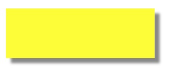
Basic shadow usage example
div
{
	width: 300px;
	height: 100px;
	background-color: yellow;
	box-shadow: 10px 10px 5px #888888;
}
Transparency
Property | Value type | Default value | Accepted values | Syntax |
opacity | float | 1 | A floating-point number from 0 to 1. | opacity: 0.5; |