Ant Dynamic Card supports animation properties. These properties allow you to gradually change an element's size, rotation, translation, and color from one value to another.
Transition
Property value | Value type | Default value | Optional values | Syntax |
transition-property | string | Empty | background-color, opacity, transform, all | transition-property: all; |
transition-property: background-color, opacity; | ||||
transition-property: background-color, opacity, transform; | ||||
transition-duration | number | 0 | transition-duration: 200; | |
transition-delay | number | 0 | transition-delay: 200; | |
transition-timing-function | string | ease | ease, ease-in, ease-out, ease-in-out, linear, cubic-bezier(x1,y1,x2,y2) | transition-timing-function: ease-in; |
transition-timing-function: cubic-bezier(0.3, 0.3, 0.9, 0.9); |
Transition example
.panel {
    margin: 10px;
    top:10px;
    align-items: center;
    justify-content: center;
    transition-property: background-color;
    transition-duration: 0.3s;
    transition-delay: 0s;
    transition-timing-function: cubic-bezier(0.25, 0.1, 0.25, 1.0);
  }
Transform
Property | Value type | Default value | Optional values | Notes |
transform | string | translateX({<length/percentage>}) |translateY({<length/percentage>}) |translateZ({<length>}) |translate({<length/percentage>} {<length/percentage>}) |translate3D({<length>},{<length>},{<length>}) {<length/percentage>}) |scaleX(<number>) |scaleY(<number>) |scale(<number>) |rotate(<angle/degree>) |rotateX(<angle/degree>) |rotateY(<angle/degree>) |rotateZ(<angle/degree>) |rotate3D(<angle/degree>, <number>, <number>,<number>) |transform-origin (center) |matrix(n,n,n,n,n,n) | translateX({<length/percentage>}): Translates the element along the X-axis. Supports length units or percentages. translateY({<length/percentage>}): Translates the element along the Y-axis. Supports length units or percentages. translate({<length/percentage>} {<length/percentage>}): Translates the element along the X-axis and Y-axis. This is a shorthand for translateX and translateY. scaleX(<number>): Scales the element along the X-axis. The value is a number that represents the scaling factor. Percentages are not supported. scaleY(<number>): Scales the element along the Y-axis. The value is a number that represents the scaling factor. Percentages are not supported. scale(<number>): Scales the element along the X-axis and Y-axis. This is a shorthand for scaleX and scaleY. rotate(<degree>): Rotates the element around a fixed point specified by the transform-origin property without deforming it. The specified angle defines the amount of rotation. A positive angle rotates the element clockwise. A negative angle rotates it counter-clockwise. transform-origin: Sets the origin for an element's transformations. Only `center` is supported. matrix: A 2D transformation matrix. translateZ and rotateZ take effect only when transform-style is set to preserve-3d. The translateZ property does not support percentage values. | |
transform-origin | string | center | left, right, top, bottom, center, or a numeric value. Both single-value and double-value syntax are supported. | |
transform-style | string | flat | preserve-3d, flat | |
perspective | length | none | none | <length> | The value must be positive. A negative value or 0 has the same effect as none. |
perspective-origin | string | center | left, right, top, bottom, center, or a numeric value. Both single-value and double-value syntax are supported. |
Transform example
.transform {
    align-items: center;
    transform: translate(150px, 200px) rotate(20deg);
    transform-origin: 0 -250px;
    border-color:red;
    border-width:2px;
  }
3D animation example
The following code provides a complete example.
.div {
    width: 300px;
    height: 300px;
    transform-style: preserve-3d;
    transform: rotateX(45deg) rotateZ(30deg) translateZ(-50px);
    perspective: 600px;
}
3D animation constraints
Animation nesting is limited to two layers. This means that a parent node and a child node can have animations at the same time. If a parent node, a child node, and a grandchild node all have 3D animations, the animation of the grandchild node may not render as expected.
Due to platform limitations, a View cannot be split on Android clients. This means a View can only be fully displayed or completely covered by another element. The following figure shows an example.
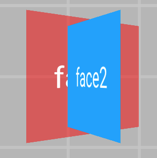 On Android, face2 completely covers face1.
 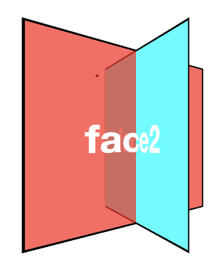 The following figure shows the expected effect on CSS and iOS.
Animation
Property | Value type | Default value | Optional values | Syntax |
animation-name | string | animation-name: demo; | ||
animation-duration | number | 0 | animation-duration: 100; | |
animation-delay | number | 0 | animation-delay: 200; | |
animation-timing-function | string | ease | ease, ease-in, ease-out, ease-in-out, linear, cubic-bezier(x1,y1,x2,y2) | animation-timing-function: ease-in; |
animation-timing-function: cubic-bezier(0.3, 0.3, 0.9, 0.9); | ||||
animation-iteration-count | number | A number infinite (equivalent to 9999) | animation-iteration-count: infinite; | |
animation-iteration-count: 10; | ||||
animation-direction | enum | normal | normal, alternate | animation-direction: alternate; |
animation-fill-mode | enum | forwards | forwards, backwards, both, none | animation-fill-mode: backwards; |
Animation example
.moving-node01 {
  width: 200rpx;
  height: 100rpx;
  background-color: red;
  margin-top: 50rpx;
  animation-name: moving-horizontal;
  animation-duration: 5000ms;
  animation-delay: 2000ms;
  animation-timing-function: ease;
  animation-iteration-count: infinite;
  animation-direction: normal;
  animation-fill-mode: forwards;
}
Keyframe animations
<template>
  <div class="root">
    <div class="line">
      <div class="subline"></div>
    </div>
  </div>
</template>

<script>
          const animation = requireModule("animation"); // Get the module.
    const keyframes = {
        'moving-horizontal': {
            "transform": [
                {
                    "p":0,
                    "v":"translateX(-200px)"
                },
                {
                    "p":0.5,
                    "v":"translateX(-100px)"
                },
                {
                    "p": 1.0,
                    "v": "translateX(0px)"
                }
            ]
        }
    };
    animation.loadKeyframes(keyframes); // Load the module.
</script>


<style>
    .root {
        display: flex;
        align-items: center;
        justify-content: center;
    }

    .line{
        width:200px;
        height:10px;
        overflow: hidden;
        background-color:gray;
    }
    .subline{
        transform:translate(-200px,0px);
        width:200px;
        height:10px;
        background-color:red;

        animation-name: moving-horizontal;
        animation-duration: 2000ms;
        animation-delay: 000ms;
        animation-timing-function: linear;
    }
</style>
Animation end callback
You can define the @on-animationEnd event for a node. When the animation ends, a callback is triggered and passes the parameter {"status":"finish/interrupt"} to the corresponding method. The value `finish` indicates that the animation completed normally. The value `interrupt` indicates that the animation was interrupted or canceled.
Example:
<template>
  <div class="root">
    <div class="anim_node" @on-animationEnd="onAnimationEnd()"></div>
  </div>
</template>

 <script>
   ...
  methods: {
    onAnimationEnd(param){
      if(param.status == "finish") {
         console.info("Animation finished.");
      } else if (param.status == "interrupt") {
         console.info("Animation interrupted or canceled.");
      }
    },
  },
};
</script>

<style>
  ...
</style>
Notes
Note the following when you use animation properties:
The root node does not support animations.
Entity widgets and external widgets, such as input and slider, do not support animations.
The skew animation is not supported. You can use the matrix property to achieve a similar effect.
Applying a CSS animation while a keyframe animation is running has no effect.
On iOS, gestures are not supported during an animation. The system responds to gestures only after the animation is complete.
Sample code
Click detailTransitionAnimation.zip to download the complete sample code.